










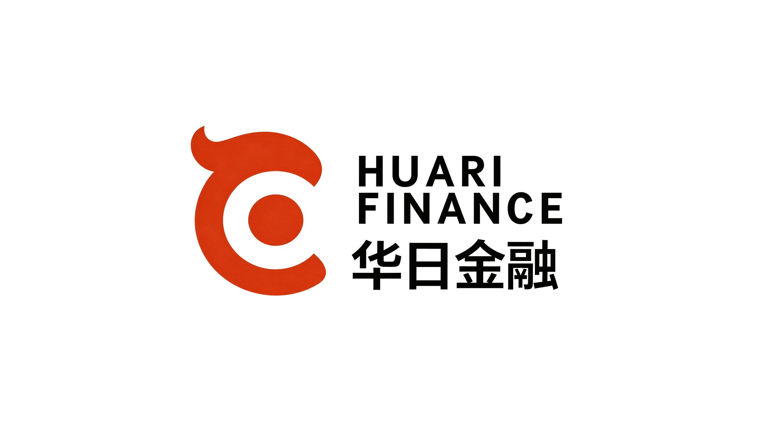
Huari Finance is a professional financial institution focusing on cross-border financial services and Sino-Japanese economic and trade cooperation. It is committed to providing comprehensive financial solutions covering cross-border payment, trade financing, investment consulting and asset management to Chinese and Japanese enterprises and investors.
The brand name "Hua Ri" accurately anchors the brand's bilateral positioning - "Hua" represents China and "Japan" represents Japan. The two characters are juxtaposed to convey the brand's core identity as a financial bridge between China and Japan. Qingmei Future was commissioned to lead the brand identity design.
The design goal of the brand logo is to convey the brand image of "China-Japan integration and financial interoperability" through the visual language of bilateral cooperation, financial expertise and cultural mutual learning.
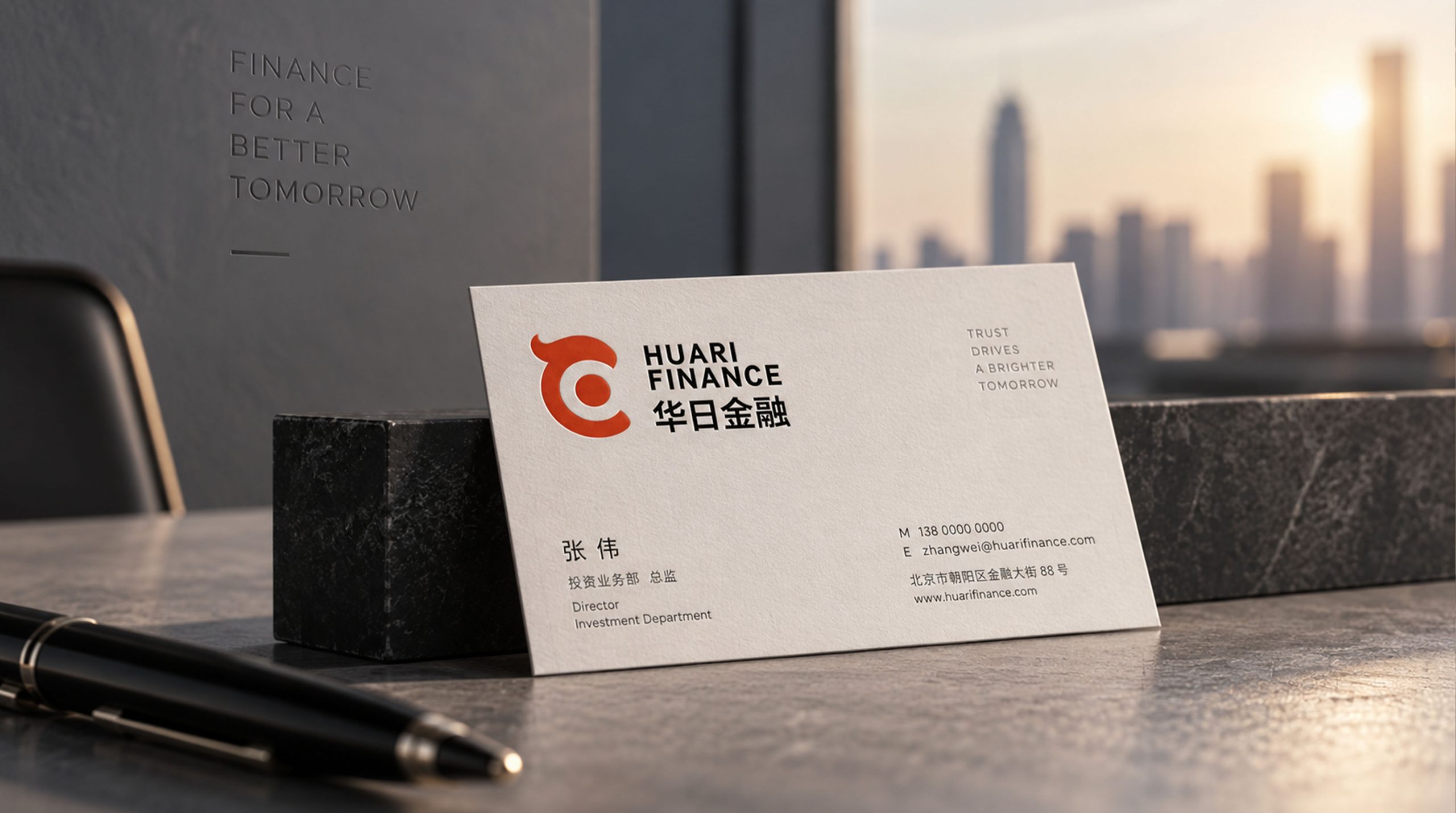
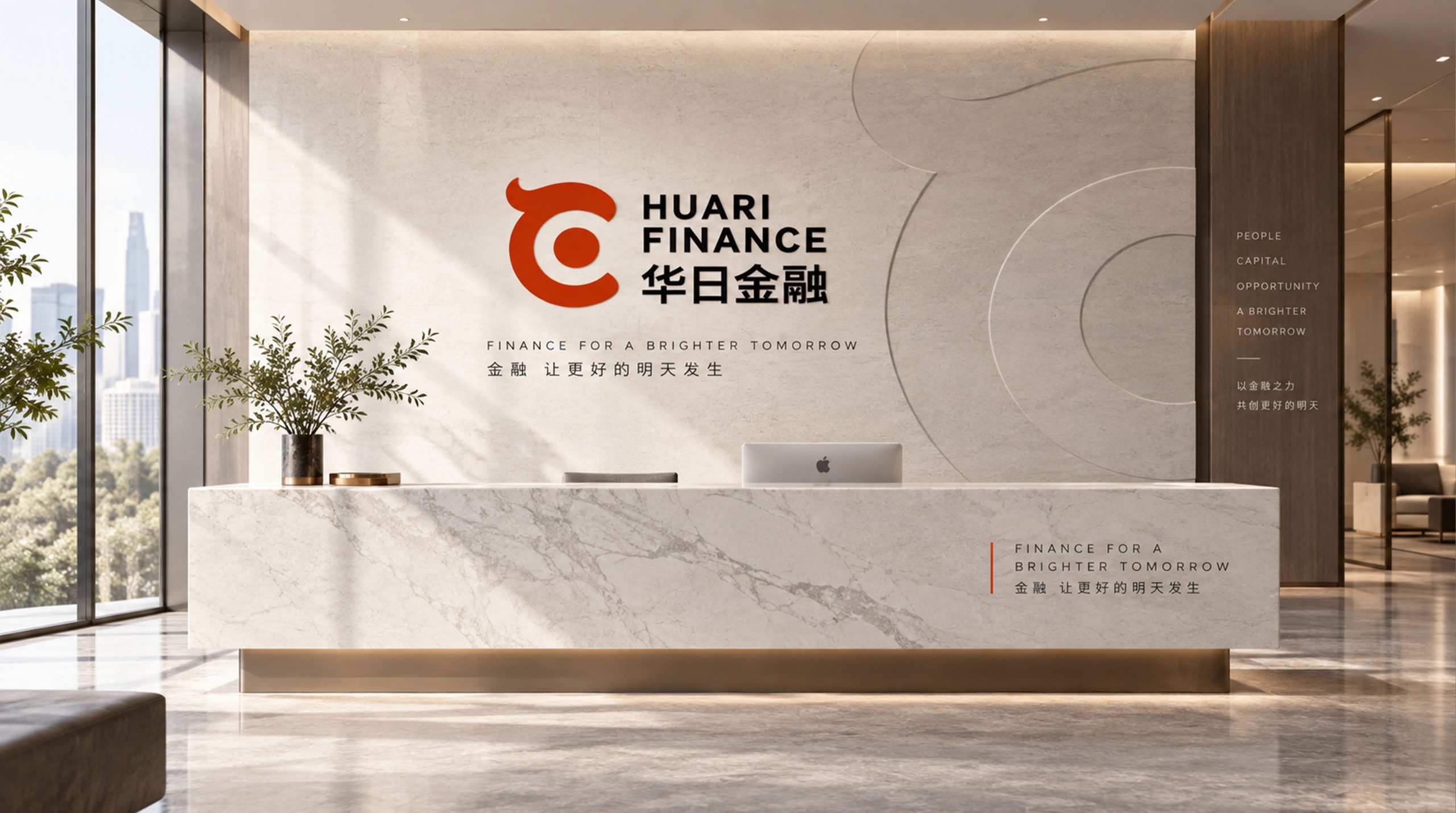


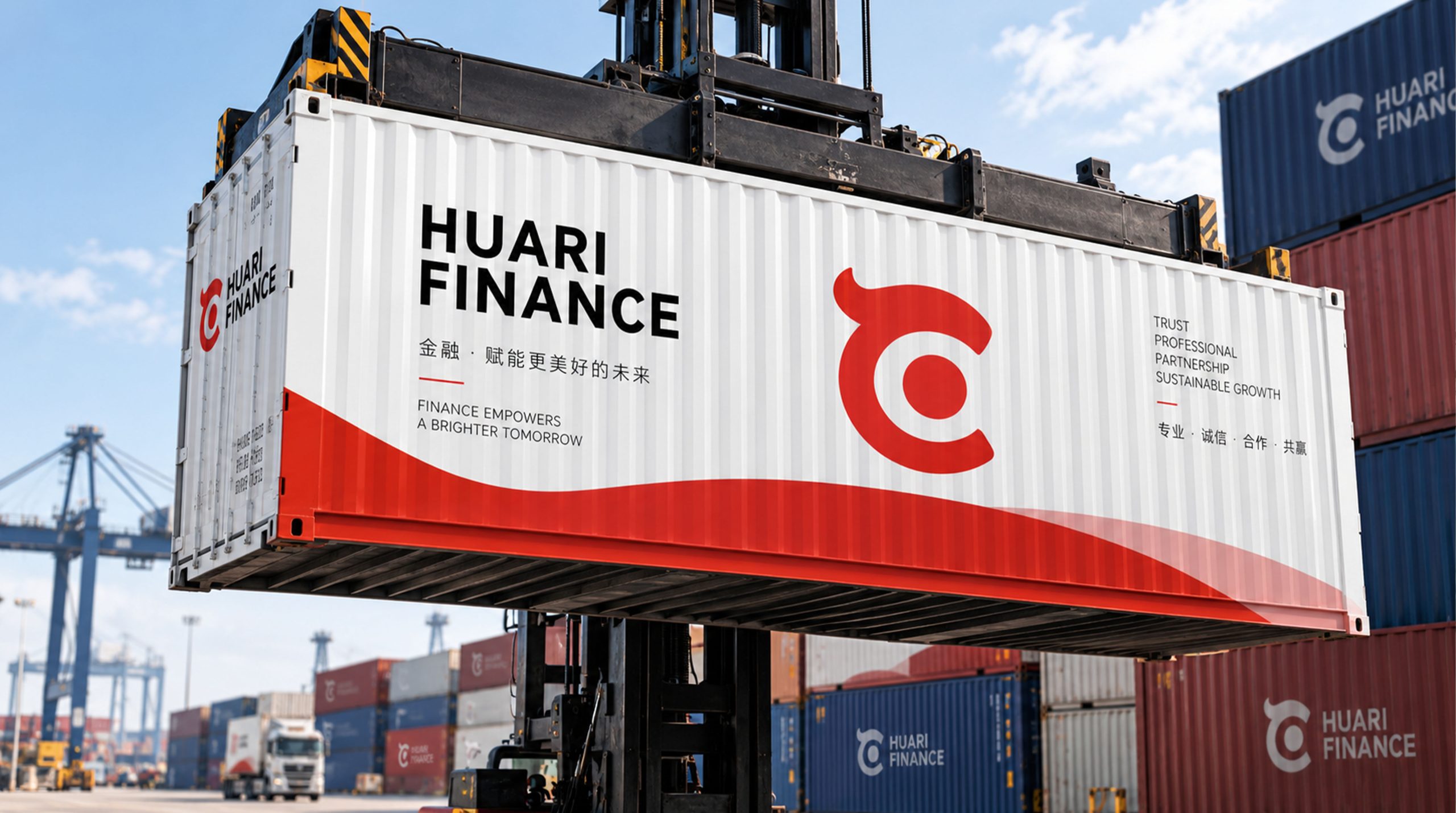
design concept
The logo takes "Rising Sun of Alliance" as its core concept, condensing a sun rising from the horizon into the brand symbol. The sun carries the dual meanings of "hua" and "sun" at the same time - in Chinese culture, the rising sun symbolizes light, hope and the vigorous rise of career; in Japanese culture, the sun is the core symbol of the national image. One sun resonates with the two countries.
graphic language
The main body of the graphic takes a semicircular sun rising slowly from the horizon as the core image. The semicircular sun is located in the upper half of the figure, and the arc is full and warm, just like the first moment when the sun crosses the horizon at dawn - full of hope and new energy. The sun is not a perfect circle but is half exposed, conveying the brand's development momentum of "rising and continuing to rise".
A horizontal straight line runs through the figure below the sun. The straight line is like the sea level or the horizon - China and Japan face each other across the sea. This horizontal line is not only an abstract expression of the Pacific Ocean between the two countries, but also a visual metaphor for the "bottom line, benchmark, and stability" of the financial industry. The sun rises from this line, conveying that Sino-Japanese financial cooperation has a bright future like the rising sun.
The two ends of the horizontal line extend to the left and right respectively, conveying the openness and scalability of bilateral cooperation. The middle section of the horizontal line can slightly arch up to form a gentle arc directly under the sun, just like the arch of a bridge - Huari Finance is the financial bridge spanning China and Japan. The overall graphic constructs "The Rising Sun" with a simple structure of "the sun rises on the line and the bridge connects the two ends".
Font composition
The Chinese version of "Huari Finance" adopts a prudent modern Song style, with clear strokes and a correct structure. The word "Hua" conveys Chinese roots, the word "Ri" concisely and powerfully echoes Japanese elements, and "finance" ends calmly. The English "HUARI FINANCE" is arranged in a standard uppercase serif font, with a generous and solemn font, ensuring the professional recognition of the brand in business scenarios between China and Japan.
color system
The main color, Huarihong #C4292E, represents the rising sun, enthusiasm and the red cultural identity shared by China and Japan. Red is the core color of both the Chinese and Japanese flags - the red of the Five-Star Red Flag and the red of Hinomaru. Using red as the main color directly establishes the cultural common denominator between China and Japan at the visual level. Auxiliary financial dark blue #0D2240 is used for financial professional elements and institutional image in the brand system. Dark blue conveys the professional signal of "rigor, safety and trustworthiness" in the financial industry. The combination of red and blue conveys "enthusiastic cooperation + professionalism and stability". Auxiliary Yuanshan Gold #B89530 is used for high-end customer service and value growth elements in the brand system. Pure white #FFFFFF as standard base color. The overall color is red and blue, reflecting the brand temperament of "enthusiasm, mutual trust, professionalism and long-term development".
Application extension
The logo can be widely used in the logos of institutional headquarters and offices in China and Japan; cross-border financial product brochures, trade financing plans and investment reports; official websites (Chinese and Japanese bilingual), digital financial service platforms and social media images; images of China-Japan Economic and Trade Forum, cross-border financial summits and bilateral business activities. In the main visual of the China-Japan Economic and Trade Forum, the rising sun logo is in the center of the stage. The red sun rises slowly on the dark blue background. The horizontal line connects the Chinese and Japanese flag elements at both ends like a bridge, conveying the brand positioning of Huari Financial as a bridge for bilateral financial cooperation. In the dynamic visual, the horizontal line spreads from the center of the picture to both ends, and the sun slowly rises from the line and the light spreads softly, symbolizing that the bright future of Sino-Japanese financial cooperation is opening up.
brand meaning
The logo contains three core images: Rising Prosperity - the rising sun conveys a positive signal that Sino-Japanese financial cooperation has a bright future and continues to rise; Bilateral Bridge - the horizontal line conveys the mission of China-Japan Finance to bridge the financial markets of China and Japan; Cultural Resonance - the red tone conveys the red cultural identity and enthusiasm for cooperation shared by China and Japan. The overall design conveys the brand vision of "China-Japan integration and financial interoperability".
Improper Usage (Protection Specification)
Do not change the semicircle proportion or rising angle of the sun; do not delete the horizontal line or change its positional relationship with the sun; do not change the hue of the main color of Huarihong; do not add gradients, strokes or decorative effects inconsistent with the financial style; do not separate the sun and the horizontal line for separate use; keep the white space ≥ 25% of the graphic height; the minimum display width shall not be less than 25mm.
design results
After the release of the logo, Huari Financial's brand recognition and bilateral trust in the fields of cross-border finance and Sino-Japanese economic and trade services have been significantly improved. "The Rising Sun", with its visual language conveying the enthusiasm for bilateral cooperation and financial professionalism, has become the core identification symbol of the brand system, demonstrating the brand vision of "China-Japan integration and financial interoperability".