










HomeBox is a comprehensive parent-child service brand with family parent-child education and children's growth experience as its core. It is committed to providing families with children aged 0-8 years old with a one-stop growth space covering early education, parent-child play, creative courses and family social interaction.
The brand name "Home Box" is lively and interesting - "Home" points out the core positioning of serving families; "Box" is like a gift box full of surprises, with new discoveries and happiness every time it is opened, symbolizing that the brand provides children and families with colorful and fun-filled growth content. Qingmei Future was commissioned to lead the brand identity design.
The design goal of the brand logo is to convey the brand image of "open the box and start growth" through the visual language of childlike warmth, family companionship and exploration of surprises.
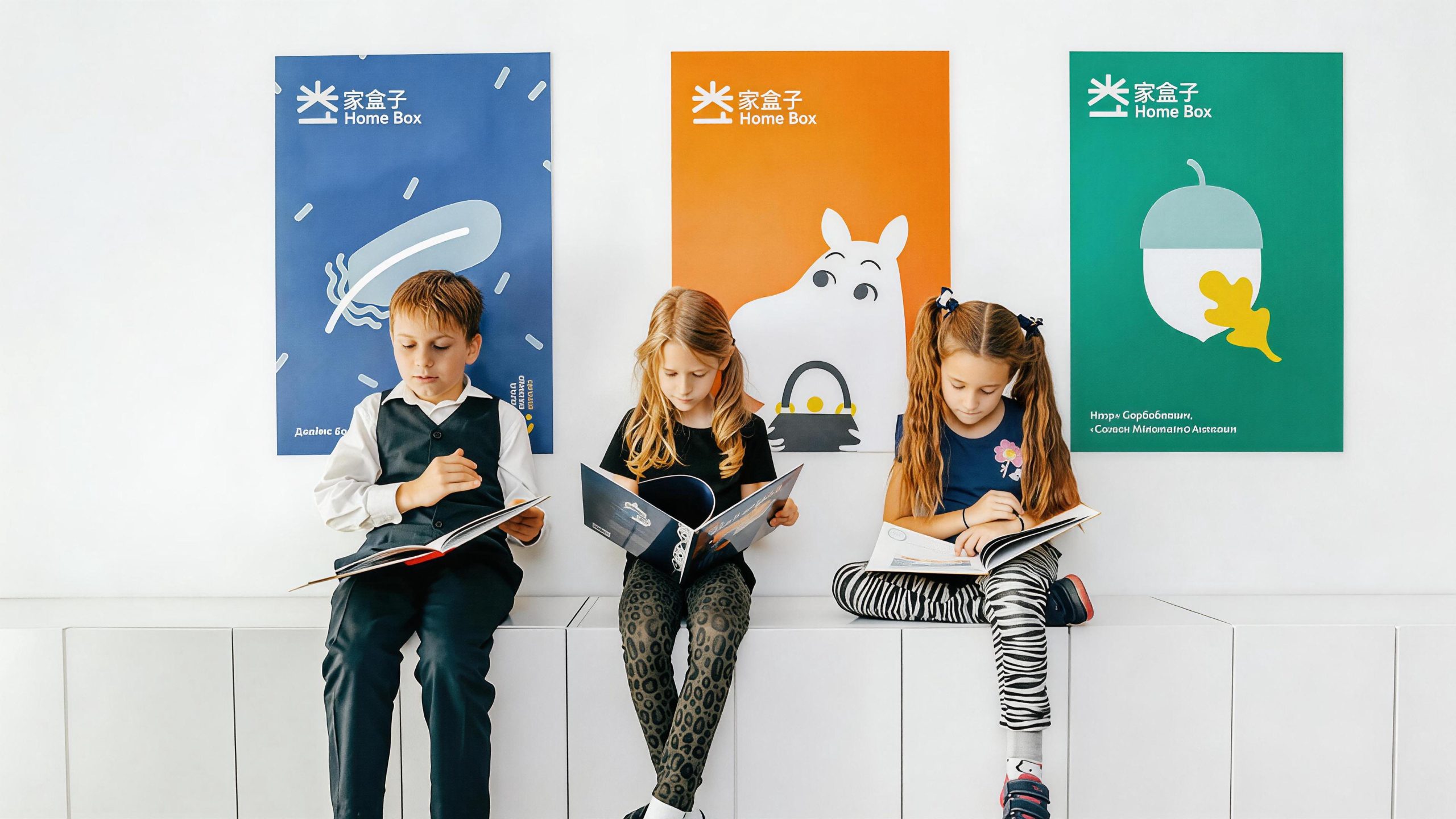
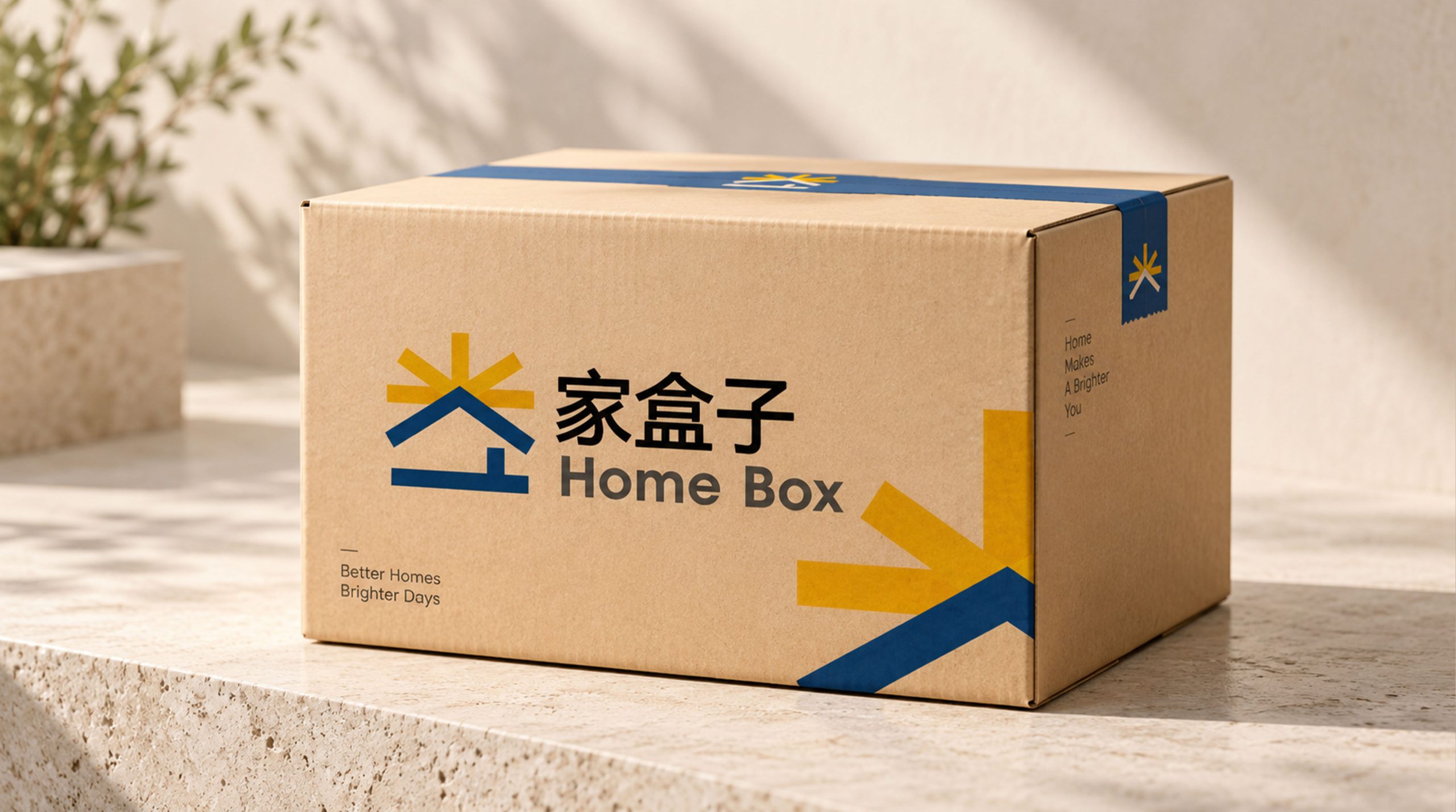
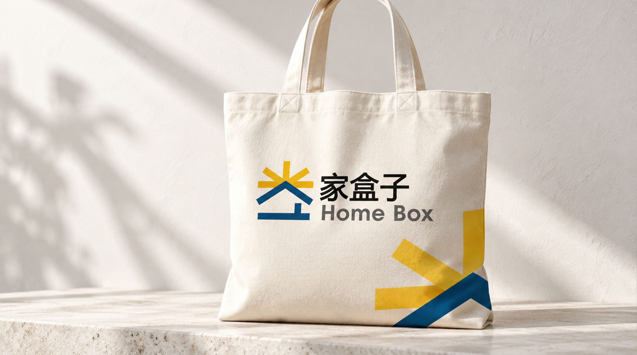
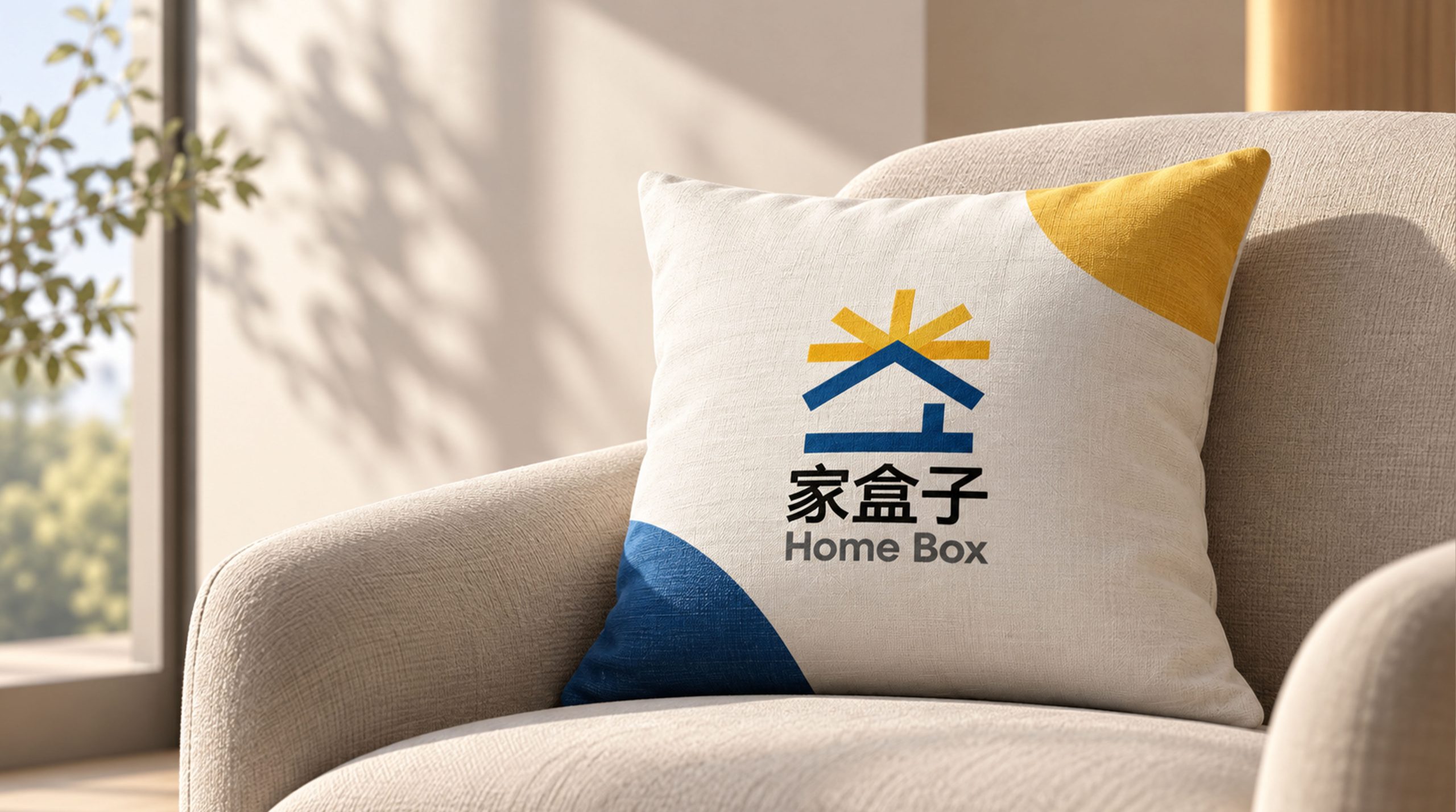
design concept
The logo takes "Box of Wonder" as its core concept, integrating a gift box being opened with the emotional imagery of family warmth. A half-open box is the most anticipated image of childhood - the moment the lid is lifted, light, color and surprise come to your face. Every time you open it, it is a new journey of exploration.
graphic language
The main body of the graphic takes a box being opened as the visual core. The box body is presented in a square shape with rounded corners, and the four corners are soft and rounded, conveying the children's brand's product principles of "safety, friendliness, and zero edges and corners". The lid of the box is presented as an upward-turned trapezoid, forming an open angle with the body of the box, as if the lid of the box has just been opened curiously by a pair of small hands.
Several brisk arcs or star patterns spill out from the opening of the box lid, as if light, inspiration and joy burst out from the box - this is the light of surprise that sparkles in a child's eyes when he opens the box. The overflowing elements are scattered in free gestures of different sizes and directions, conveying the "unfettered and full of possibilities" nature of the childhood world.
The front of the box is left blank with a simple outline of a house or a heart graphic. The house echoes the brand semantics of "home" - this is not an ordinary box, but a "home" box, containing the happiness of the family and the growth of the children. The overall graphic is presented with soft lines and a full sense of volume, like a cute building block toy, which makes children want to reach out, touch, play and open it when they see it. The composition creates a "box of surprises" with the interesting structure of "a surprise comes out when the box is opened, and a home is hidden in the box".
Font composition
The Chinese "Home Box" uses a round, childlike font with chubby strokes and a bouncing structure. The word "home" is warm and stable like the arms of parents, and the word "box" is lively and lively like a child's laughter. The English "FAMILYBOX" is arranged in a rounded sans serif font. The letters are full and cute, and the mixed uppercase and lowercase letters add a sense of intimacy and childishness.
color system
The main color box orange #FF6F3C represents vitality, happiness and the warm sunshine of childhood. Orange is the most infectious color among children's brands - bright but not dazzling, warm but not anxious, just like the ever-bright smile on a child's face. Auxiliary Exploration Blue #42A5F5 is used for curriculum and educational elements in the brand system. Blue conveys the curiosity of learning and exploration. Assisted Growth Green #66BB6A is used for natural experience and outdoor activity elements in the brand system. Auxiliary creative yellow #FFCA28 is used for artistic creation and play interactive elements in the brand system. The four-color combination forms a colorful color system of "orange, blue, green and yellow", just like an open box of colorful building blocks, conveying the brand promise of "Colorful and Comprehensive Growth" of Jiabox. Pure white #FFFFFF as standard base color.
Application extension
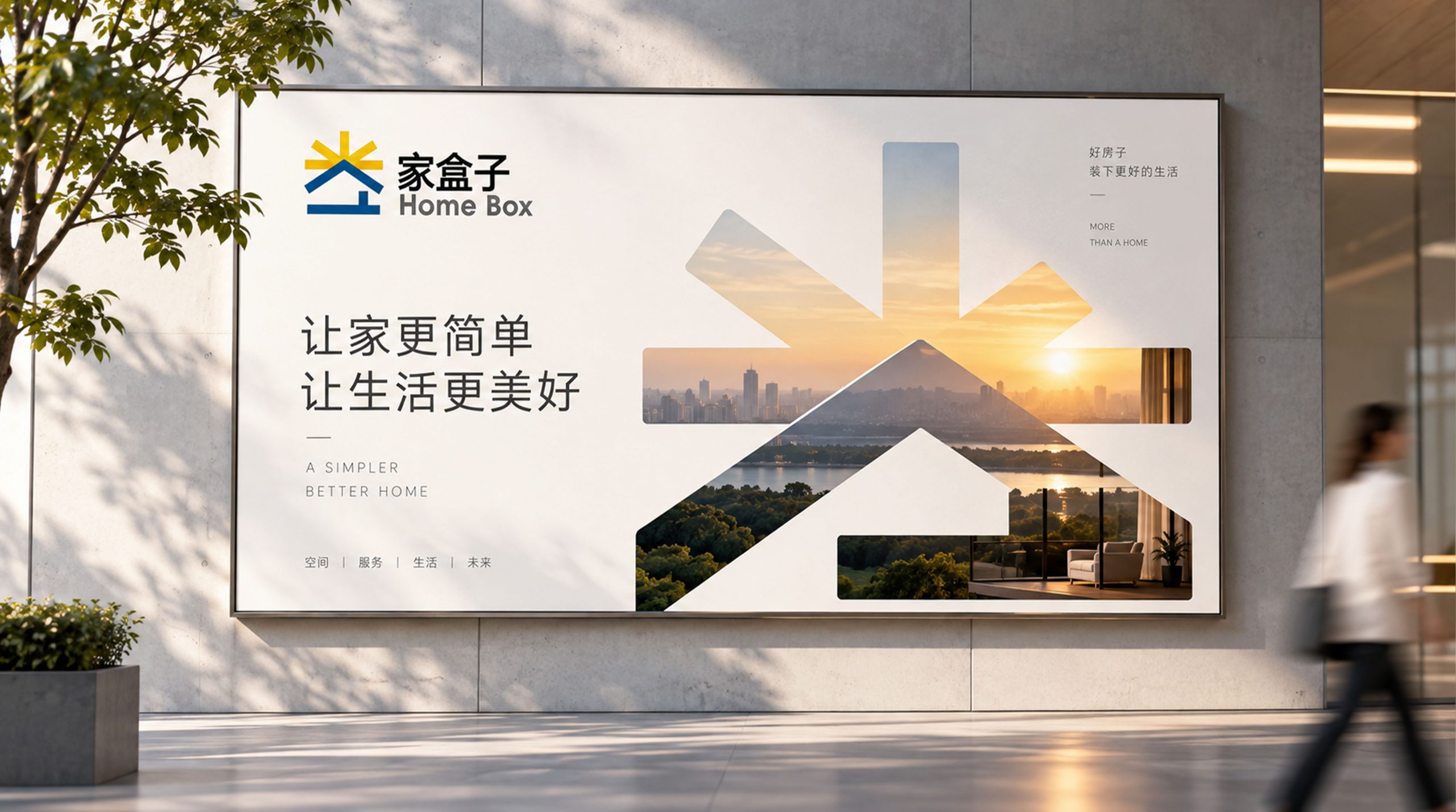
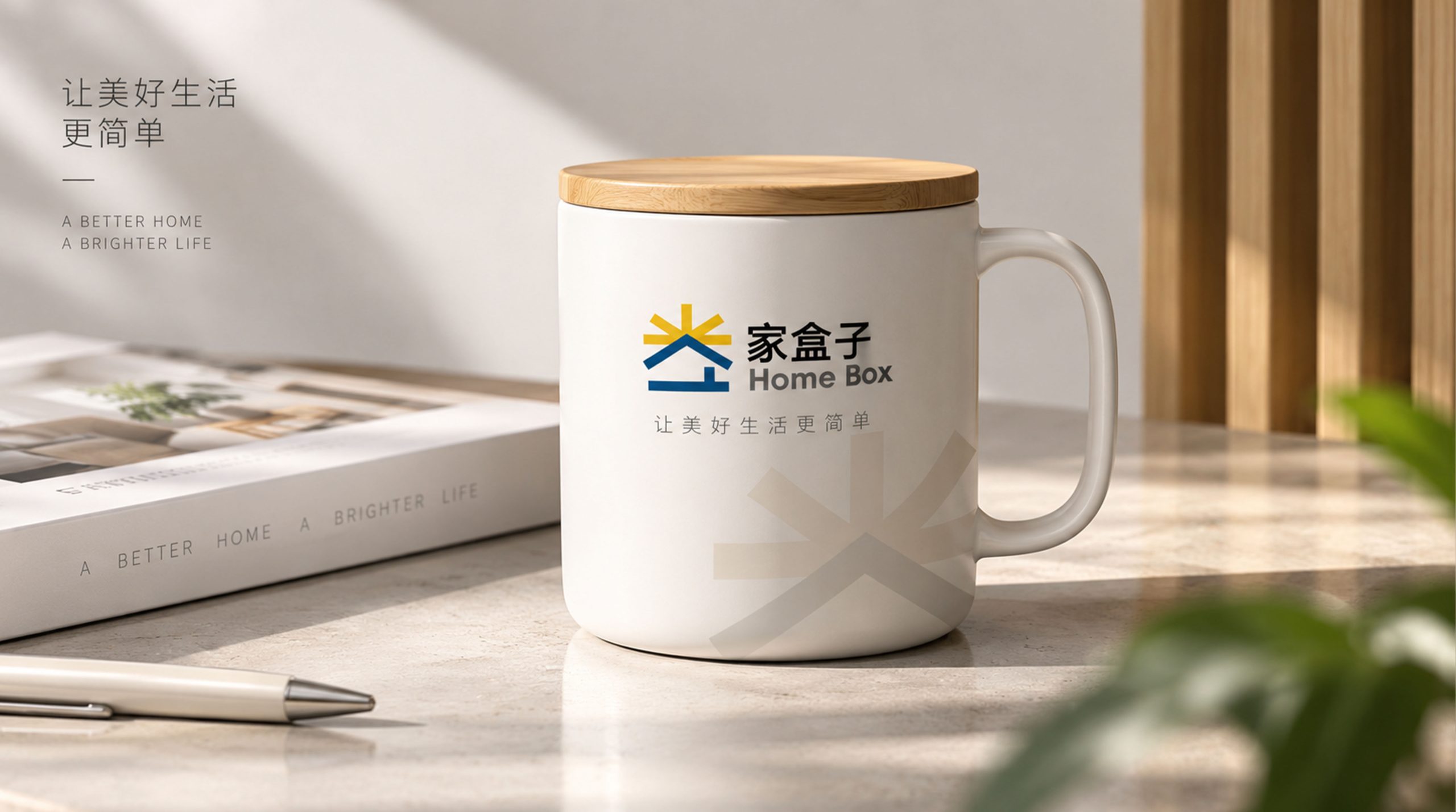
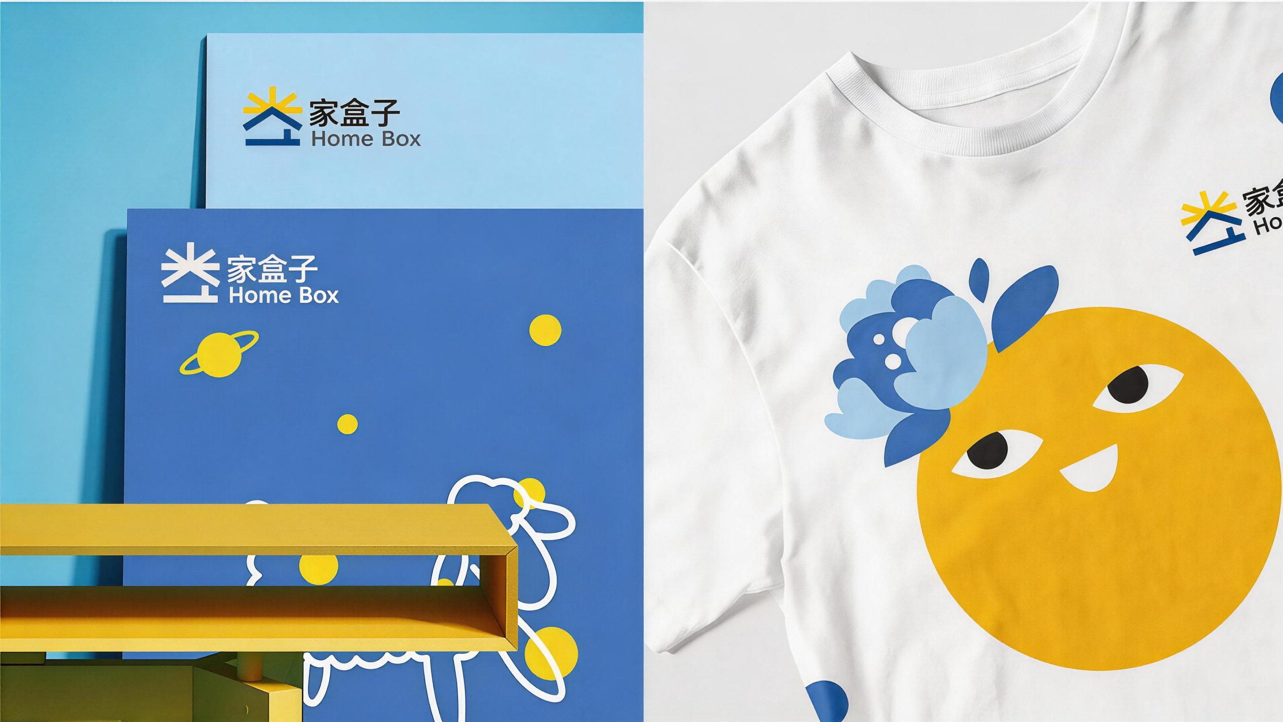
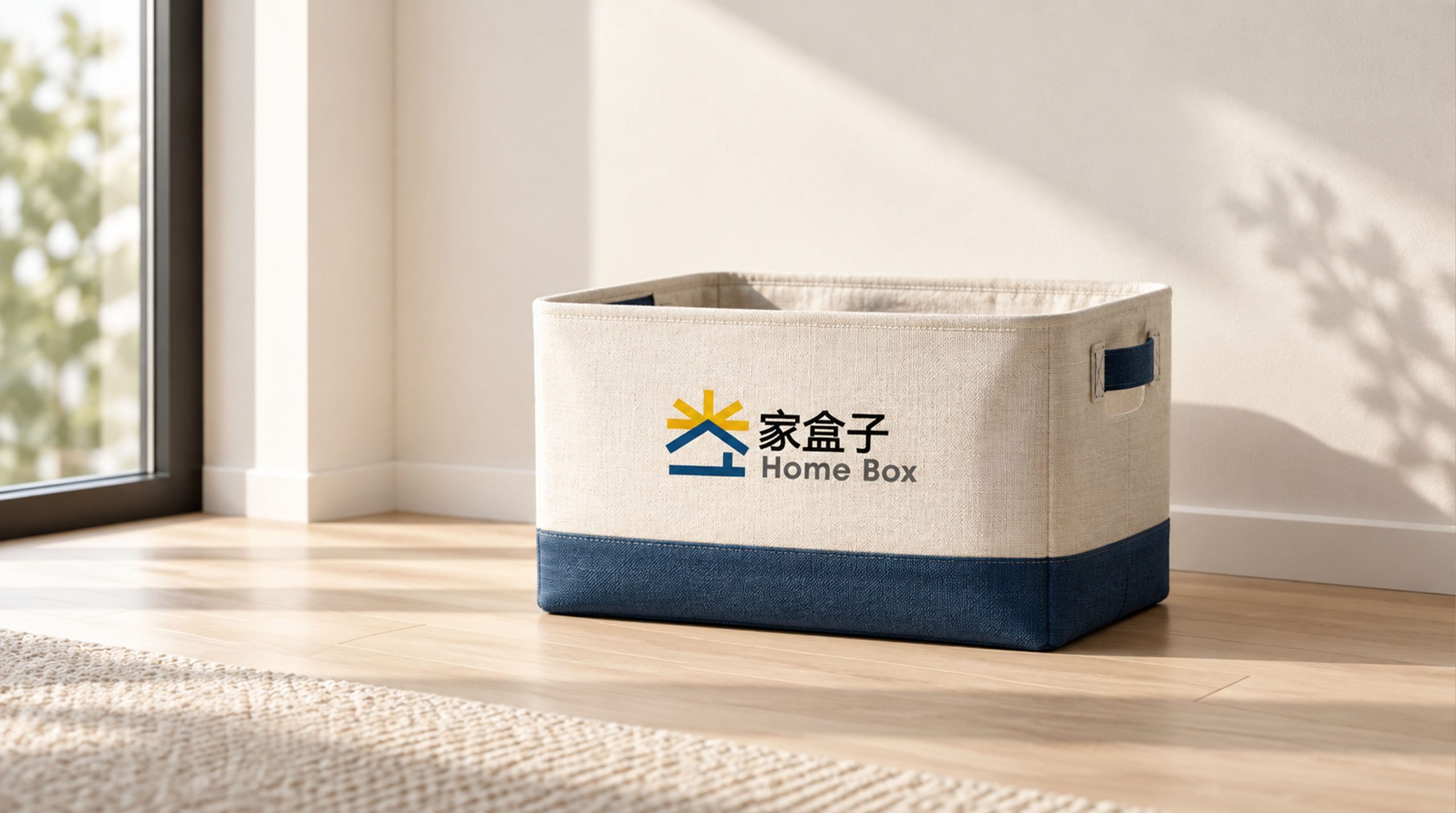
The logo can be widely used in parent-child center doors, indoor space guides and play area signs; course manuals, growth files, parent-child activity invitations and membership cards; official website, parent APP, social media and short video platform images; parent-child education exhibitions, maternal and infant expos and brand cross-border cooperation images; children's peripheral products, brand toys and holiday gift box packaging. At the entrance of the parent-child center, the box logo is presented as a three-dimensional device - a life-size large colorful box stands at the door. The lid of the box is slightly opened to reveal light. The children hold the hands of their parents and run excitedly toward "the big box". The brand experience begins at the entrance. In the dynamic visual, the box is gently shaking in the center of the picture, and the lid of the box is curiously opened by a pair of small hands. Colorful lights and stars happily jump out of the box, symbolizing that the family box opens a growing world full of surprises for every family.
brand meaning
The logo contains three core images: Wonder & Discovery - the open box lid and the overflowing light convey the brand experience of childhood full of curiosity and exploration; Family Warmth - the home-shaped pattern and warm orange main color in the box convey the concept of parent-child companionship with family as the core; Colorful Growth - the multi-colored color system conveys the educational content of all-round development and diversified growth. The overall design conveys the brand vision of "open the box and start growth".
Improper Usage (Protection Specification)
Do not change the rounded square proportion of the box or the opening angle of the lid; do not delete overflowing surprise elements in the box; do not change the hue of the orange main color of the box; do not replace the rounded corners with sharp corners or add serious decoration that is inconsistent with children's style; do not separate the box body and the lid for separate use; keep the white space ≥ 25% of the graphic height; the minimum display width shall not be less than 25mm.
design results
After the release of the logo, Jiahezi’s brand recognition and family popularity in the field of family parent-child education and children’s growth experience have significantly increased. "Surprise Box", with its visual language that combines childlike warmth and exploration fun, has become the core identification symbol of the brand system, showing the brand vision of "open the box and start growth".