










Jiajia Liandian Technology is a technology company with smart home and Internet of Things technology as its core. It focuses on smart home appliance interconnection, whole-house intelligent control systems and home energy management solutions. It is committed to using technology to make every family's life more convenient, more comfortable and smarter.
The brand name contains clear business logic - "Jiajia" means a beautiful family, conveying the brand vision of making the home better; "Lian" means interconnection and connectivity, symbolizing the interconnection of all things between smart devices; "Dianke" means electronic technology, clarifying the technology-driven corporate gene. Homes are better because of technology, and devices are smarter because of the Internet. Qingmei Future was commissioned to lead the brand identity design.
The design goal of the brand logo is to convey the brand image of "intelligent connections to thousands of homes, happy living with technology" through the visual language of intelligent interconnection, family warmth and technological convenience.
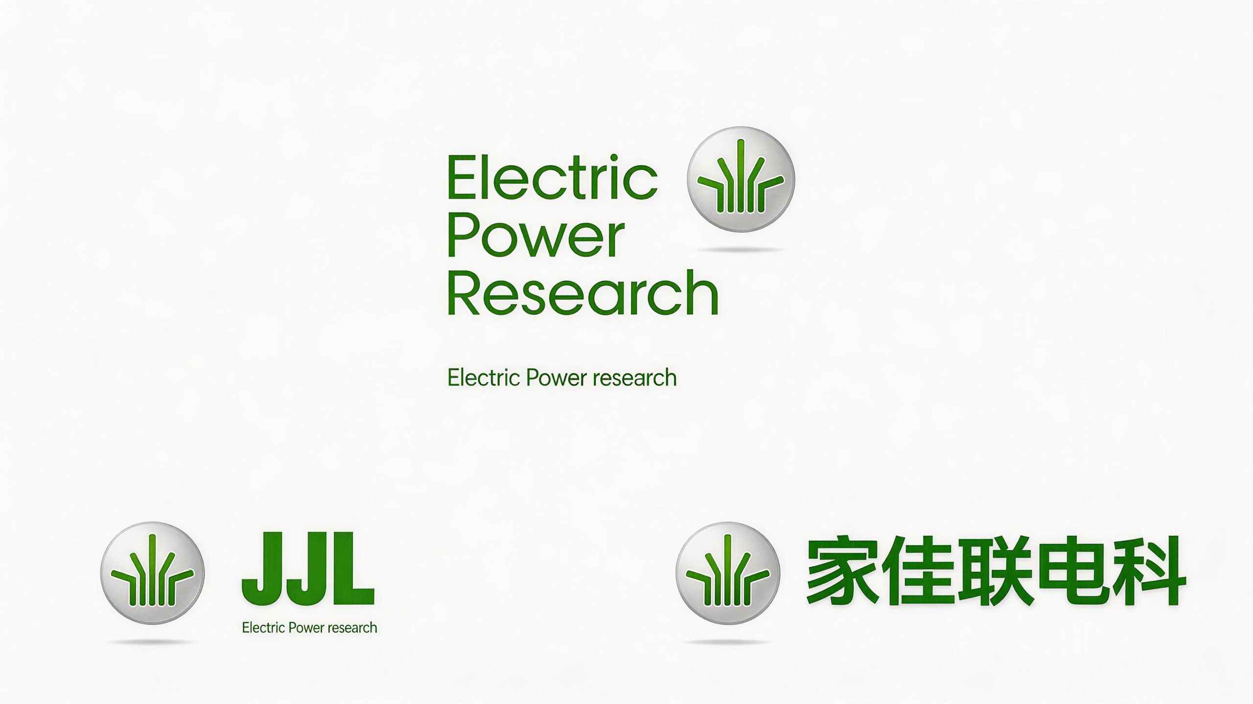
design concept
The logo takes "Smart Home" as its core concept, integrating the outline of the house with the network connection signal. The house is the visual prototype of "home", and the connection signal is the technical expression of "connection" and "electric technology" - a house that can send out signals is an intelligent and interconnected home.
graphic language
The graphic is based on a simple silhouette of a house. The roof is presented in a triangular shape with neat and clean lines, conveying the simple aesthetics of modern residences. The body of the house is supported by a square shape, which gives it a stable and down-to-earth feel, just like the sense of security at home.
Several concentric arcs extend upward from the roof tip of the house, just like Wi-Fi signals or radio waves radiating outward from the roof. The signal arc expands from the inside to the outside, and the lines gradually become thinner, conveying the real-time communication status of the smart home system sending and receiving data to the external network. The signal arc grows naturally from the house - it is not an external antenna, but the house itself has the gene of intelligent networking, conveying the product concept of "home itself is intelligent".
The interior of the house is presented with a rounded power symbol or switch icon left blank. The power symbol is the most common "startup" symbol for smart devices - a single touch can wake up the entire house's intelligence, conveying the convenience and intuitiveness of product control. The overall graphics handles all turns with rounded corners to avoid sharp edges and corners, conveying the "safe, friendly, zero-distance" user experience of home products. The composition is based on a three-layer structure of "house shape as the base, signals as the wings, and switches as the heart" to build a "smart home".
Font composition
The Chinese "Jiajia Liandianke" uses a modern sans-serif font with rounded corners, rounded and friendly strokes, and a compact and bright structure. "Jiajia" conveys the beauty of home with warmth and friendliness, "Lian" conveys the attributes of the Internet with a strong sense of connection, and "Dianke" conveys technological genes concisely and neatly. The English "JIAJIALIAN DIANKE" or brand abbreviation is arranged in standard uppercase sans serif font to ensure clear identification in the technology industry and product packaging.
color system
The main color, Zhilian Blue #2196F3, represents technology, intelligence and digital connection. Bright blue is the most mainstream brand color in the global smart home and Internet of Things industries, conveying the industry signal of "technology, modernity, and trustworthiness" while visually giving people a refreshing and comfortable home experience. Auxiliary Home Warm Orange #FF9800 is used in the brand system as a warm element for home users, just like the warm lights that light up at home in the evening, injecting the warmth of "home" into the blue of technology. The combination of blue and orange conveys "smart technology + family warmth". Auxiliary fresh green #4CAF50 is used for energy saving, environmental protection and energy management elements in the brand system to convey the green energy saving value of smart homes. Pure white #FFFFFF is used as the standard background color and the basic color of the product interface. The overall color uses blue and orange as the dual core, reflecting the brand temperament of "intelligent technology and home warmth".
Application extension
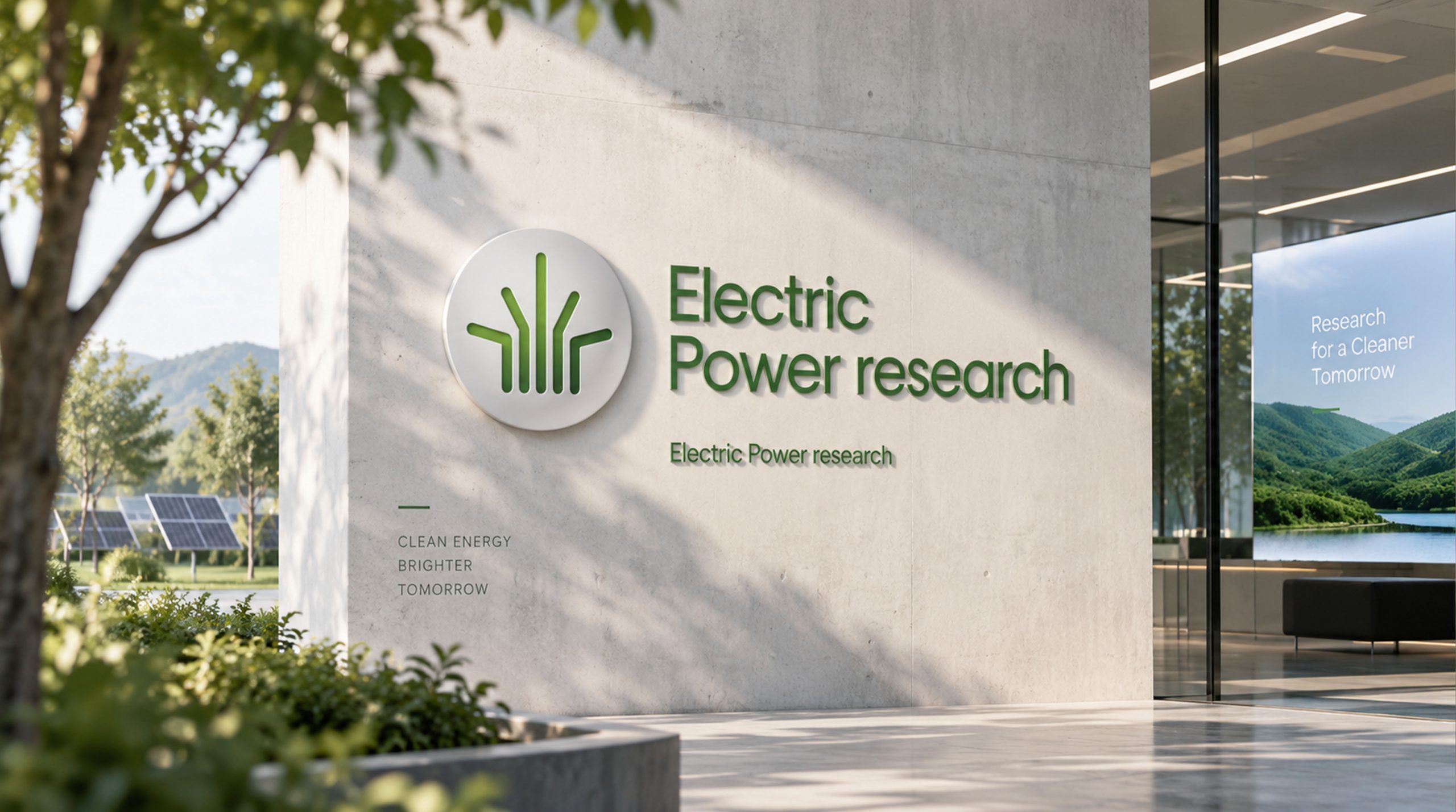
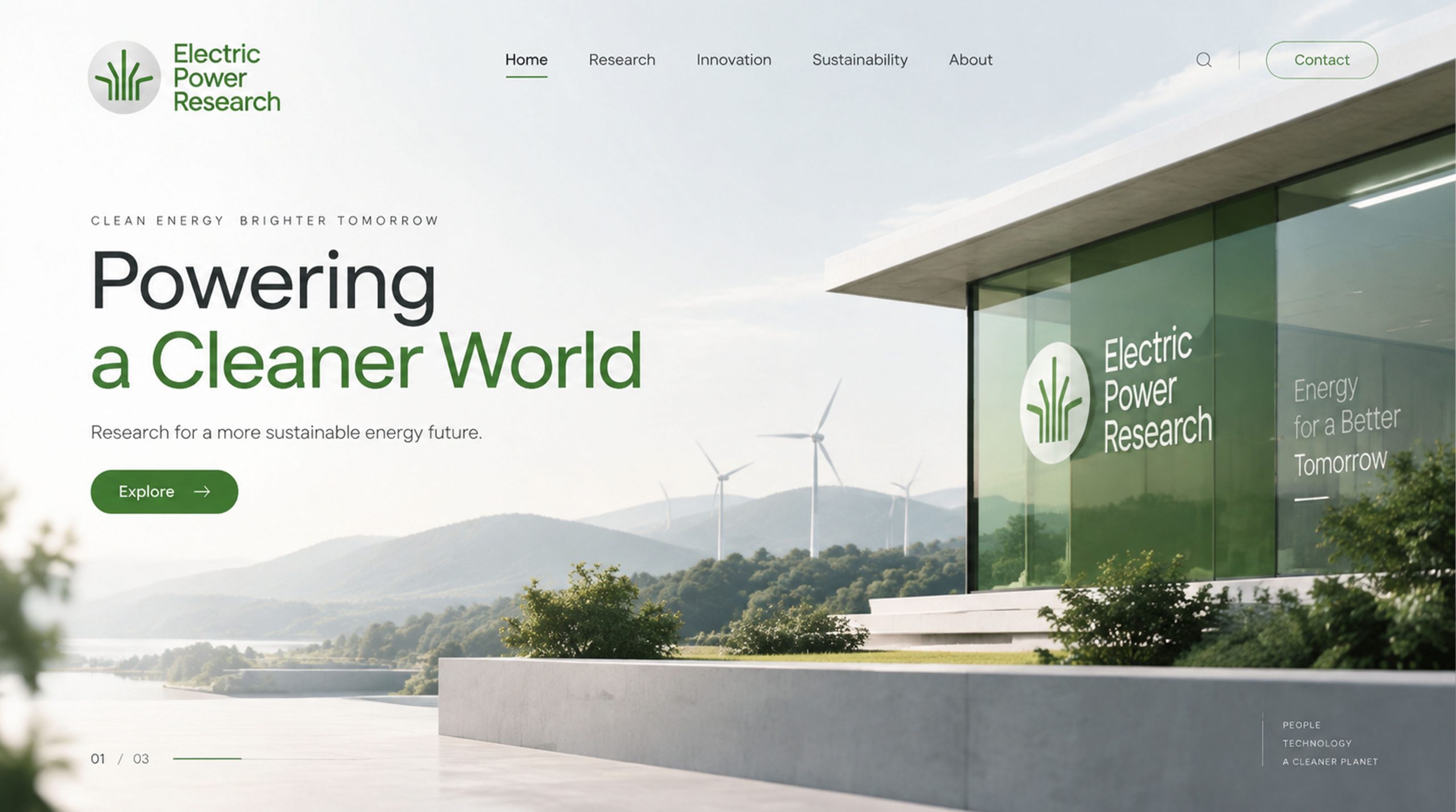
The logo can be widely used in smart home product shell nameplates, packaging boxes and instructions; whole-house smart experience center doors and exhibition hall logos; official websites, smart home control APP icons and interfaces, mini program entrances; consumer electronics shows, smart home expositions and developer conference images. In the smart home control APP, the logo is presented as a dynamic icon on the startup page - the outline of the house is steadily presented, the signal arc spreads outwards and pulses in turn, and the power symbol inside the house flashes softly with the rhythm of a breathing light, conveying instant feedback that "your smart home is online".
brand meaning
The logo contains three core images: Smart Connection - the signal arc conveys the technical ability of smart devices to connect everything; Better Home - the outline of the house and warm colors convey the brand vision of making the home more comfortable and convenient; Tech Powered - the power symbol and the blue main tone convey the corporate gene of using electronic technology to drive home intelligence. The overall design conveys the brand vision of "connecting thousands of homes intelligently and living happily with technology".
Improper Usage (Protection Specification)
Do not change the basic proportion of the house outline or the diffusion direction of the signal arc; do not delete the power symbol in the house or replace it with other graphics; do not change the hue of the main color of Zhilian Blue; do not add strokes, shadows or decorative effects inconsistent with the style of technological home; do not split the house and use the signal arc alone; keep the white space ≥ 25% of the height of the graphic; the minimum display width shall not be less than 20mm.
design results
After the release of the logo, Jiajia LMC's brand recognition and user awareness in the fields of smart home and Internet of Things have significantly improved. "Smart Home", with its visual language that integrates technological interconnection and family warmth, has become the core identification symbol of the brand system, demonstrating the brand vision of "intelligent connections, technology-enabled living".