










Hubei Wuhan Financial Leasing is a professional financial leasing institution rooted in Hubei and Wuhan. With financial leasing, operating leasing and leased asset management as its core businesses, it serves strategic industries such as infrastructure construction, advanced manufacturing, medical health and green energy. It is committed to using leasing financial tools to assist the development of the real economy and the upgrading of regional industries.
The brand name directly indicates the regional identity and business attributes of the institution - "Hubei Wuhan" anchors the geographical hub of the thoroughfare of nine provinces and the strategic highland emerging in the central region, while "Financial Leasing" clearly defines the professional financial positioning with leasing as the core. Qingmei Future was commissioned to lead the brand identity design.
The design goal of the brand logo is to convey the brand image of "based on Jiangcheng and integrating industries" through the visual language of regional responsibility, financial expertise and industrial empowerment.
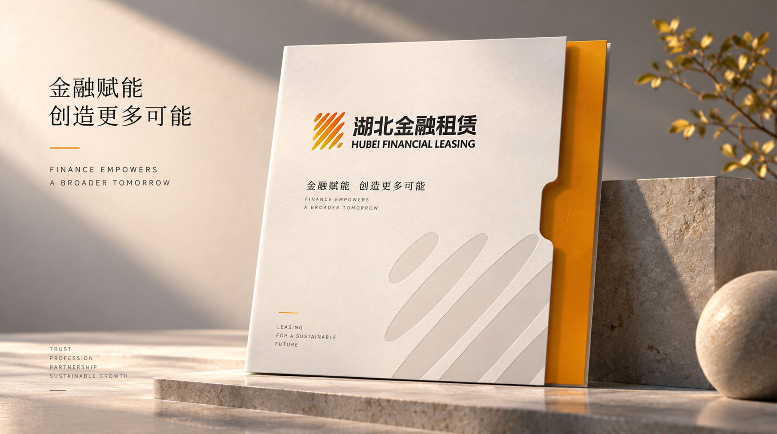
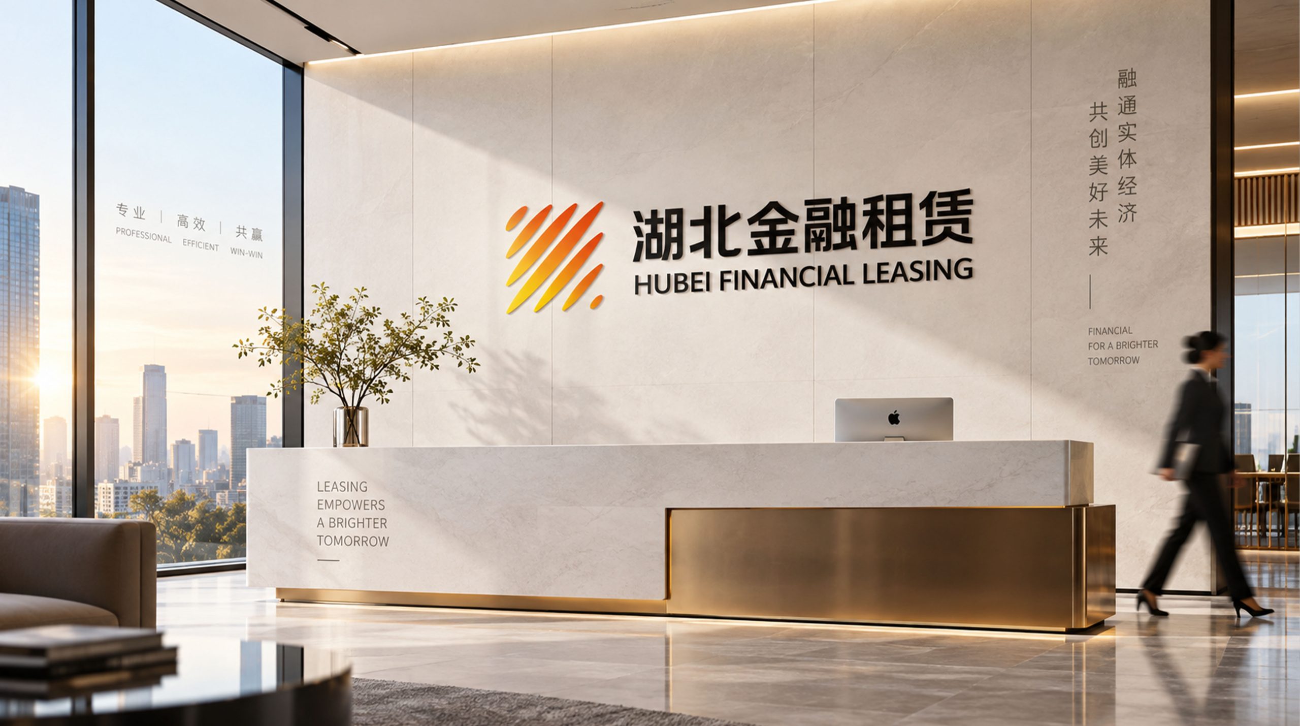
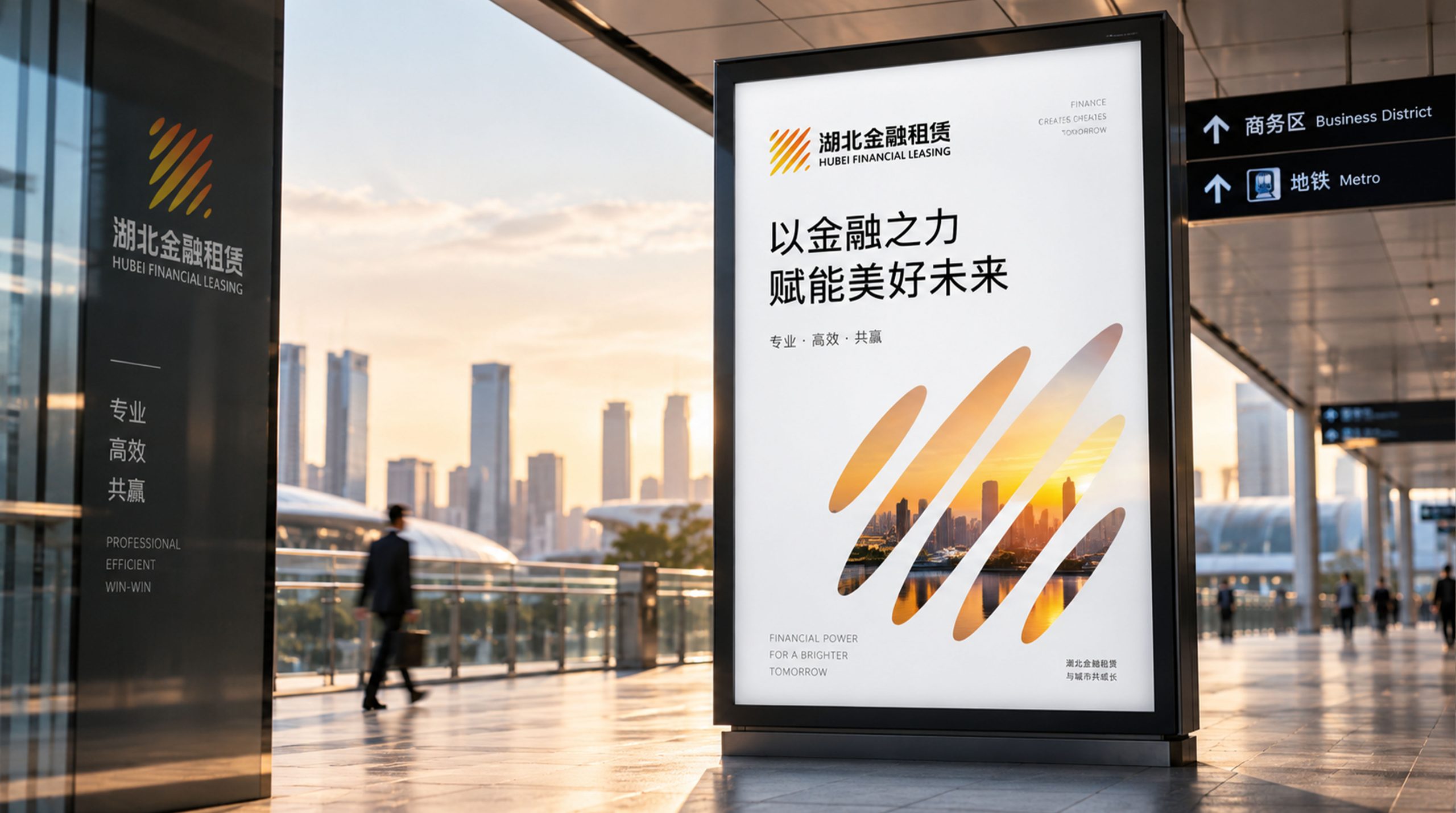
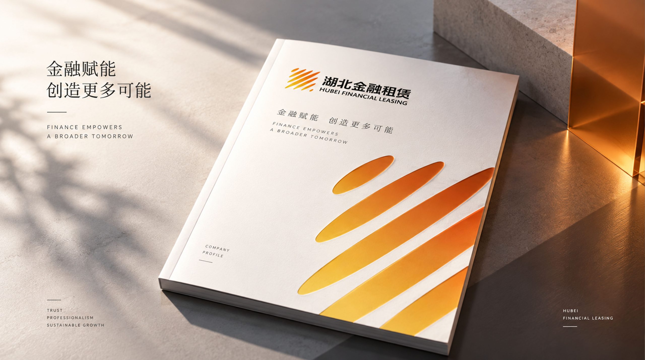
design concept
The logo takes "Golden Bridge over Rivers" as the core concept, integrating the city landmark image of Wuhan's "intersection of two rivers" with the functional metaphor of a financial bridge. Wuhan was born due to the intersection of the Yangtze River and the Han River. The intersection of the two rivers is the city's most profound geographical DNA; the essence of financial leasing is to build a financial bridge between asset owners and users. The river is the soul of Wuhan, the bridge is the foundation of leasing, and building a bridge over the river is Wuhan Financial Leasing.
graphic language
The main body of the figure starts from the left side with two flowing arcs, one up and one down, converging to the right, just like the Yangtze River and the Han River rushing from different directions and converging into one in the three towns of Wuhan. The upper arc trend is stretched and open to represent the majesty of the Yangtze River, while the lower arc trend is calm and restrained to represent the depth of the Han River. The two arcs meet and merge in the middle of the figure, and the intersection forms a substantial node - Wuhan, the central hub of the thoroughfare of nine provinces.
An arched arc spans above the node where the two rivers converge, like a bridge over the river. Wuhan is the capital of bridges in China. The first bridge over the Yangtze River was born here. The bridge is one of the most recognizable city symbols in Wuhan. The arc of the arch bridge is presented as a simple and powerful single line, with both ends firmly falling on both sides of the river, conveying the core service function of financial leasing of "connecting both ends of assets and bridging the capital gap".
The highest point of the bridge arc is located above the center of the graphic, forming the visual high point of the overall composition and conveying the positive momentum of the brand's upward development. After the natural confluence of the two rivers under the bridge, the arcs extend to the right in a wider single line, just like the merged Yangtze River rushing eastward into the sea, conveying the development pattern of the organization based in Wuhan and serving the whole country. The overall composition constructs the "Jianghui Golden Bridge" with an upper and lower structure of "two rivers intersecting and an arch bridge spanning".
Font composition
The Chinese "Wuhan Financial Leasing" adopts the correct modern Song style, with thick, steady and clear strokes, conveying the solemn authority of local financial institutions. "Wuhan" conveys the identity of the city, and "financial leasing" clarifies the business attributes. The English "WUHAN FINANCIAL LEASING" is arranged in a standard uppercase serif font with a standardized and professional font to ensure clear identification in industry communications and capital markets.
color system
The main color, Jiangcheng Blue #0A4D8C, represents the water of the Yangtze River, financial trust and professional depth. The blue color is like the deep color of the Yangtze River water surface under a clear sun - it is calm, broad and a giant ship carrying 10,000 tons, conveying the financial strength and risk control strength of financial leasing institutions. Auxiliary Golden Bridge Gold #B8943E is used to mark financial value and honor in the brand system. Gold is associated with the original meaning of "finance", just like the golden light shining on the Wuhan Yangtze River Bridge when the sun shines on it. The combination of blue and gold conveys "the calmness of the river + the value of finance". Auxiliary Chutian Gray #6B7B8D is used for auxiliary information and system basic elements. Pure white #FFFFFF as standard base color. The overall color uses blue and gold as the dual core, reflecting the brand temperament of "Jiangcheng Finance, Steady and Professional".
Application extension
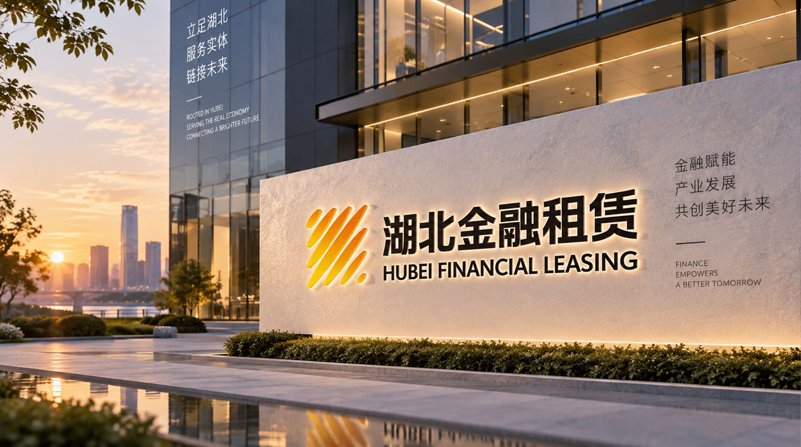
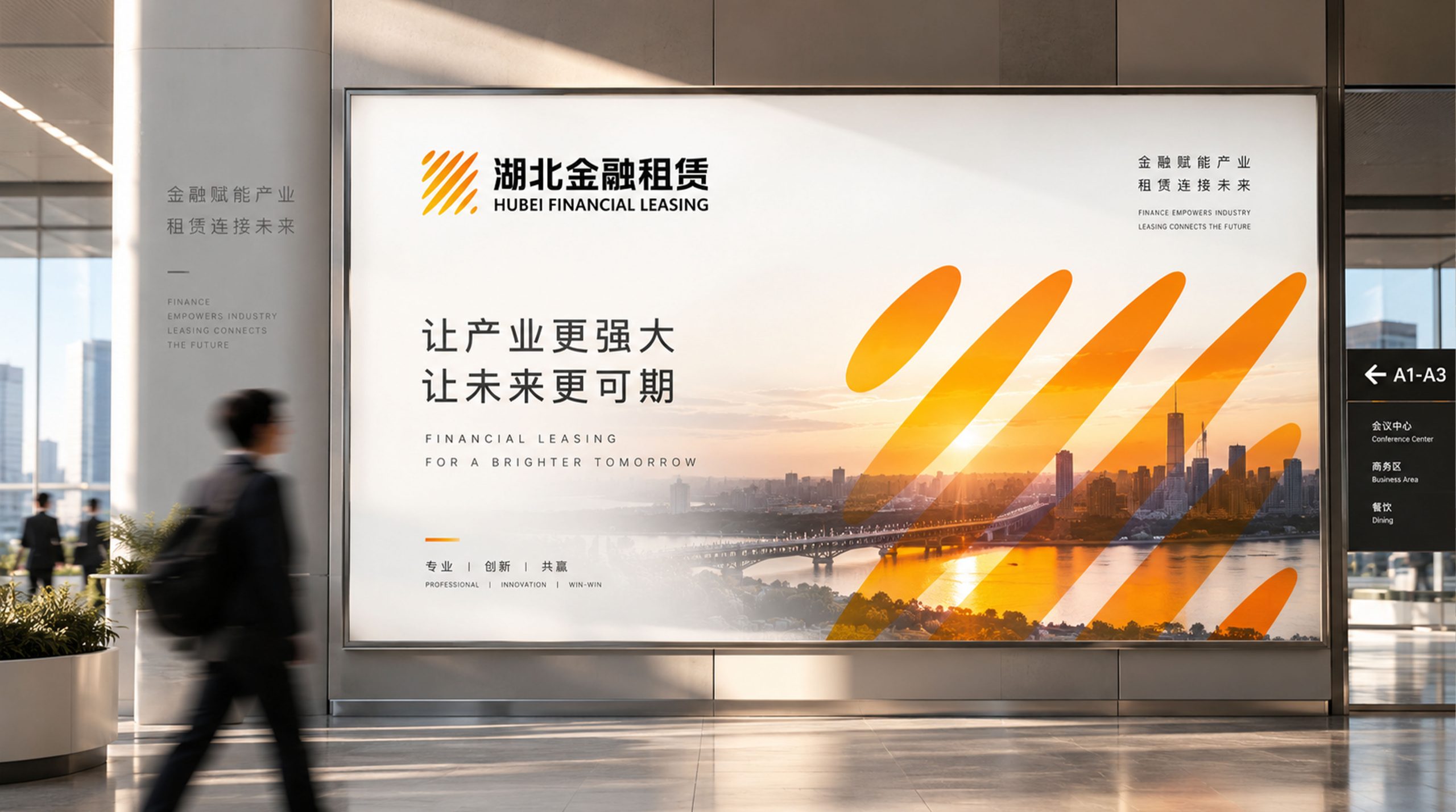
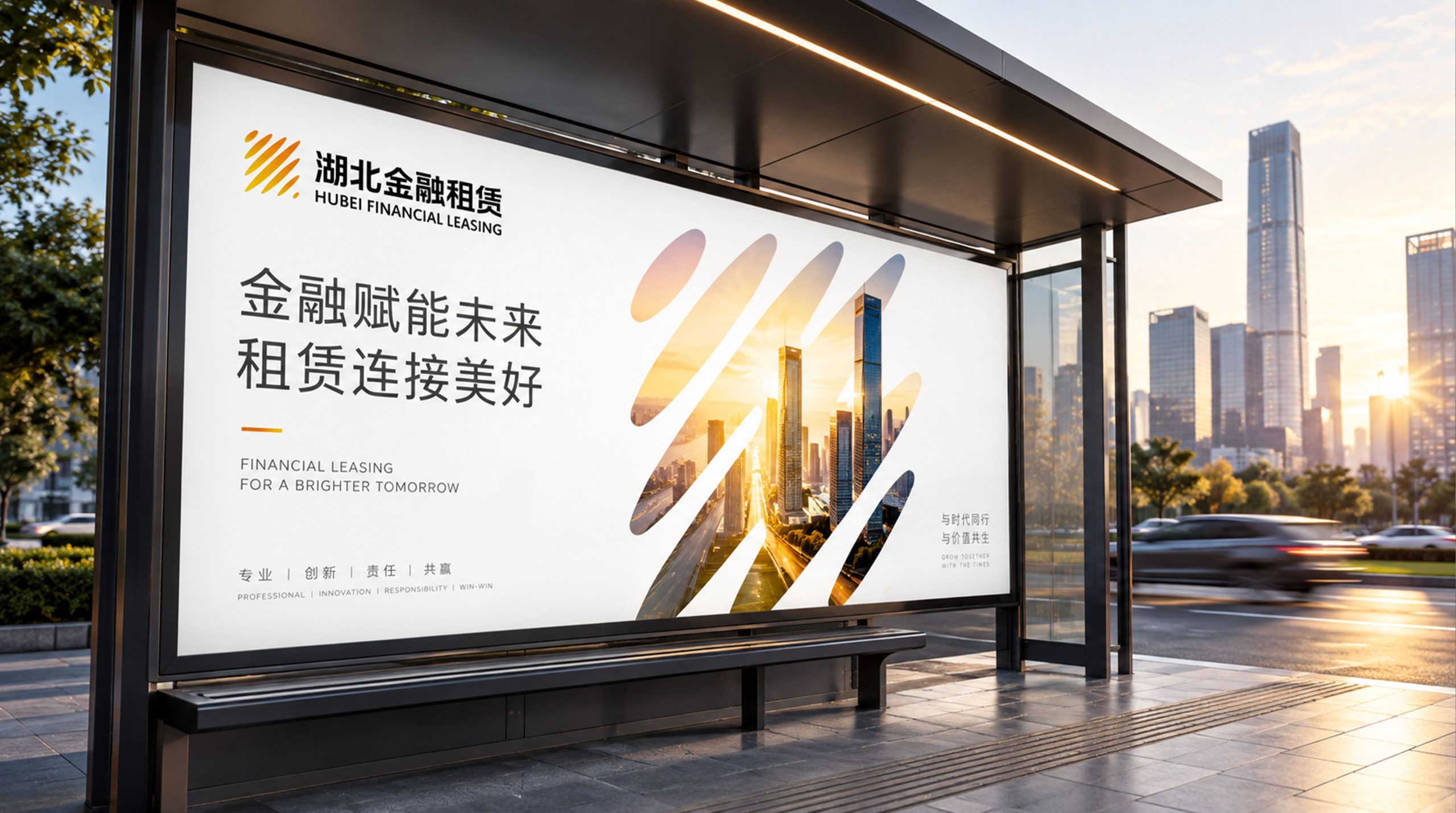
The logo can be widely used in logos of institutional headquarters and branch offices; financial leasing contracts, asset management reports and project investment plans; official websites, business management platforms and digital communication materials; financial leasing industry summits, Central Financial Forum and government cooperation project images. In the lobby of the organization's headquarters, the Jianghui Golden Bridge logo is presented in metal relief on the image wall. The flowing sense of the arcs of the two rivers and the stability of the arch bridge complement each other on the dark background, conveying the financial power rooted in Jiangcheng. In the dynamic visual, two river arcs flow in from both sides of the picture and meet in the center. The arch bridge is erected from above the convergence point, symbolizing that Wuhan Financial Leasing is based on the river city and uses finance as a bridge to connect the two ends of the industry.
brand meaning
The logo contains three core images: River City Foundation - the intersection of Shuangjiang conveys the agency's regional advantages rooted in Wuhan and is based on the strategic hub of the intersection of the two rivers; Financial Bridge - the arch bridge conveys the core service function of financial leasing connecting both ends of assets and assisting the real economy; Confluence Forward - the trend of converging eastward conveying the agency's development pattern based in Wuhan and serving the whole country. The overall design conveys the brand vision of "based on Jiangcheng and integrating industries".
Improper Usage (Protection Specification)
Do not change the intersection relationship of the two river arcs or the spanning position of the arch bridge; do not delete the arc of the arch bridge or change its upper and lower relationship with the river; do not change the hue of the main color of River City Blue; do not add gradients, strokes or decorative effects inconsistent with the financial style; do not separate the river and the bridge for separate use; keep the white space ≥ 25% of the graphic height; the minimum display width shall not be less than 30mm.
design results
After the release of the logo, Hubei Wuhan Financial Leasing's brand recognition and regional influence in the fields of financial leasing and regional industrial services have significantly improved. "Jianghui Golden Bridge" has become the core identification symbol of the brand system with its visual language that integrates Jiangcheng's geographical genes and financial bridge functions, showing the brand vision of "based on Jiangcheng and integrating industries".