










Ailuo is a consumer brand with original design and life aesthetics as its core. It focuses on the design and development of household products, personal accessories and lifestyle products. It is committed to using simple and exquisite design language to create daily goodies with both beauty and functionality for urban consumers.
The brand name "Ailuo" has an elegant sound - "Ai" means the fragrance of grass and trees, symbolizing nature, freshness and vitality; "Luo" means the beauty of Luoshui, which has the ancient "Luo Shen Fu", symbolizing elegance, agility and the implicit charm of oriental aesthetics. The two words merge into one, like a breeze carrying the fragrance of vegetation blowing over the water. Qingmei Future was commissioned to lead the brand identity design.
The design goal of the brand logo is to convey the brand image of "natural beauty and elegance of life" through the visual language of simple aesthetics, natural freshness and exquisite life.


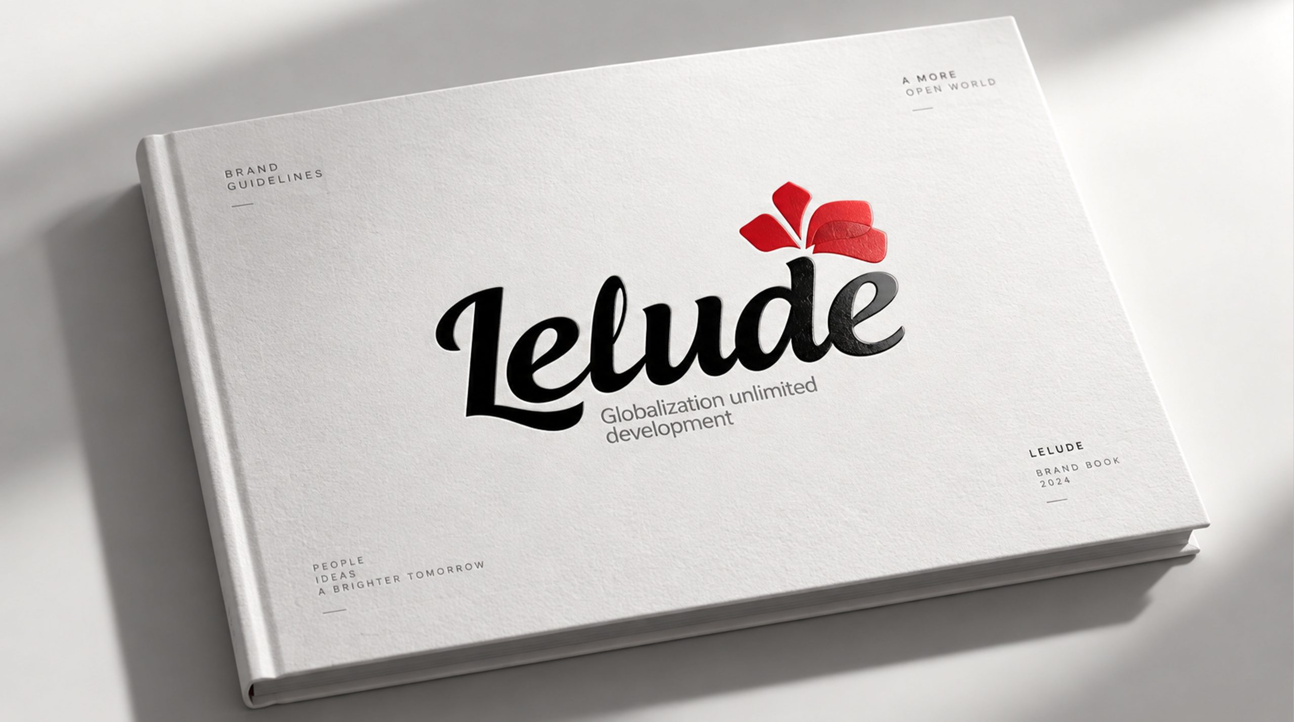
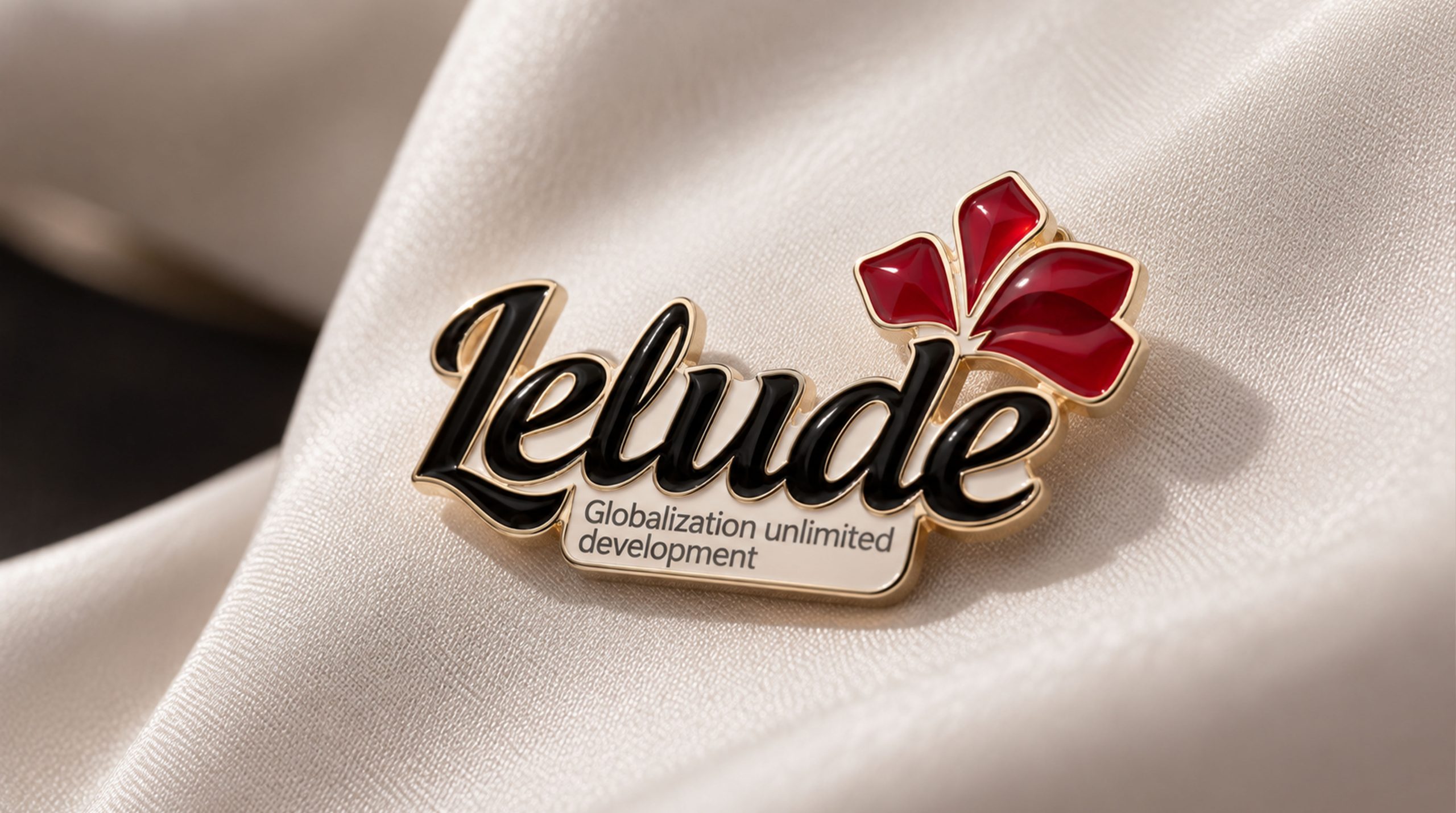
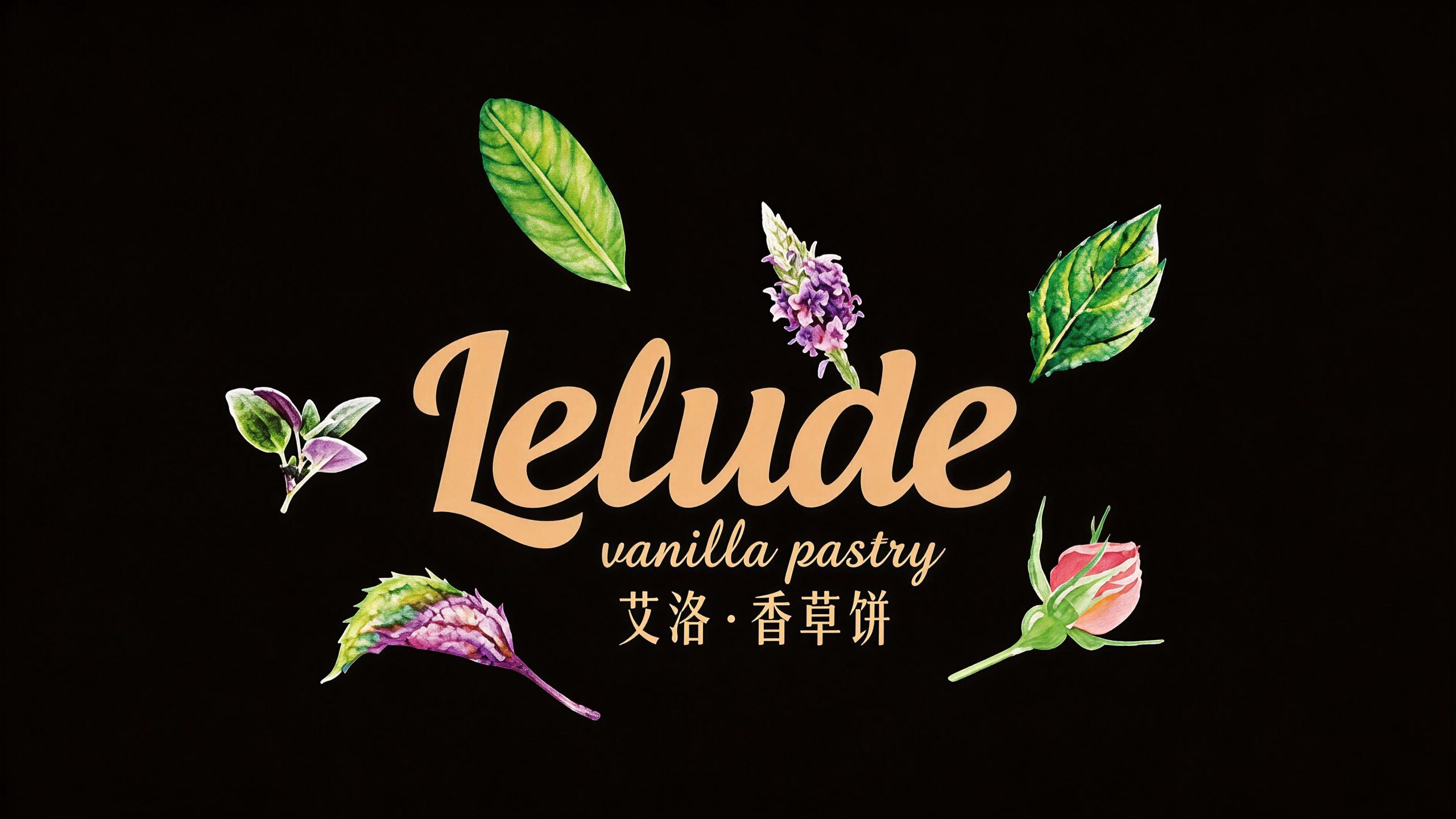
design concept
The logo takes "Leaf on Water" as its core concept, integrating the lightness of a leaf and the agility of a drop of water into a minimalist brand symbol. Leaf is the plant gene of "Ai", and water is the flowing water meaning of "Luo" - when a leaf falls on the water, it creates a circle of tiny ripples, which is quiet, natural and just right.
graphic language
The main body of the graphic is a minimally refined leaf shape. The leaf shape has a smooth S-shaped curve as the midrib, and the curve stretches gracefully from bottom to top, just like the natural posture of a leaf swaying gently in the breeze. There is a symmetrical arc on both sides of the midrib curve to outline the leaf edge. The arc is full and round, rising and closing naturally. The two arcs merge softly at the tip of the leaf and naturally converge at the root of the leaf. The entire leaf shape is slender but not delicate, simple but not monotonous.
The lower part of the leaf shape gently surrounds the root of the leaf with a thin arc, just like the first ripples when the leaf falls into the water - extremely light, extremely thin, and extremely light, conveying the brand's aesthetic attitude of "not ostentatious, not noisy, and just right". The ripple arcs are presented with the finest lines, contrasting in thickness with the full arcs of the leaves, just like the relationship between the protagonist and the background, solid and virtual.
The overall leaf shape tilts slightly to the right, as if being blown gently by a breeze, giving the static graphics a natural sense of agility. The overall composition is based on the minimalist artistic conception of "leaves falling on the water surface, with slight ripples" to construct "one leaf, one water".
Font composition
The Chinese "Ailuo" uses a slim modern sans-serif font, with light and even strokes and a stretched and transparent structure. The prefix of the word "AI" is as light as the sprout of a plant, and the three dots of the word "Luo" are vividly echoing the image of water. The English "AILO" is arranged in a slim uppercase sans-serif font, with loose and breathable letter spacing. The triangles and circles of "A" and "O" form a geometric rhythm, and the overall wordmark is like a line of exquisite hot stamping printed on cotton and linen packaging.
color system
The main color Aiello Green #6B8F71 represents nature, vegetation and a peaceful attitude toward life. This is a soft tone between gray and green - not the bright green of new leaves, but the gray-green of vegetation that has settled over time, just like the subtle green color on the leaves of mountain plants after rain, conveying the brand's aesthetic tone of "low saturation, high texture". Auxiliary water grained rice #F5F0E8 is used as the basic background of the brand system, just like the natural off-white of handmade paper, providing a warm and soft support for the green. Auxiliary Graphite Gray #4A4A4A is used for basic text and supporting information. Auxiliary Luo Shui Blue #A8C4D6 is used for water-related embellishment elements in the brand system, like the soft blue of clear, shallow water. The overall color is gray green as the core, reflecting the brand temperament of "natural, low-key, exquisite texture".
Application extension
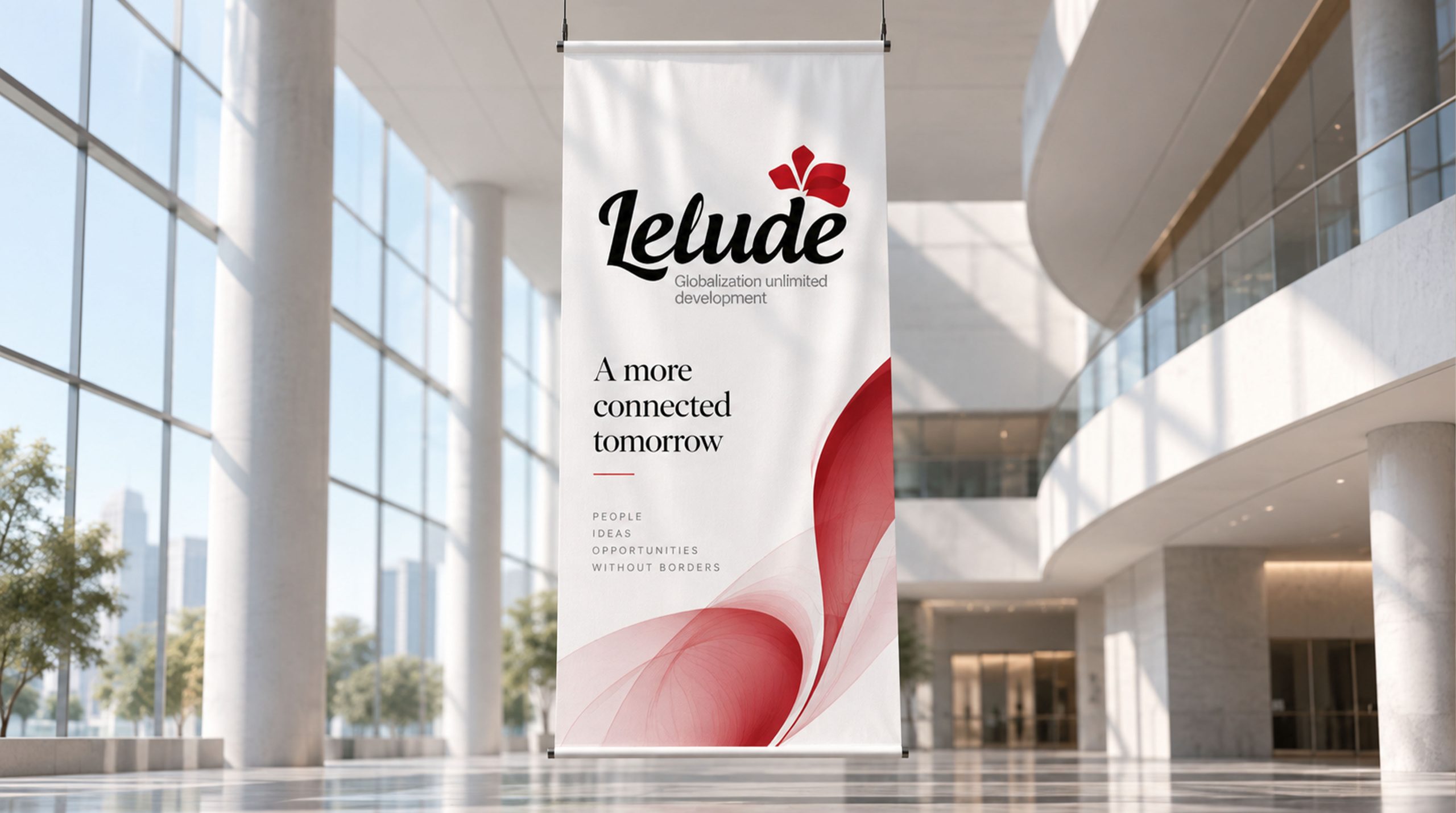
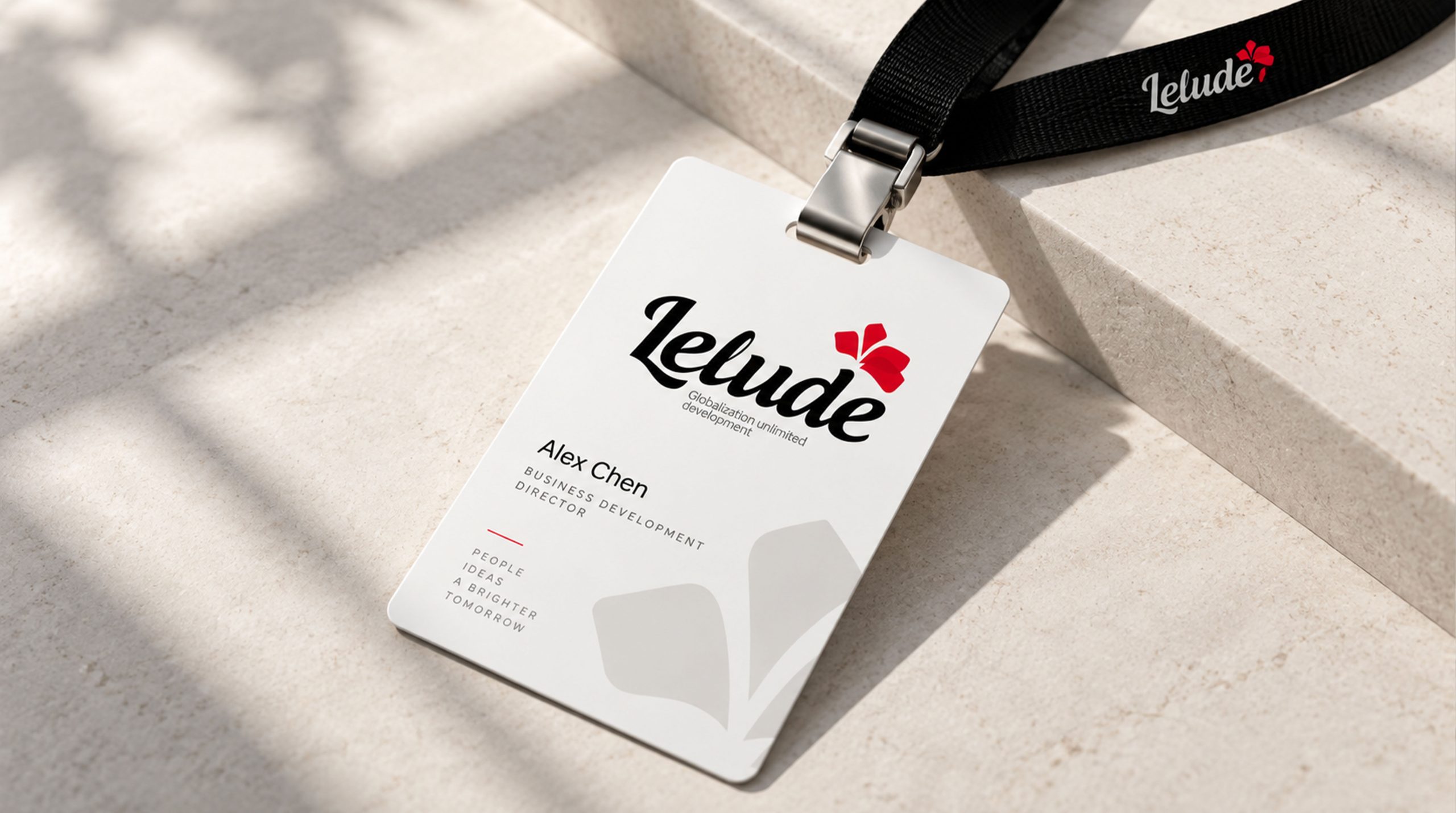
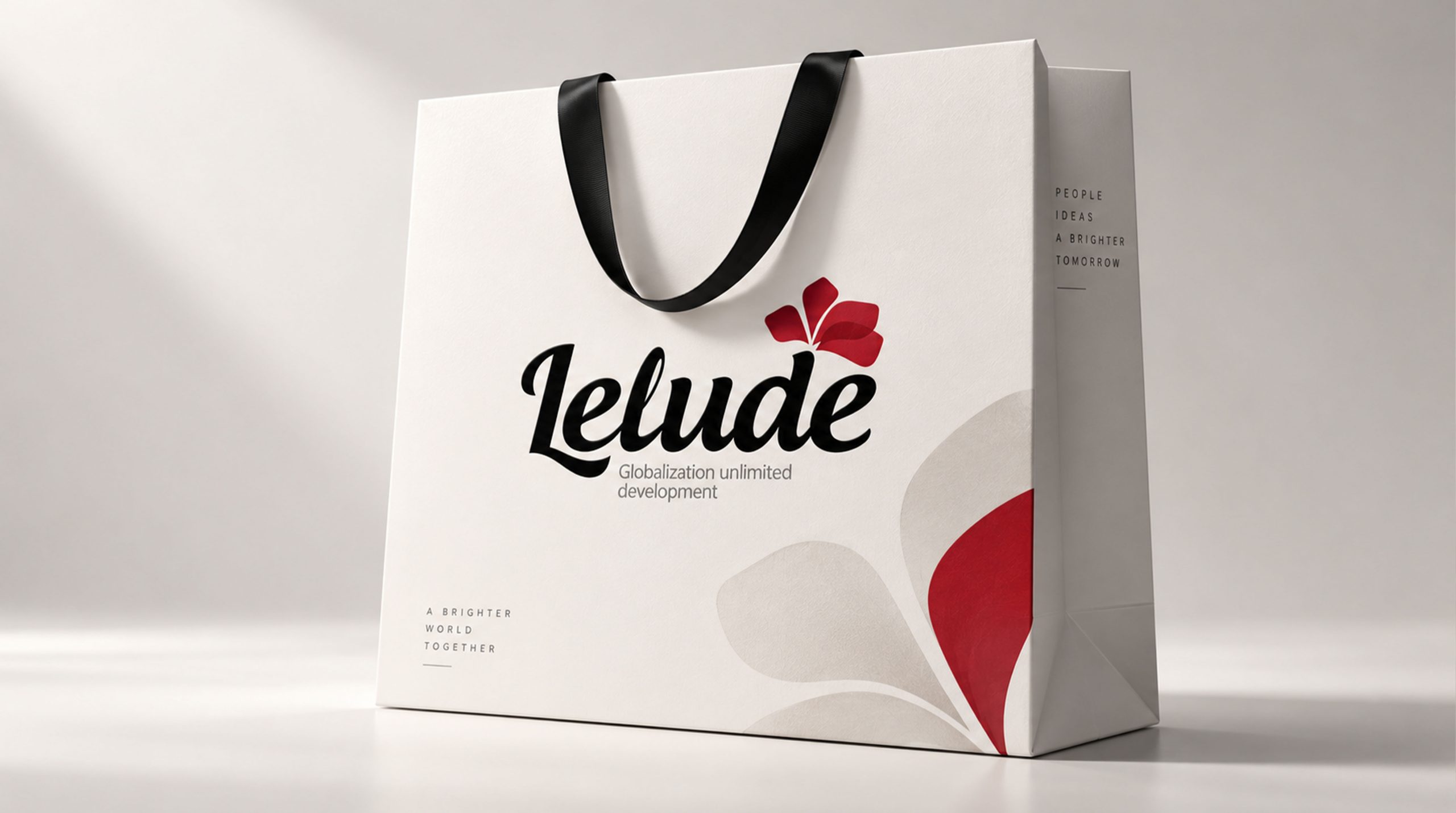
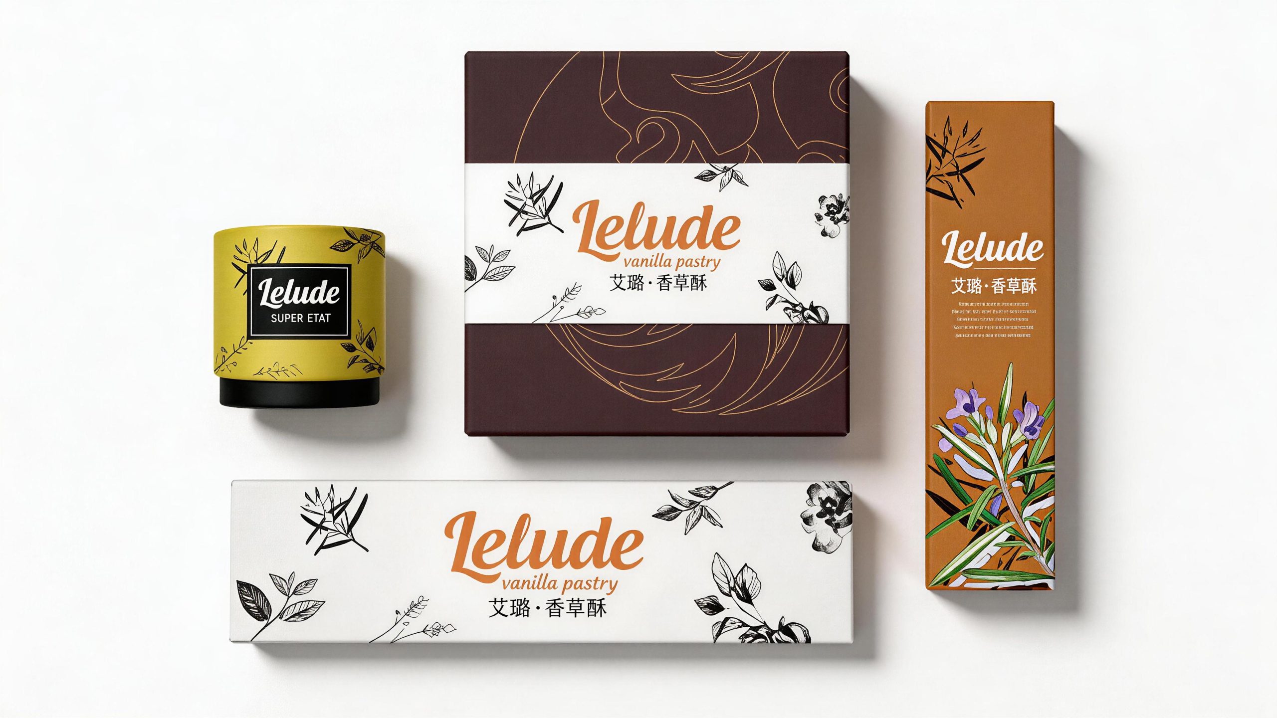
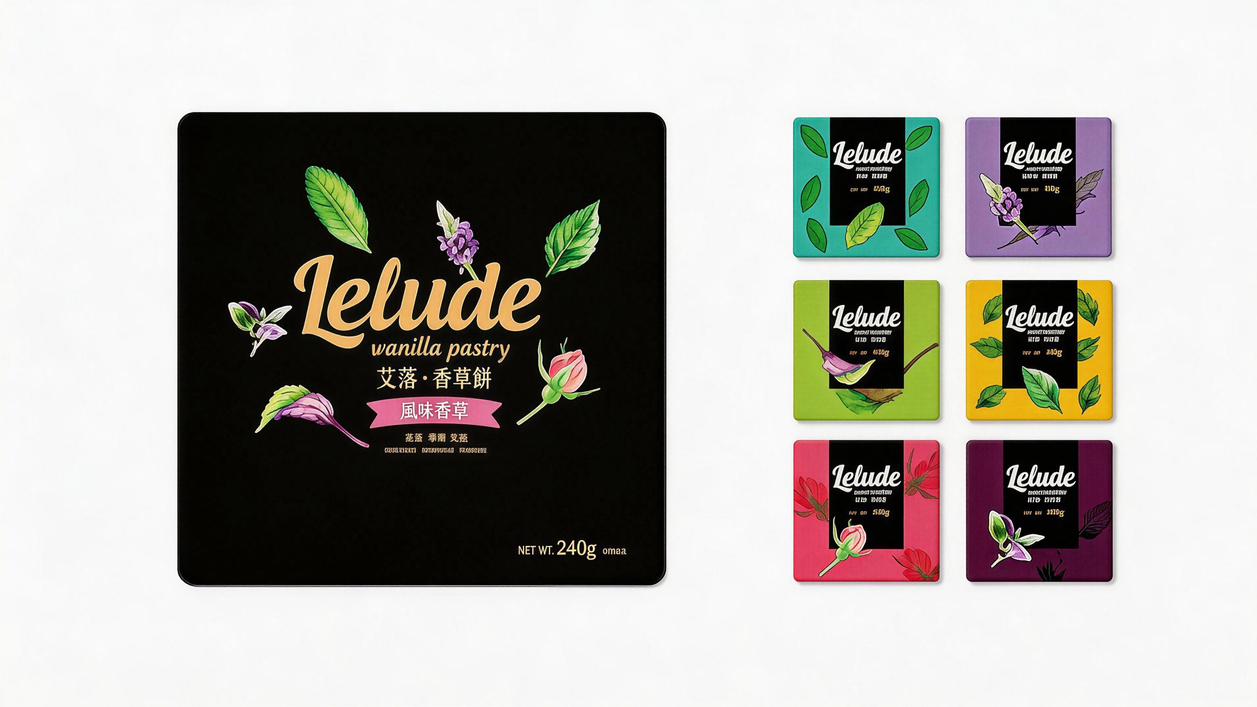
Logos can be widely used in product packaging, labels, hangtags and gift box envelopes; brand flagship store fronts, display spaces and display props; official websites, e-commerce platform stores and social media images; lifestyle exhibitions, design weeks and brand cross-border cooperation images. On product packaging, the Ello Green logo is presented on the cotton-linen textured packaging surface using embossing or hot-stamping processes. The leaf-shaped and rippled slender lines on the natural material present a delicate hand-made touch. Consumers can feel the brand's "natural, refined, and warm" aesthetic attitude the moment they open the package. In the dynamic vision, the leaf shape gently falls from the center of the picture, and when it touches the bottom, there is a circle of subtle ripples. Everything is quiet and beautiful.
brand meaning
The logo contains three core images: Natural Beauty - the leaf shape conveys the brand's design genes rooted in natural aesthetics; Graceful Flow - the rippled arc conveys the subtle, flexible and appropriate aesthetic pursuit of Eastern aesthetics; Refined Living - the thin lines and soft tones convey the brand's product concept of injecting exquisite beauty into daily life. The overall design conveys the brand vision of "natural beauty and elegance of life".
Improper Usage (Protection Specification)
Do not change the S-shaped midrib curve or leaf edge arc proportion of the leaf shape; do not delete the ripple arc or increase the number of ripple circles; do not change the hue of the main color of Aiello Green or replace it with a highly saturated color; do not add strokes, shadows or decorative effects inconsistent with the brand aesthetics; do not separate leaves and ripples for separate use; keep white space ≥ 30% of the graphic height; the minimum display width shall not be less than 20mm.
design results
After the release of the logo, Ailuo's brand recognition and consumer reputation in the fields of original design and life aesthetics have significantly improved. "One leaf, one water" has become the core identification symbol of the brand system with its minimalist, natural and exquisite and flexible visual language, showing the brand vision of "natural beauty and elegance of life".