










Bybo Medical is a national chain of medical institutions with oral medical services as its core. Its business covers dental implants, orthodontics, aesthetic restorations, children's dentistry and comprehensive oral treatment. It is committed to providing patients with high-quality oral health solutions with international diagnosis and treatment standards and humanistic care.
The brand name "Bybo" is transliterated from the English "Bybo", and at the same time conveys positive associations in the Chinese context - "Bybo" means respect and visit, symbolizing the respect and courtesy that medical institutions treat every patient; "Bo" means erudition and broadness, symbolizing the professional depth and breadth of disciplines of the medical team. Qingmei Future was commissioned to lead the brand identity design.
The design goal of the brand logo is to convey the brand image of "professional dentistry, confident smile" through the visual language of medical professionalism, humanistic warmth and confident smile.


design concept
The logo takes "Arc of Smile" as its core concept, integrating a warm arc of smile with the professional attributes of dental medicine. Smile is the ultimate service result in the dental medical industry - the goal of every diagnosis and treatment is to make patients regain their confident smile. With the smile arc as the core of the logo, it directly conveys the brand's service creed of "all for smiles".
graphic language
The graphic structure is based on a geometric variant of the brand's initials "B". "B" is composed of round and full double arcs. The upper and lower semi-circles are like the soft outlines of two lips - the upper arc is slightly smaller and the lower arc is slightly larger, naturally showing the proportional relationship between the upper and lower lips when smiling. The letter "B" here completes the double interpretation from the letter to the lip shape.
Between the two semi-arcs of the “B,” a horizontal smile arc runs naturally through the connection point, its ends gently upturned, like a sincere smile from the heart: not an exaggerated laugh, not a polite forced smile, but the confidence and comfort that radiate from within once oral health is restored. This smile arc is the soul of the entire logo. Without it, the “B” is merely a letter; with it, the “B” becomes a smiling face.
The vertical pen of "B" is presented as a slightly thick straight line, stably supporting two half-arcs, like a reliable professional pillar of a medical institution - technology is the foundation that supports a smile. The overall graphics handles all turns with rounded corners, conveying the "gentle, painless and comfortable" diagnosis and treatment experience of the medical brand. The composition uses the ingenious fusion of "letters as lips and arcs as smiles" to build the "arc of a smile".
Font composition
The Chinese "Baibo Medical" uses modern boldface with rounded corners, rounded and soft strokes, and a clear and stable structure. "Baibo" conveys the brand personality, and "Medical" clarifies the industry attributes. The overall font strikes a balance between the professionalism and reliability of a medical institution and the approachability and friendliness of a consumer brand. The English "BYBO MEDICAL" is arranged in a rounded capital sans-serif font, with a modern and gentle font.
color system
The main color, Baibo Blue #0077C8, represents medical professionalism, cleanliness and trust. Blue is the most widely used brand color in the global medical and health industry, naturally conveying the industry signal of "professional, hygienic and trustworthy". The bright and clear color of Bybo's blue is different from the seriousness and coldness of the dark blue of traditional hospitals. It uses a lighter color temperature to convey the "de-fear" service concept of the modern dental chain brand - visiting Bybo for dental treatment is a comfortable and pleasant experience, not a stressful medical treatment. Auxiliary Smile White #FFFFFF As the standard background color and the basic color of the diagnosis and treatment space, white conveys the core visual promise of oral medicine - a mouthful of white teeth. Auxiliary vitality orange #FF8C42 is used in the brand system to create affinity elements for children’s dentistry and young users. The warmth of orange injects humanistic care into the blue profession. Auxiliary light gray #E8ECF0 is used for interface information level and auxiliary background. The overall color is blue and white, reflecting the brand temperament of "professional, clean, warm and trustworthy".
Application extension
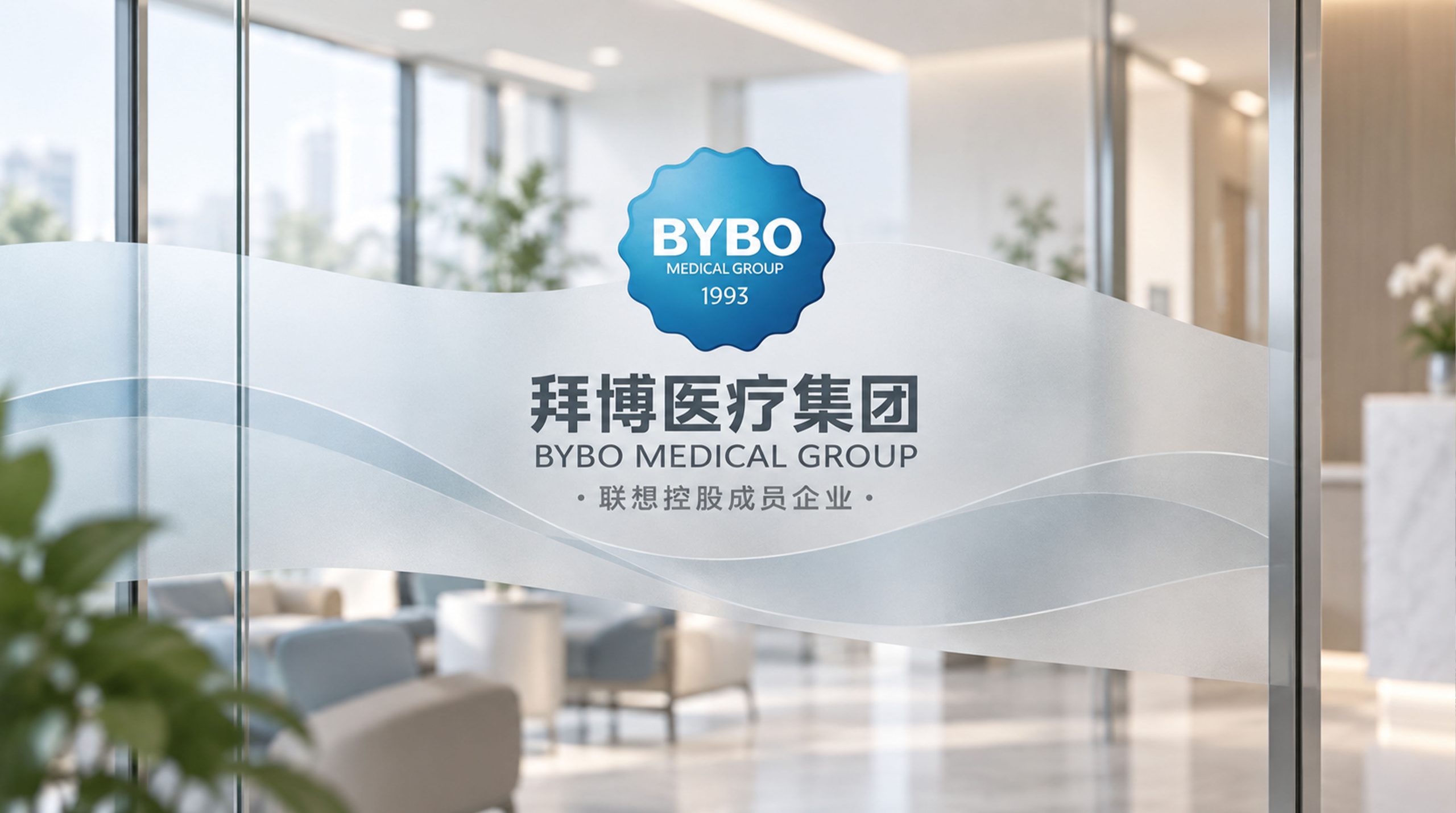
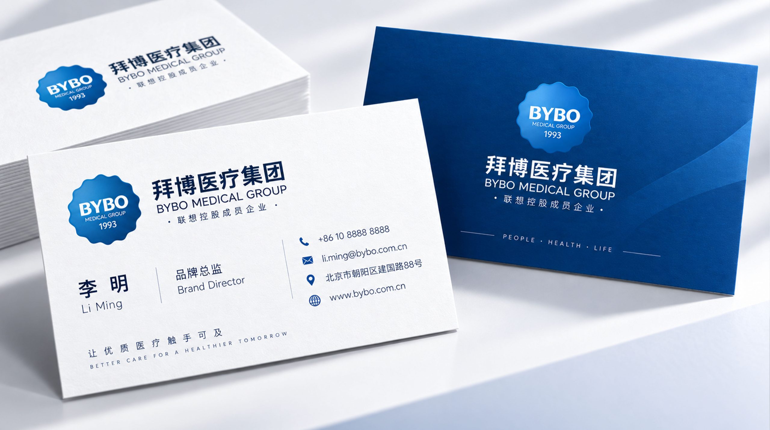
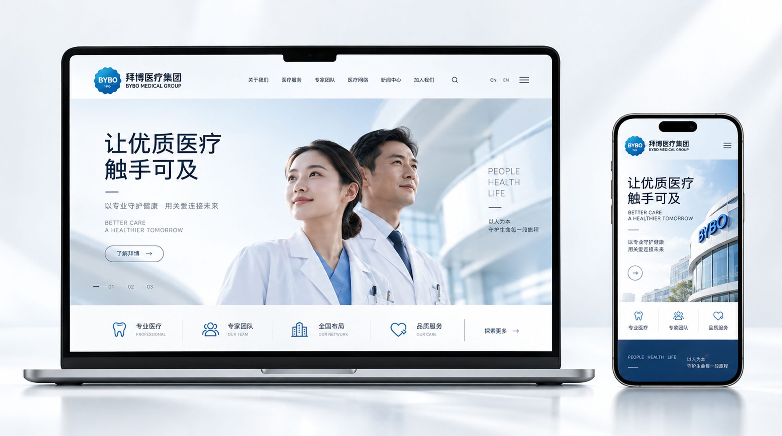
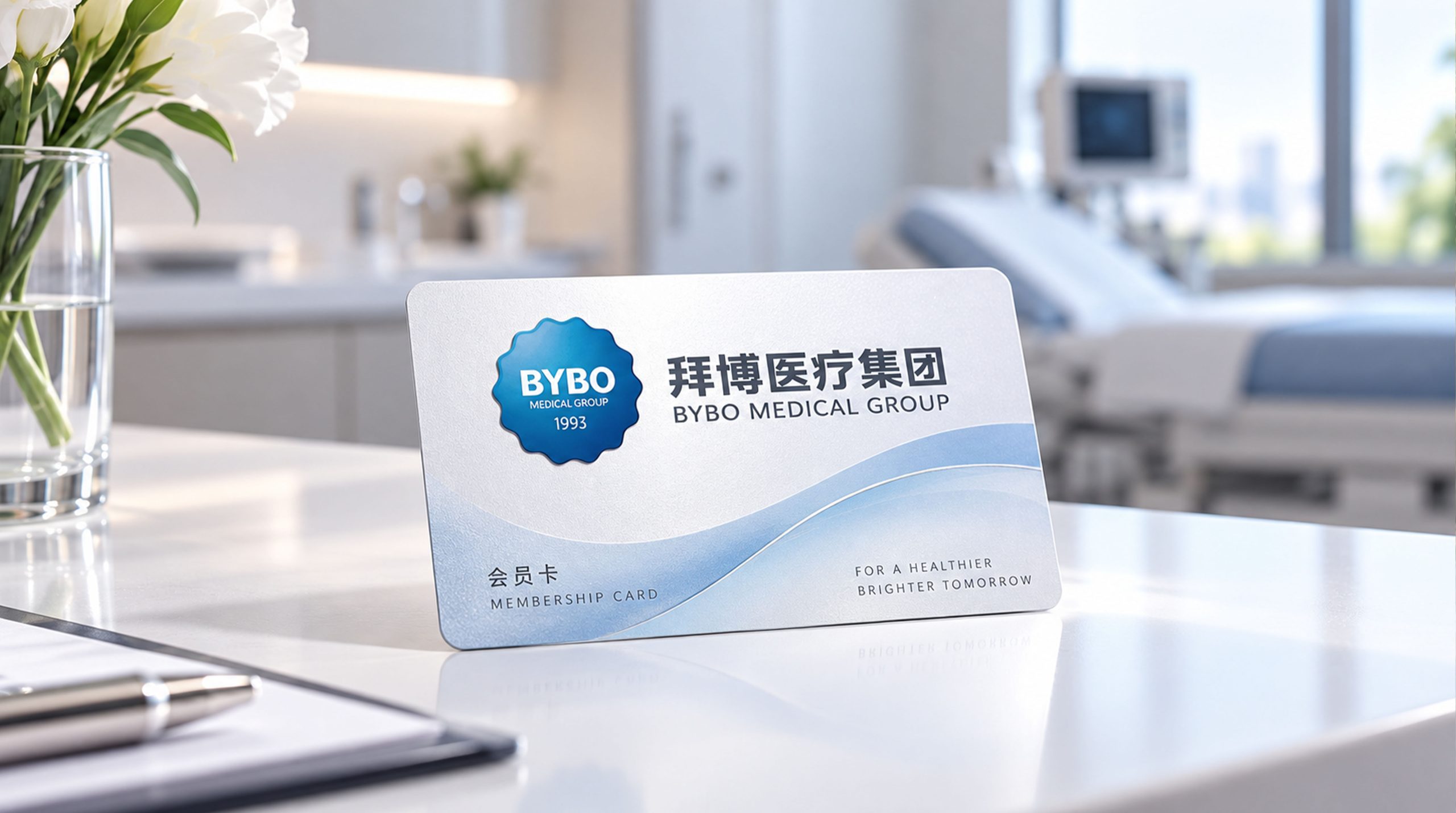
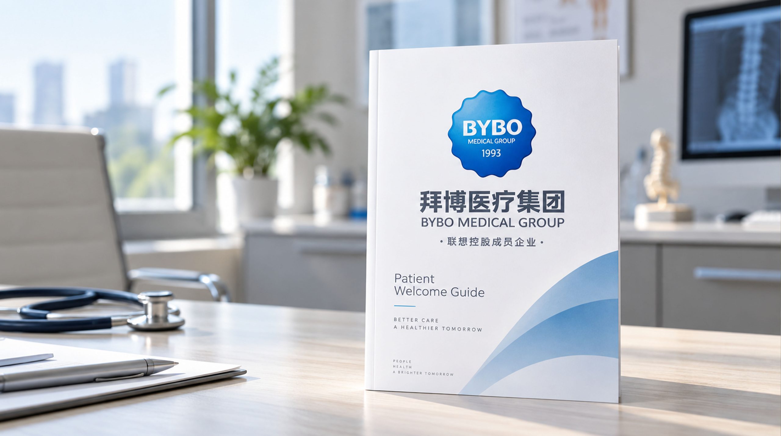
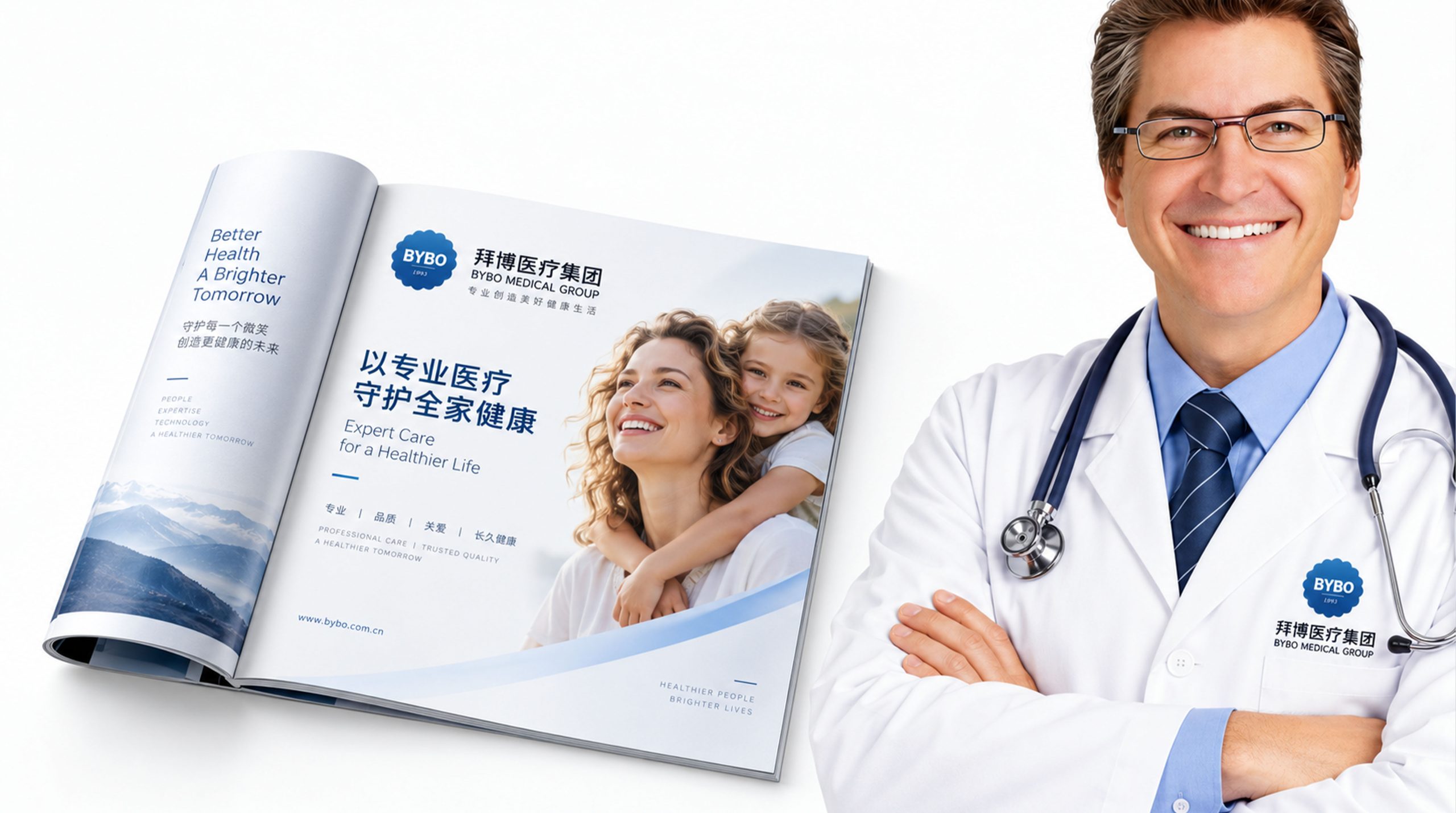
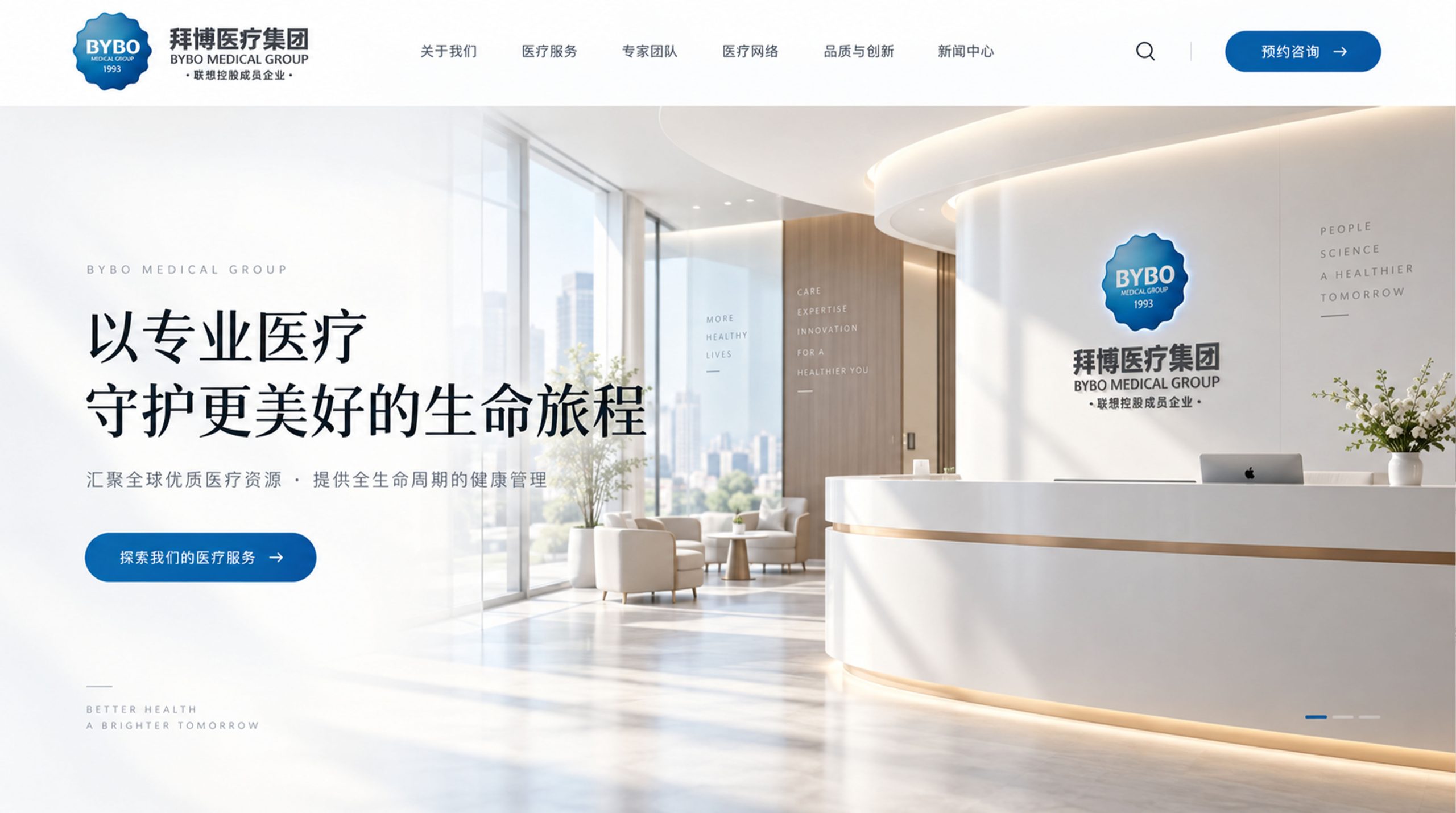
The logo can be widely used in outpatient door entrances, waiting area image walls and clinic room logos across the country; treatment cards, medical records, diagnosis and treatment plans and postoperative care manuals; official websites, online appointment platforms, patient APPs and social media images; dental medical forums, dental industry exhibitions and brand public welfare activities. At the entrance of the outpatient clinic, the Baibo blue logo is displayed on the door in the form of a light box or metal letters. The arc of the smile is clearly visible from a distance, just like a warm smile greeting every arriving patient. In the dynamic vision, the two half-arcs of "B" are rounded and formed in sequence, and the central smile arc finally rises slightly to complete, and the entire graphic "laughs" at the last moment.
brand meaning
The logo contains three core images: Confident Smile - the arc of the smile conveys the ultimate goal of dental care and the wonderful results of patients regaining their confidence; Medical Excellence - the solid vertical pen and blue main tone convey the professional reliability of diagnostic and treatment technology and the rigorous norms of medical standards; Humanistic Care - the rounded shape and gentle tones convey the modern dental service concept of "patient-centered and fear-free". The overall design conveys the brand vision of "professional dentistry, confident smile".
Improper Usage (Protection Specification)
Do not change the upper and lower proportions of the "B" double arc or the upward angle of the smile arc; do not delete the smile arc or replace it with a straight line; do not change the hue of the main color of Bybo Blue; do not replace the rounded corners with sharp corners or add decorative effects inconsistent with the medical style; do not separate "B" and the smile arc for separate use; keep the white space ≥ 25% of the graphic height; the minimum display width must not be less than 20mm.
design results
After the release of the logo, Bybo Medical's brand recognition and patient trust in the dental medical chain field have been significantly improved. "Arc of Smile", with its visual language that combines medical expertise and humanistic warmth, has become the core identification symbol of the brand system, showing the brand vision of "professional dentistry, confident smile".