










Baixuehui is an educational service platform with comprehensive quality education and diversified curriculum integration as its core. It is committed to gathering high-quality educational resources and providing young people with one-stop learning options covering art, sports, science and innovation, language and academic tutoring.
The three characters of the brand name "Bai Xue Hui" are progressive - "Bai" means hundreds of kinds and schools, symbolizing the richness and diversity of course categories; "Xue" means learning and studying, pointing out the core behavior of education; "Hu" means gathering and intersection, symbolizing the centralized integration of high-quality resources on one platform. Hundreds of things learned, gathered in one place. Qingmei Future was commissioned to lead the brand identity design.
The design goal of the brand logo is to convey the brand image of "a gathering of hundreds of learnings and unlimited growth" through the visual language of diverse gathering, knowledge vitality and open growth.

design concept
The logo takes "Constellation of Learning" as its core concept, gathering knowledge points in multiple subject areas in a common orbit like stars. Each star represents a subject, an ability, and a specialty. The stars gather together like the brightest constellation in the night sky - Baixuehui is a platform for children to light up each of their own stars.
graphic language
The graphic consists of several dots of different sizes arranged around a central point. The dots represent different subject areas in different sizes - large dots are like core subjects, small dots are like interests and specialties, and each dot is an independent and complete learning world.
The dots are distributed in a circular or spiral trajectory around the center, just like stars orbiting the core, conveying the platform logic of "hundreds of courses centered around a child's growth needs". The dots are gently connected with thin arcs or dotted lines, just like the connections between constellations - different disciplines are not isolated from each other, but form an interconnected knowledge network under the integration of the platform.
The central point is a slightly larger circle representing the learner. The child sits at the heart of all education, and every resource revolves around their development. The fullness of the central dot against the lightness of the surrounding ones creates a clear hierarchy. The overall silhouette is nearly circular, signaling comprehensive coverage and an open, inclusive platform. Built on a centripetal composition of “many stars, one center,” the mark becomes a “Constellation of Knowledge.”
Font composition
The Chinese wordmark Baixuehui is set in a rounded modern sans-serif, with full, confident strokes and a bright, lively structure. "Bai" (hundred) opens broadly to suggest richness and diversity, "Xue" (learning) stands square to express a dedication to knowledge, and "Hui" (gathering) flows freely to evoke the convergence of resources. The English wordmark BAIXUEHUI is set in rounded uppercase sans-serif letters, friendly and contemporary.
color system
The main color, convergence blue #2979FF, represents the vast sky of knowledge, exploration and growth. The bright blue conveys the brand signal of "openness, wisdom, and trustworthiness" in the education industry, and at the same time conveys the youth education brand's vitality and vitality with its positive and bright color temperature. Each dot can be presented in a variety of auxiliary colors - artistic purple #AB47BC, sports orange #FF7043, science and technology green #66BB6A, language yellow #FFCA28. The multi-colored dots form a colorful visual array, directly conveying the diversity and richness of "Hundred Learnings". Pure white #FFFFFF as standard base color. The overall color is dominated by blue with multi-color as auxiliary embellishments, reflecting the brand temperament of "diversity gathering and dynamic growth".
Application extension
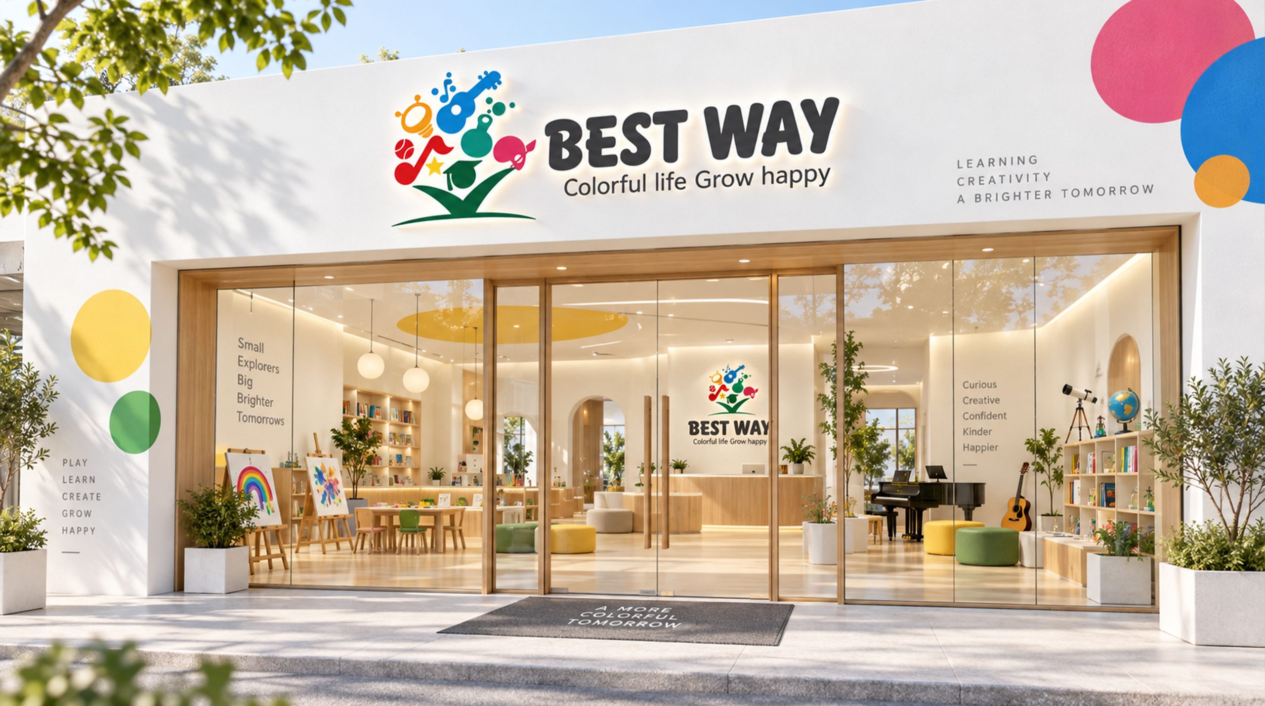
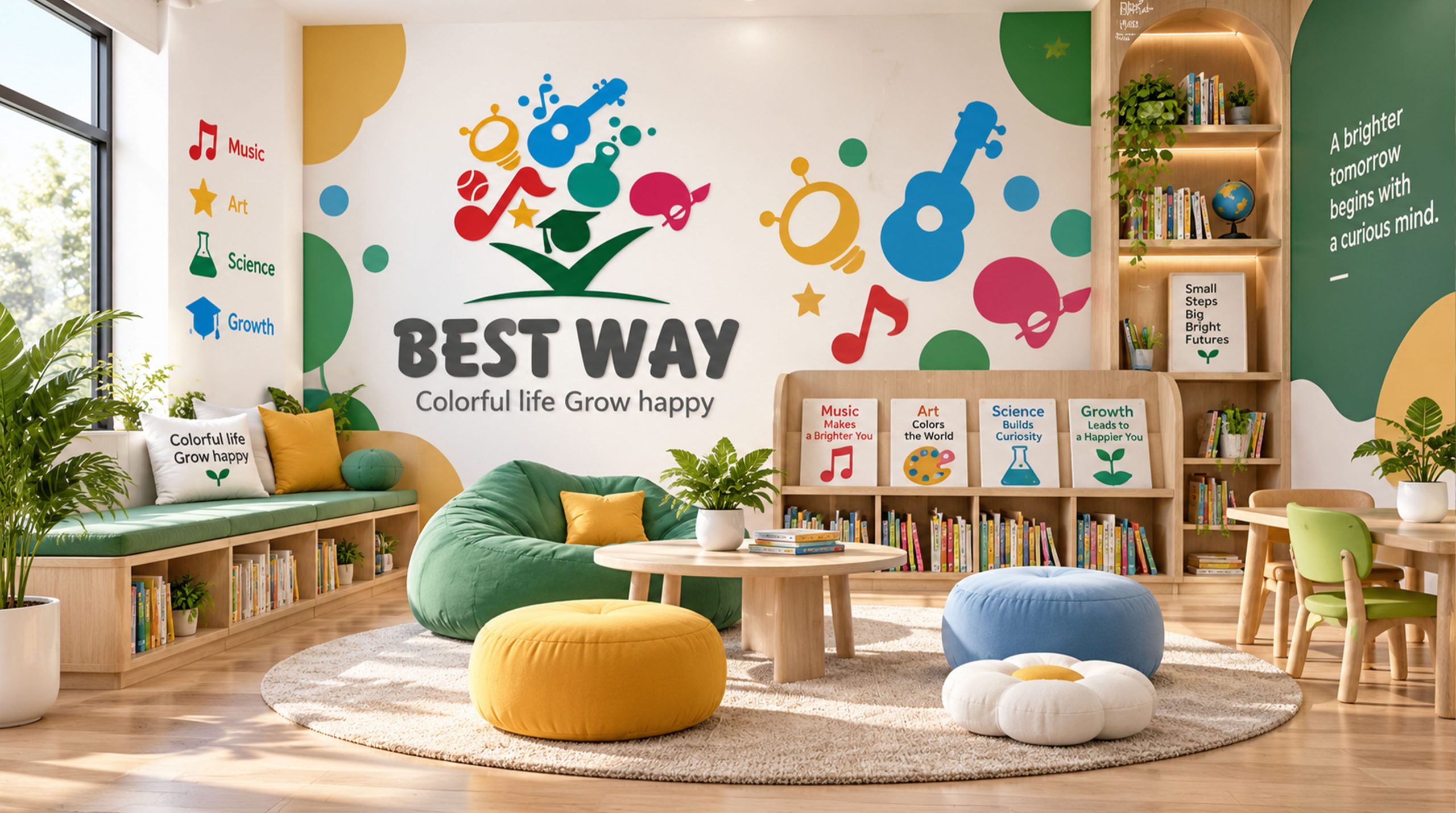
The logo can be widely used in education center doors, campus halls and classroom signs; course manuals, student growth reports and parent communication materials; official websites, course selection platform APPs and social media images; education industry expos, quality education forums and brand cooperation event images. In the course selection platform APP, each dot can be used as an entrance icon for subject classification. Users click on the dots of different colors to enter the corresponding course list. The logo graphic is the functional entrance for product interaction - the brand symbol and user experience are integrated here. In the dynamic vision, colorful dots fly briskly from the periphery to the center of the screen, then settle and surround one by one. The connecting arcs light up one by one, and a complete knowledge constellation is gathered and formed in a few seconds.
brand meaning
The mark carries three core ideas. Diverse Convergence: dots of varied colors and sizes represent hundreds of high-quality educational resources brought together on one platform. Learner-Centered: the central dot reflects a platform where every resource revolves around the learner's needs. Connected Learning: the arcs linking the dots express an education in which disciplines interconnect and learners grow in every dimension. Together, they express the brand vision: “Hundreds of paths to learning, limitless room to grow.”
Improper Usage (Protection Specification)
Do not change the centripetal distribution structure of dots or delete the central dot; do not reduce the number of dots to less than three; do not change the hue of the main color of convergence blue or unify multi-color dots into a single color; do not add strokes, shadows or decorative effects inconsistent with the educational style; keep white space ≥ 25% of the diameter of the graphic; the minimum display width shall not be less than 25mm.
design results
After the release of the logo, Baixuehui's brand recognition and parent awareness in the fields of comprehensive quality education and diversified curriculum platforms have significantly improved. "Knowledge Star Collection" has become the core identification symbol of the brand system with its visual language of conveying diverse convergence and people-centeredness, showing the brand vision of "gathering of hundreds of learnings and unlimited growth".