










Shengmao Plaza is a commercial real estate brand with urban complex operation as its core. It integrates shopping and retail, catering, leisure and entertainment, and business offices, and is committed to creating a regional urban life center and consumer destination.
The brand name "Shengmao" means prosperity - "Sheng" means prosperity and victory, symbolizing the prosperity of business and the brand's leading position; "Mao" means luxuriant and luxuriant, symbolizing the rich diversity of business types and the prosperity of popularity. Shengmao means quality, and Mao means prosperity. Shengmao is a vibrant urban commercial highland. Qingmei Future was commissioned to lead the brand identity design.
The design goal of the brand logo is to convey the brand image of "luxury, prosperity and the heart of the city" through the visual language of prosperity, urban vitality and quality life.
design concept
The logo uses the "Flourishing Crown" as its core concept, integrating the canopy of a large leafy tree with the architectural outline of the city skyline. Big trees are the most natural visual incarnation of the word "Mao" - leafy and full of vitality; the city skyline is the spatial expression of the commercial plaza as a city landmark. The outline of the building faintly emerges from the canopy, conveying that Shengmao Plaza is like a leafy towering tree in the city, providing shade and vitality to the surrounding communities.
graphic language
The main structure of the graphic is a simple silhouette of a big tree. The crown of the tree is presented in a full arc shape, which is round and plump like a stretched cloud or a luxurious crown, conveying a sense of "luxury" visual richness. The contour line of the tree crown is not a smooth single arc, but an undulating edge composed of several continuous small arc-shaped waves, just like the natural form of overlapping branches and leaves, conveying a commercial ecology with rich business formats and substantial content.
The interior of the tree crown is vaguely interspersed with several vertical straight lines, like branches branching off a tree trunk - it can also be interpreted as the vertical outline of urban buildings, staggered like commercial buildings of different heights on the skyline. This dual interpretation of branches and architecture allows the logo to switch freely between "natural lushness" and "urban prosperity".
The tree trunk supports the entire tree crown with a thick and steady vertical line, just like the core main building of the square - stable, upright, and bearing everything. The bottom of the tree trunk spreads out slightly in two symmetrical arcs, just like tree roots digging into the earth, conveying the commercial plaza’s business determination to deeply cultivate the community and take root in the city. The overall composition uses a vertical structure of "luxuriant crown at the top, stem in the middle, and stable roots at the bottom" to build a "luxuriant crown".
Font composition
The Chinese "Shengmao Plaza" uses a stable modern boldface with thick and straight strokes. "Shengmao" conveys the brand's prosperous temperament, and "Plaza" clarifies the attributes of commercial space. The English "SHENGMAO PLAZA" is arranged in a standard uppercase sans-serif font with a regular and elegant font, ensuring professional recognition in commercial real estate promotion and investment scenarios.
color system
The main color is Sheng Mao Jin #A07B3F, which represents prosperity, quality and commercial value. Gold is the most valuable color in commercial real estate brands. Like the bright light of the city center under the sun, it conveys the quality positioning of Shengmao Plaza as a regional commercial highland. Auxiliary urban green #3A7D5C is used for ecological landscape and leisure elements in the brand system. The green color echoes the natural image of the tree canopy and conveys the environmental quality of the square "prosperity with nature". The combination of gold and green conveys "the prosperity of business + the greenness of life". Auxiliary calm gray #4A4A4A is used for basic text and system auxiliary information. Pure white #FFFFFF as standard base color. The overall color uses gold and green as the dual core, reflecting the brand temperament of "prosperous quality, pleasant ecology".
Application extension
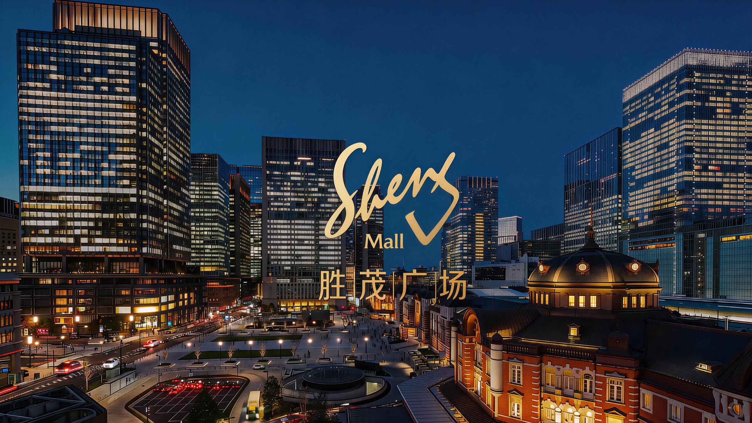
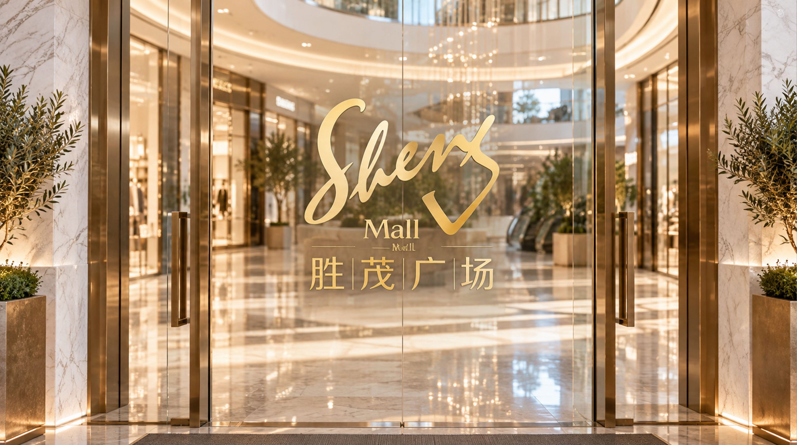
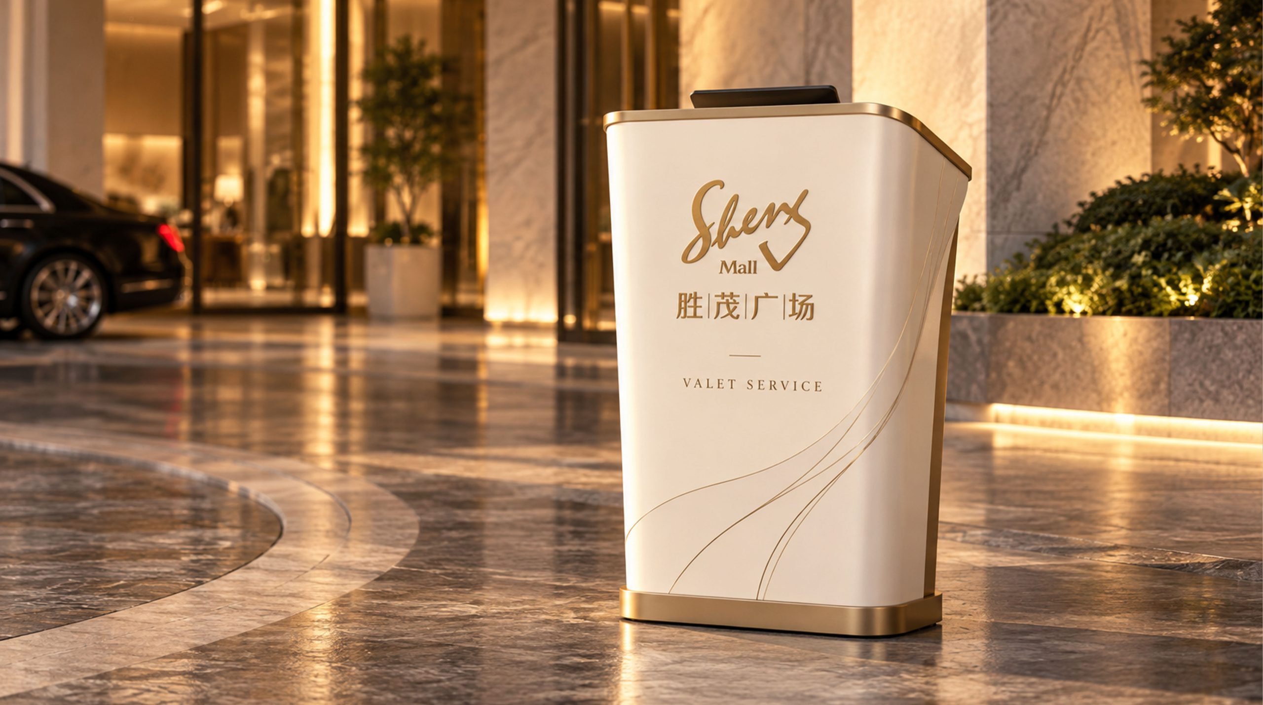
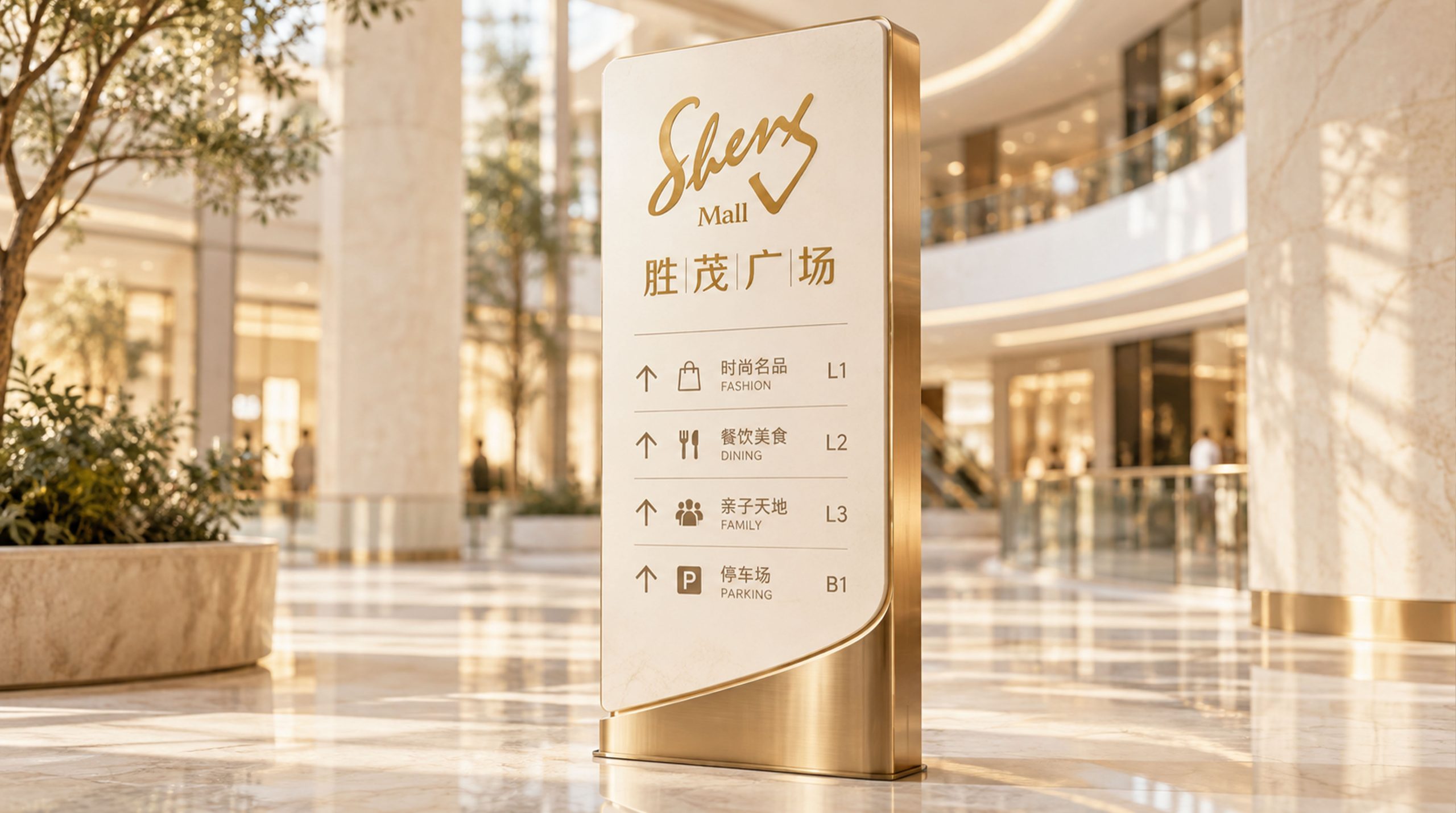
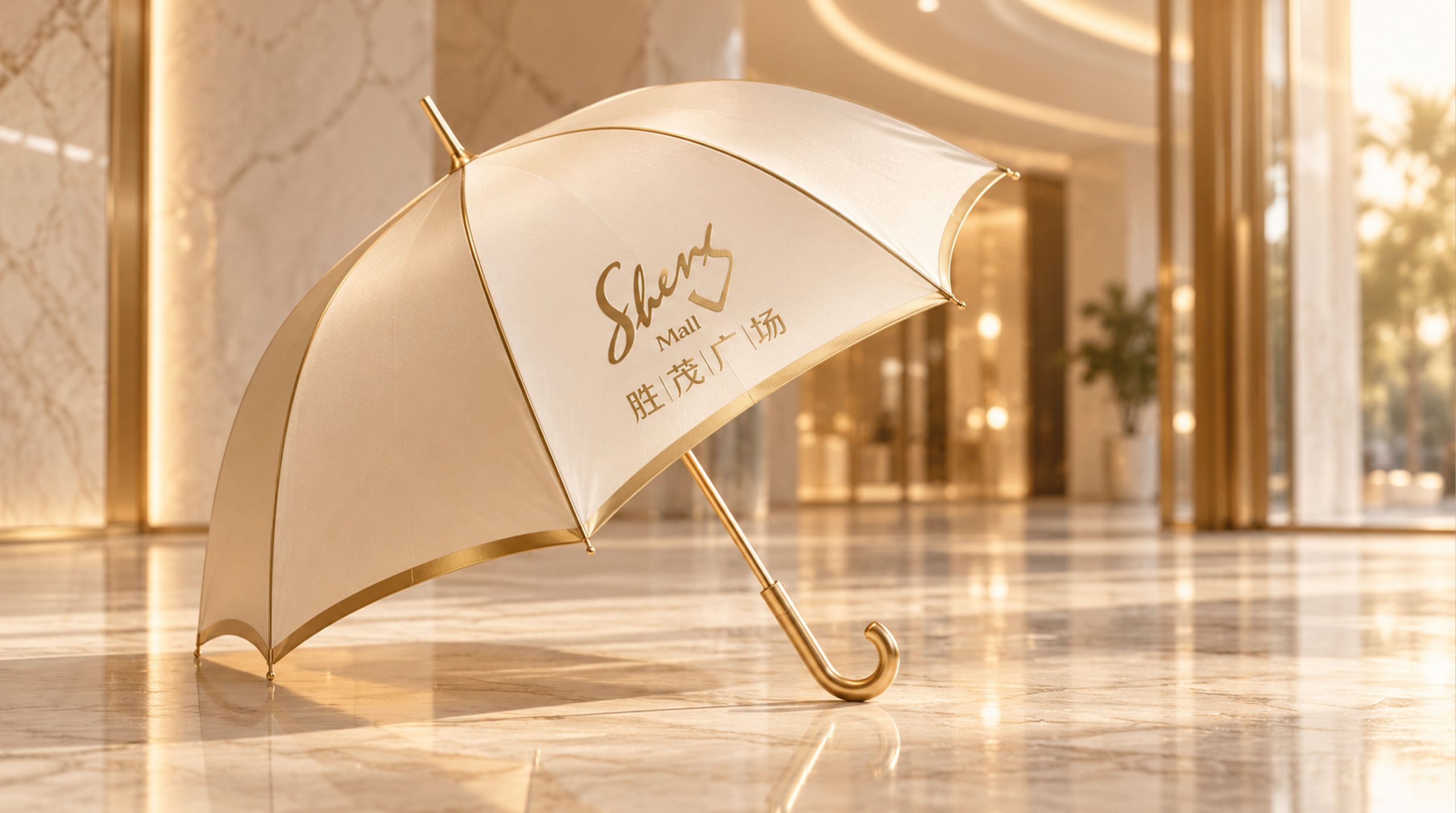
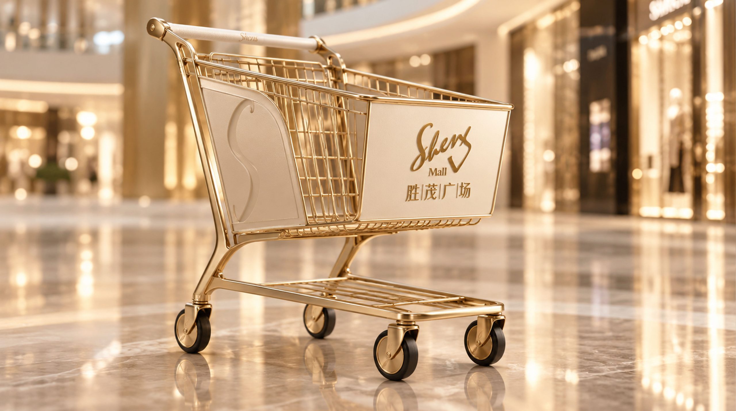
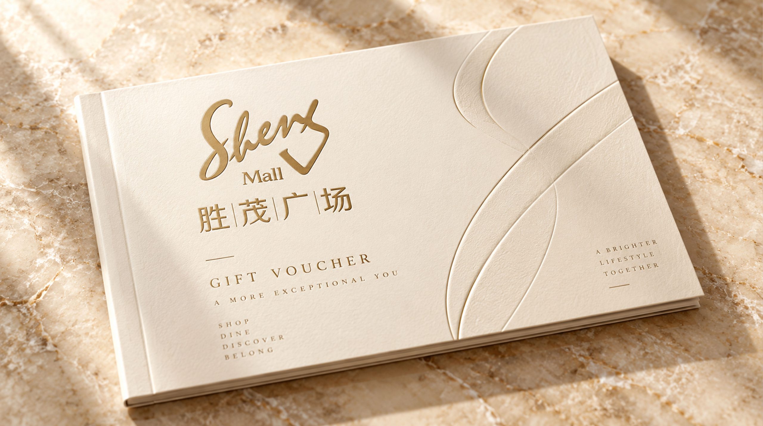
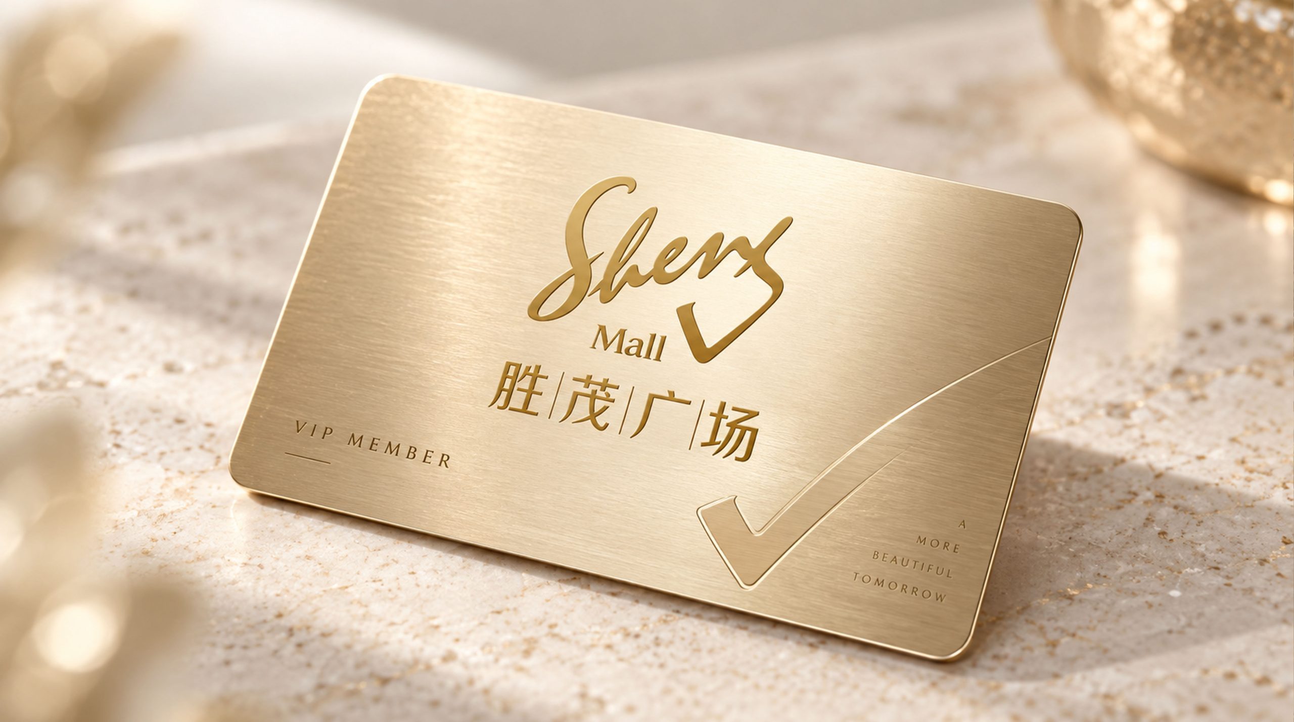
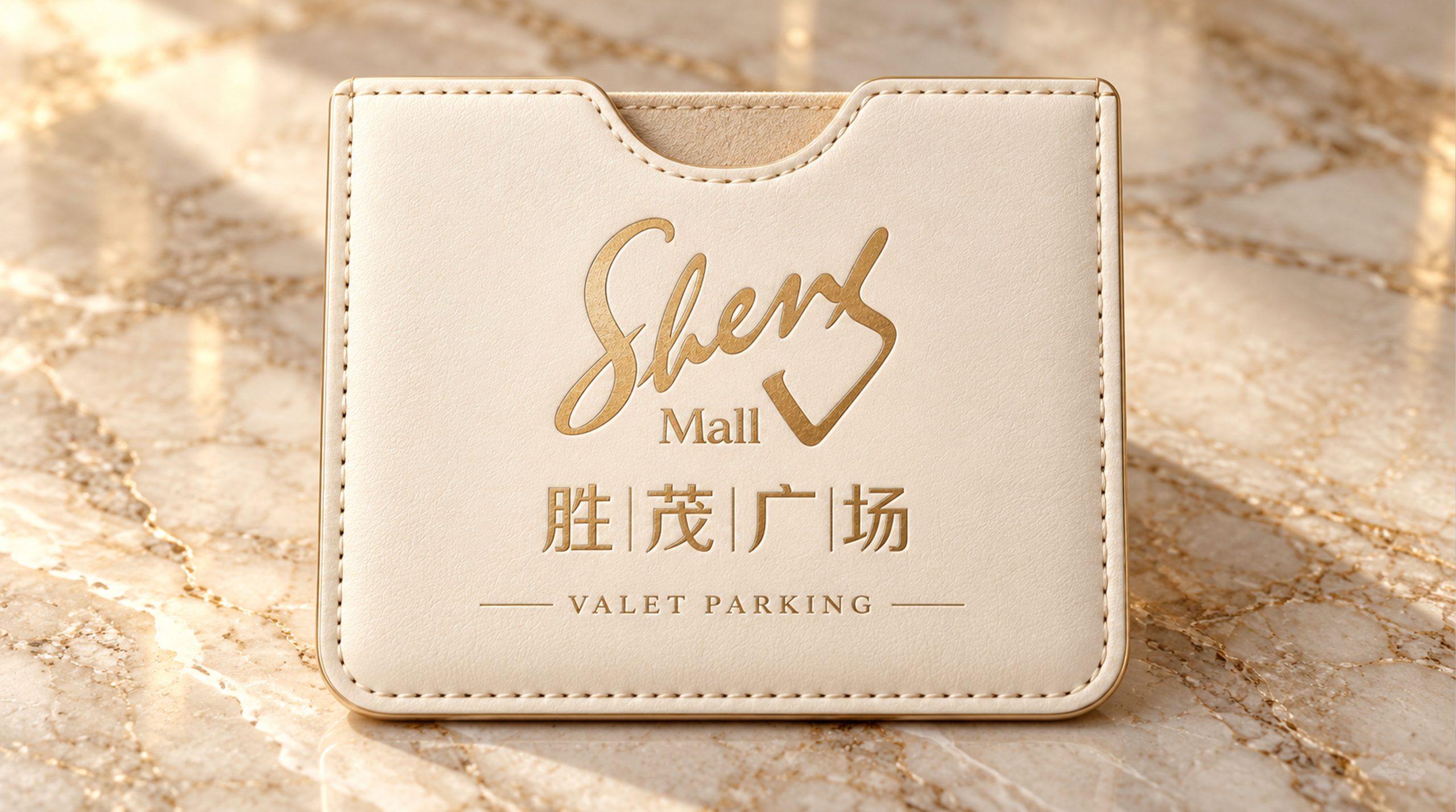
The logo can be widely used in the main entrance and facade signs of the square, indoor guidance systems and floor guides; investment brochures, merchant cooperation plans and property management documents; official websites, member service platforms and social media images; square opening celebrations, festival theme activities and brand linkage promotion images. At the main entrance of the square, the lush crown logo is presented on the front facade of the building with large metal three-dimensional characters. The golden tree crown glows warmly in the night lights, becoming the most eye-catching commercial landmark in the city block. In the dynamic vision, the tree trunk stands steadily and erect from the ground, the crown spreads lushly from the center to the surroundings, and the branches and leaves are cascading and abundant. The outline of the building is looming in the crown, symbolizing that Shengmao Plaza is like a towering tree prospering and growing in the city.
brand meaning
The logo contains three core images: Flourishing Prosperity - the lush tree canopy conveys the commercial vitality of the square with its rich business formats and strong popularity; Urban Landmark - the looming architectural outline in the tree canopy conveys the square's landmark positioning as a regional city center; Rooted Growth - the steady trunks and roots convey the commercial determination to deeply cultivate the community and continue to operate. The overall design conveys the brand vision of "luxury and prosperity, the heart of the city".
Improper Usage (Protection Specification)
Do not change the full arc proportion or wavy edge characteristics of the tree crown; do not delete the trunk or change its support relationship with the crown; do not change the hue of the main color of Shengmao Gold; do not add gradients, strokes or decorative effects that are inconsistent with the commercial style; do not separate the crown and the trunk for separate use; keep the white space ≥ 25% of the graphic height; the minimum display width shall not be less than 30mm.
design results
After the release of the logo, Shengmao Plaza's brand recognition and consumer awareness in the urban commercial complex field have been significantly improved. "Crown of Lush", with its visual language that blends natural lushness and urban prosperity, has become the core identification symbol of the brand system, showing the brand vision of "luxury, prosperity, and the heart of the city".