










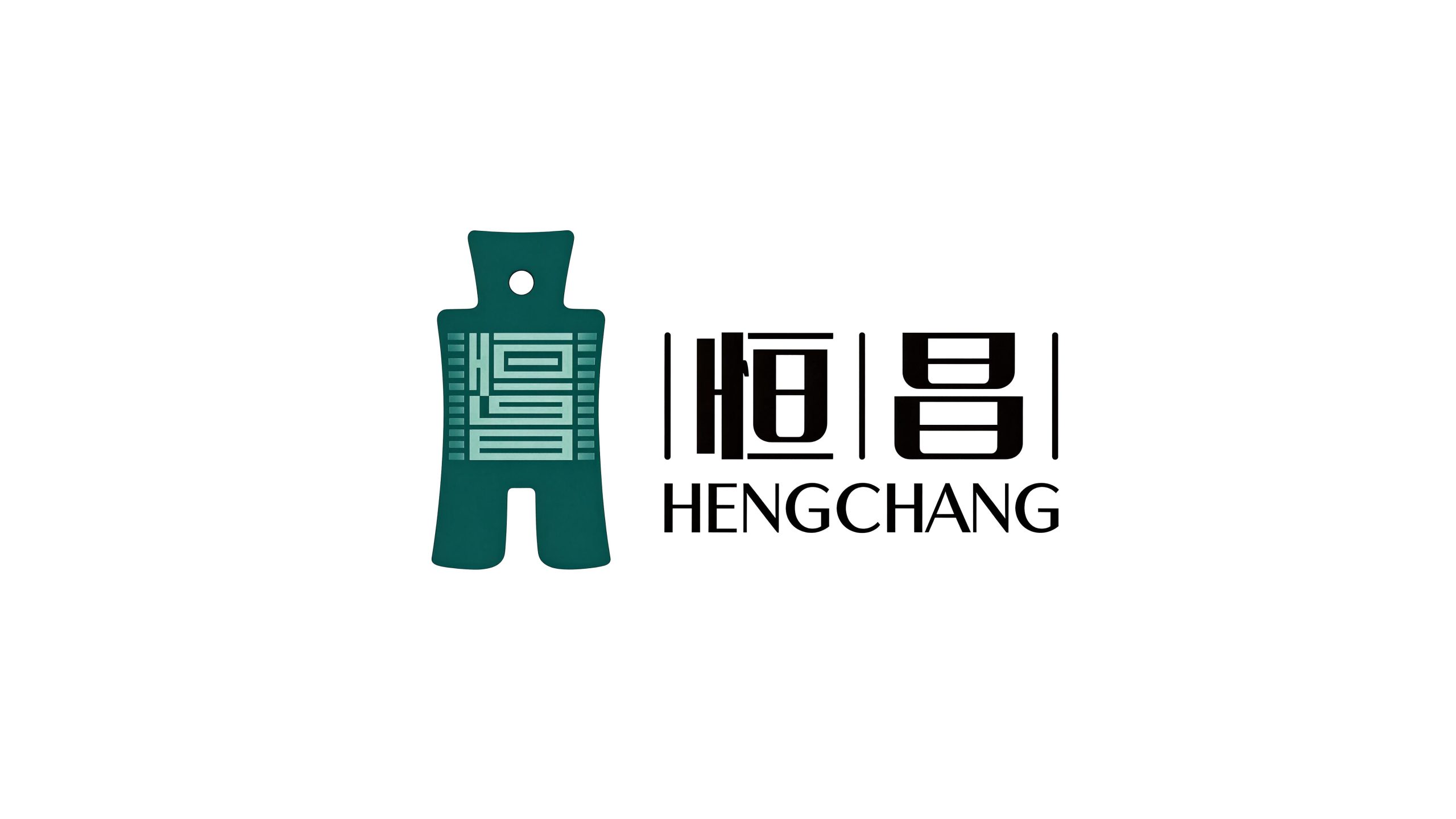
Hengchang is a comprehensive financial technology enterprise with wealth management and financial information services as its core. It is committed to providing individual and institutional customers with diversified financial services covering asset allocation, credit consulting, insurance planning and investment consulting.
The brand name "Hengchang" carries a far-reaching business vision - "Heng" means permanence and eternity, symbolizing the long-termism of corporate operations and perseverance in service commitments; "Chang" means prosperity and prosperity, symbolizing the continued growth of customer wealth and the prosperity of the business. Persistence is determination, prosperity is vision, and only long-term prosperity can be achieved. Qingmei Future was commissioned to lead the brand identity design.
The goal of brand logo design is to convey the brand image of "persistence, long-term success, and promising prosperity" through the visual language of stability, longevity, wealth growth, and professional trust.
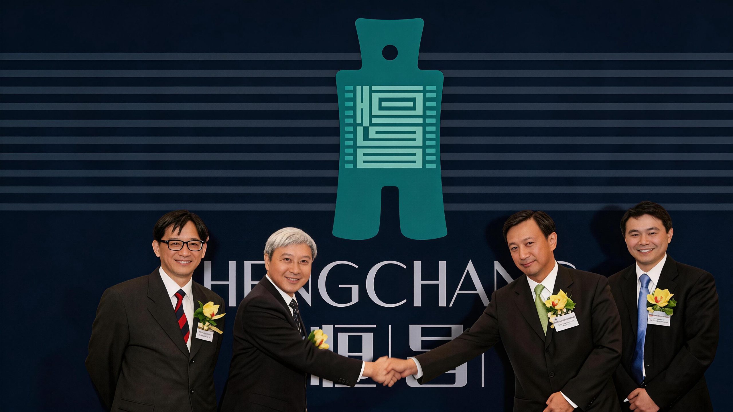
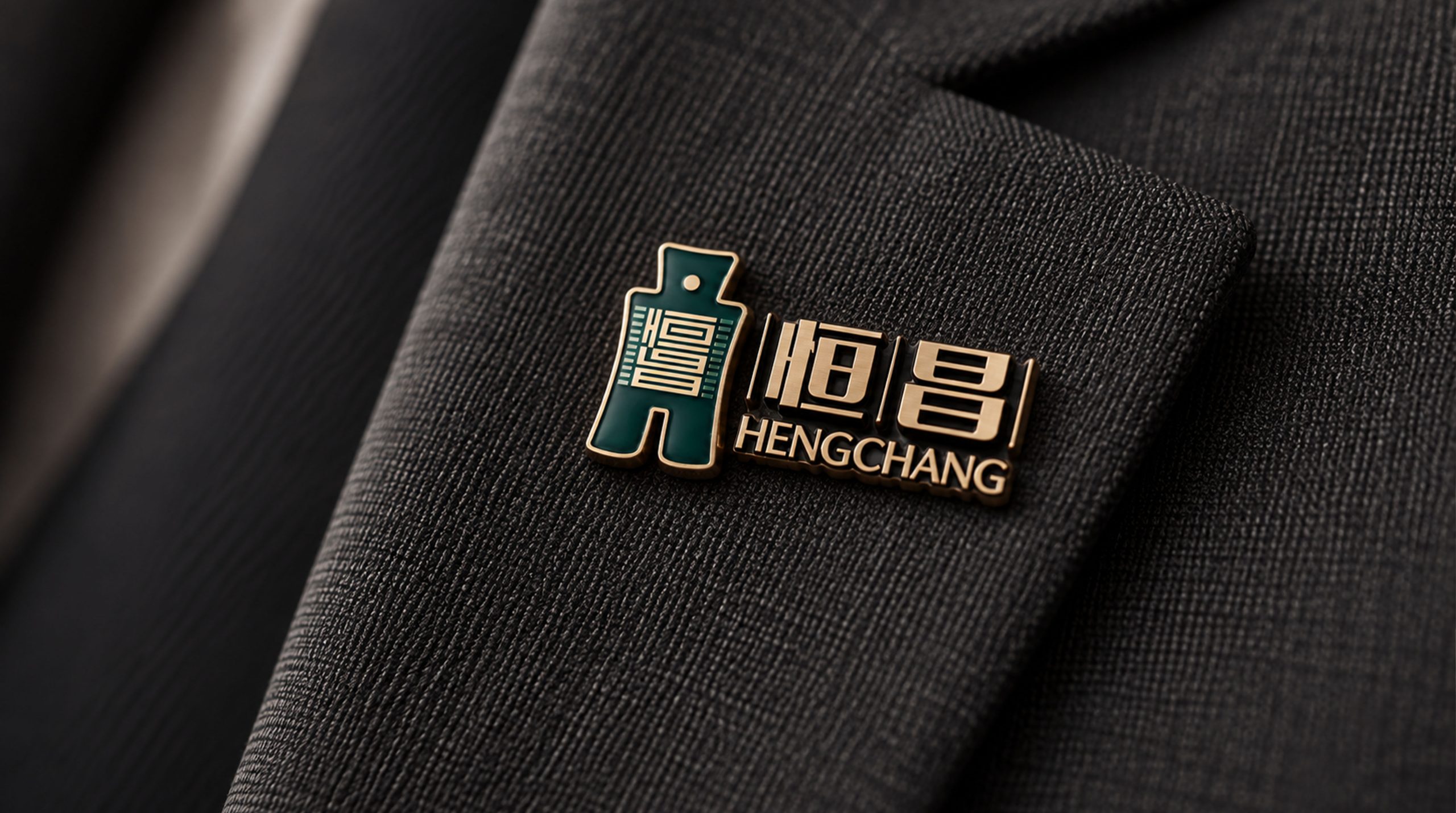
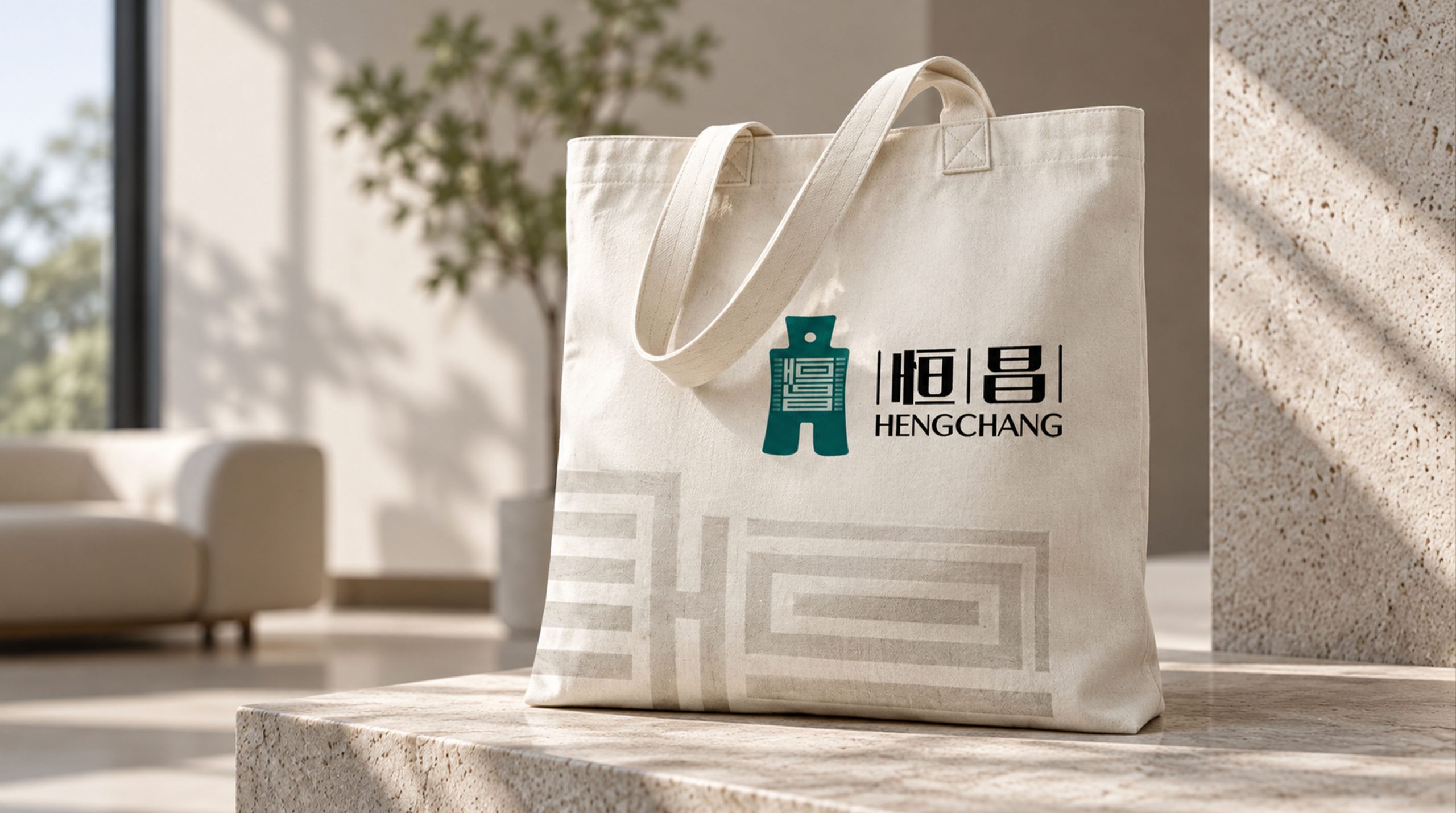
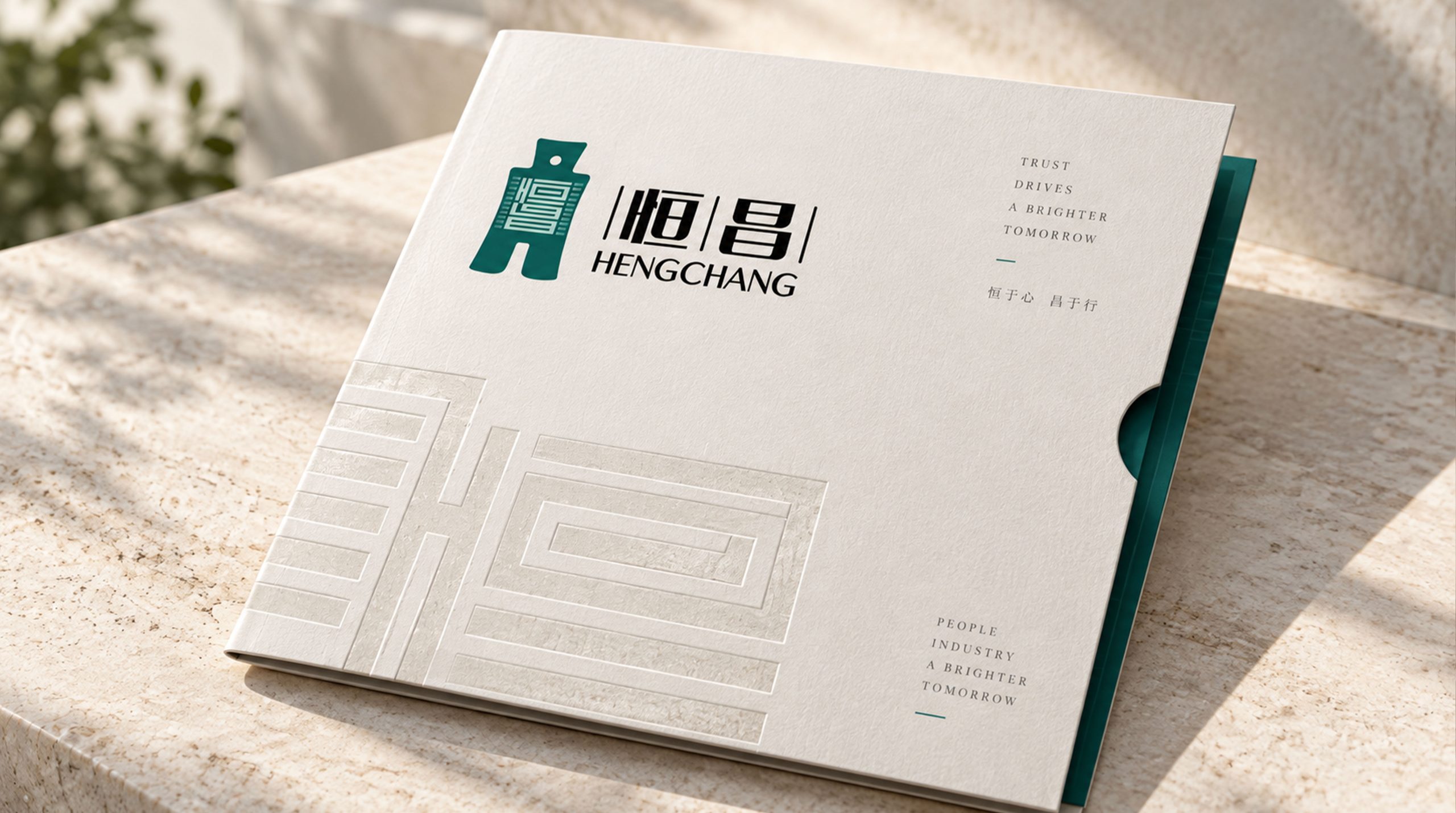
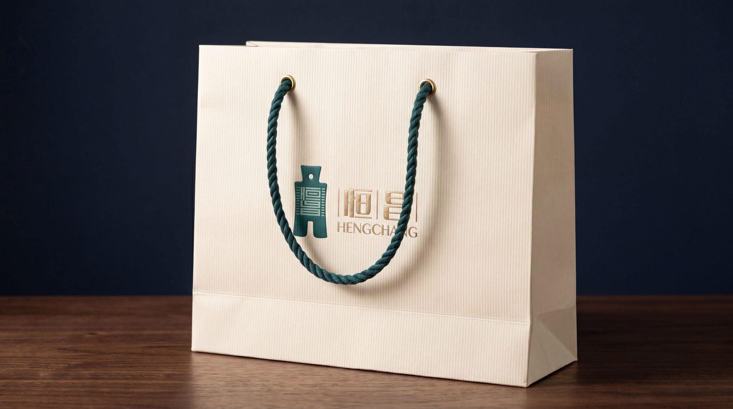
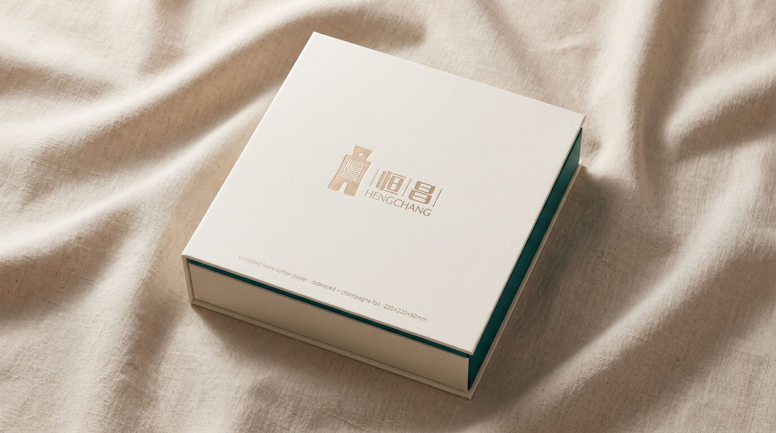
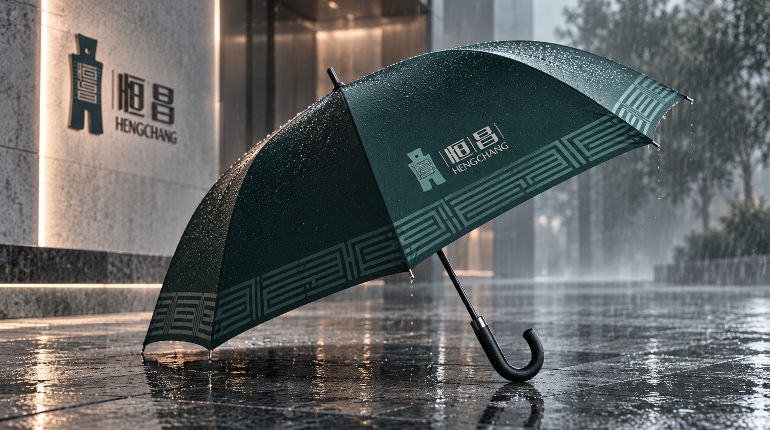
design concept
The logo takes "Eternal Sunrise" as its core concept, integrating a sun that never sets with a steady rising arc. The sun is the most intuitive bright image of the word "Chang" - "Chang" means the sun is rising. The superposition of two "Ri" characters on top of one another is "Chang". The sun hanging high is a sign of prosperity. The eternally rising sun conveys the brand's dual meaning of "eternal prosperity".
graphic language
The graphic uses a round sun as the core element. The sun is located in the upper half of the graphic. The circle is full and stable, like a star - it does not flash by like a meteor, but shines permanently and never goes out, conveying the lasting power of the word "heng". Below the sun, a broad rising arc stretches from the lower left to the upper right. The arc is like a steadily rising wealth growth curve - not a steep surge, not a violent fluctuation, but a steady upward slope, conveying the core concept of "steady appreciation and long-term compound interest" in wealth management. The arc holds the sun up slowly, as if the sun rises higher every day than the day before.
The starting point of the arc is thinner and gradually thickens to the right, conveying the growth process of wealth from starting to accumulating, and from small to large. The end of the arc is not closed, but extends to the upper right in an open attitude, conveying that growth has no end and prosperity can be expected.
The intersection of the sun and the arc merges naturally. The sun is not an independent element suspended above the arc, but is lifted up from the rising power of the arc - the steady growth of wealth ultimately brings brightness and prosperity to the client's life. The overall composition constructs "the constant sun rising in the east" with a simple structure of "arc supporting the sun, rising continuously but never falling".
Font composition
The Chinese "Hengchang" adopts a stable modern Song style, with thin horizontal lines, thick vertical lines, and clear strokes. The word "heng" is placed vertically next to the heart, which is like inner concentration, and the word "chang" is superimposed on two days to echo the sun pattern. The English "HENGCHANG" is arranged in a standard uppercase serif font with a generous and solemn font, ensuring the brand's professional recognition in the financial industry and business scenarios.
color system
The main color Hengchang Blue #0B3C6B represents financial trust, professional depth and long-term stability. Dark blue is like the most permanent star background in the night sky - it does not change due to market fluctuations and does not sway due to short-term temptations, conveying the management determination of "long-termism and not chasing trends" of wealth management institutions. Auxiliary Prosperity Gold #C19A3E is used for wealth growth and value return elements in the brand system. Gold is directly related to the radiance of wealth and the joy of value-added. The combination of blue and gold conveys "steadiness and conservation + prosperity of wealth". Auxiliary Warm Gray #8E9AAE is used for auxiliary information and system base elements. Pure white #FFFFFF as standard base color. The overall color uses blue and gold as the dual core, reflecting the brand temperament of "stable professionalism and value growth".
Application extension
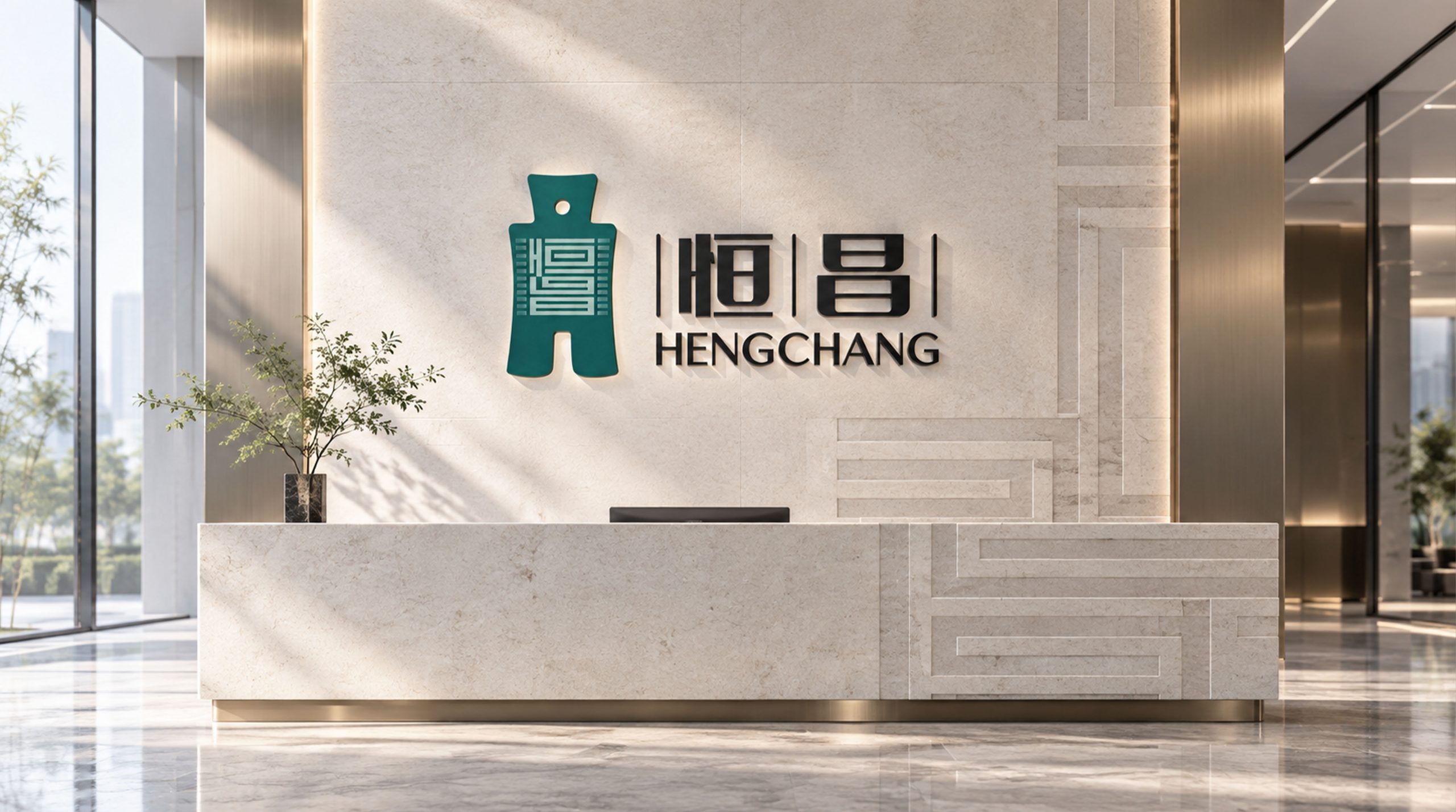
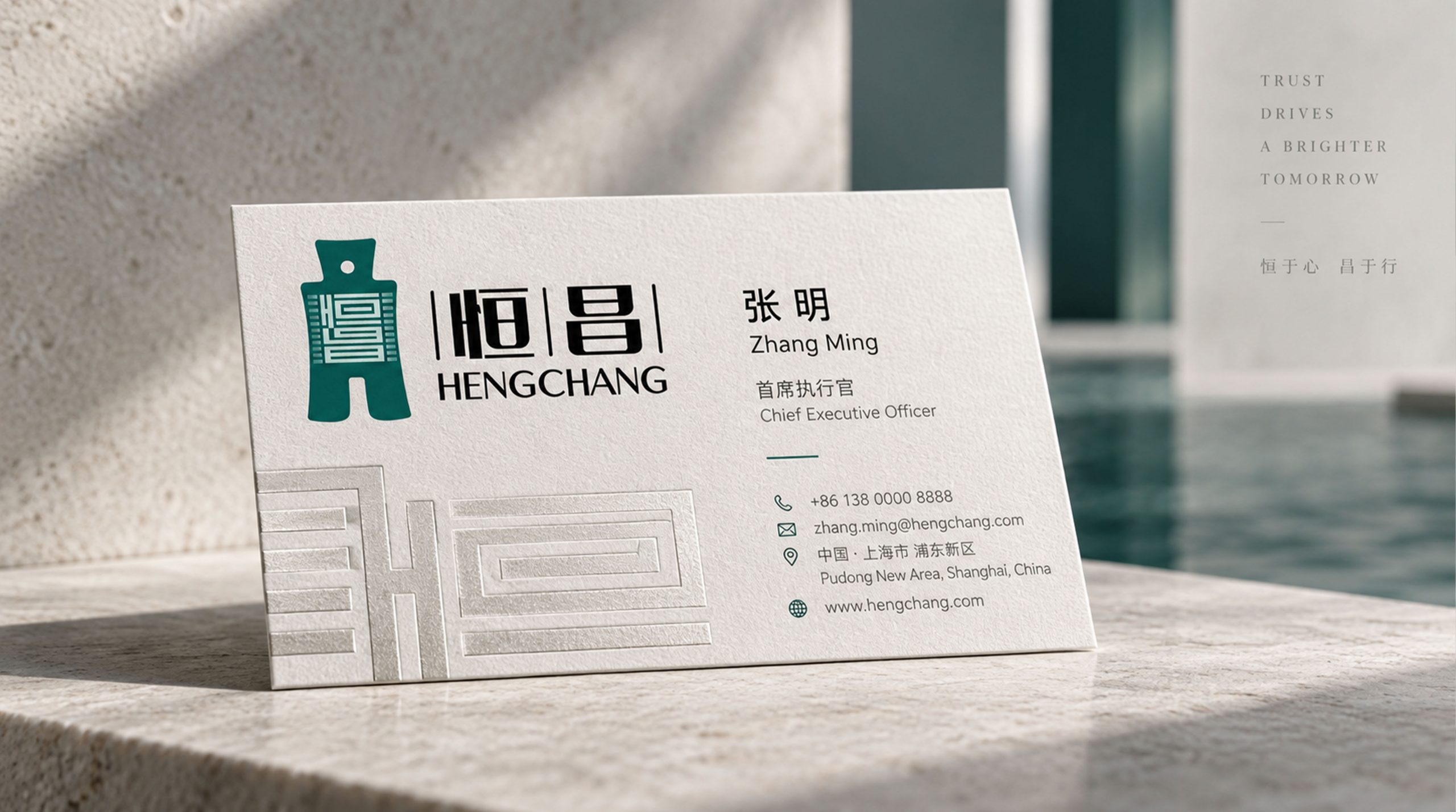
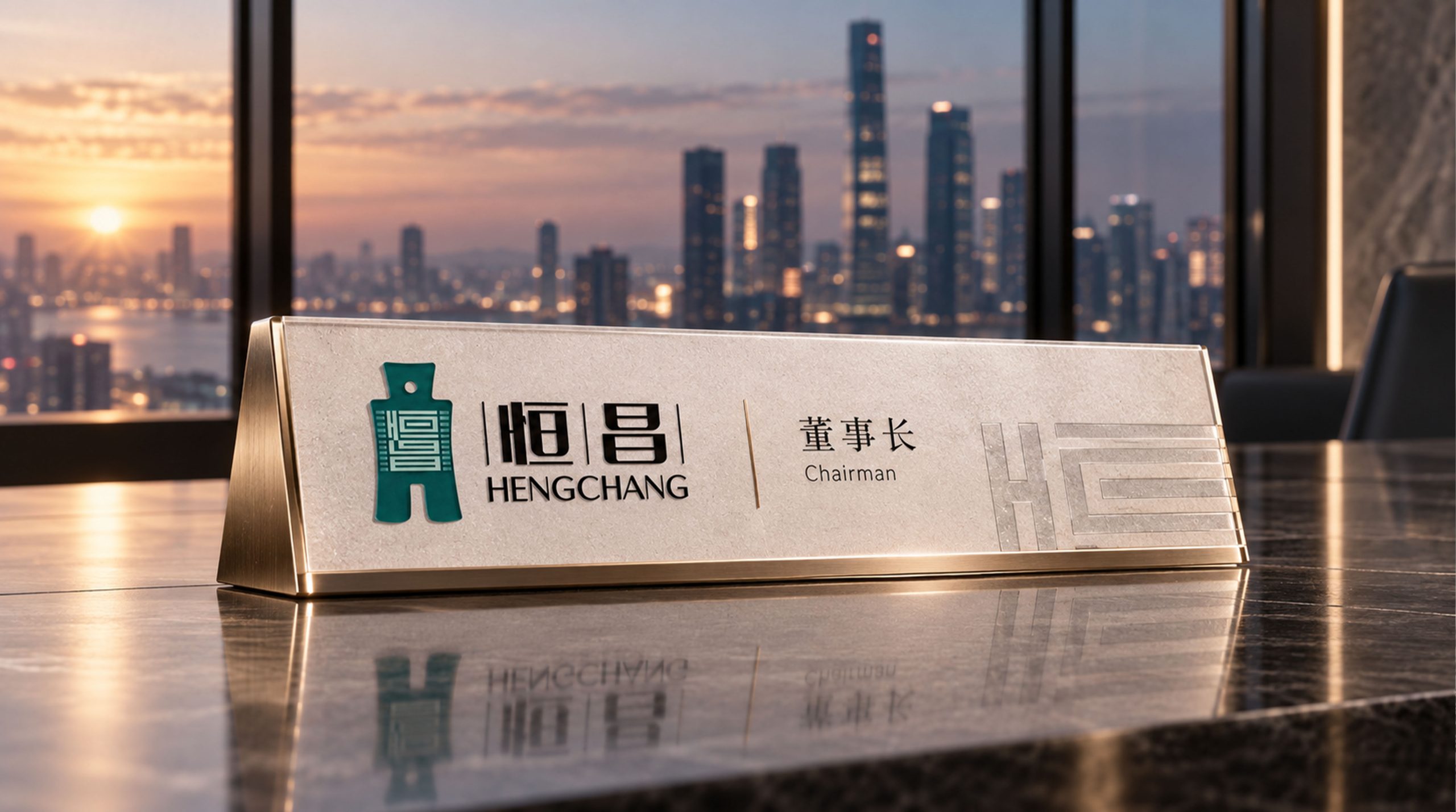
The logo can be widely used in corporate headquarters and national branch logos; wealth management plans, investment advisory reports and customer service manuals; official websites, financial service APPs and digital communication materials; wealth management forums, financial technology summits and brand charity event images. In the wealth salon of high-end customers, the Hengri logo with a blue background and gold label appears in the center of the main visual of the event. A golden sun shines permanently on the dark blue background, conveying the brand promise of "walking with Hengchang, wealth will last forever". In the dynamic vision, a rising arc is slowly drawn from the lower left side of the screen. The sun is steadily held up by the rising power of the arc, and the light spreads softly, symbolizing Hengchang's long-lasting professionalism in lifting the light of wealth for every customer.
brand meaning
The logo embodies three core ideas. Enduring Commitment: a star-like sun speaks to long-term thinking in the business and steadfast service commitments. Prosperous Growth: a rising arc expresses the aspiration for steady growth in clients' wealth and lasting prosperity in life. Professional Support: the arc supporting the sun represents the institution's core value of upholding clients' wealth with professional expertise. Together, the design conveys the brand vision: “Constancy carries far; prosperity is within reach.”
Improper Usage (Protection Specification)
Do not change the circular proportion of the sun or the fusion relationship with the arc; do not change the rising direction of the arc or replace it with a downward trend; do not change the hue of the main color of Hengchang Blue; do not add gradients, strokes or decorative effects that are inconsistent with the financial style; do not separate the sun and the arc for separate use; keep white space ≥ 25% of the graphic height; the minimum display width must not be less than 25mm.
design results
After the release of the logo, Hengchang's brand recognition and customer trust in the wealth management and financial technology fields have been significantly improved. "Hengri Dongsheng" has become the core identification symbol of the brand system with its visual language that conveys long-term determination and prosperous growth, showing the brand vision of "persistence to reach the future and prosperity to be expected".