










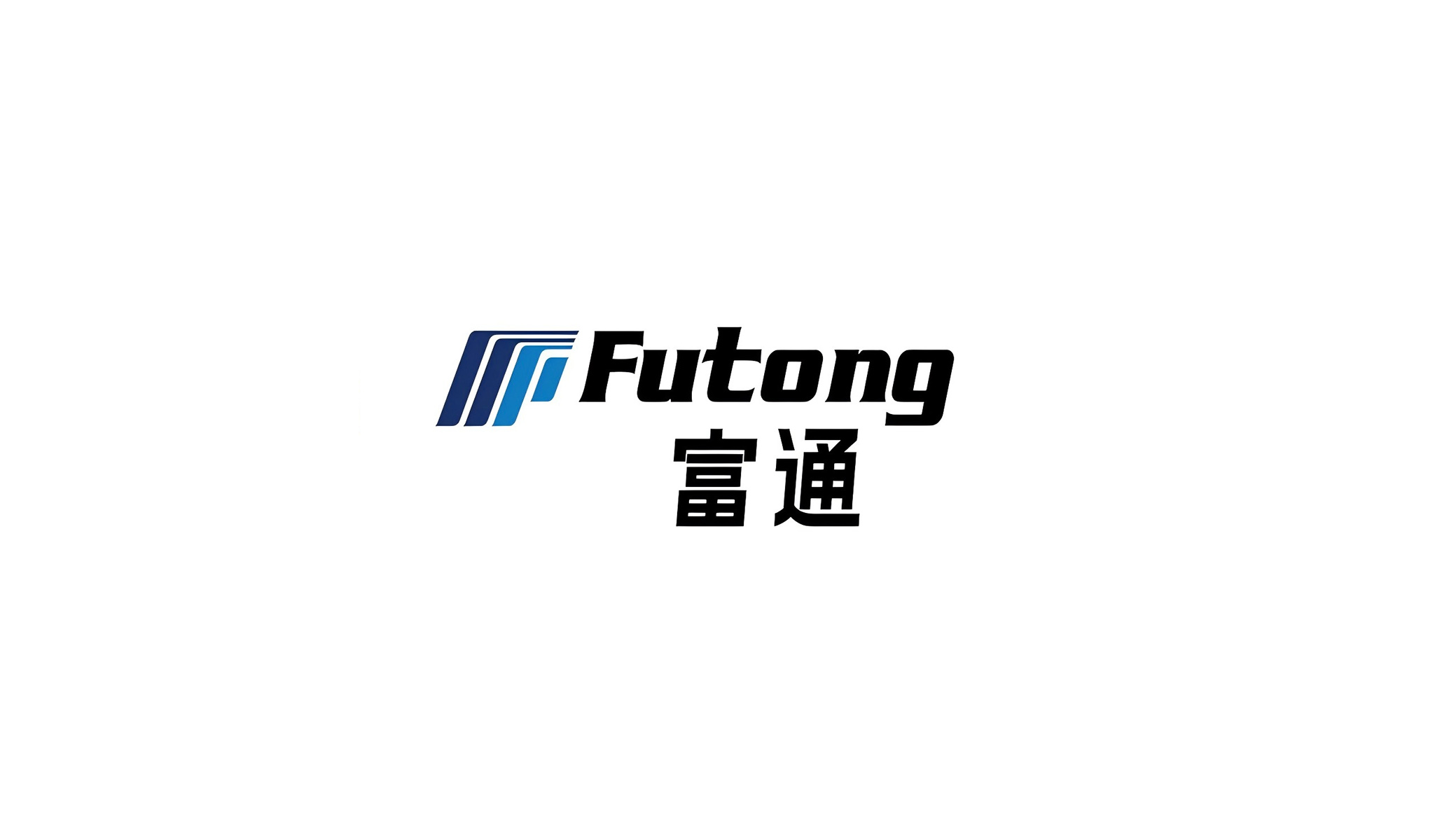
This project delivered a comprehensive upgrade of the brand identity system for Futong Eastern Technology.
The goal was to establish a unified visual identity (VI) through a systematic, international and technology-driven visual language, and to create an extensible system of supporting graphics that gives the brand greater recognition and contemporary appeal in global markets.
Blue is the core visual vocabulary of the system, combining technological order with corporate stability to build a brand impression of “Connection · Innovation · Intelligence.”
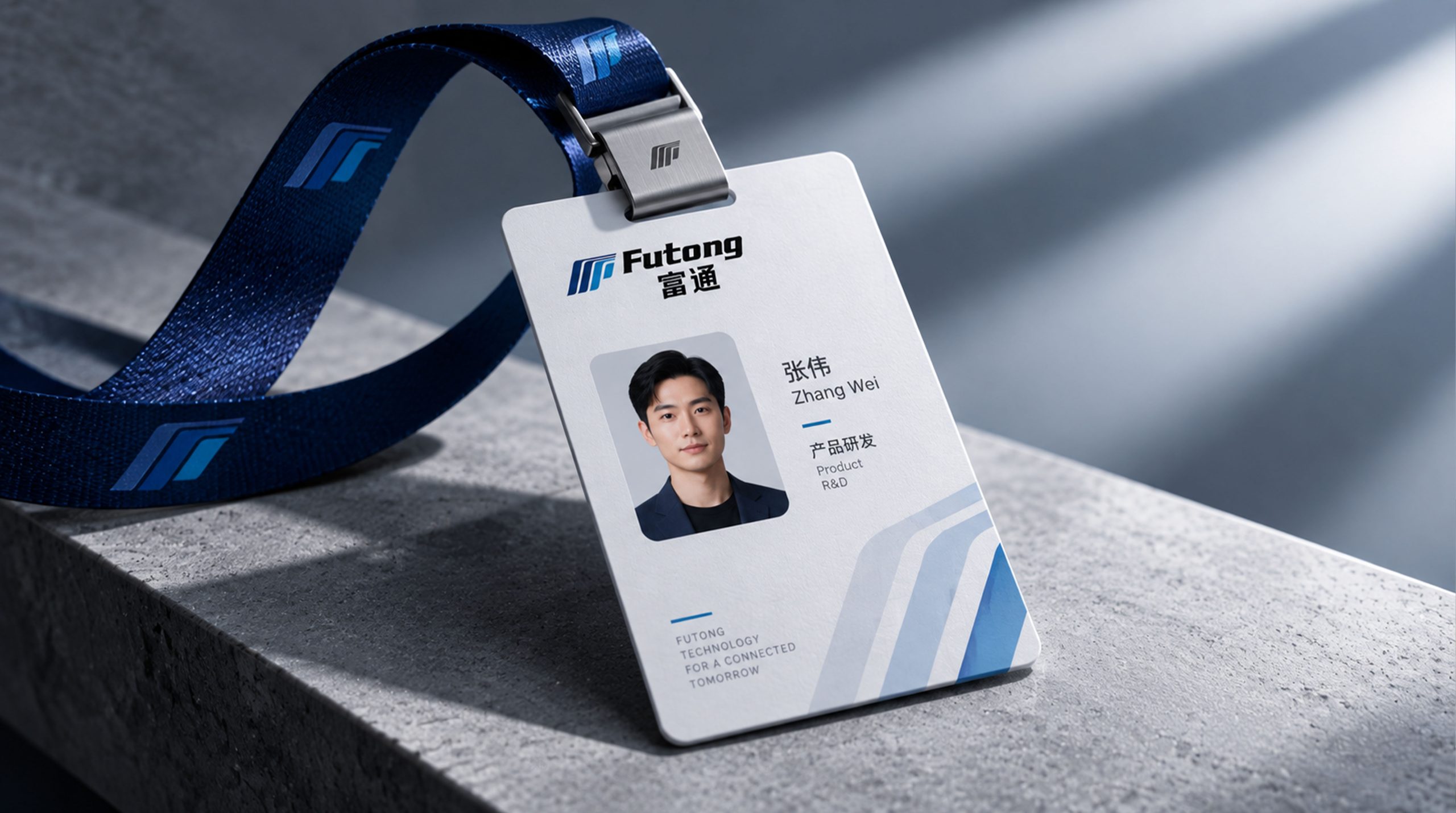
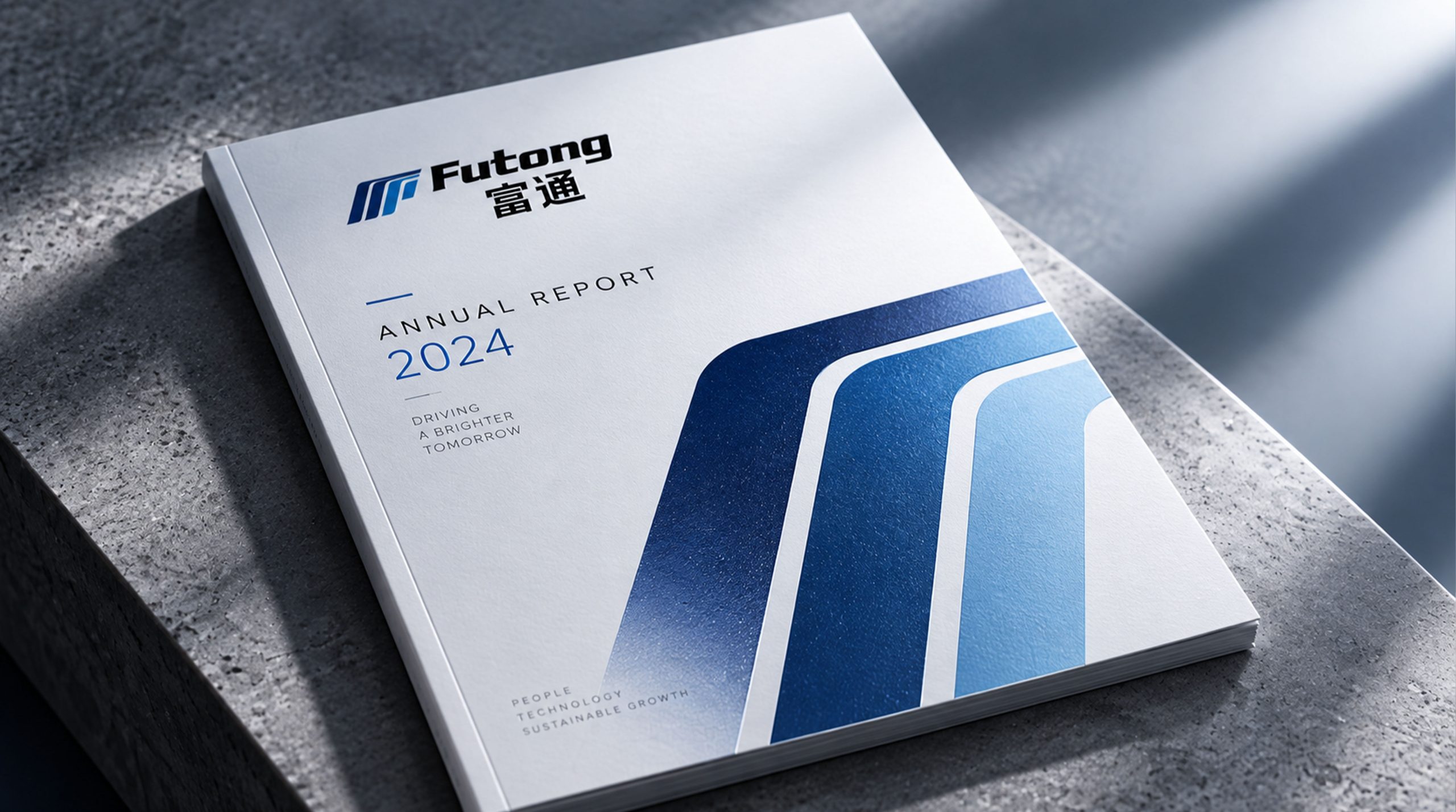
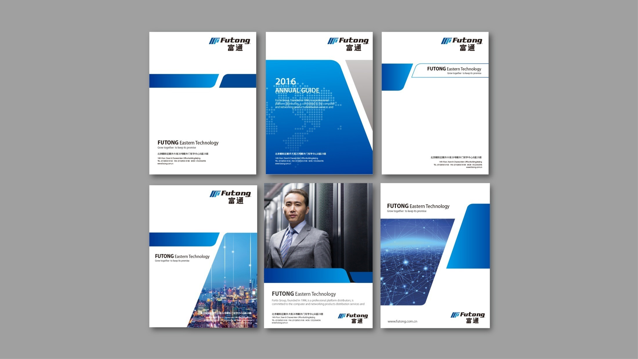
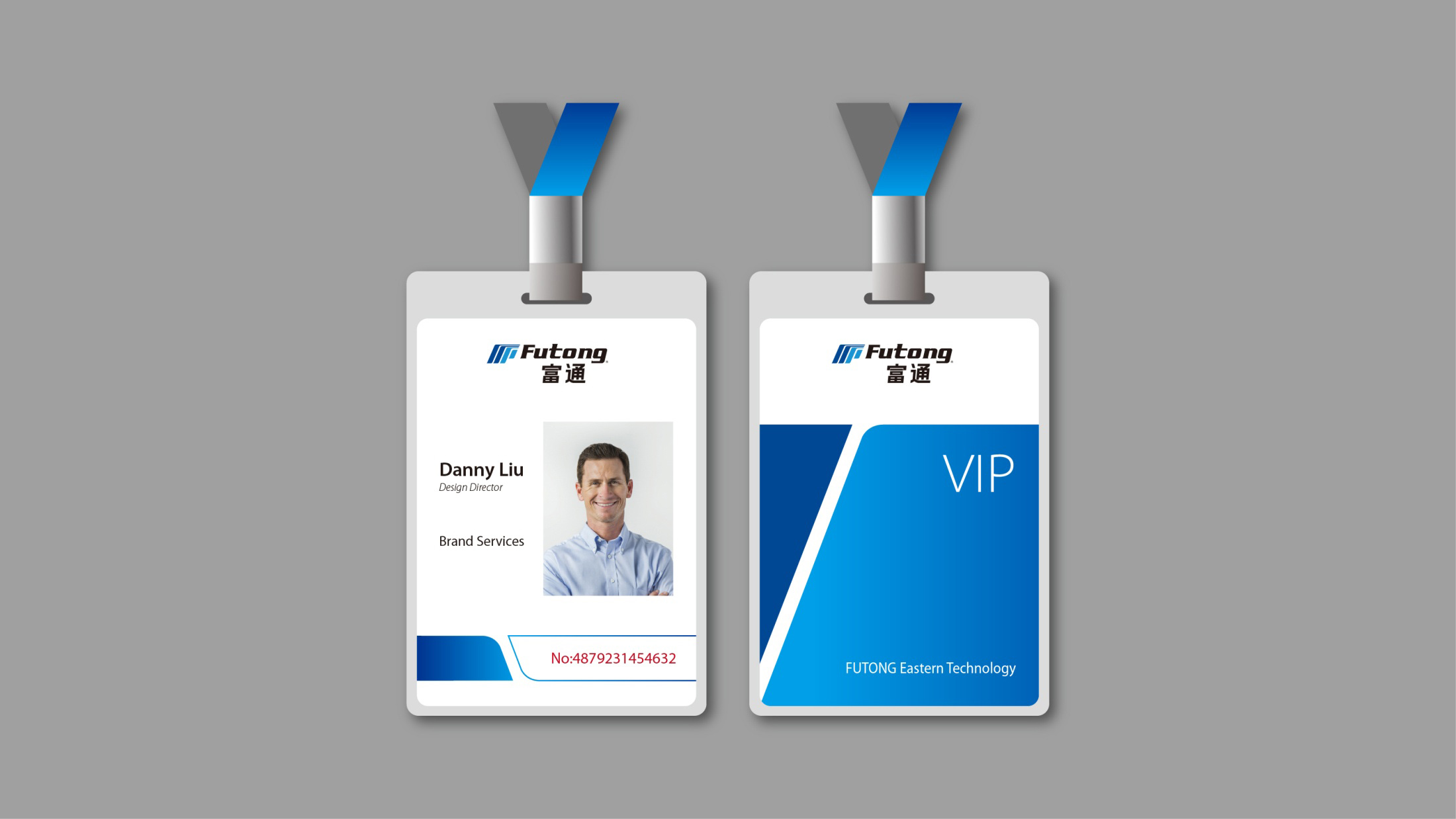

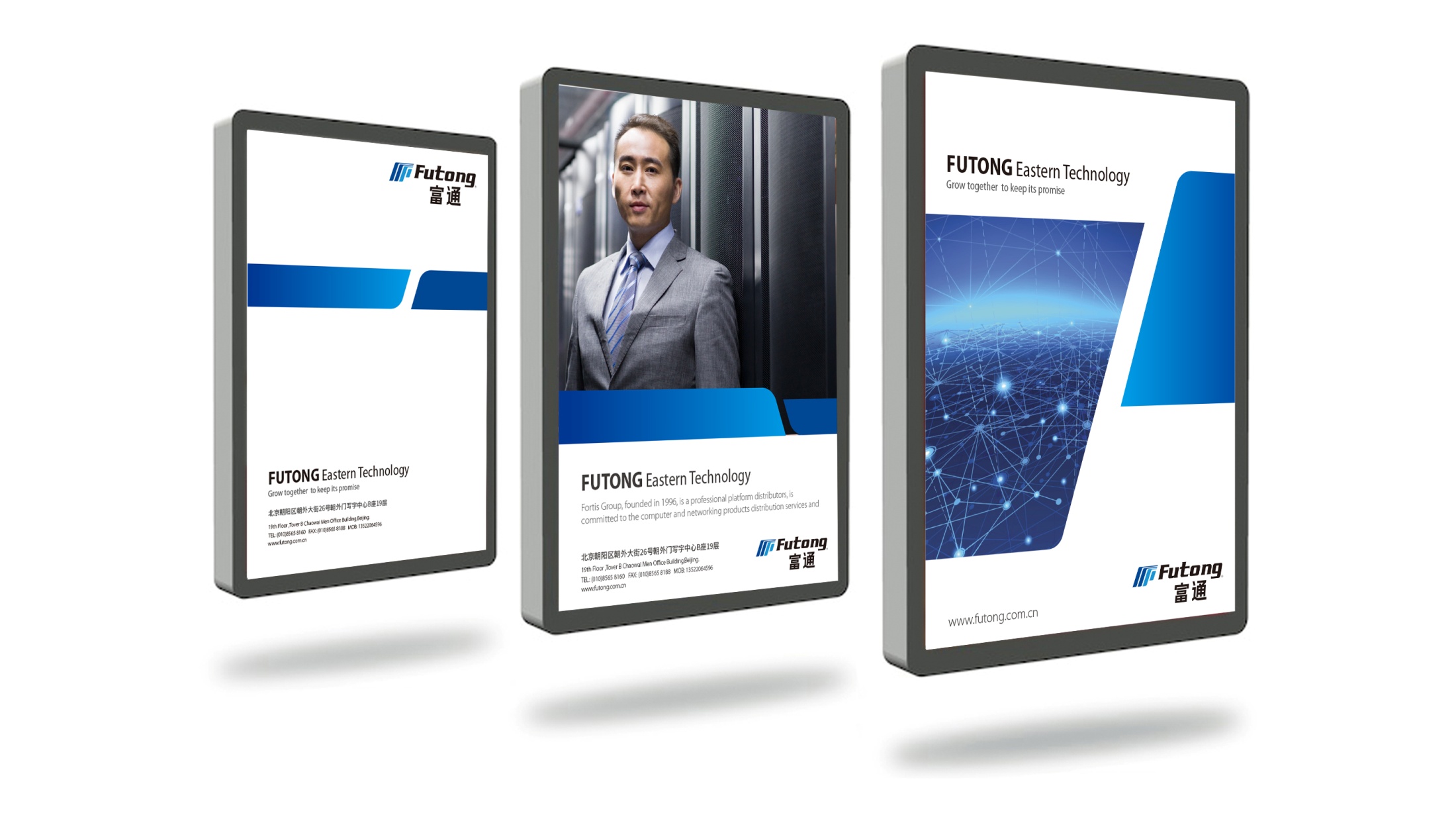
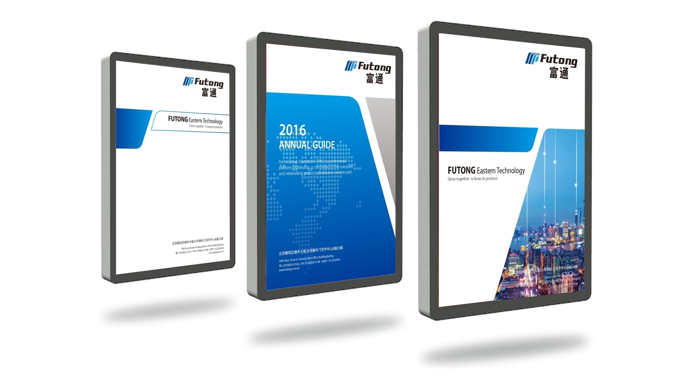
design concept
The logo concept stems from Speed & Connectivity. Angled geometric lines form the primary mark, symbolizing communication flows, signal transmission and the direction of energy. The forward-leaning wordmark creates a sense of momentum, reflecting the company's pioneering spirit and commitment to continuous innovation. The composition is simple and powerful, embodying the highly recognizable logic of a modern industrial brand.
graphic language
Parallel diagonal lines: the efficient flow of information and industrial processes; Upward-right angle: growth, momentum and an ascendant brand outlook; Tapering lines: the technological energy logic of “convergence → output”; Rectangular base: stability and engineering strength. The mark evokes both the flow of a communication signal and the cross-section of an industrial conduit, combining technological rationality with a symbol of strength.
Fonts and composition
The English wordmark Futong is set in an italic geometric sans serif. Its compact letterforms and pronounced momentum reinforce the brand's sense of speed and professionalism. The Chinese name uses a sturdy sans-serif structure that balances and contrasts with the English. A vertical lockup, with English above and Chinese below, projects an international corporate image while respecting local visual conventions.
color system
Deep Blue #1E355E: technological rationality, trust and depth; Bright Blue #2C5C8E: innovation, connection and future energy; Black #000000: strength, professionalism and engineering character. The blue gradient system establishes a brand tone of “technological cool × industrial rationality,” reinforcing the company's international, high-tech positioning.
Application and extension
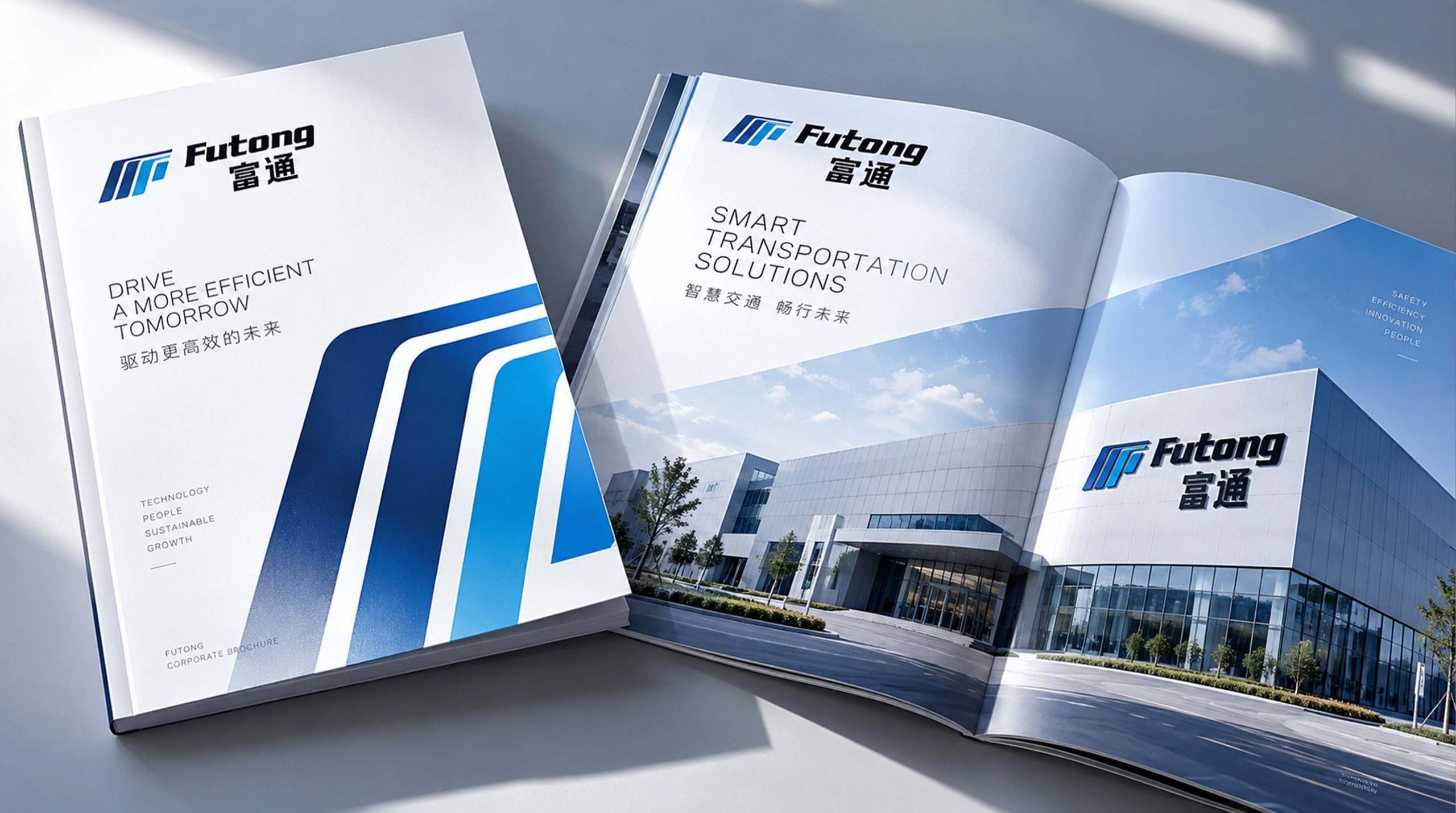
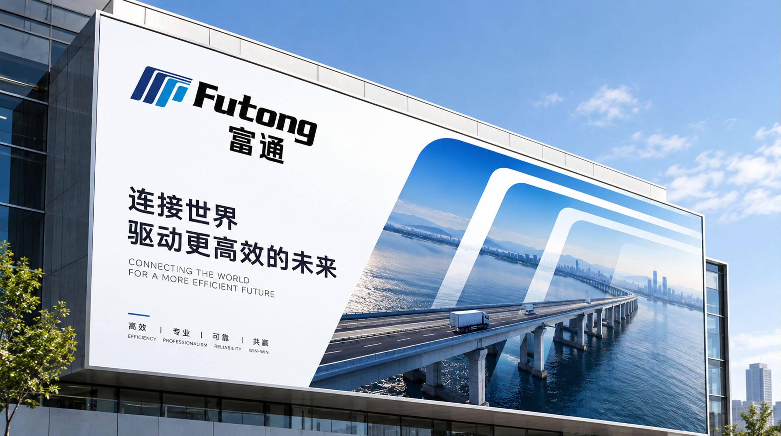
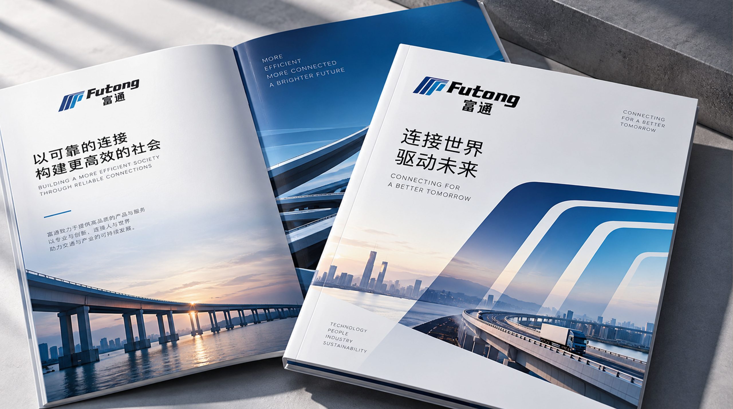
The logo is built for systematic application. Corporate: company identity, trade show materials, vehicles and engineering equipment; Product: cables, mechanical components and packaging labels; Spatial: site wayfinding, building facades and office identity. In motion, the parallel diagonals can serve as animated elements that simulate signal flow or data transmission, reinforcing the brand's technological image.
brand meaning
The Futong logo expresses the brand's core value of “technology-driven × connecting the future”: Diagonal lines → speed and direction; Blue → trust and rationality; English wordmark → international outlook and professionalism; Chinese characters → a brand rooted in China. More than a visual identifier, it symbolizes the company's convictions, using technology as the thread to weave an industrial network that connects the future.
Improper Usage (Protection Specification)
Do not change the angle or number of diagonal lines; Do not alter the gradient direction or add shadows; Do not skew, break or invert the colors; Recommended minimum width: 32mm.
design results
Following the logo launch, Futong established a highly recognizable brand system in the communications and industrial engineering sectors through a visual language of 'industrial structure × technological velocity.' The parallel-line motif became the core graphic element across brand touchpoints, from brochures and exhibition spaces to digital interfaces. The project represents Qingmei Future's mature expression in industrial technology and brand system design, achieving visual unity from structural design through to brand essence.