










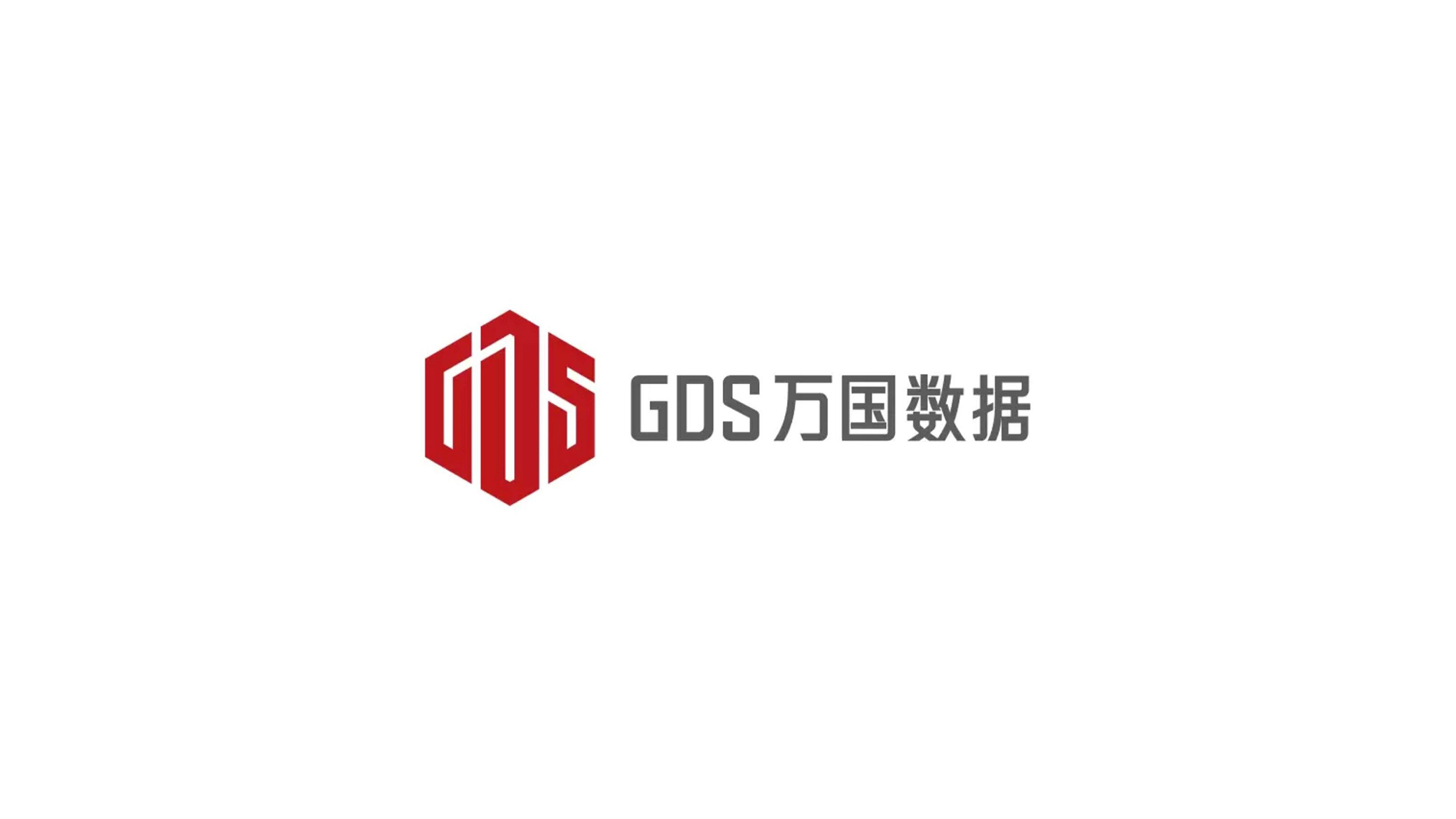
This project delivers a brand identity system upgrade for GDS Services, China's leading data center and cloud infrastructure enterprise.
The design objective: construct a systematic brand identity within the data, network, and cloud ecosystem through modular, international, technology-driven visual language, reinforcing the brand's professional and innovative image as an industry leader.
The overall design adopts a 'hexagonal honeycomb structure' as the core visual symbol, representing high-density data interconnection and systematic intelligence.
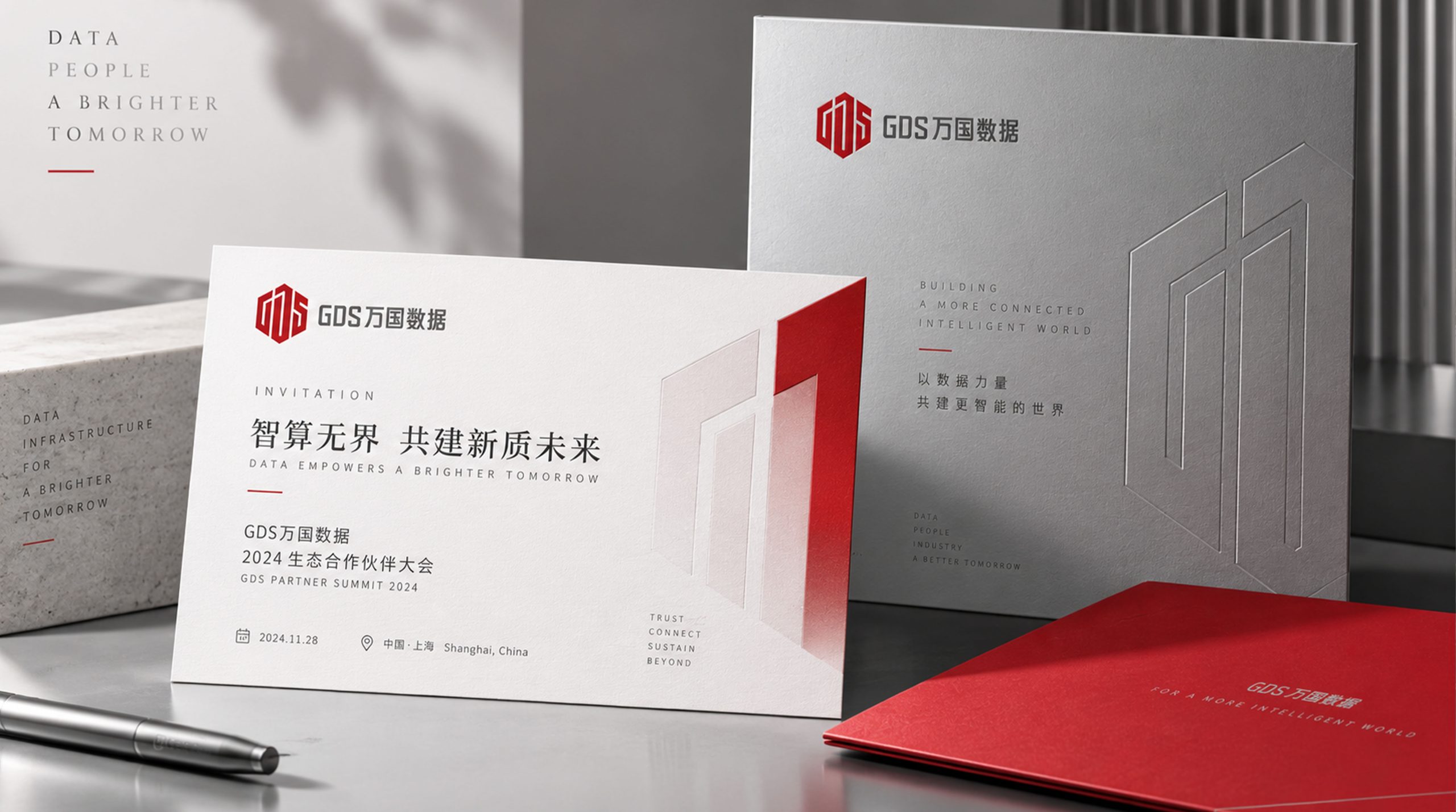
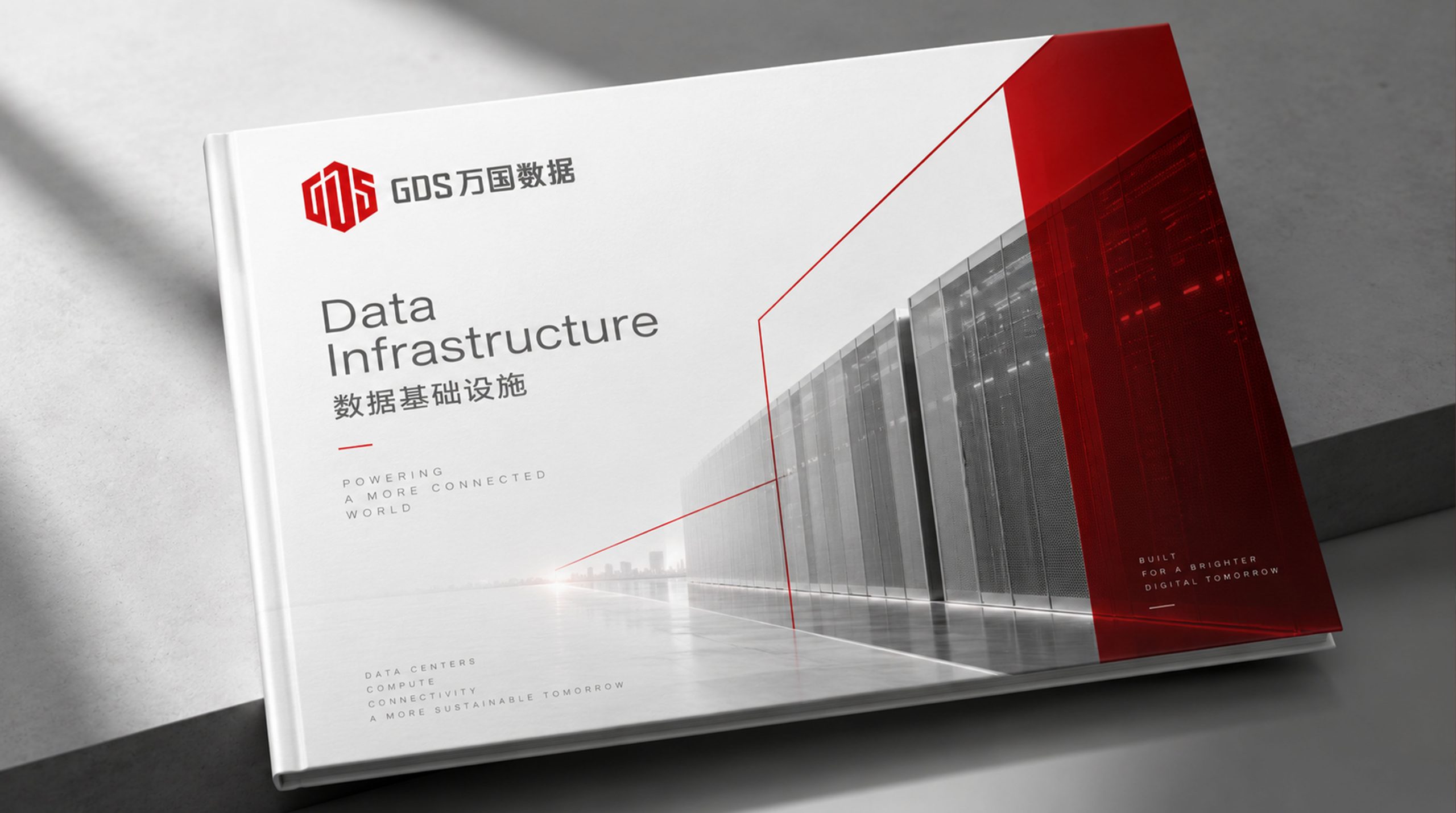
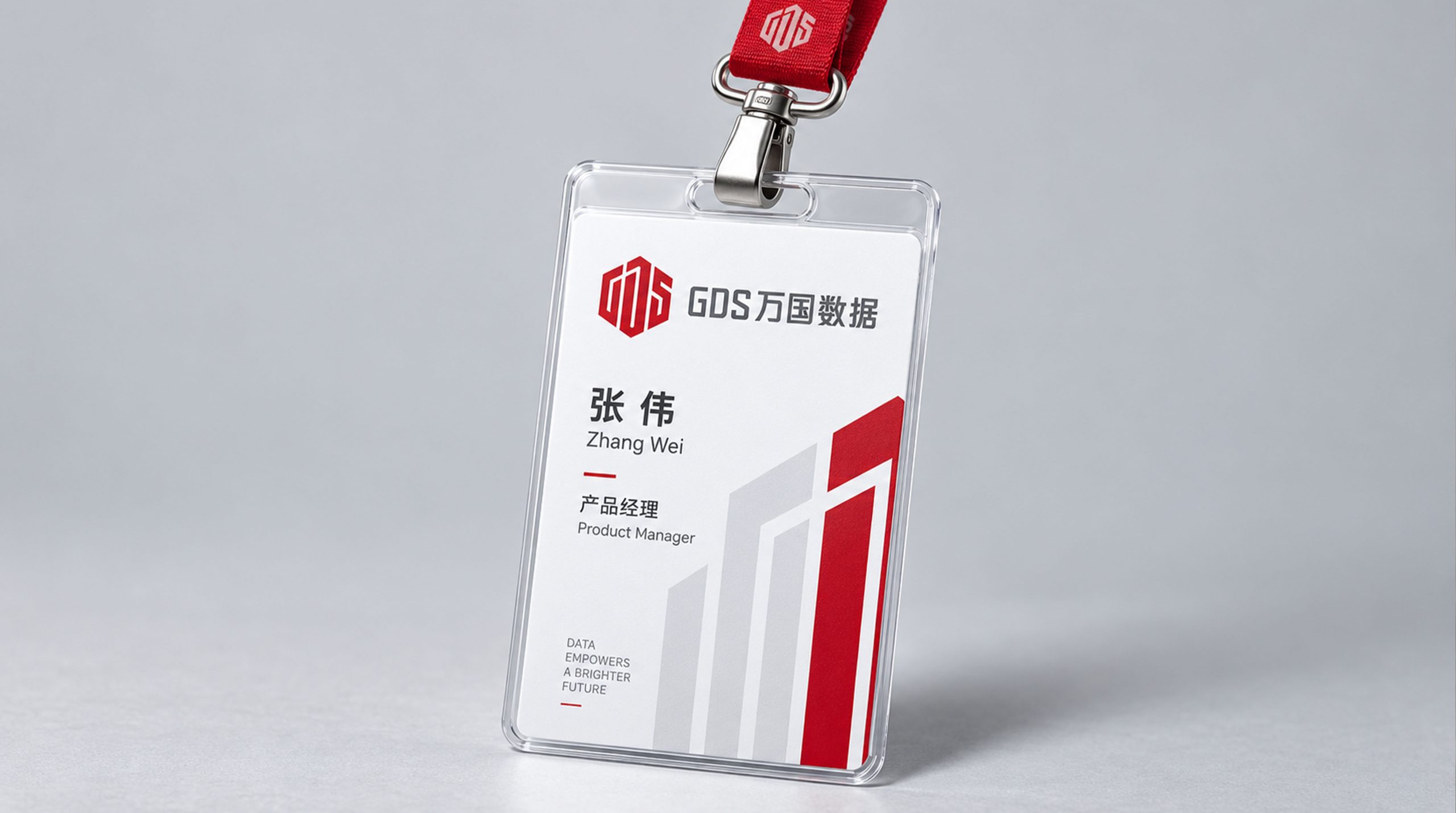
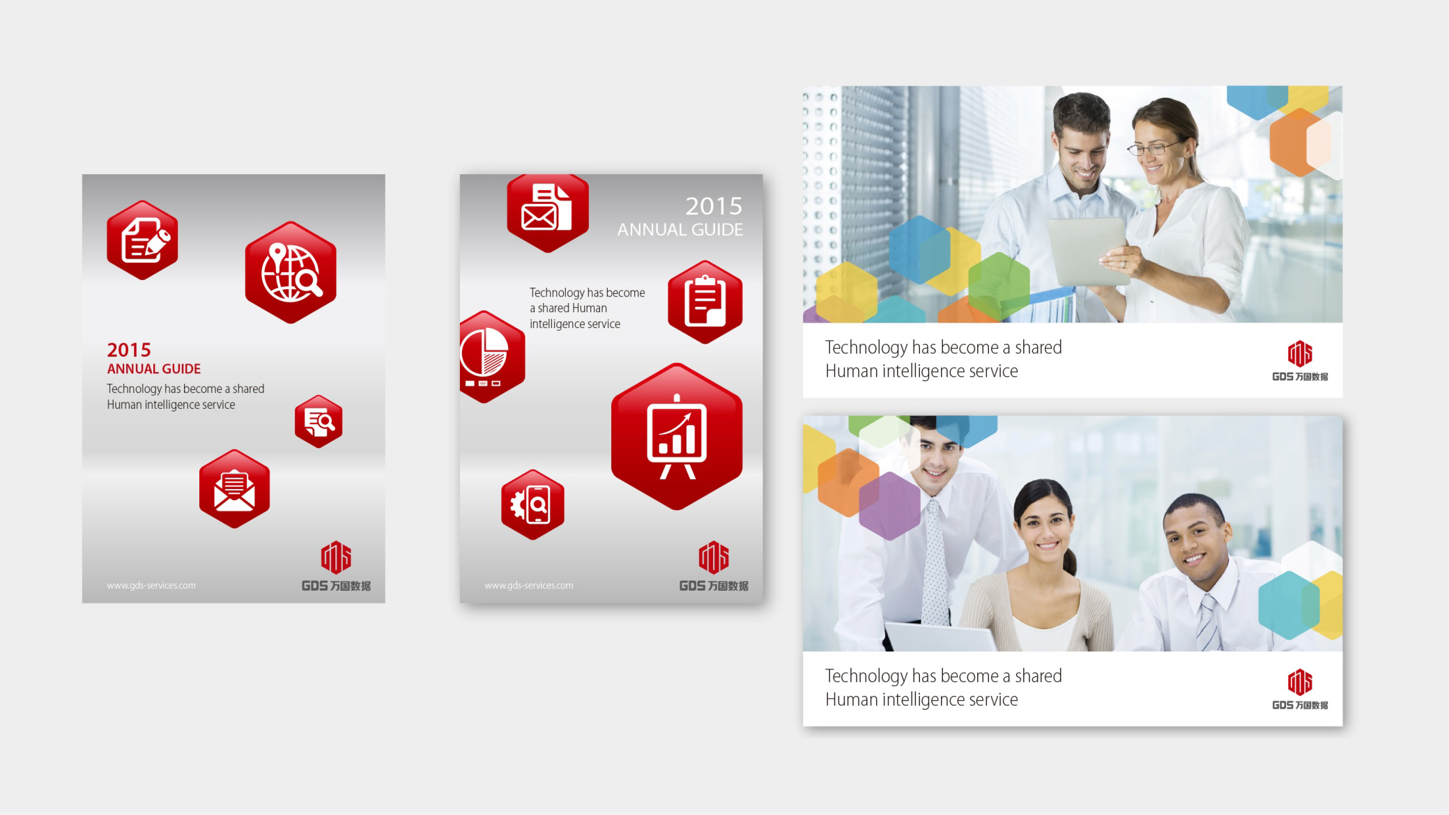
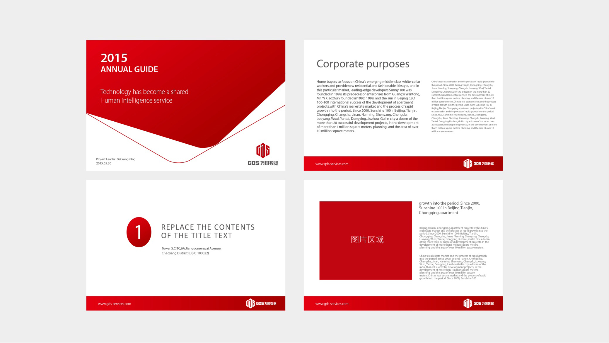
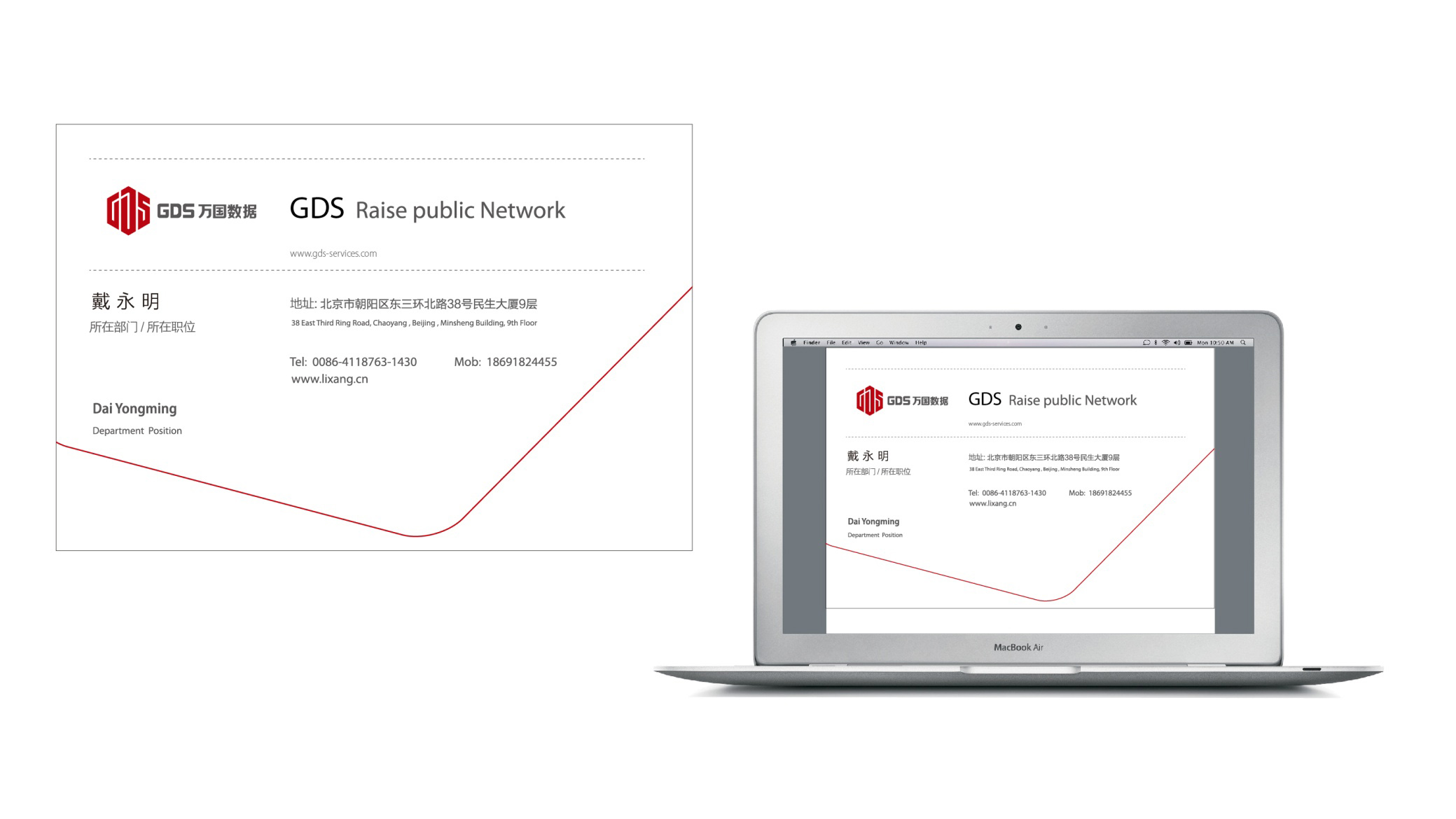
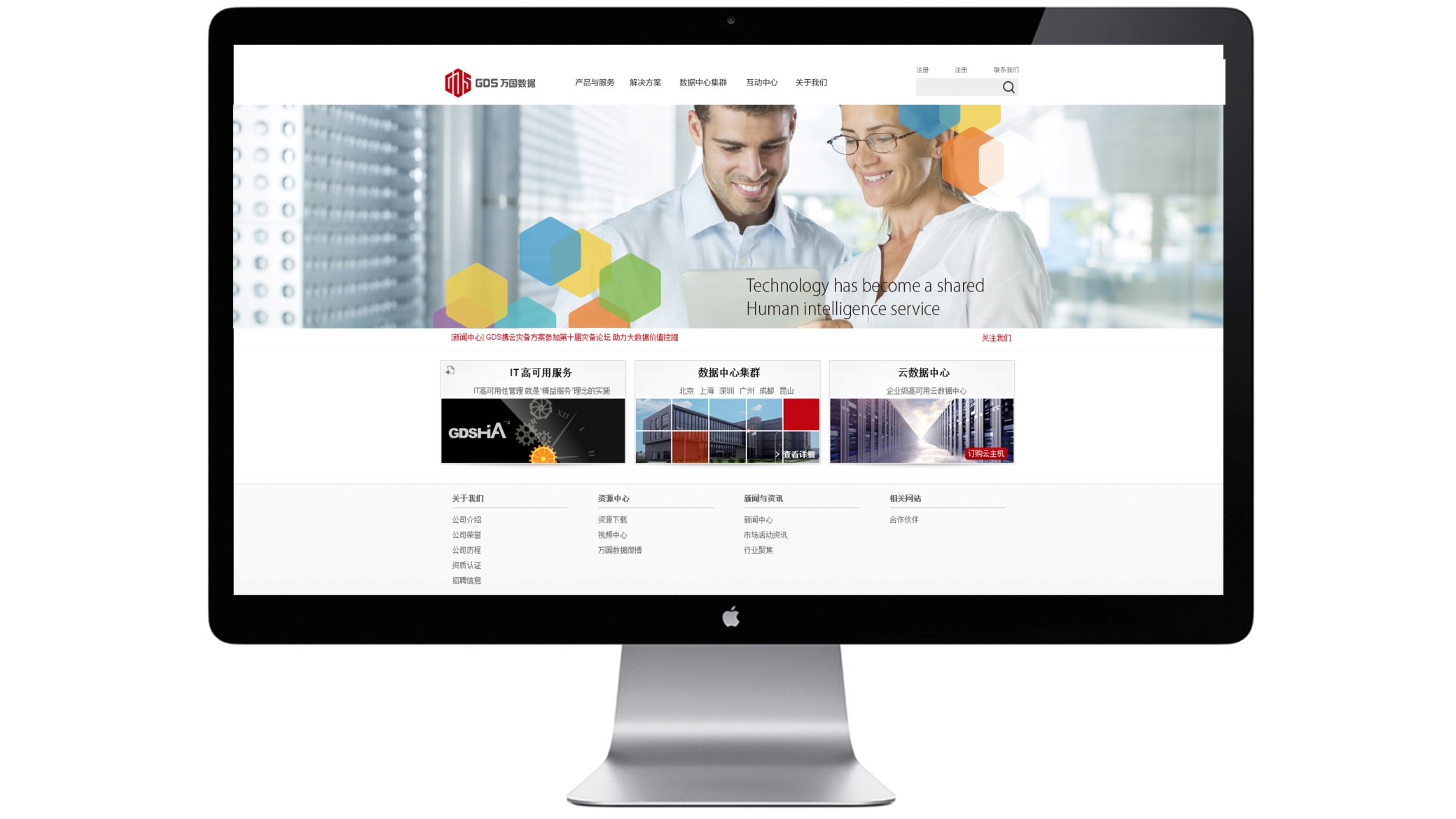
design concept
The logo core comprises 'cube + letterform structure,' expressing the architectural logic and structural stability of data centers through three-dimensional geometry. The red cubic volume represents GDS's solid foundation in high-density data storage; geometricized letters 'G,' 'D,' 'S' are embedded within the cubic structure, signifying 'data integrated in structure, technology supporting the world.' The overall form evokes both the modular stacking of data warehouses and the firm's steady growth.
graphic language
Cubic form: represents structural order and spatial logic of data centers; Embedded GDS letterforms: embodies deep integration of brand name and data technology; Sharp-angled lines: symbolize technological precision, efficiency, and industrial engineering spirit; Red cubic volume: signifies energy, velocity, and the progressive spirit of Chinese technology. The overall design constructs a visual system through 'geometric rationality + architectural logic,' finding balance and strength between technology and engineering.
Fonts and composition
The English wordmark "GDS" and its Chinese name use a modern, industrial sans-serif with strictly horizontal and vertical strokes and tight spacing, expressing technical rigor and structural unity. A medium-bold weight creates a solid counterpart to the cube symbol. An overall ratio of about 1 : 1.2 (symbol : type) ensures strong recognition on buildings, server equipment, and brand materials.
color system
Primary Industrial Red #C1302D: represents energy, trust, and industry leadership; Supporting Deep Gray #5B5B5B: symbolizes technological rationality and system stability; Silver White #F6F6F6: used for backgrounds or digital interfaces, enhancing spatial hierarchy; Gradient Dark Red #8B1D19 → #C1302D: conveys technological flow in digital media. The overall palette constructs a brand impression of 'Chinese technology × engineering order,' balancing authority and modernity.
Application and extension
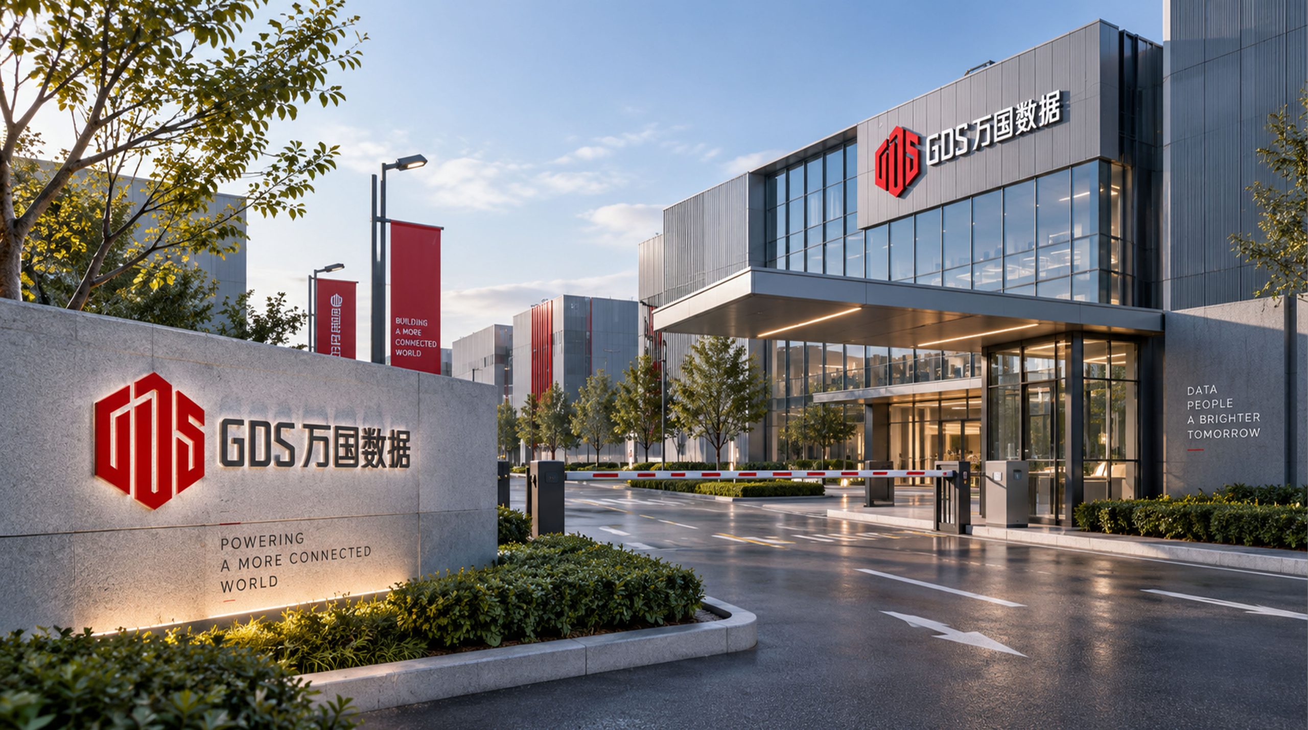
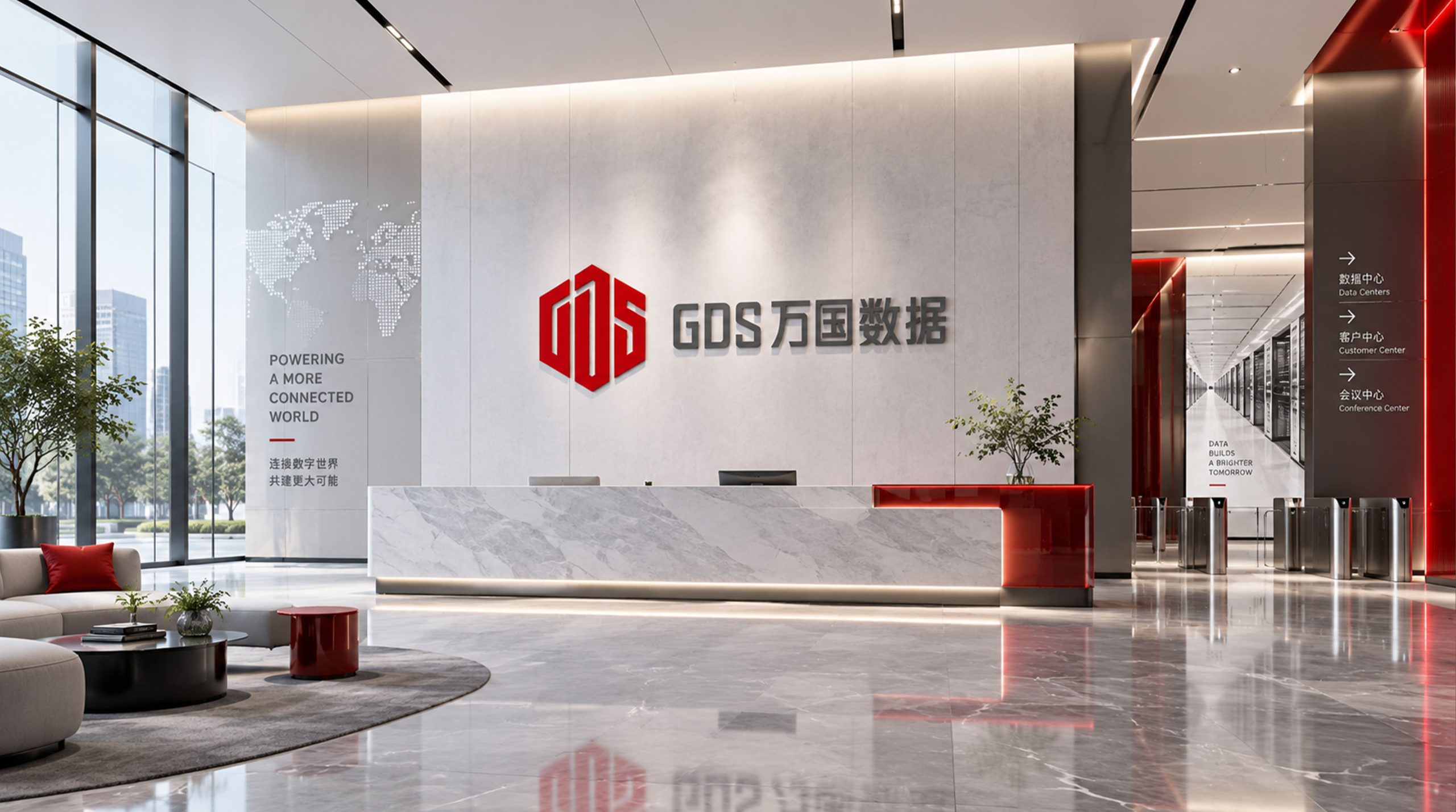
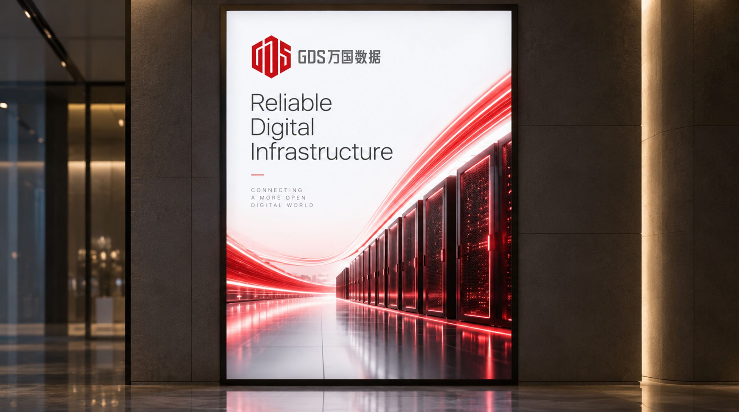
The logo system applies broadly across: data center facades, equipment room corridors, control panels, and security access systems; technical whitepapers, server nameplates, websites, and system backend interfaces; employee uniforms, ID badges, stationery, vehicles, architectural wayfinding systems; digital animation, where the cubic graphic can rotate and decompose into 'data flow module' dynamic effects. The graphic blocks can also extend as brand visual texture for spatial displays and promotional materials.
brand meaning
The logo integrates three layers of brand symbolism: Core of Data — the cube symbolizes high-density data centers and technical core; Structural Reliability — geometric lines embody engineering and security; China's Digital Backbone — red visuals represent national technological confidence and international competitiveness. Overall, it symbolizes GDS's national mission as 'information infrastructure pillar' in the digital economy era.
Improper Usage (Protection Specification)
Do not adjust cube proportions or rotation angles; Do not alter the primary red or add shadow effects; Do not use gray type on light gray or low-contrast backgrounds; Maintain clearspace ≥ 20% of graphic width; Minimum display width must not be less than 28mm.
design results
Following the logo launch, GDS formed a unified brand recognition system across international capital and technology markets, widely applied across data center clusters in Shanghai, Shenzhen, Hong Kong, and overseas. The cubic red form became a visual symbol of China's premium data infrastructure industry, known in the technology sector for 'rational construction × stable trust.' The design was created by Qingmei Future and selected for the Asia Technology Brand Identity and Digital Infrastructure Visual Annual.