










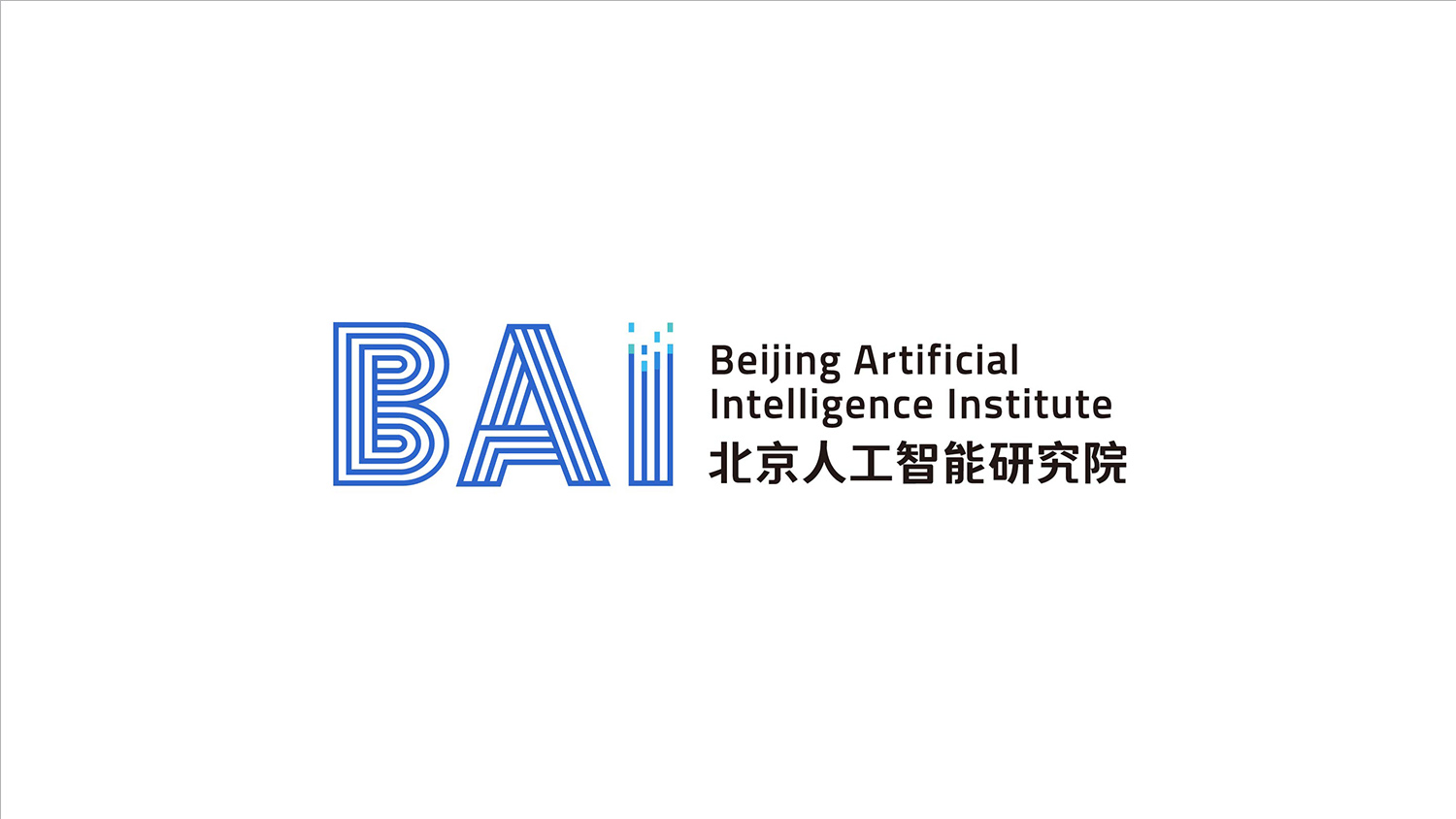
This project created the logo and a systematic visual identity for the Beijing Institute of Artificial Intelligence (BAI).
The goal was to build a visual identity, in an international academic and scientific language, that represents China’s strength in AI research.
Composed around “data × intelligence × order,” the logo expresses the institute’s openness and academic depth in algorithms, science and future technology innovation.
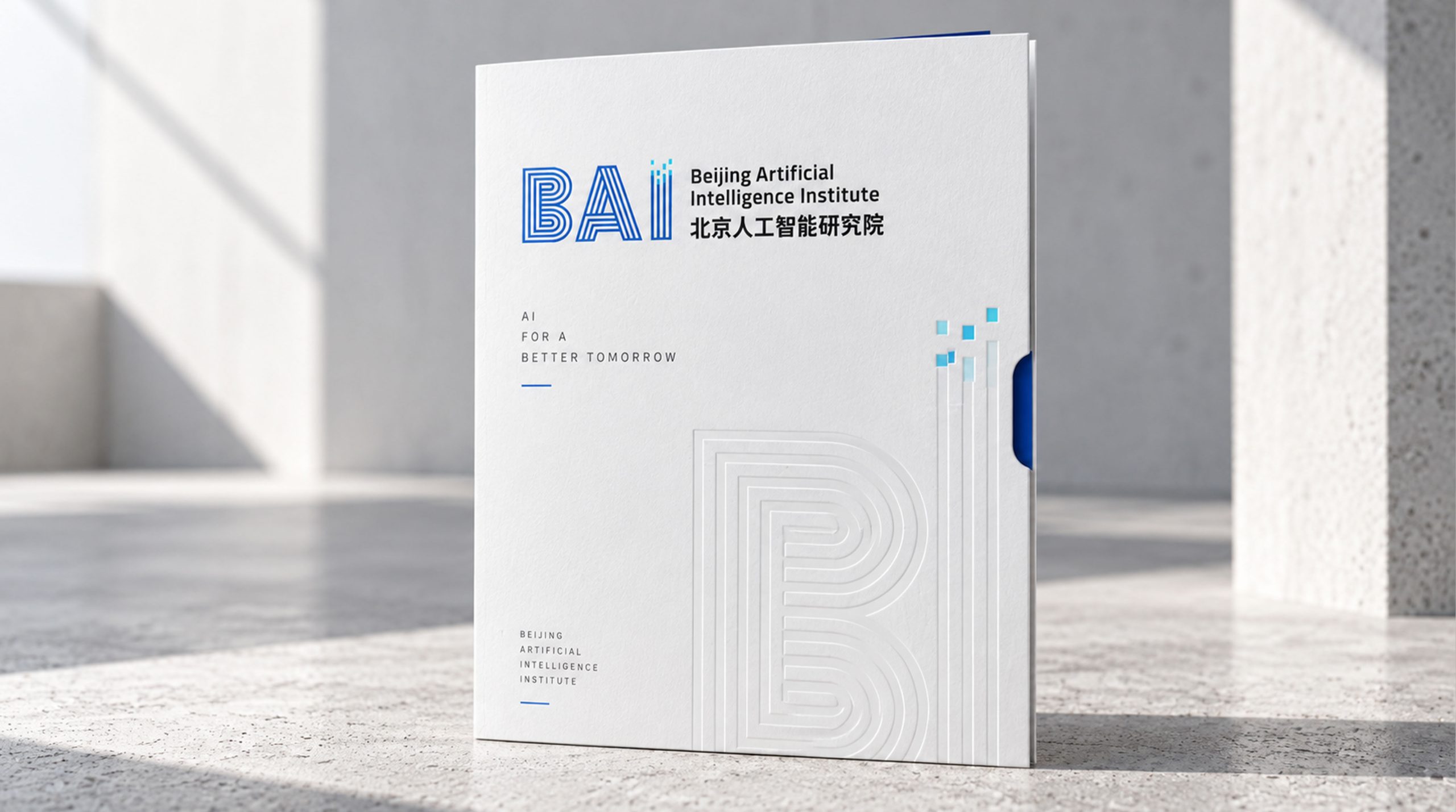
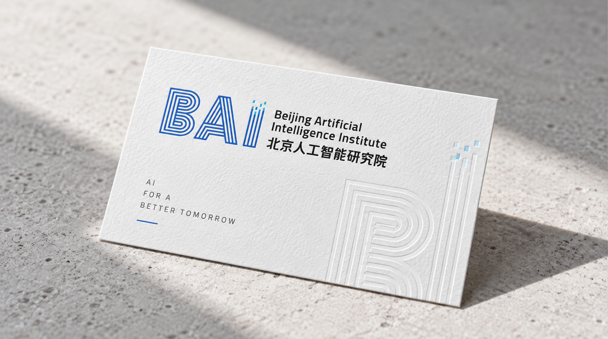

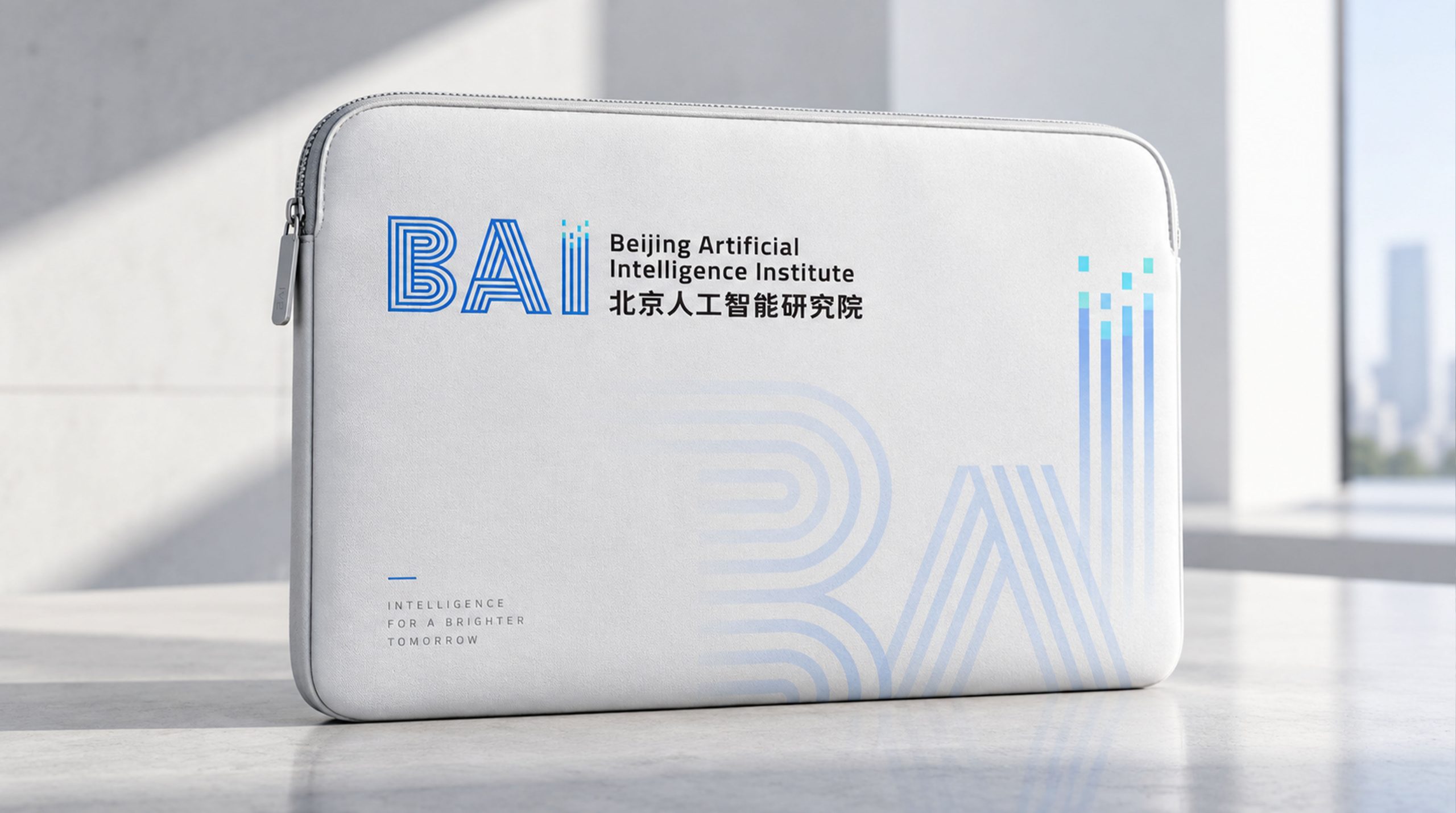
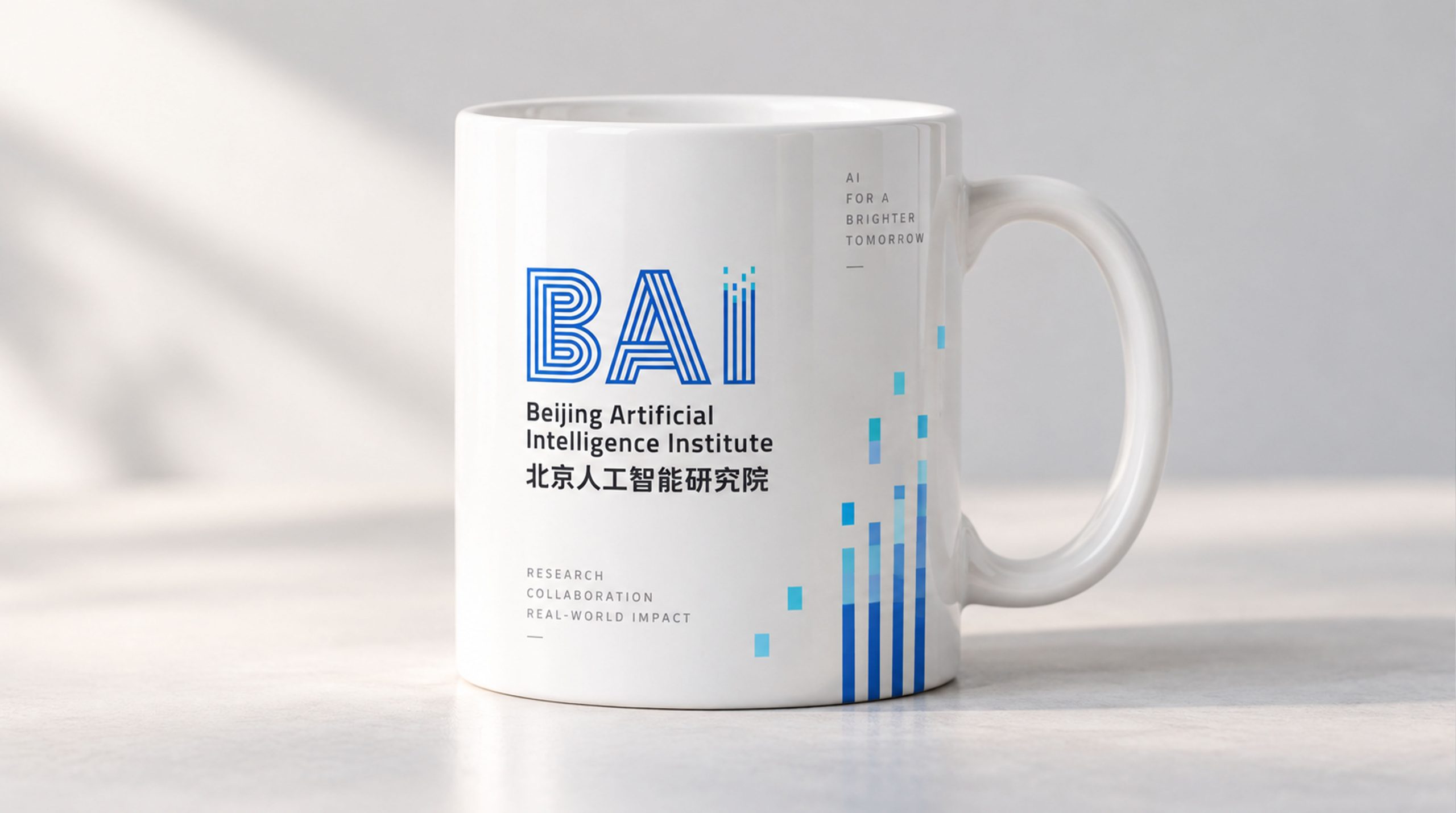
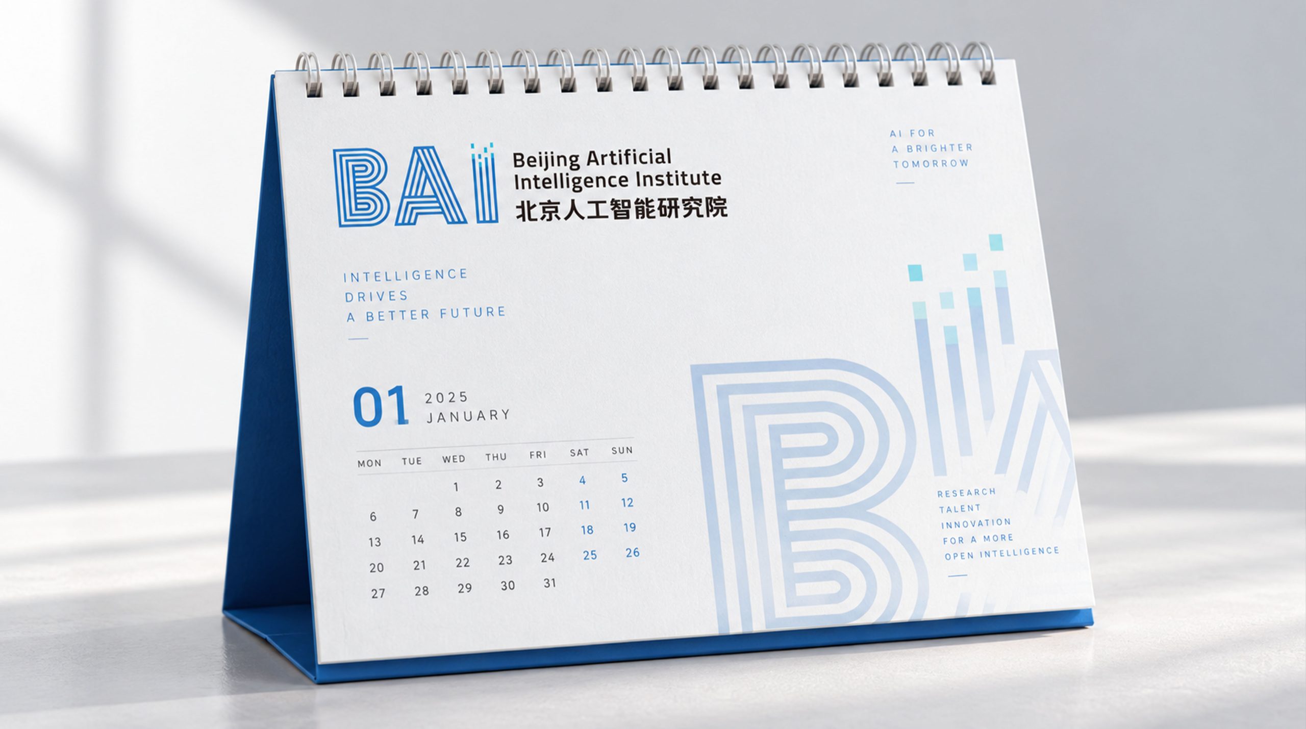
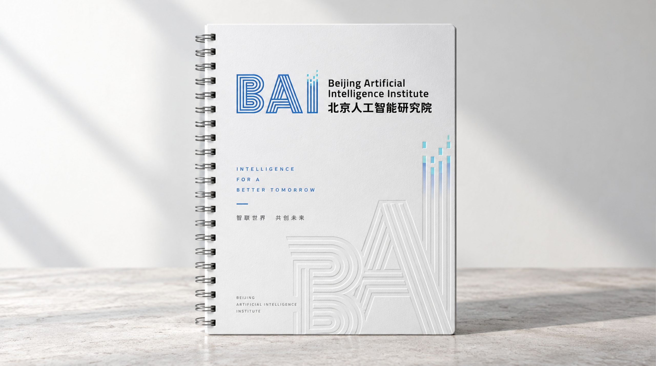
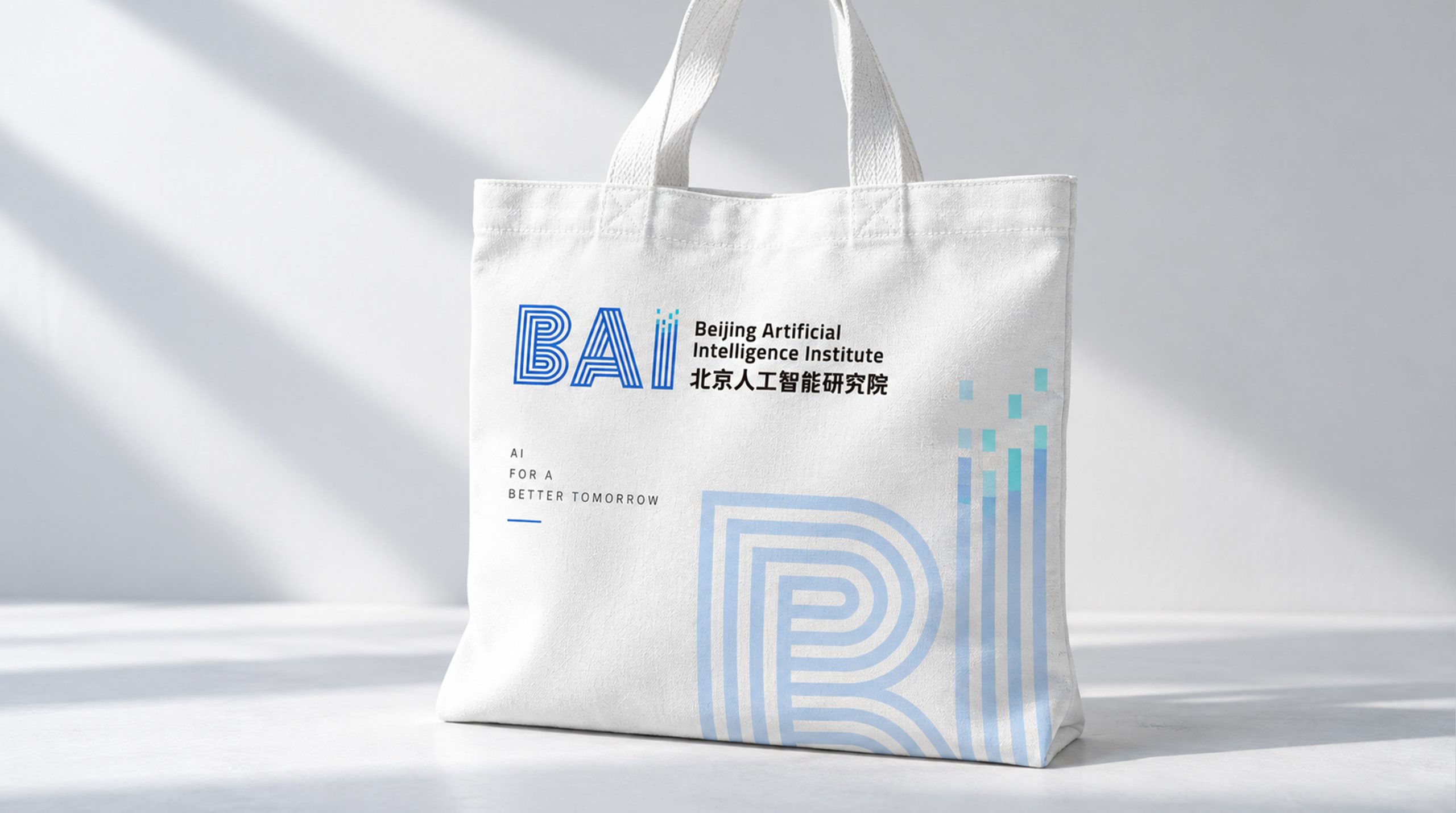
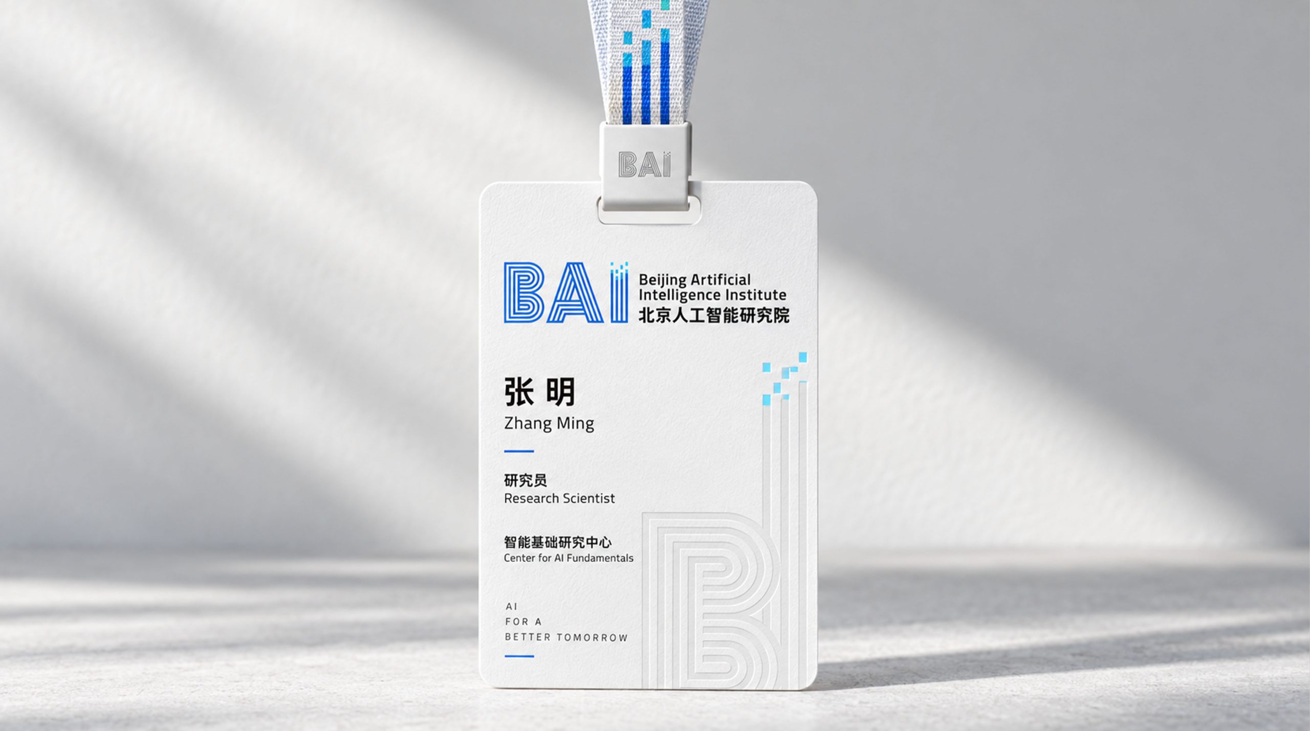
design concept
The design is built on the core idea of “technological rationality × data flow × intelligent evolution.” The primary mark is composed of the three letters “BAI,” rendered in a multi-line structure with an ordered logic that visualizes the “computational trajectories” of artificial intelligence. The “ii” symbol above the letters stands for “Intelligent Interface” and “Information Integration.” The resulting visual language, “energy flowing within rational order,” embodies the precision and innovative spirit of a scientific research institution.
graphic language
Structural logic: letters built from matrix-like lines evoke the layered architecture of algorithmic models and neural networks. Multiple lines: data flow and parallel computing, conveying the logical order of AI. Ascending “ii”: the growth of information, the expansion of thought and scientific innovation. Line rhythm: the structure moves from dense to open, suggesting AI's journey from complex computation to insight.
Fonts and composition
The English name Beijing Artificial Intelligence Institute is set in a modern sans-serif with balanced weight and even spacing. The Chinese name uses a medium-weight gothic, visually unified with the English. The bilingual names are stacked on the right, following the standard layout of international research institutions. The primary mark "BAI" in blue serves as the visual focal point and memory anchor.
color system
Tech Blue #1A56D1: intelligence, rationality and research depth. Highlight Cyan #00AEEF: innovation, growth and inspiration. Neutral Charcoal #333333: balances academic rigor with brand stability. White Space #FFFFFF: reflection, openness and inclusiveness. The blue palette forms the backbone of the identity, strengthening its international visual recognition.
Application and extension
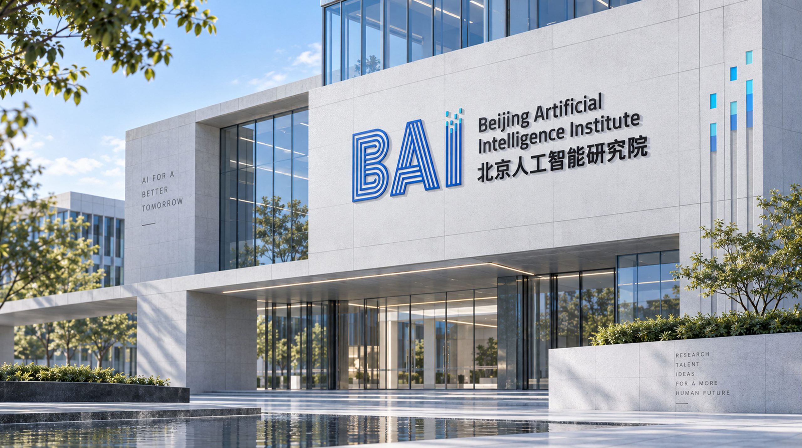
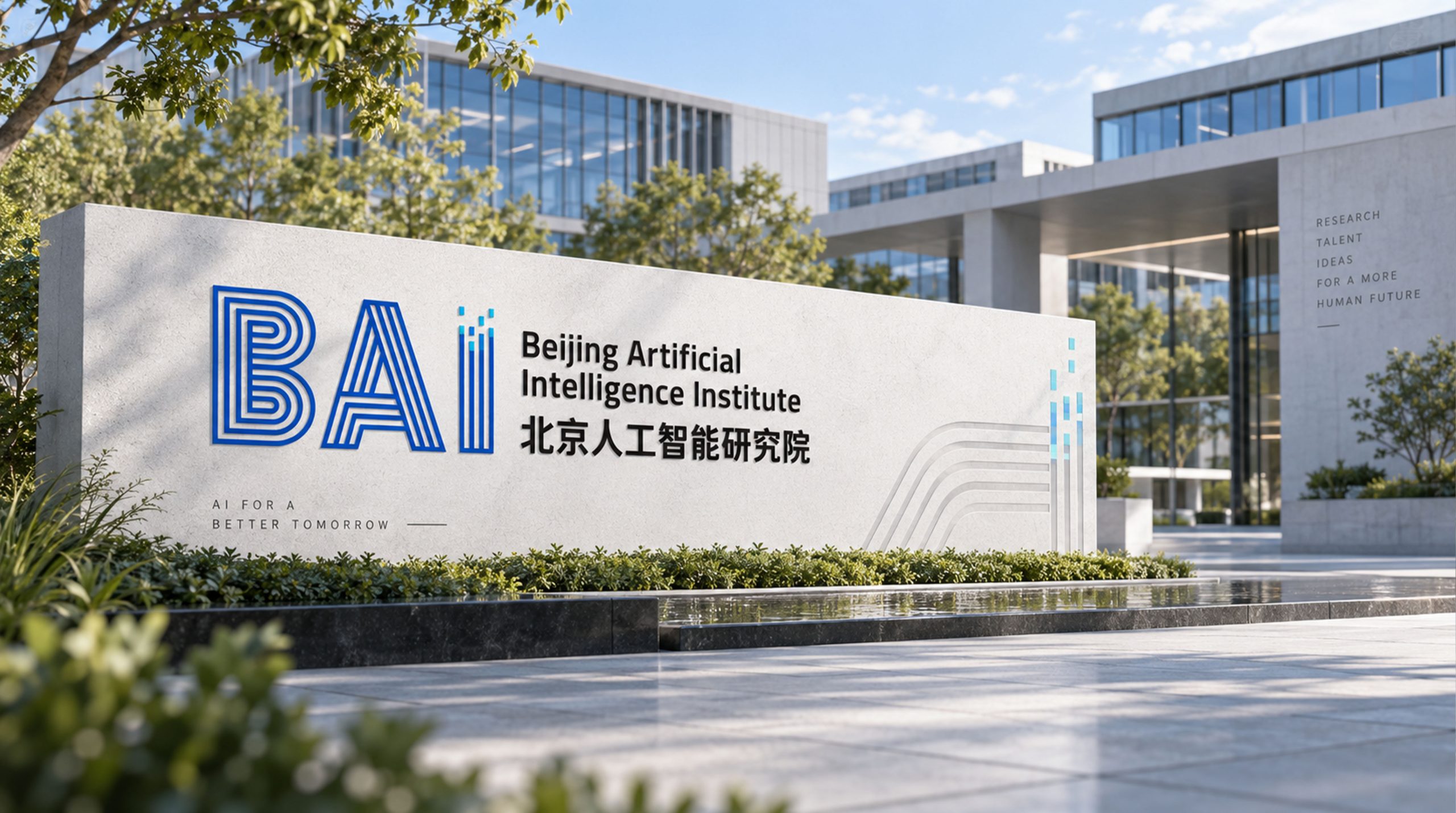
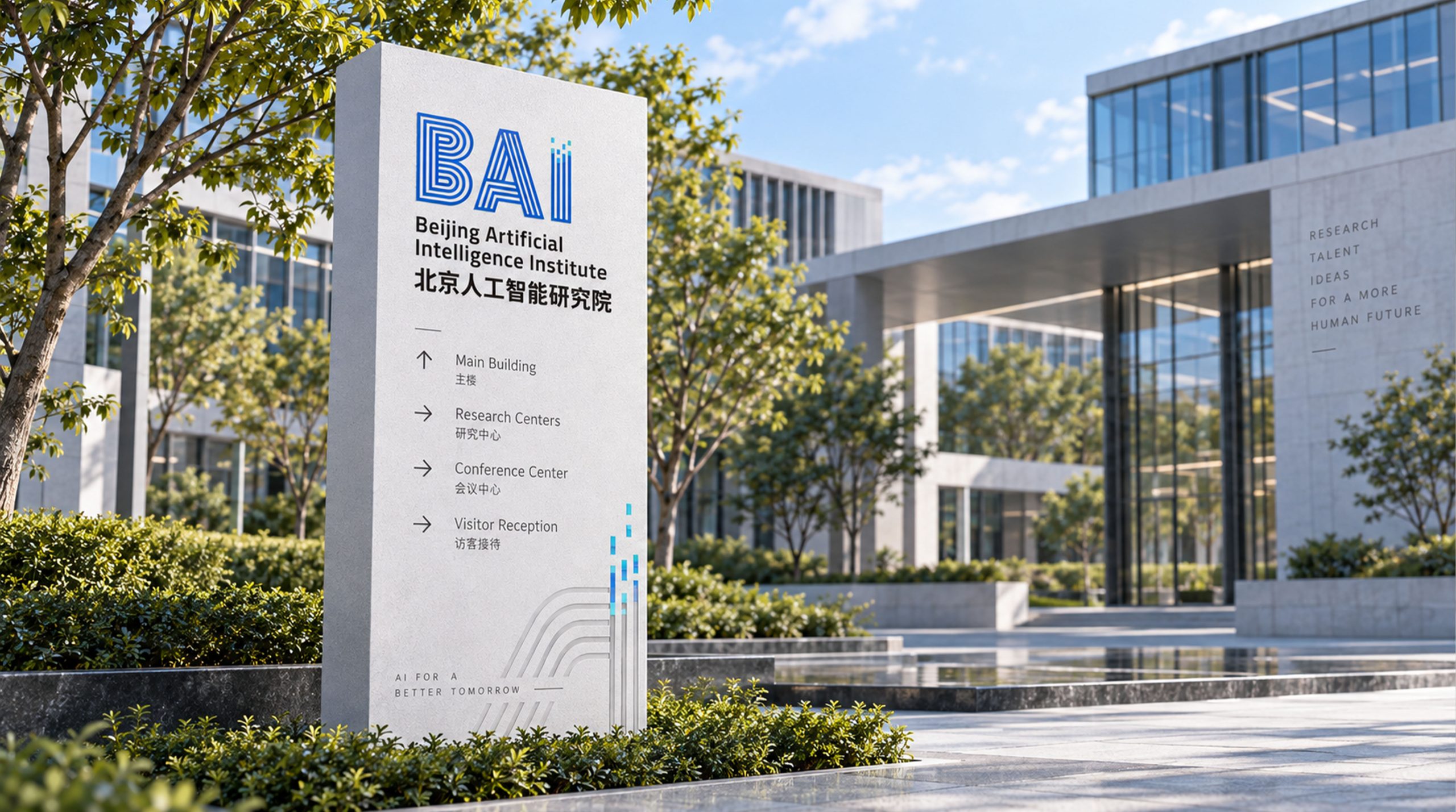
The mark is highly adaptable across academic contexts. Institute system: research papers, scientific publications, reports and conference materials. Academic communications: international forums, posters, the website and exhibitions. Technology product lines: extendable to AI algorithm platforms, data systems and sub-lab brand architecture. Motion version: the multi-line structure animates to depict data input and intelligent generation.
brand meaning
The BAI mark builds its visual philosophy on “rational structure + intelligent meaning.” B: Brain and Base (fundamental research). A: Algorithm and Advance (frontier exploration). I: Intelligence and Integration. Together they express the three-part logic of AI: computation → cognition → creation. The mark embodies the Institute's core belief: “Understand the world through algorithms; connect the future through intelligence.”
Improper Usage (Protection Specification)
Do not alter line spacing or proportions. Do not replace the primary blue with any other color. Do not skew the mark or apply 3D effects. Recommended minimum display width: 40 mm.
design results
Following its launch, the Beijing Artificial Intelligence Institute's new mark was widely acclaimed in both academia and industry. Its linear, technical structure strengthens the Institute's academic character while giving the identity a forward-looking, highly communicable quality. Applied across paper covers, exhibition systems and AI research showcases, it has become “a visual symbol for the era of intelligent research.” The project stands as a landmark in Qingmei Future's structured design work at the intersection of research brands, AI logic and visual systems, interpreting “the visual language of intelligence” through “the rational order of data.”