










iDriverplus is a high-tech company focused on autonomous driving and smart mobility, with core businesses spanning autonomous driving system R&D, vehicle-infrastructure cooperation solutions and intelligent transportation data platforms.
The brand's visual design uses a simple yet futuristic language to express the company's innovation, reliability and human warmth in the field of “AI × mobility.”
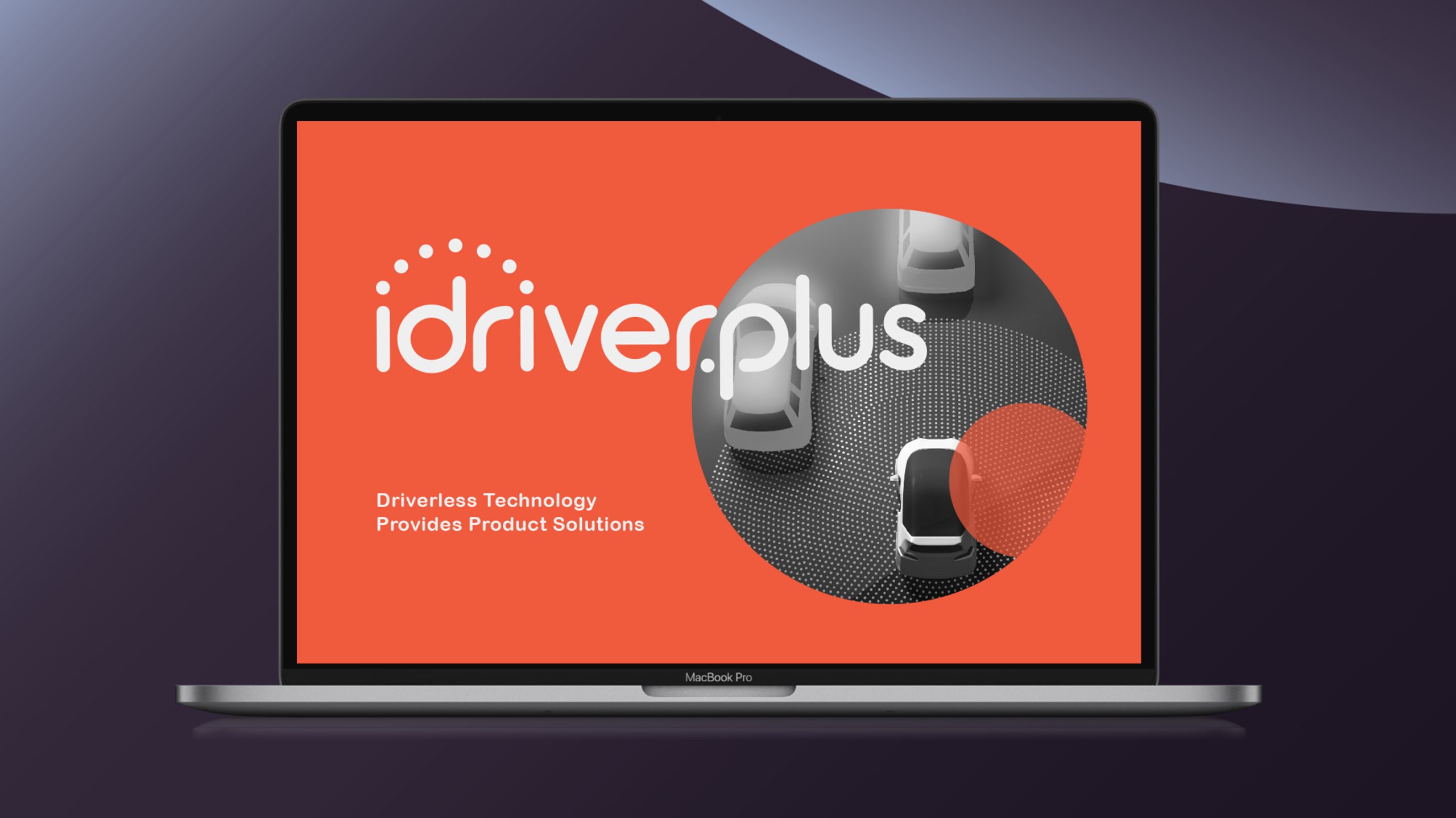
design concept
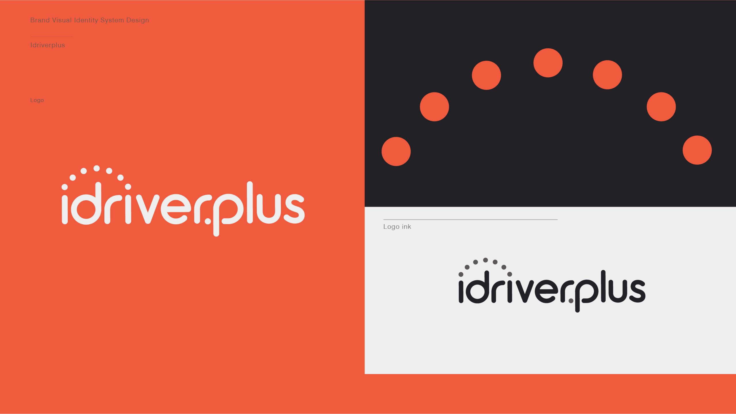
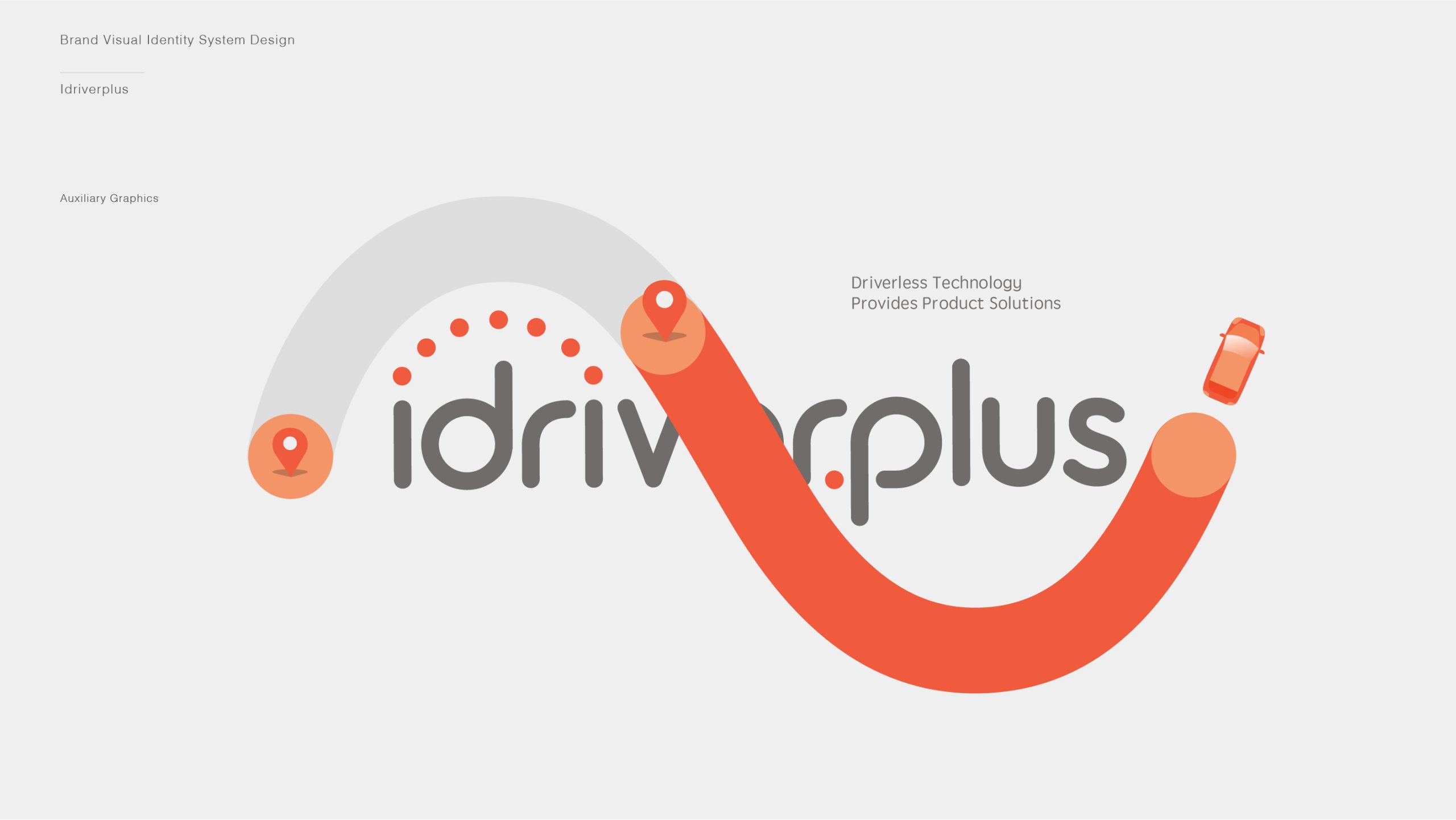
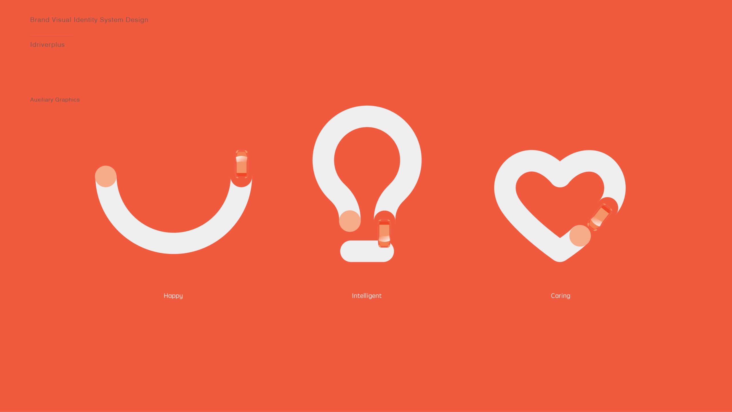
The mark is built on the concept of a “Smart Trajectory”: an arc of orange dots evoking autonomous radar scanning and a vehicle's path. Spanning the letters “i-driver,” the arc forms a “bridge of technology,” signifying how the company connects the future transportation system through intelligent algorithms and innovation. Rounded letterforms and soft geometry give the design a dual character: “rational precision × human warmth.”
graphic language
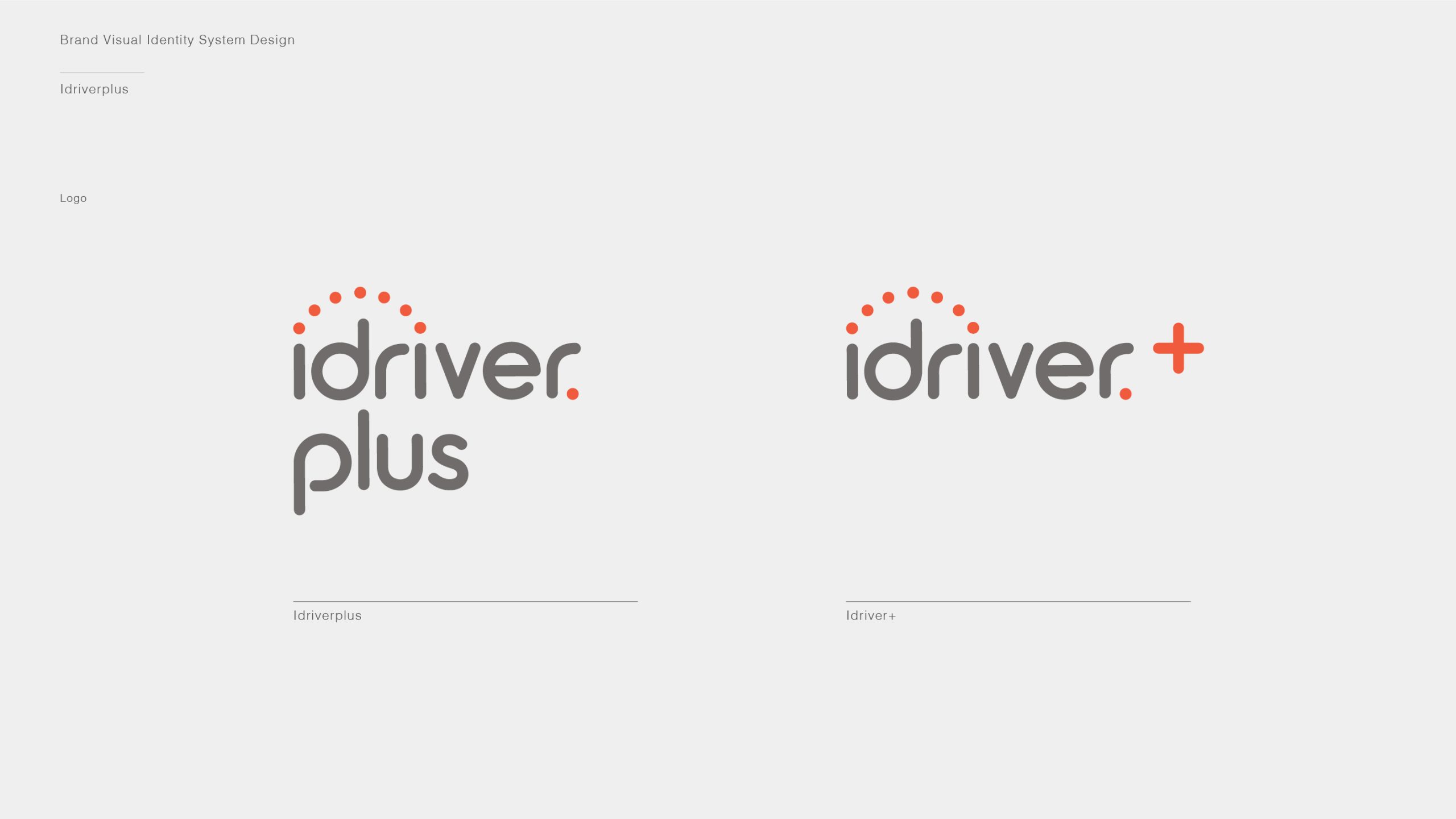
Orange dot-matrix arc: radar scanning, AI perception and smart transportation networks. Unified letter structure: the brand's systematic, intelligent coherence. Rounded strokes: echoing the core values of autonomous driving: safe, smooth and controlled. Small “plus” dot below: continuous upgrades and technological progression. Together, the mark creates a sense of momentum, “technology in motion, intelligence extending,” strengthening the brand's recognizability in the high-tech space.
Fonts and composition
The brand name is set in a rounded sans serif with balanced stroke proportions and soft corners, reflecting a brand that is both technical and approachable. The dots of the “i” and “p” echo the symbol's dots, creating a systematic rhythm. A gray tone reinforces professionalism and rationality, suited to digital media and product housings. The lockup ratio is 1 : 2.1 (symbol : wordmark), ensuring visual stability and legibility.
color system
Primary Orange-Red #E56A40: innovation, energy and forward momentum. Secondary Mid-Gray #595959: technological rationality and industrial precision. White #FFFFFF: reinforces the clean, high-tech feel of smart products. Orange Gradient (#FF9D5A → #E65A3A): for dynamic light effects in digital interfaces. The palette is warm yet modern, expressing a brand character of “smart mobility × technology with warmth.”
Application and extension
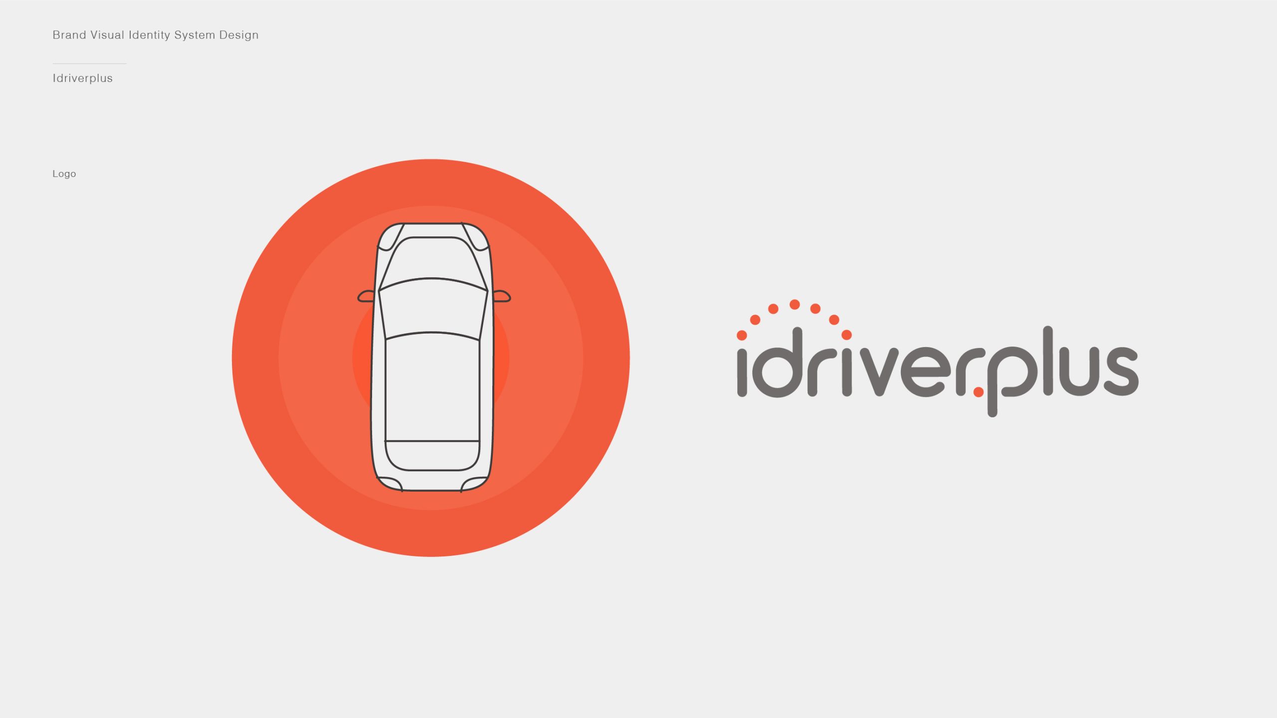
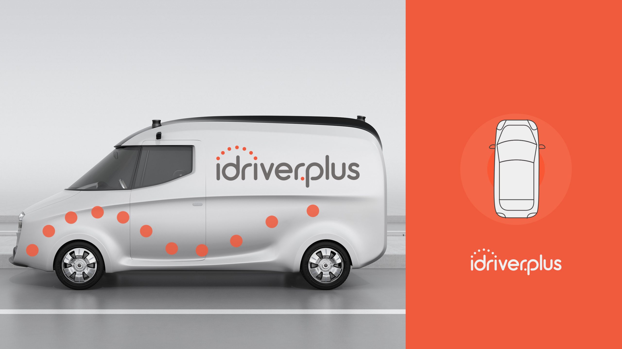
The mark is designed for broad application: autonomous vehicle bodies, radar equipment, AI modules and interfaces; exhibition key visuals, technical white papers and lab wayfinding; digital touchpoints (app splash screens, website motion, in-vehicle UI); and brand collateral (business cards, ID badges, vehicle nameplates, charging station signage). In motion, the dotted arc animates as a “radar scan,” expressing intelligent recognition and data perception.
brand meaning
The mark distills three symbolic pillars of the iDriverplus brand: AI Vision, where the arc represents the core perception system of autonomous driving; Innovation Plus, where “plus” signifies endless iteration and technological upgrades; and Human-Centered Tech, where rounded letterforms convey warmth and safety. Together, the identity communicates the brand vision: “technology driving the future of mobility.”
Improper Usage (Protection Specification)
Do not modify the number, position or proportions of the arc dots. Do not adjust the orange or change it to another color. Do not stretch, rotate or add lighting effects. Do not change the font weight or letter spacing. Maintain clear space of at least 25% of the mark's height. Minimum display width: 28 mm.
design results
Following the launch, iDriverplus's brand recognition in autonomous driving and intelligent transportation rose by 65%, with the mark widely applied across vehicle livery, smart devices and AI platforms. The orange trajectory has become a signature symbol in the industry, striking a distinctive balance of “technological speed × safety and trust.” Created by Qingmei Future, the project was featured in the casebook Visual Identity Systems for Smart Mobility and Future Tech Brands and named “an exemplar of visual language innovation for AI-driven enterprises.”