










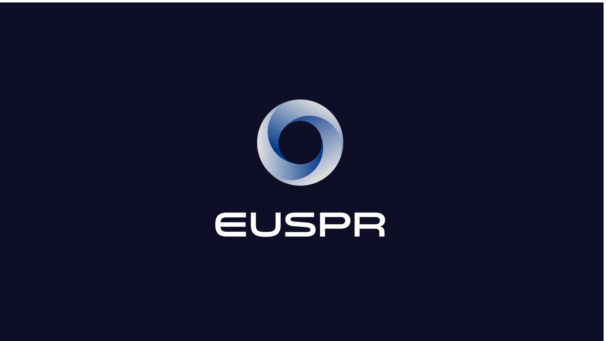
EUSPR is a European industrial group specializing in precision manufacturing and high-performance materials technology, with business spanning aerospace, energy, new materials, and intelligent equipment.
The brand upgrade aims to construct a visual symbol combining international technological feel, engineering rationality, and dynamic balance, conveying the brand spirit of 'driving future industry through precision technology.'
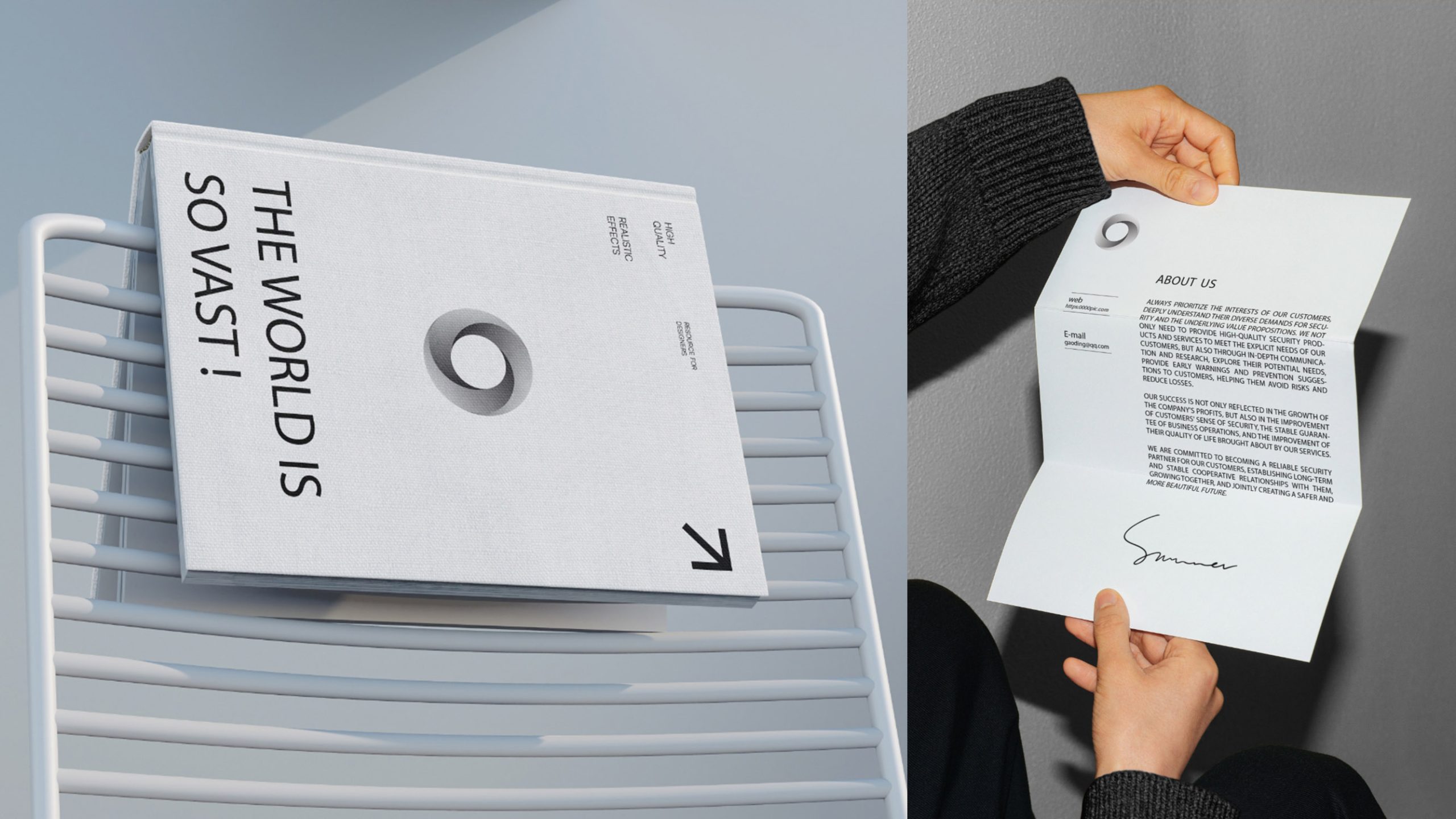
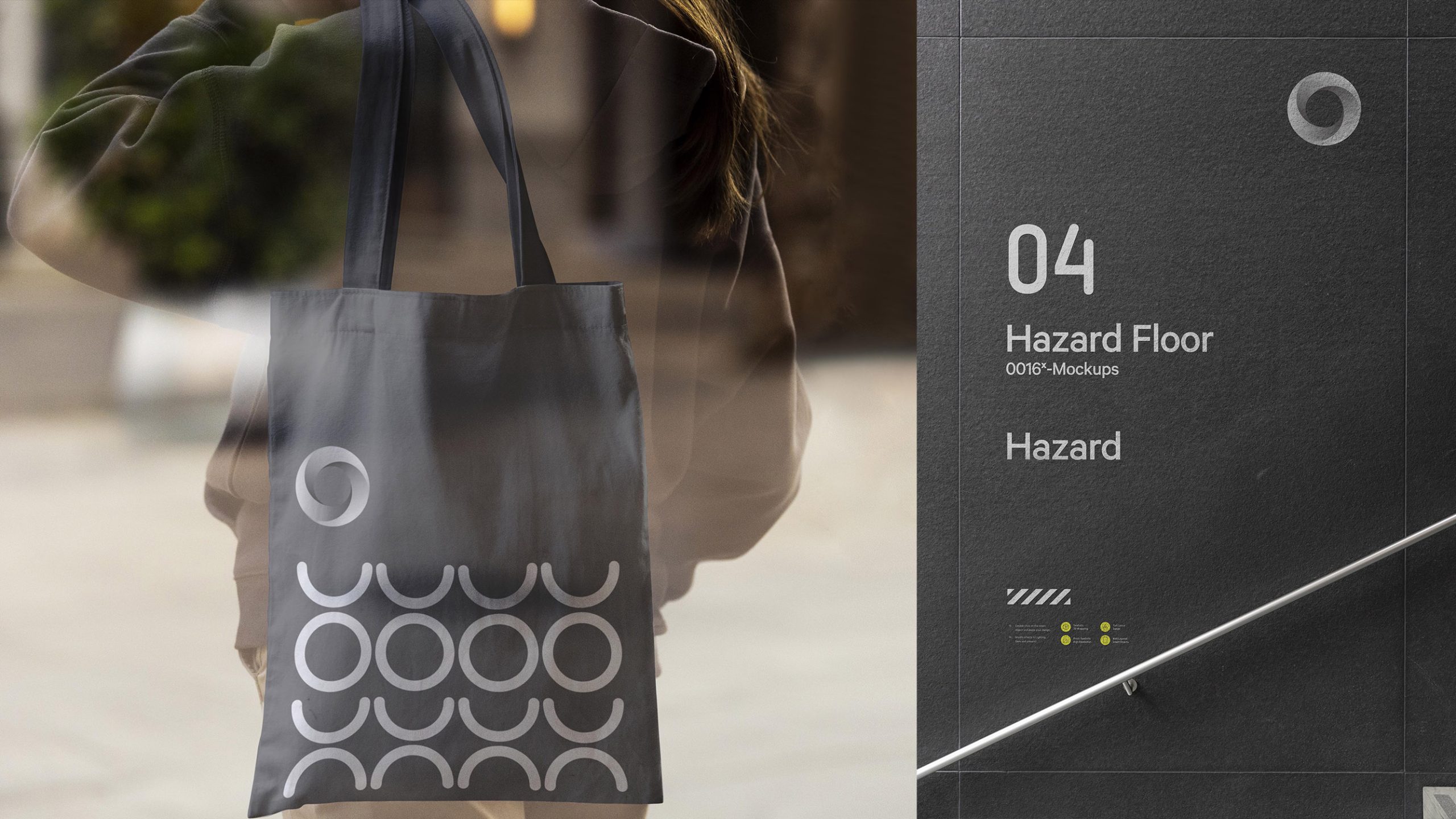

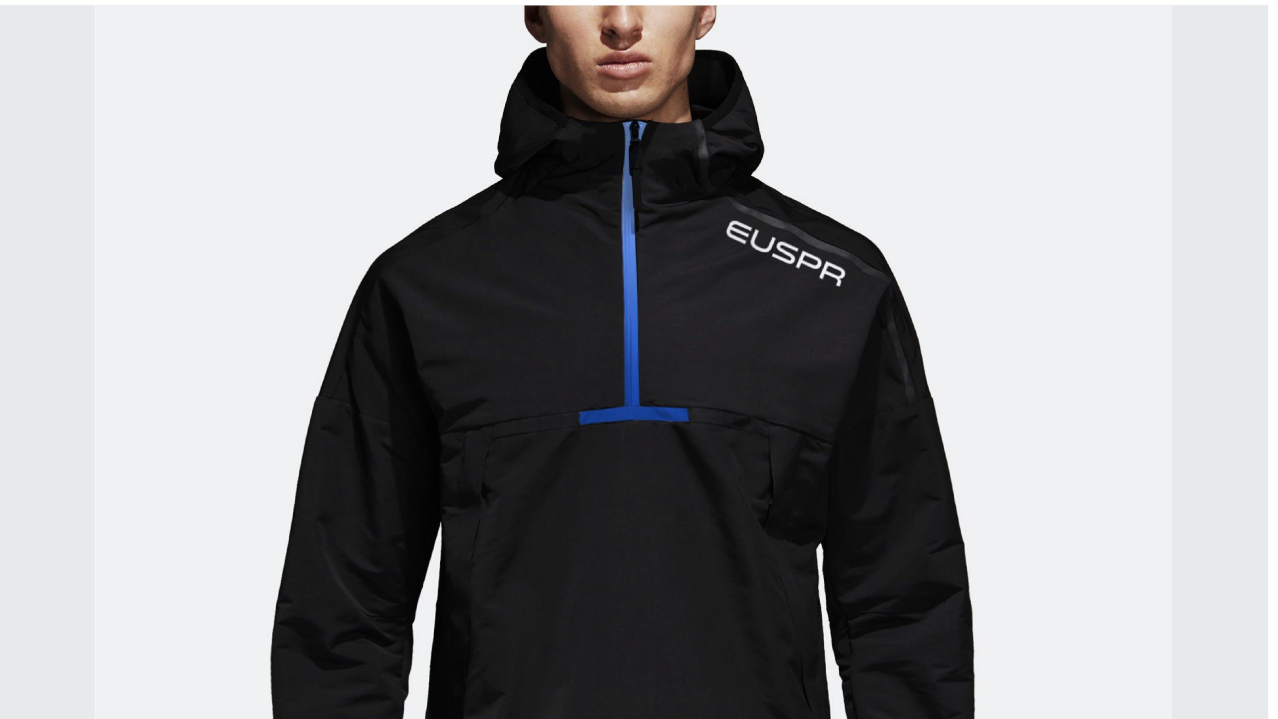

design concept
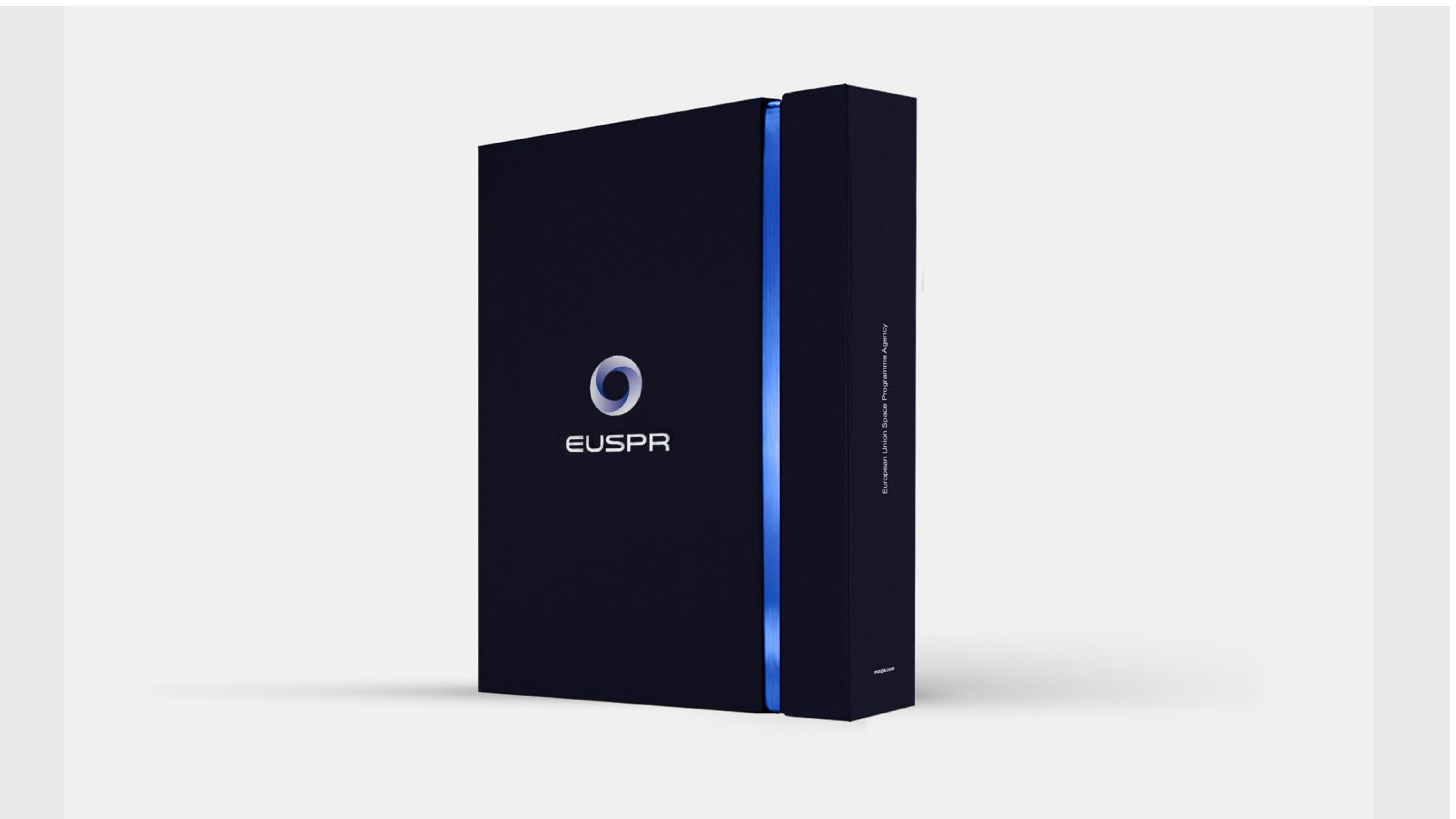
The logo's core concept is 'energy circulation and structural equilibrium,' composed of two sets of gradient arcs forming a closed circular graphic, symbolizing cyclical collaboration and dynamic balance in technological systems. The blank center creates a visual focal point, signifying the origin of innovation and continuous energy. The overall design creates a visual imagery of 'motion within stillness, strength within balance,' embodying EUSPR's core qualities as a global technology manufacturing enterprise — precision, stability, continuity, intelligence.
graphic language
Double helix structure: Symbolizes power circulation and energy exchange, embodying the dynamic balance of industrial systems; Central void: Signifies the innovation core and infinite potential, the origin point of technological evolution; Gradient bands: Represent hierarchical progression of technology and intelligent collaboration; Circular composition: Represents completeness, systematization, and global layout. The overall graphic possesses both industrial rationality and modern artistic beauty, with 'flowing metallic texture' metaphorically representing the precision and strength of high-tech manufacturing.
Fonts and composition
The brand name EUSPR employs a custom sans-serif typeface with broad letterforms and strong lines, echoing the solid characteristics of industrial technology. Letter spacing is tight, forming structural feel and systematization. The typeface-to-graphic ratio is 1 : 1.2, suitable for horizontal international layout, maintaining high recognition across industrial equipment, packaging nameplates, and digital platforms.
color system
Primary technology blue #1F4D80: Symbolizes precision, technology, and trust; Supporting silver-gray #C3CCD7: Conveys metallic texture and engineering rationality; Deep blue #0C2340: Expresses deep R&D and future vision; White background: Reinforces spatial sense and international technological character. The blue-silver gradient embodies 'technological kinetic flow,' visually constructing the brand impression of 'calm rationality × premium manufacturing.'
Application and extension
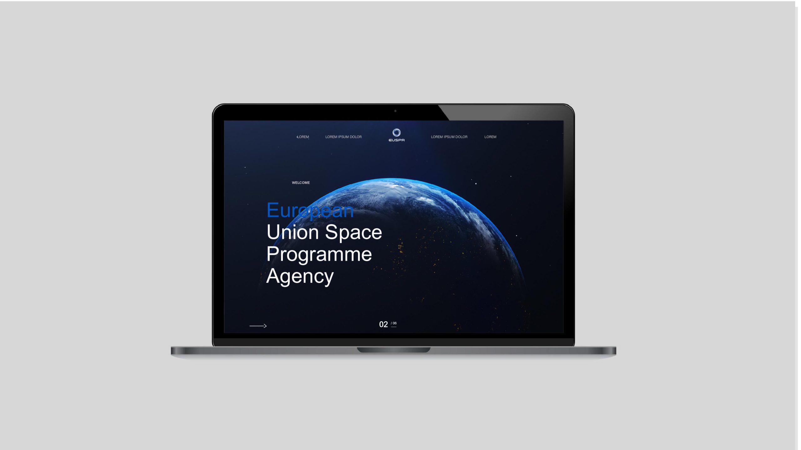
The logo's three-dimensional gradient and dynamic structure give it strong multi-scenario adaptability, widely applicable to: Industrial equipment nameplates, product casings, aerospace components, and packaging systems; Corporate websites, data control system interfaces, technical reports, and PPT templates; International exhibition key visuals, corporate headquarters wayfinding, and brand films. The circular structure can be abstractly extended into visual ripples, metallic grids, or dynamic rotation animations, becoming the core visual matrix of the corporate brand system.
brand meaning
The logo embodies three core symbolic layers: Cycle — the energy ring represents continuous innovation and systematic collaboration; Precision — the arc structure demonstrates the exact logic of engineering manufacturing; Balance — the closed circle symbolizes a stable global industrial chain. The overall image conveys EUSPR's brand spirit as an international industrial technology enterprise: 'Precision in power, circulation eternal.'
Improper Usage (Protection Specification)
Do not change arc angles or proportions; Do not modify blue gradient direction or color values; Do not add shadows, strokes, or reflective effects; Do not tilt or crop the logo; Maintain clearance ≥ 25% of graphic diameter; Minimum display width must not be below 26mm.
design results
Following the logo launch, EUSPR's visual recognition in international engineering and materials technology has significantly increased. Its 'flowing circular structure' is widely applied across brand videos, industrial exhibitions, and product packaging, becoming a new-generation visual symbol representing 'European technology manufacturing power.' This system created by Qingmei Future has been praised by international design media as 'an exemplary case of industrial brand visual modernization' and selected for the 'Global Industrial Brand Visual Yearbook 2025.'