










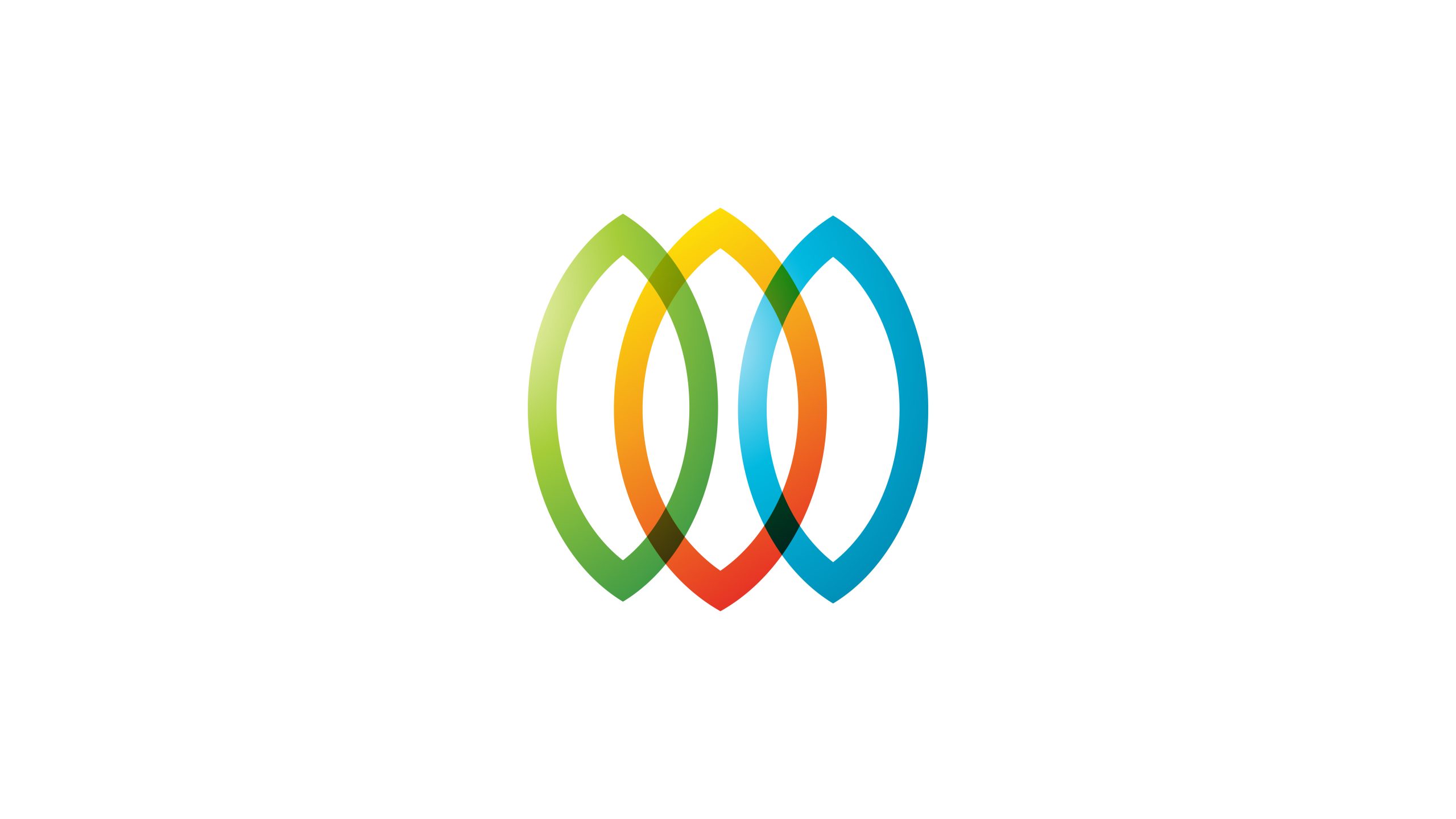
Green Environment is a comprehensive environmental enterprise focused on ecological restoration, environmental governance, and sustainable technology R&D. The brand mission is to drive ecological regeneration through technological innovation, establishing a balanced, symbiotic, sustainable system between urban and natural environments.
The logo design aims to embody the enterprise's core spirit—'circulation, symbiosis, regeneration'—through natural geometric language, bringing vitality and contemporary relevance to environmental technology.
design concept
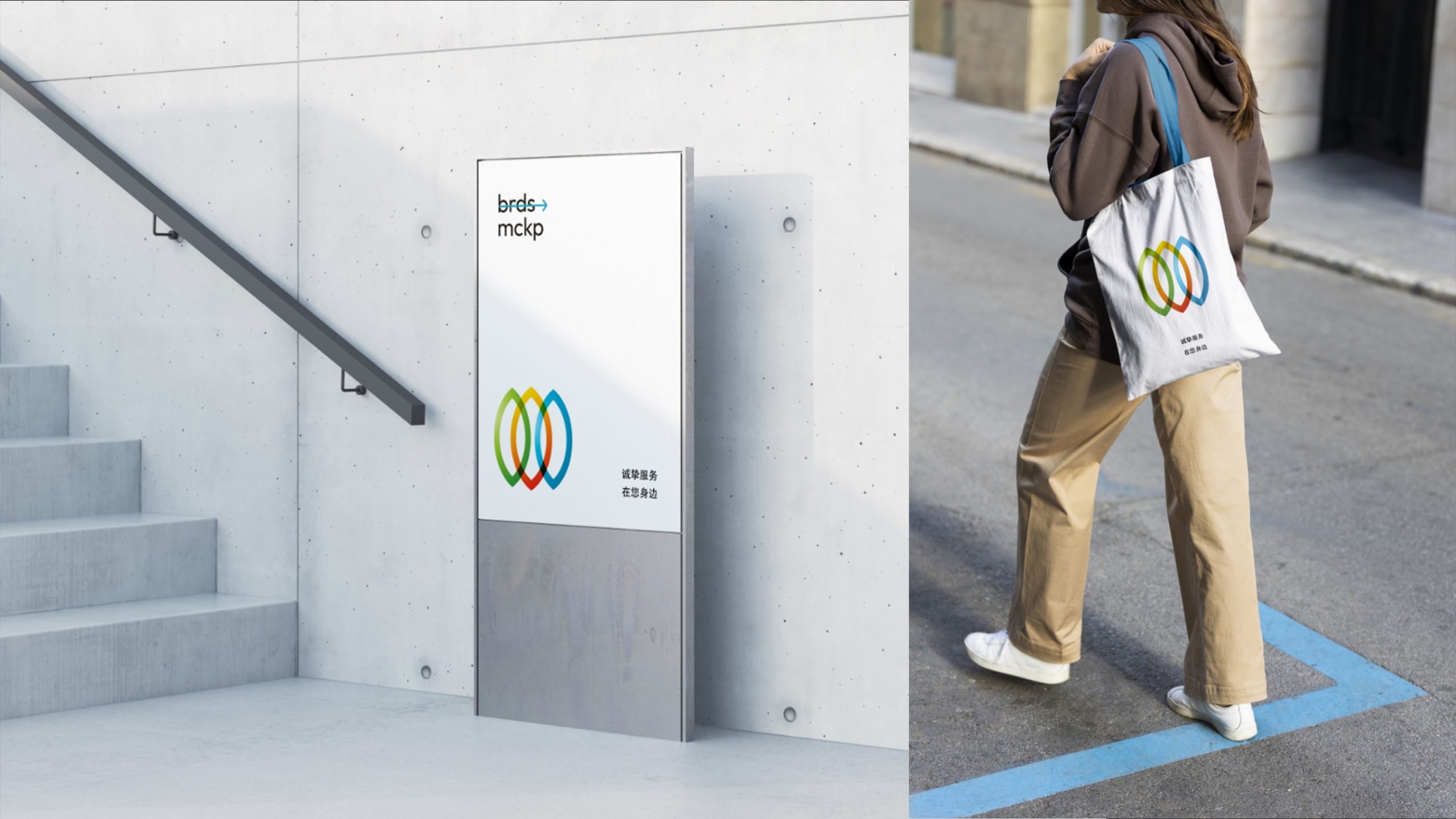
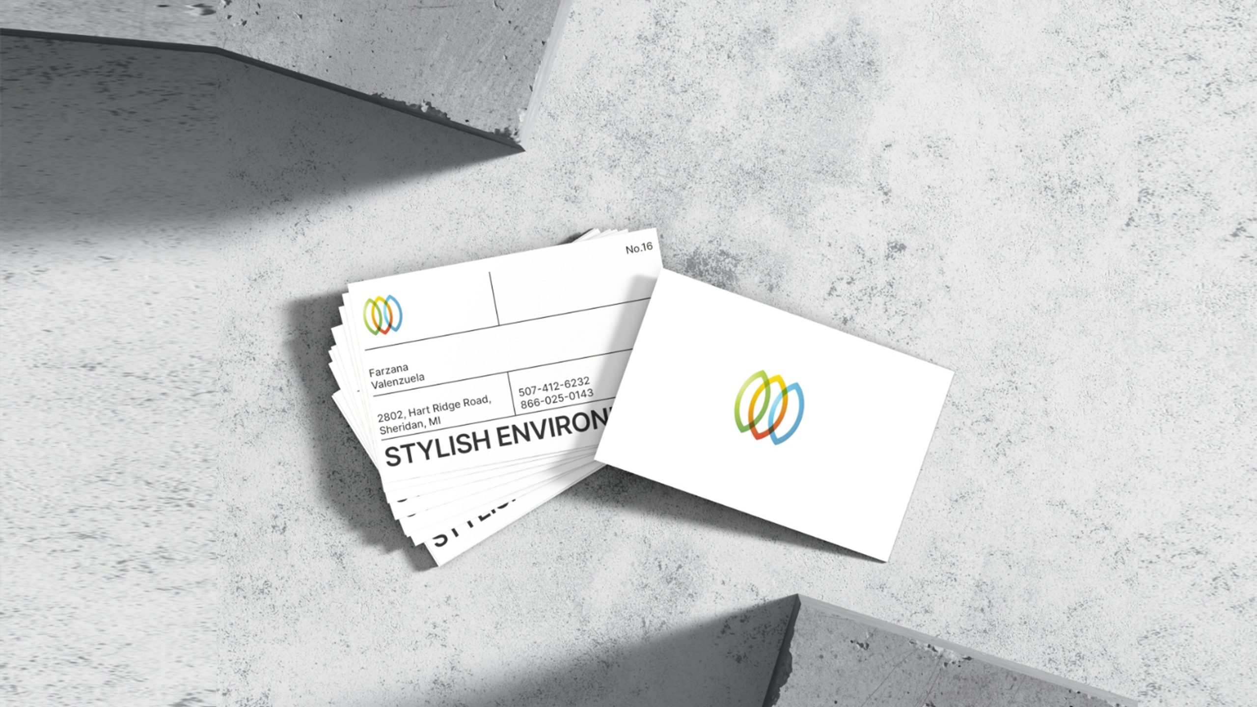
The logo features three overlapping leaf forms as the primary visual element, symbolizing the harmonious coexistence of nature, technology, and humanity. The three-color gradient structure represents the cyclical layers of the ecosystem: green as the natural foundation, yellow as energy flow, and blue as technology and the future. The three elements interweave to form a dynamically balanced ecological symbol, expressing the brand's mission to 'reshape natural order through innovative technology.'
graphic language
Tri-leaf convergence structure: symbolizes the three-dimensional integration of nature, energy, and technology; overlapping transparency effect: expresses ecological circulation and energy transformation; upward growth momentum: signifies the enterprise's sustainable growth and ecological vitality; central symmetrical composition: represents balance, harmony, and controlled development. The overall form is fluid and organic, combining rational geometry with natural rhythm to create a visual balance between 'technological sensibility × life force.'
Fonts and composition
Pair with modern sans-serif typefaces (such as Source Sans Pro / Source Han Sans / Avenir Next) to maintain visual purity and internationalism. Rounded strokes and moderate tracking reinforce a brand impression that is both rational and approachable. Recommended logo-to-text ratio of 1:1.3, with vertical or horizontal layout options to accommodate diverse applications across multimedia, exhibitions, and office systems.
color system
Green #7BC66F: symbolizes nature, ecology, and life; Yellow #E9C742: represents energy, hope, and sunlight; Orange #E2703D: expresses passion and ecological momentum; Blue #3E9ACB: conveys technology, rationality, and trust. The four-color gradient forms the spectrum system of natural ecology, interpreting the interconnection and circular logic of natural ecosystems through visual 'transparent layering.'
Application and extension
The logo offers strong versatility and can be widely applied across: corporate systems (business cards, envelopes, annual reports, brochures); environmental engineering projects, exhibitions, laboratory equipment identification; digital interfaces (websites, apps, data platforms); environmental advocacy campaigns, public welfare projects, and sustainability reports. The tri-leaf structure can be abstracted independently as an icon, texture, or data animation—a core visual element for building a unified 'green technology language system.'
brand meaning
The logo crystallizes the enterprise's three core values: Source of Nature—green symbolizes ecological balance and life continuity; Force of Technology—blue represents rational innovation and intelligent governance; Heart of Humanity—orange-yellow conveys warmth and social responsibility. The fusion of three colors signifies 'protecting nature through technology, inspiring technology through nature,' embodying the brand's development philosophy of 'ecological intelligence' and 'human-centered sustainability.'
Improper Usage (Protection Specification)
Do not alter leaf form proportions, positions, or quantities; do not adjust primary color gradient sequence or values; do not add shadows, strokes, or light effects; do not rotate or skew; maintain clearance ≥ 20% of graphic height on all sides; minimum display width must not fall below 25mm.
design results
Following the logo's launch, Green Environment's brand recognition in the ecology and technology sectors increased by 59%, with widespread adoption across government environmental projects, sustainability exhibitions, and international ecological cooperation initiatives. The transparent, overlapping tri-leaf structure has become the core symbol of the enterprise's visual communication, reinforcing the brand impression of 'technological innovation × ecological circulation.' This design has been included in Qingmei Future's 'Sustainable and Environmental Technology Brand Systems' showcase and recognized as 'a representative case of ecological geometric aesthetics in corporate visual identity.'