










NILE is a brand dedicated to the research, development and manufacture of premium automotive seating systems. It draws inspiration from “the comfort philosophy of Nile civilization”: natural curves, resilient materials and enduring craftsmanship.
The company's vision is to combine human-centered design with engineered structure, creating seating systems that are safe, comfortable and artful, so that every ride becomes a journey of physical and mental ease.
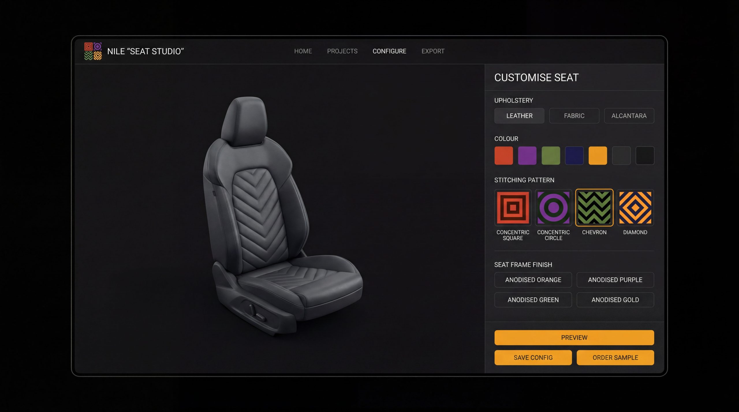
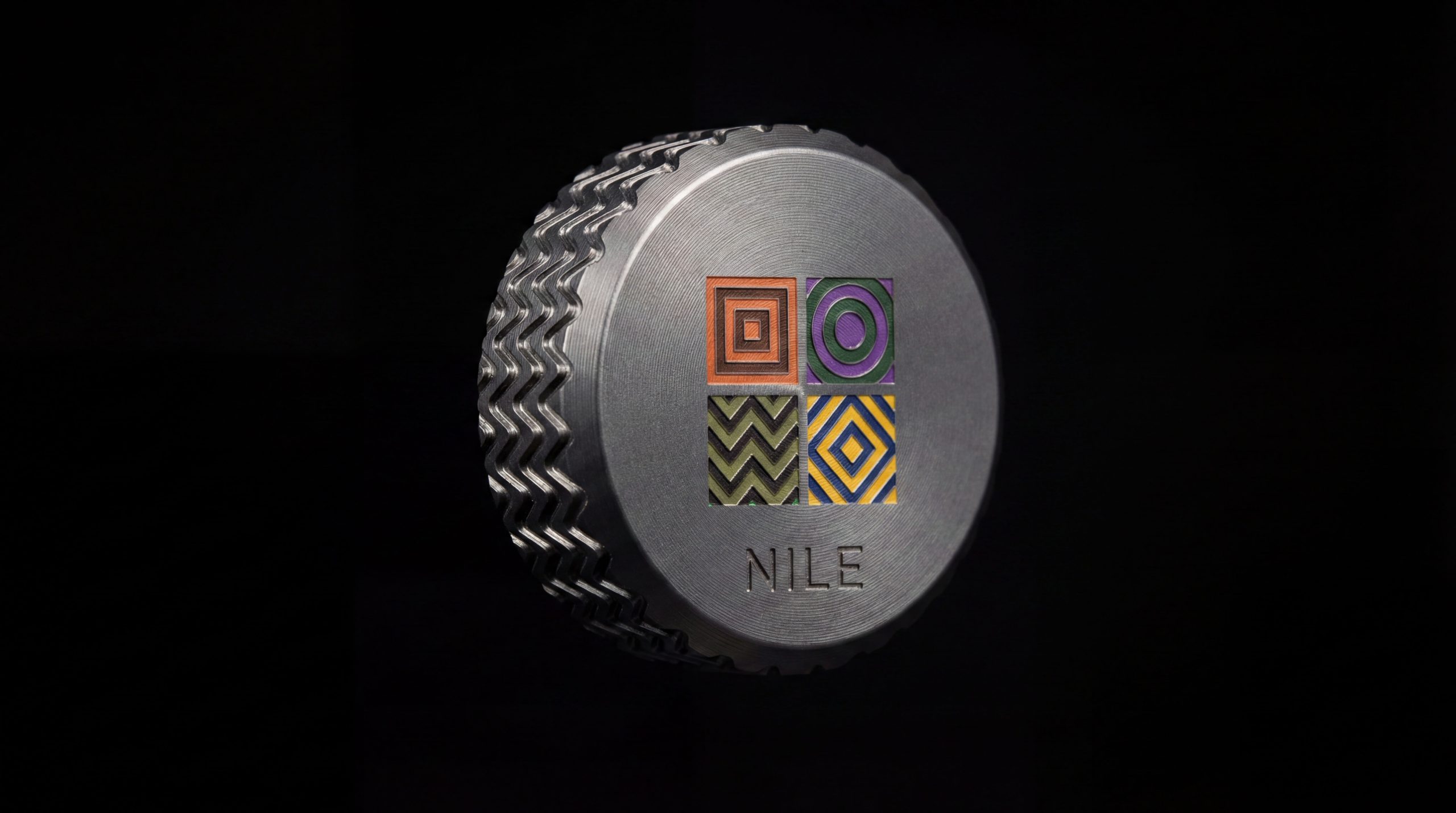
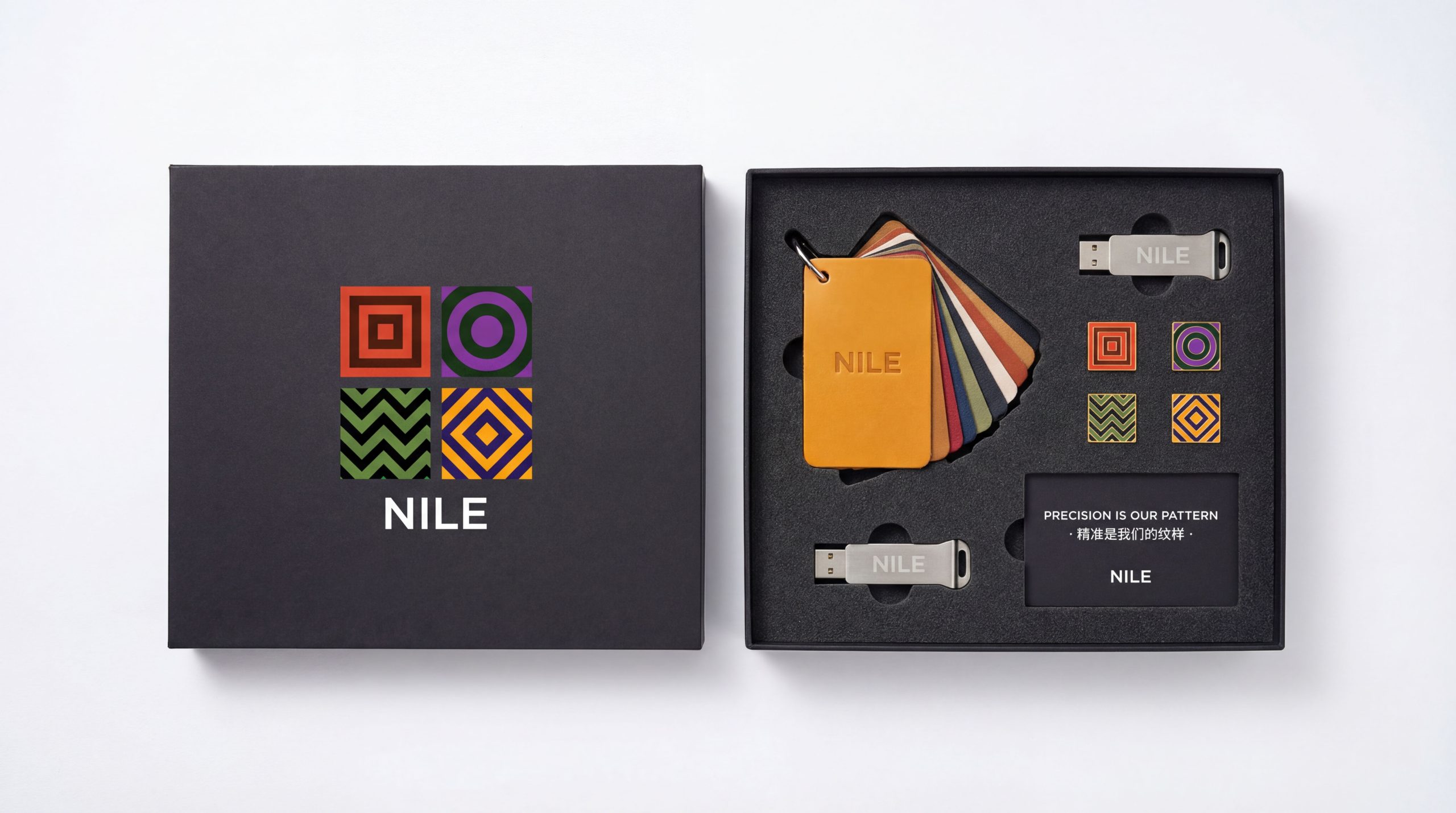
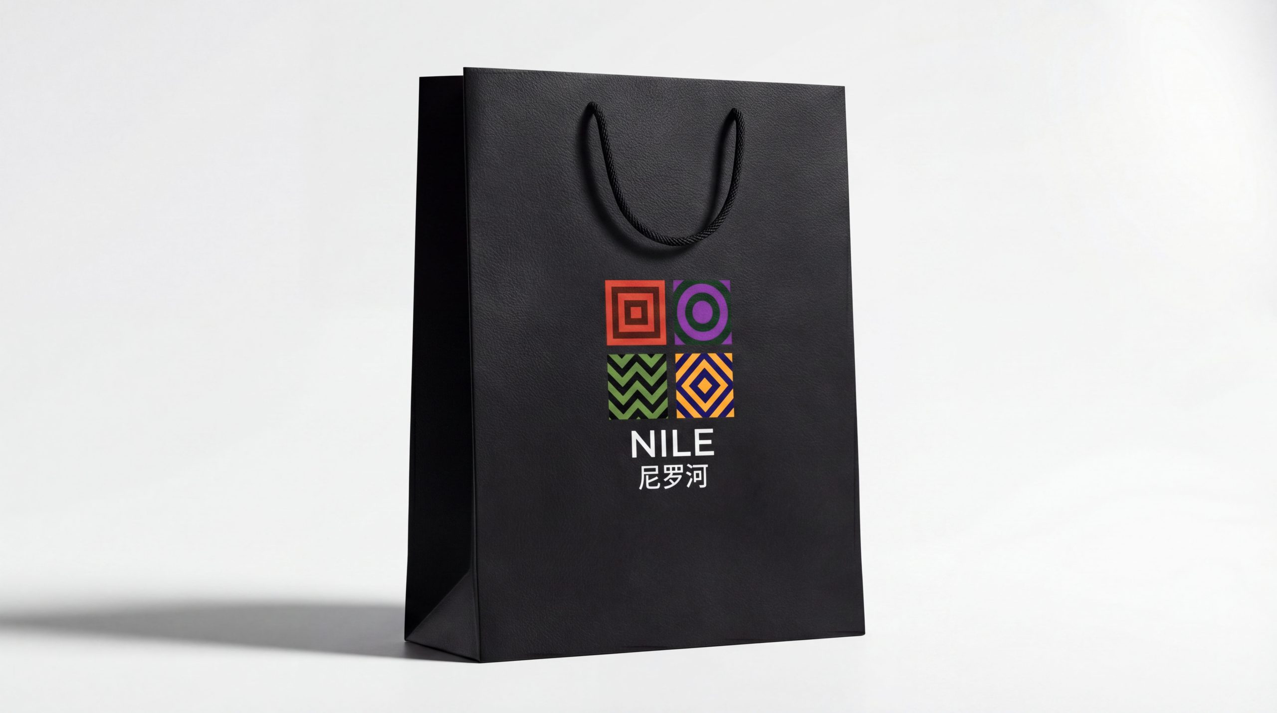
design concept
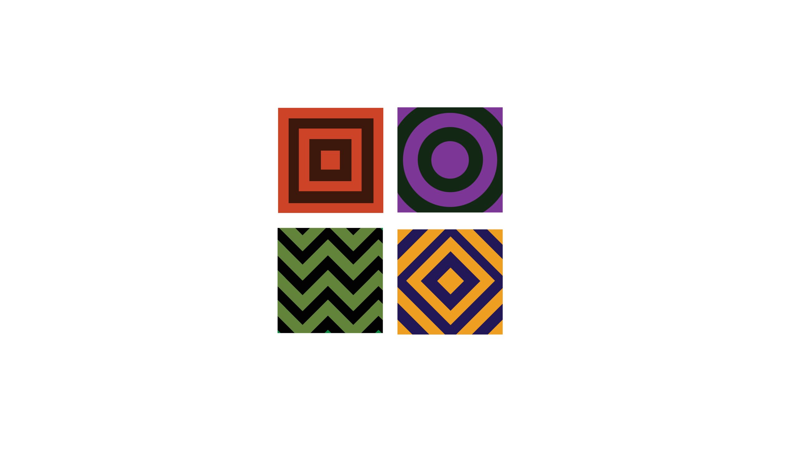
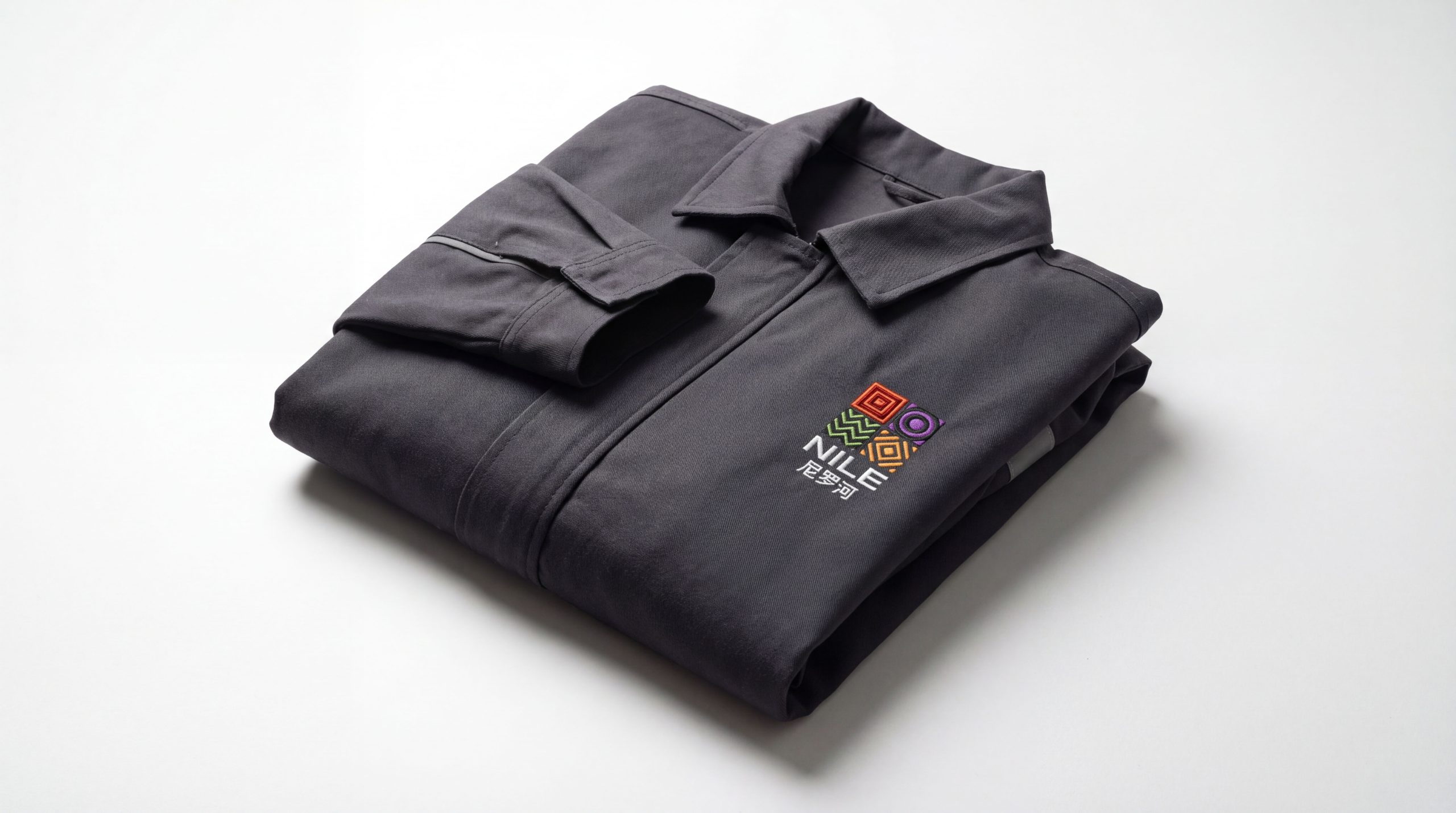
The mark's core idea is “flowing civilization, structured order.” Four independent geometric squares form a matrix that represents four dimensions: strength, flow, balance and comfort. The forms draw on the landscape textures of the Nile and the geometric ornament of ancient Egyptian art. They fuse natural curves × industrial rationality, showing a brand that brings human warmth to mechanical technology.
graphic language
Square forms: the safety and stability of automotive structure, and the base shape of the product. Circle against square: a balance of hard and soft, still and moving. Wave curves: echo the flow of the Nile, evoking comfort and an enveloping experience. Inward focus: each square draws toward its center, alluding to the ergonomic core of the seat, which is support, cradling and relaxation. Together, the four forms make a complete matrix, signifying systematic solutions across vehicle types and seating scenarios.
Fonts and composition
The NILE wordmark uses a custom sans-serif with compact proportions and softly rounded corners, balancing solidity and softness. The verticals of N and E reinforce structure, while the open space around L and I creates a flowing rhythm that echoes the four-part symbol. The composition rests on a square grid, keeping the rational order of industrial design.
color system
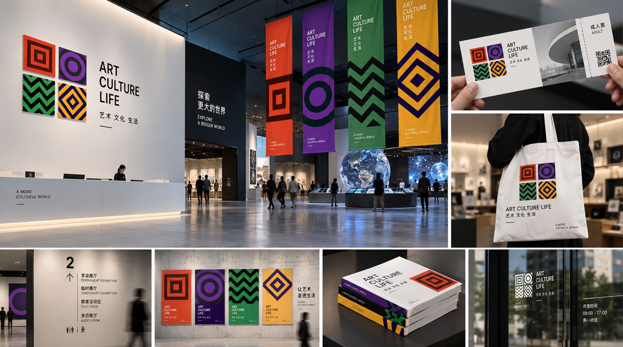
Copper Red #9B3C27: strength and warmth, evoking the texture of leather and machinery. Sand Green #5D6E3D: drawn from the plant life along the Nile, representing nature and relaxation. Deep Purple #4C2E6C: premium quality and deep comfort. Amber Orange #E79A37: sunlight and warmth, heightening the pleasure of the ride. The four colors stand alone yet complement each other. They set the brand's visual rhythm and represent “a unified system of diverse experiences.”
Application and extension
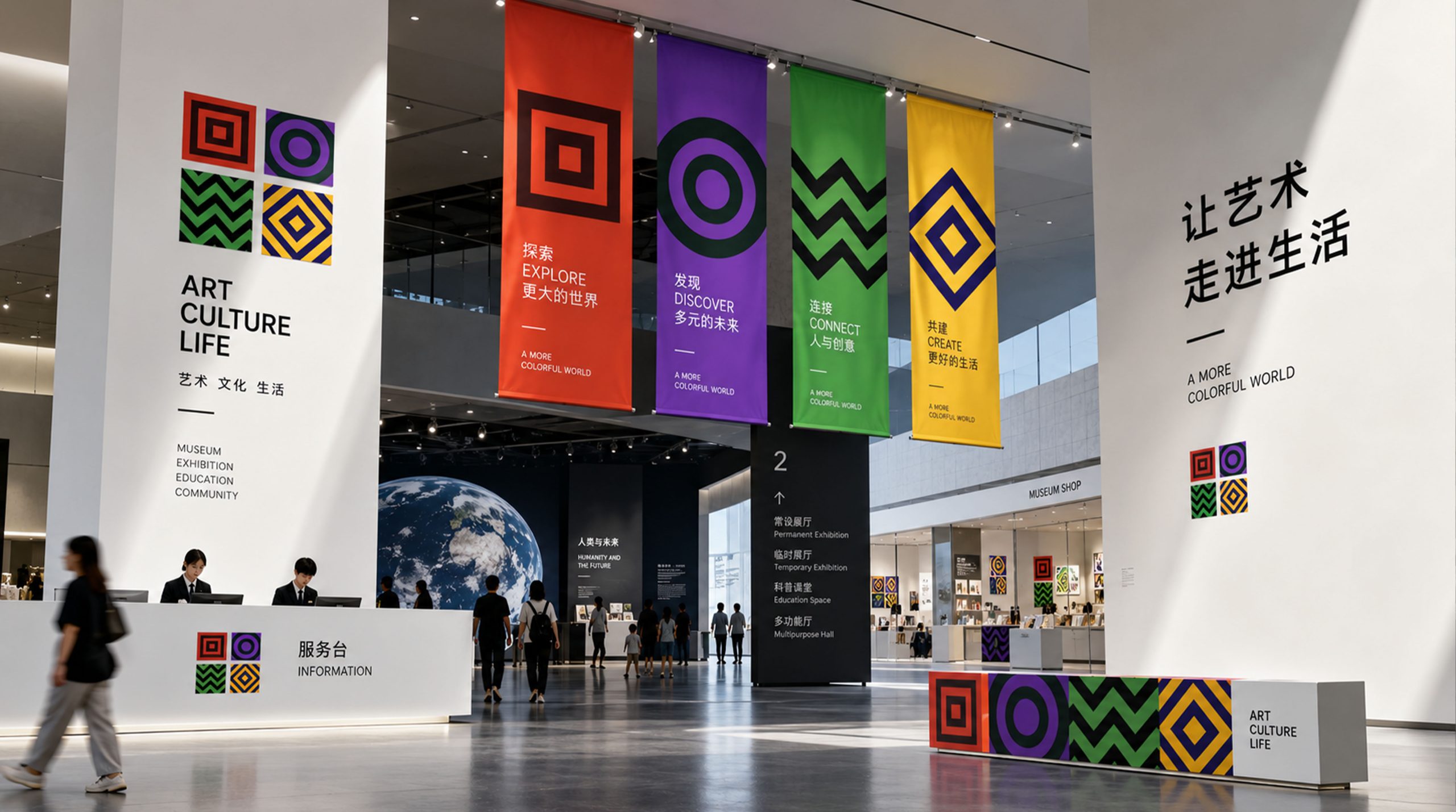
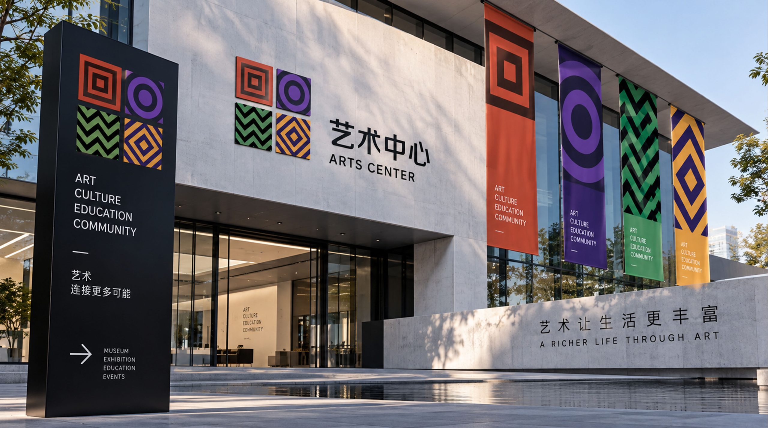
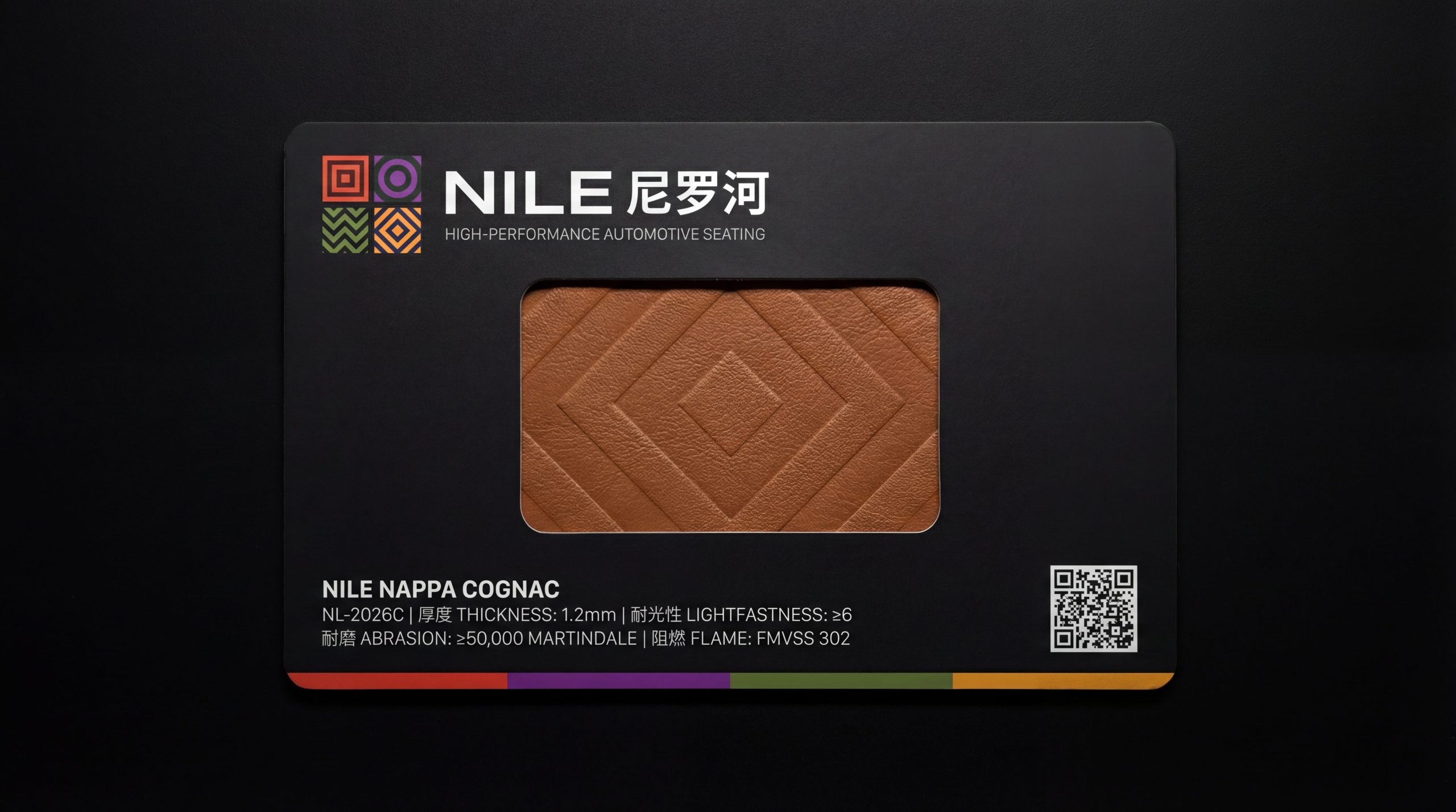
The mark is highly distinctive and modular, with applications at three levels. Corporate: brand identity, website and product catalogs. Product: seat labels, headrest embossing and stitched badges. Spatial: showroom displays, retail wayfinding and auto show installations. In motion, the four squares can unfold or rotate rhythmically, mirroring the way a seat stretches and wraps around the body.
brand meaning
The NILE mark embodies the brand's dual spirit of “flowing civilization × technological comfort.” Square → safety and structure. Circle → comfort and embrace. Texture → the flow and vitality of the Nile. Four-part matrix → a systematic product portfolio and brand philosophy. More than a visual symbol, it is an aesthetic belief in comfort and order that returns the act of sitting to its most essential human balance.
Improper Usage (Protection Specification)
Do not alter the proportions or order of the four squares. Do not extract any single module for standalone use. Do not add shadows or gradients. Minimum display width: 35 mm.
design results
Since the new logo launched, NILE has become a new visual benchmark in China's premium automotive interiors sector. Its “geometric matrix × civilizational imagery” approach gives the brand distinctive recognition at trade shows and in partnerships with automakers. Through this project, Qingmei Future turned a design philosophy of “rational structure × emotional comfort” into a tangible symbol, giving an industrial product the warmth of culture.