











The Beijing Municipal Foreign Affairs Office is the capital’s principal gateway for international exchange and cooperation. It is charged with fostering global ties, deepening city diplomacy and serving China’s national strategy of opening up.
The identity uses visual language to express the capital’s openness, inclusiveness and cultural confidence. It also affirms Beijing’s role in international exchange as China’s political and cultural center, creating a modern mark system that balances governmental gravitas with global recognizability.

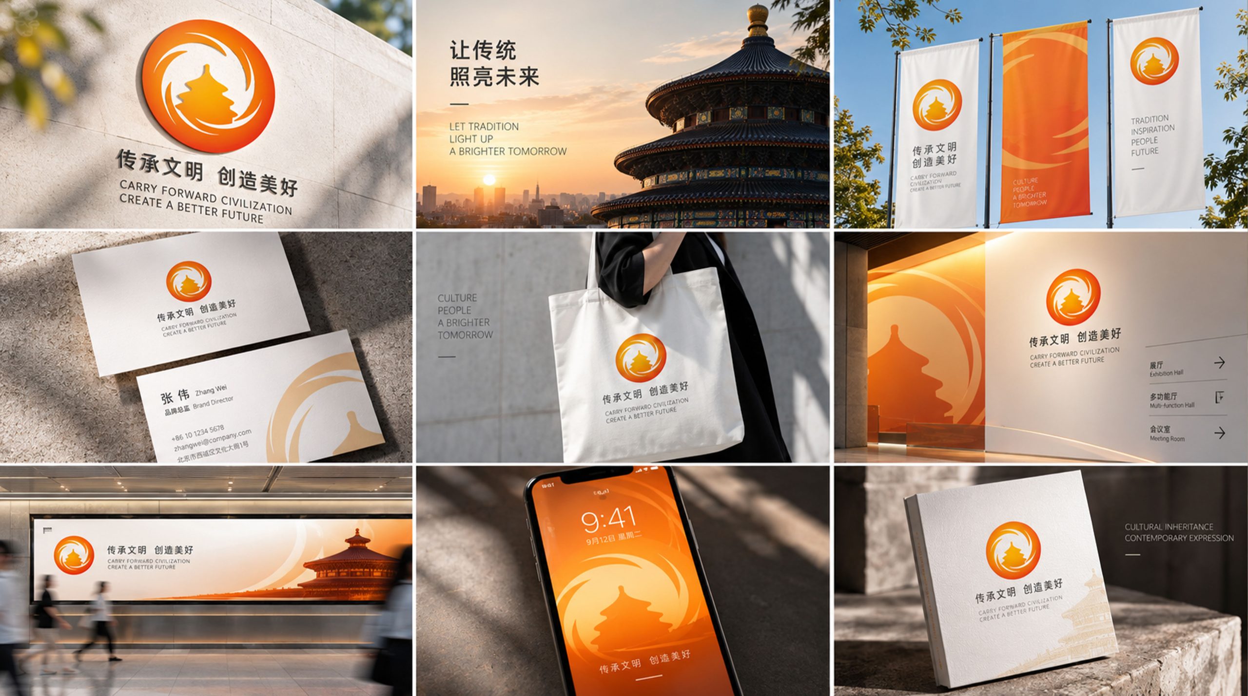
design concept
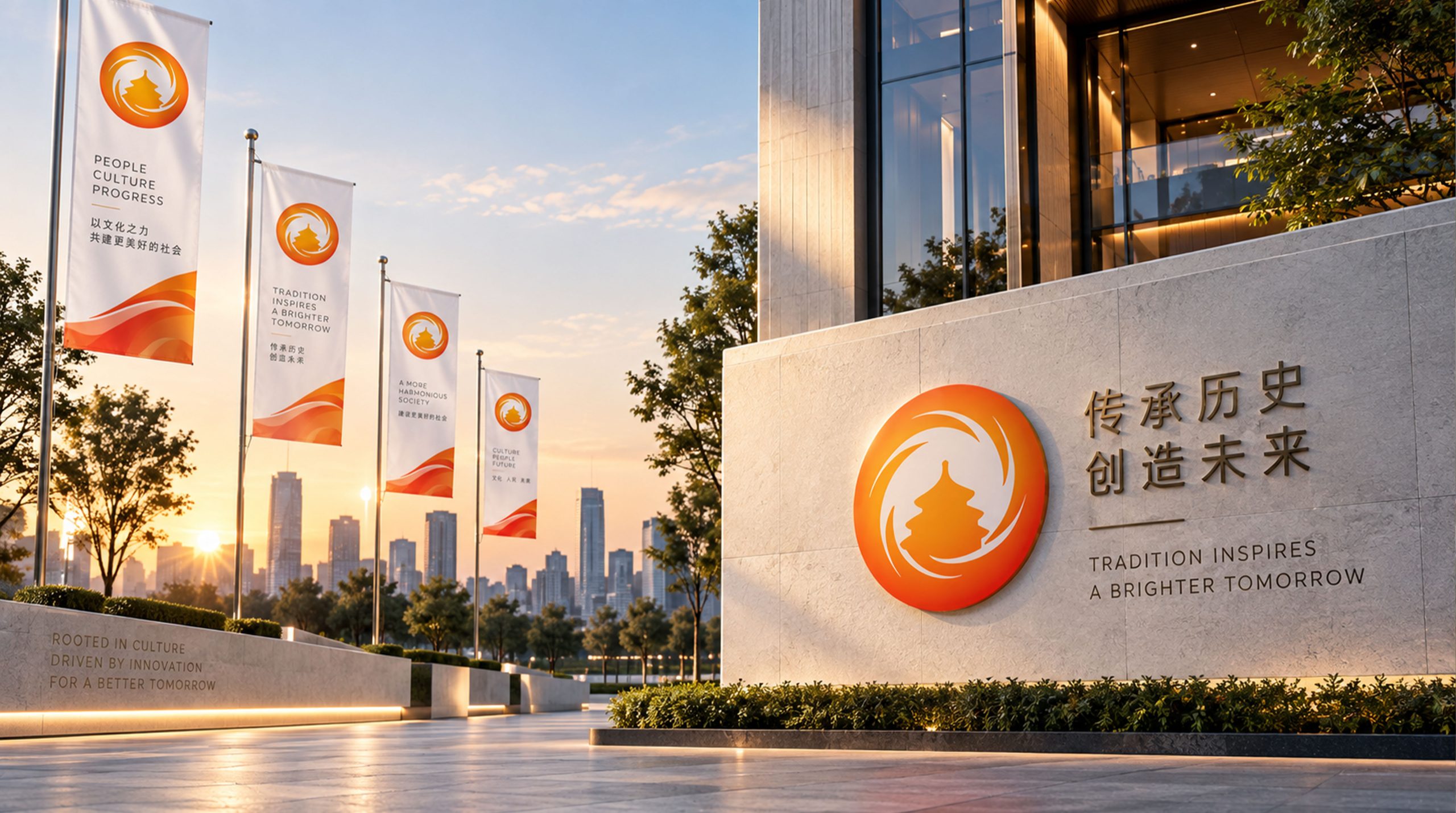
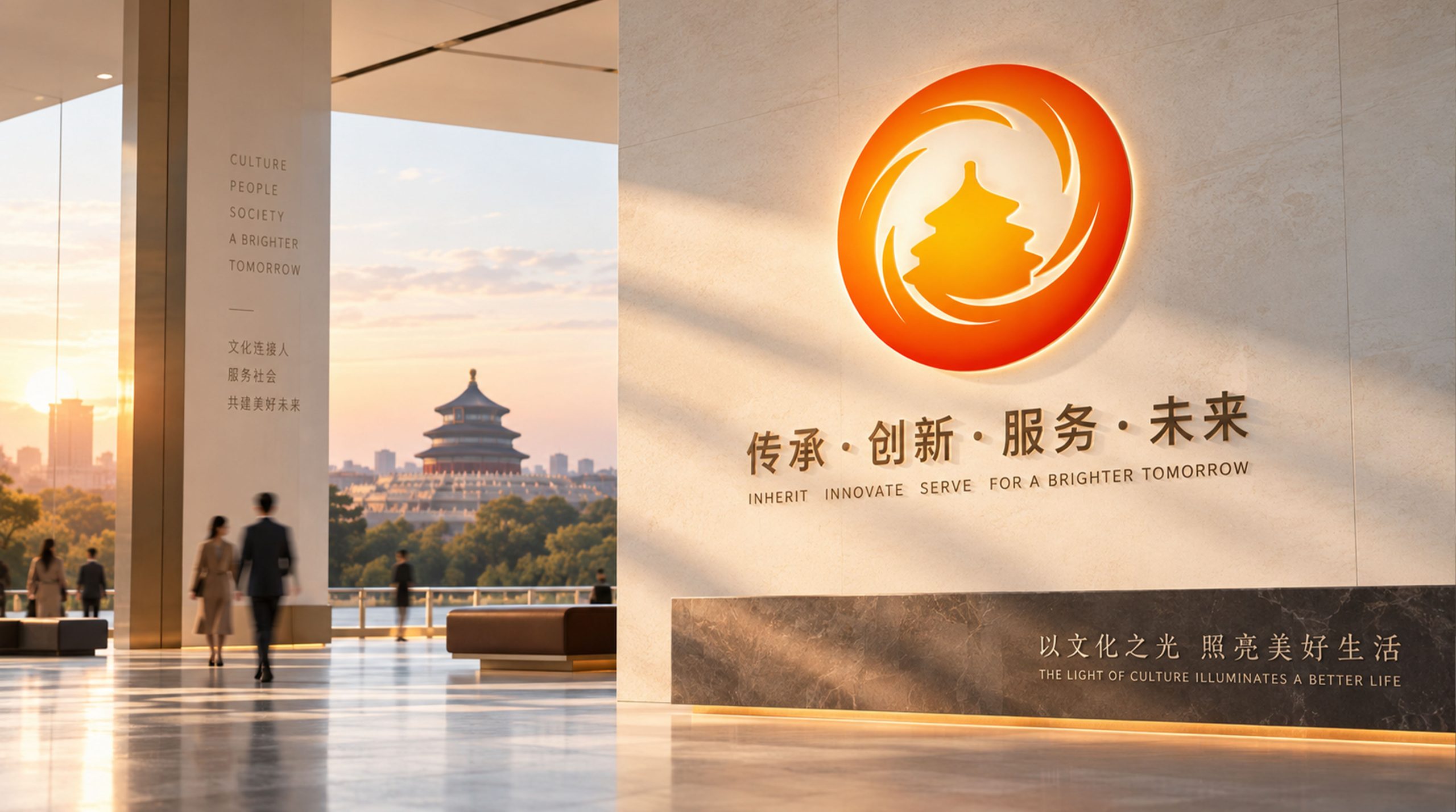
Built around the idea of “Beijing through a global lens,” the mark pairs a silhouette of the Hall of Prayer for Good Harvests at the Temple of Heaven with sweeping circular lines. Together they symbolize Beijing’s ongoing openness and the continuous cycle of exchange on the world stage. The circle stands for harmony, unity and completeness, and the dynamic swirl for exchange, cooperation and shared success. Blending the ordered beauty of Eastern culture with the modernity of international graphic design, it embodies the capital’s spirit: “connecting the world through tradition, shaping the future through openness.”
graphic language
Temple of Heaven silhouette: the cultural foundation of the capital and the image of the nation. Encircling spirals: the inclusive, reciprocal nature of city diplomacy and the steady advance of multilateral cooperation. Circular composition: the globe and its networks of exchange, presenting “Beijing, a city of international engagement.” Radiating motion: an outward energy field expressing Beijing’s proactive openness to the world. The result is both steady and dynamic, serving the dual needs of a government institution and international communication.
Fonts and composition
The emblem is typically paired with the bilingual name: Foreign Affairs Office of the People's Government of Beijing Municipality / Beijing Foreign Affairs Office. The typography is a dignified, steady sans-serif (Source Han Sans / Helvetica recommended), with Chinese and English set side by side to support international communication. The symbol-to-wordmark ratio is 1 : 1.4, which keeps the visual weight balanced across government documents, official events, conference backdrops and other settings.
color system
Primary orange-gold #F28C28 conveys warmth, energy and open collaboration. The orange-red gradient #F6A623 → #D8511E expresses the flow of energy in international exchange. Neutral white #FFFFFF stands for transparency, clarity and impartiality. Supporting dark gray #333333 is reserved for type and balances the overall composition. Anchored in warm tones, the palette creates an “Eastern sunlight” impression: Beijing embracing the world with a positive, welcoming face.
Application and extension
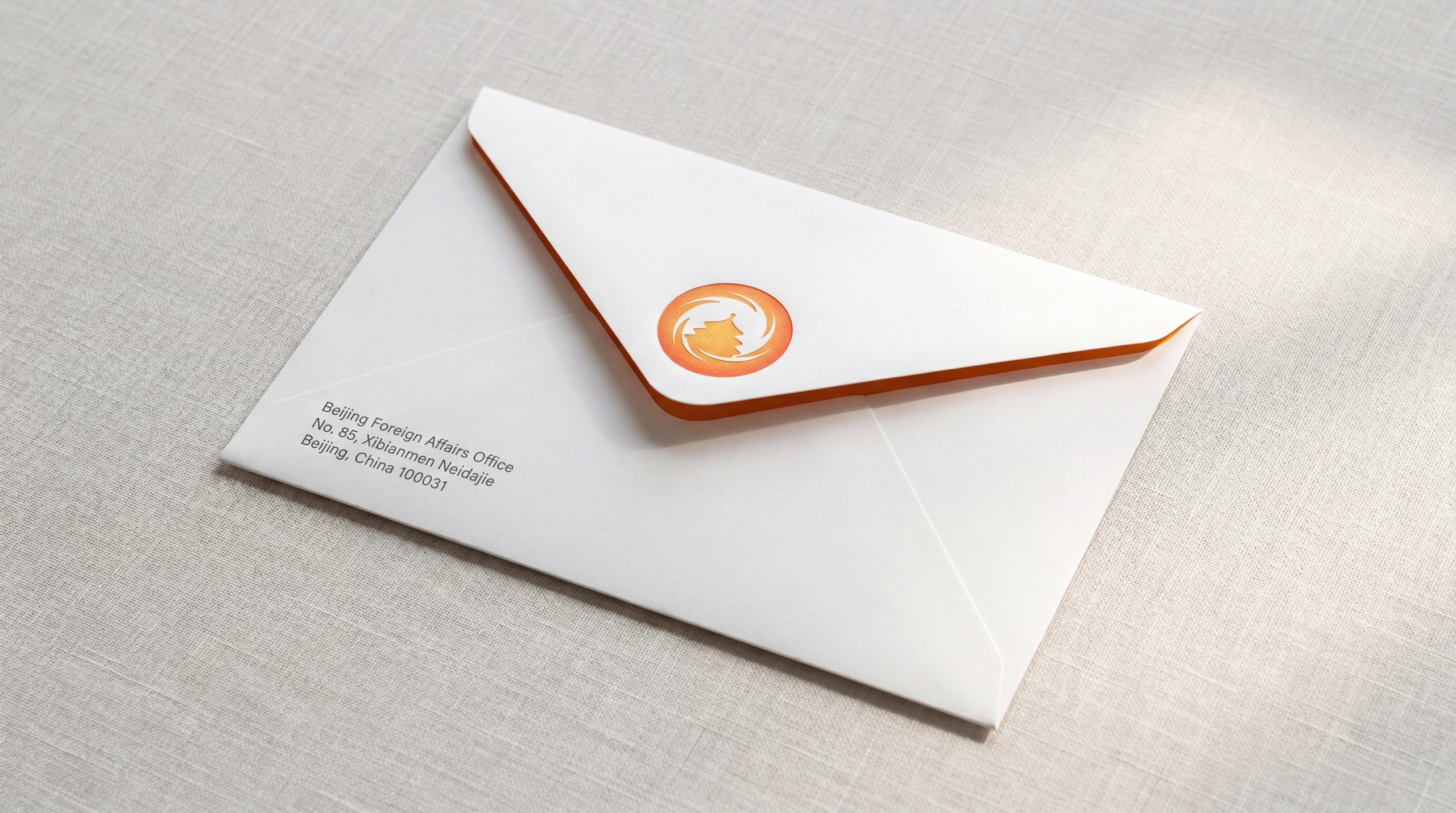
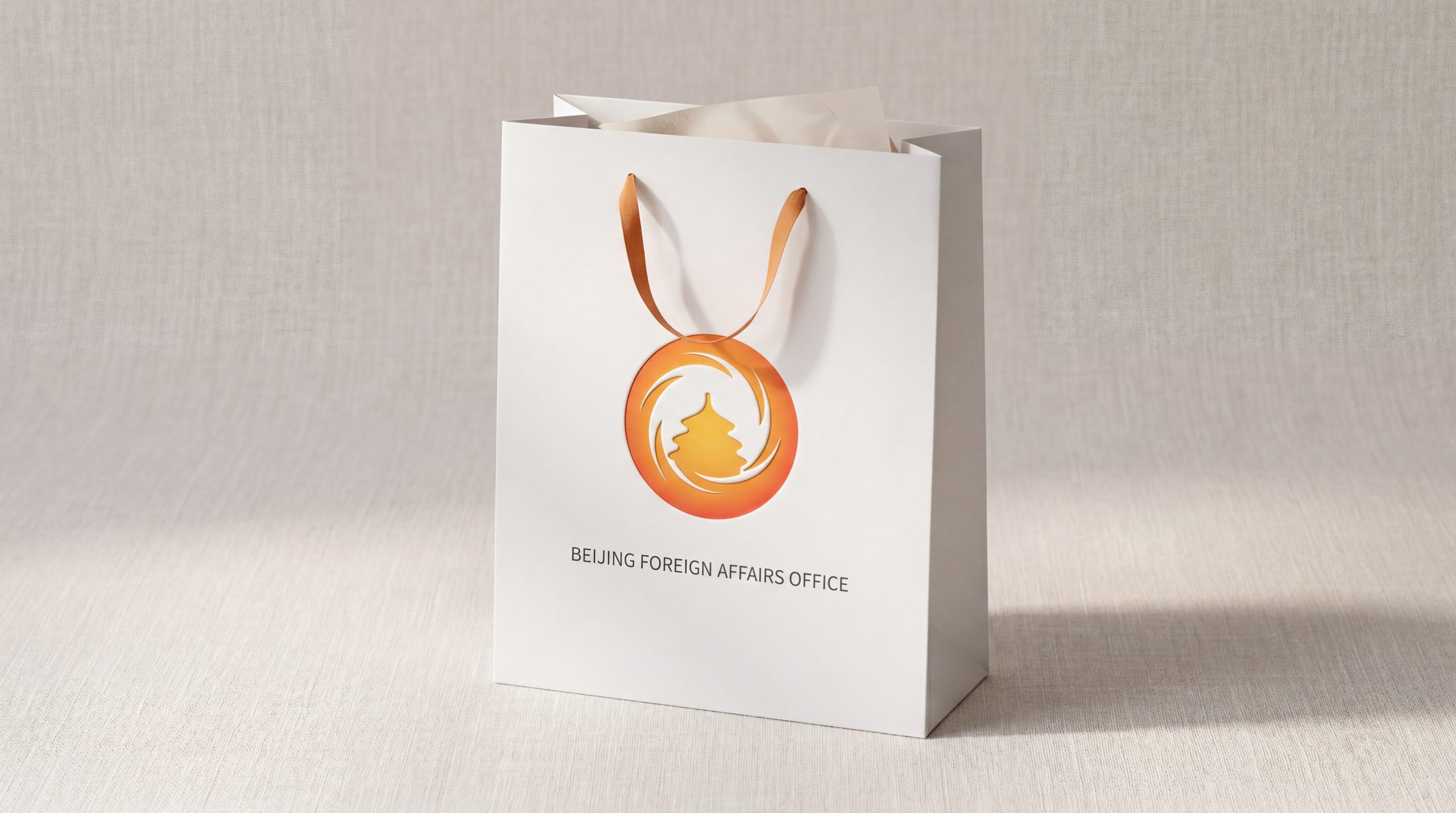
The emblem is designed for wide application: key visuals for international conferences, credentials for foreign-affairs events and signing-ceremony backdrops; official document covers, websites, video openers and digital platforms; diplomatic gifts, flags, lapel pins and commemorative medals. In motion, the rotating ring becomes an “exchange flow” animation that expresses connected information and cross-cultural learning.
brand meaning
The emblem distills the three core missions of the Beijing Foreign Affairs Office. Openness: the circle symbolizes the city's inclusiveness and China's opening-up policy. Communication: the flowing ring represents ongoing multilateral cooperation. Cultural Confidence: the Temple of Heaven silhouette conveys the Eastern spirit and the capital's cultural heritage. Together, the identity expresses a capital diplomacy that connects the world through culture and builds trust through dialog.
Improper Usage (Protection Specification)
Do not alter the proportions or rotation direction of the ring. Do not change the primary orange-gold or add colors beyond the specified gradient. Do not add shadows, glows or 3D effects. Do not combine the emblem with unofficial elements. Maintain clear space on all sides of at least 20% of the symbol's diameter. Minimum display width: 28mm.
design results
Since its launch, the emblem has markedly raised the Beijing Foreign Affairs Office's visual recognition at international conferences and in external exchange. Several international organizations have called it “one of the most distinctly Eastern yet modern city-diplomacy emblems.” Its rounded, open form is widely used in international meetings, cultural exchange and the media, and has become a visual symbol of Beijing as a “center for international exchange.” The design is now one of Qingmei Future's benchmark cases in Visual Identity Systems for Cities and Government Institutions, where it stands as an exemplary fusion of “Eastern cultural grammar × international symbolic logic.”