










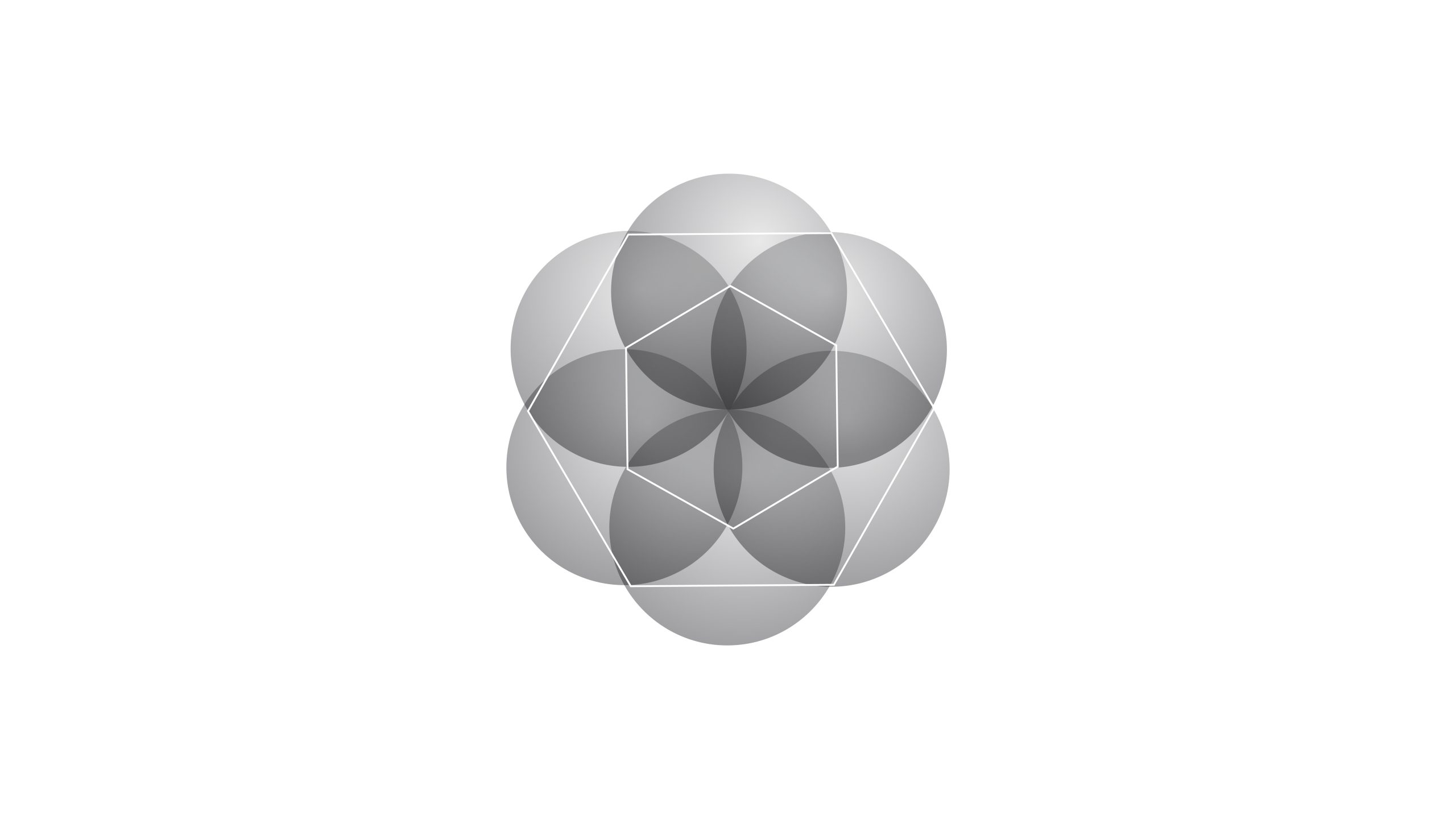
SynCore is a technology company focused on intelligent algorithms, chip development and data computing architecture. Its vision is to power innovation in the age of intelligence from the computational core and to build the intelligent foundation for a connected world.
The company wanted a visual system that combines rigorous scientific structure with imagery of intelligent life, expressing its brand spirit: “intelligence born of order.”
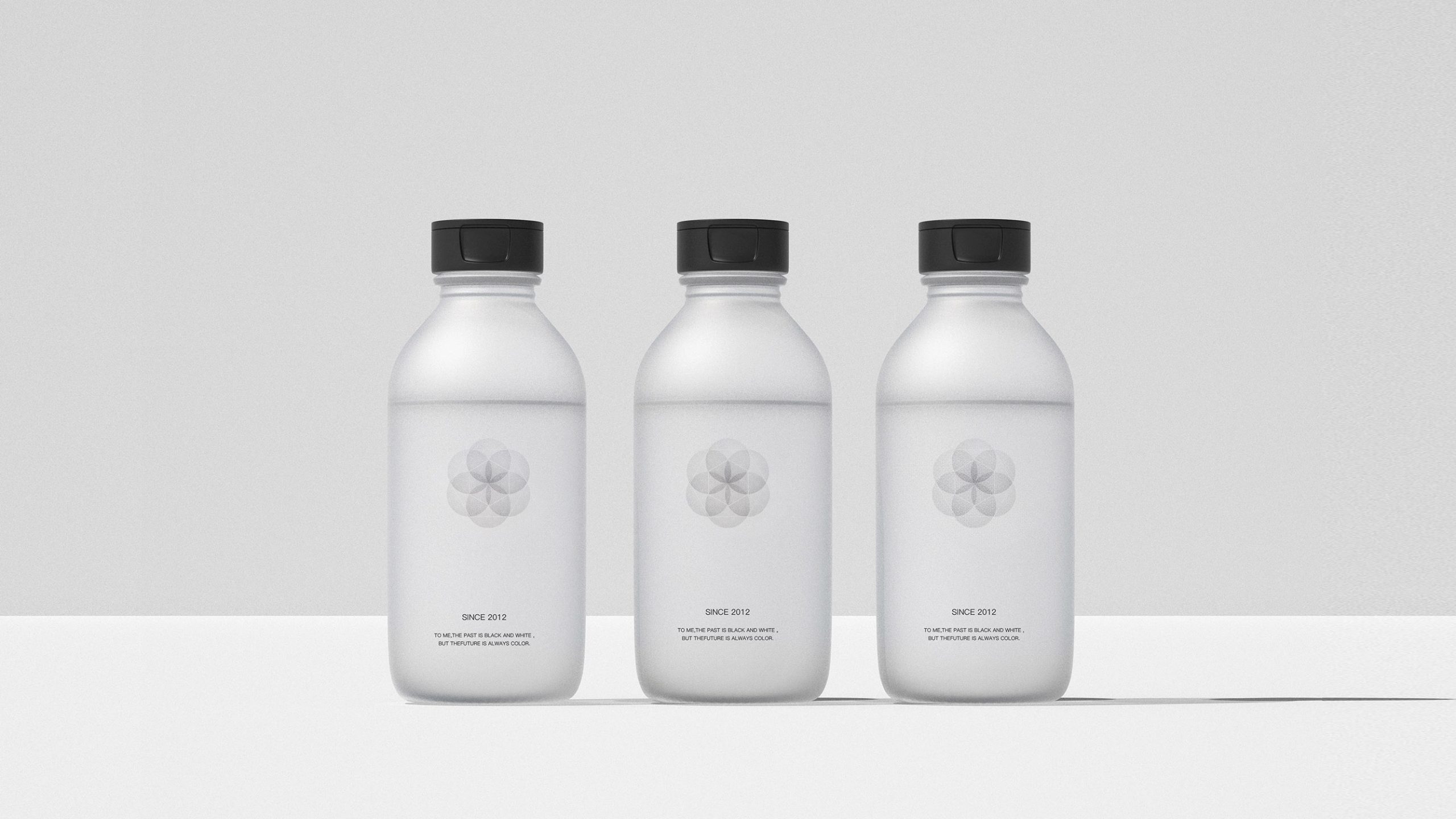

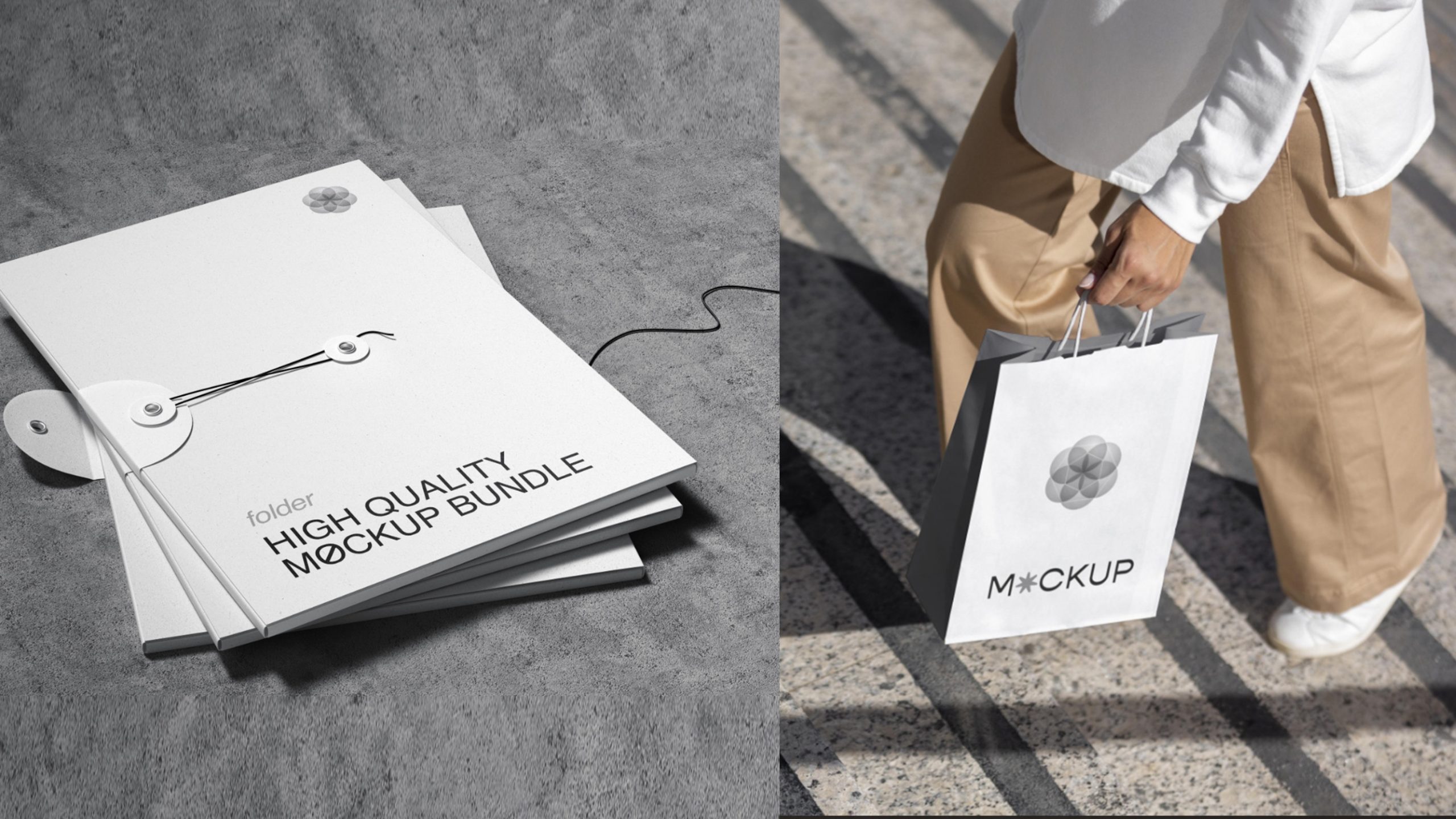
design concept
The emblem is built on the idea of a “Synchronized Core.” It starts from geometric symmetry. The central core represents the intelligent hub of data and algorithms, and the outer petal-like matrix depicts information and energy radiating outward. The composition moves from the inside out, following the logic of “intelligence converging → energy resonating → technology growing.” This progression symbolizes the brand's continuously evolving technological vitality.
graphic language
Six-petal core matrix: hexagonal symmetry establishes the stable order of an information system and signifies algorithmic completeness and precise technical collaboration. Layered inner-outer structure: an intelligent core sits at the center with an energy ring outside, showing information expanding and connecting from point to plane. Overlapping transparent layers: these represent multidimensional data fusion and convey the openness and inclusiveness of technology. Circular boundary: a closed-loop system and an ecosystem built for sustainable evolution.
Fonts and composition
The SynCore wordmark is set in a custom geometric sans-serif with precise proportions and restrained strokes. Rounded corners and softened terminals temper the coldness of tech and give the brand an approachable intelligence. The bilingual lockup is center-aligned, echoing the symbol and reinforcing the idea of a converging core.
color system
Silver gray #C0C0C0: technological metallic sheen and future order. Dark gray #4A4A4A: computational logic and the intelligent core. White-light gradient #FFFFFF → #E8E8E8: spatial depth for flowing information energy and data fusion. The understated, rational palette conveys a premium sense of future technology × systems intelligence.
Application and extension
The emblem extends easily across the whole system. Corporate: technical white papers, system architecture presentations and investor roadshows. Product: chip packaging, smart devices and data dashboard interfaces. Spatial: showroom installations, wayfinding and interactive displays. In the motion version, the central core can pulse with a “breathing light” effect that symbolizes circulating data and surging intelligence.
brand meaning
The SynCore emblem conveys a dual spirit of rational systems × intelligent life. The central core → the source of algorithmic intelligence. The outer matrix → a resonant field of information energy. The layered progression → the living logic of continuous system evolution. The mark is more than a tech company's identifier. It expresses a brand philosophy: “building intelligence through computation, nurturing the future through structure.”
Improper Usage (Protection Specification)
Do not alter the six-petal symmetry or its proportions. Do not add drop shadows, outlines or irregular gradients. Do not skew or distort. Recommended minimum display width: 28mm.
design results
Since the launch, SynCore has established a distinctive visual language within the tech industry. Its “intelligent core × system matrix” imagery has been widely used at algorithm conferences, technology forums and exhibitions, and has set a new paradigm for how future-facing tech companies express themselves visually. The project represents Qingmei Future's mature work in technology systems design and the philosophy of intelligent visuals, unifying rational logic with a sense of intelligent life.