










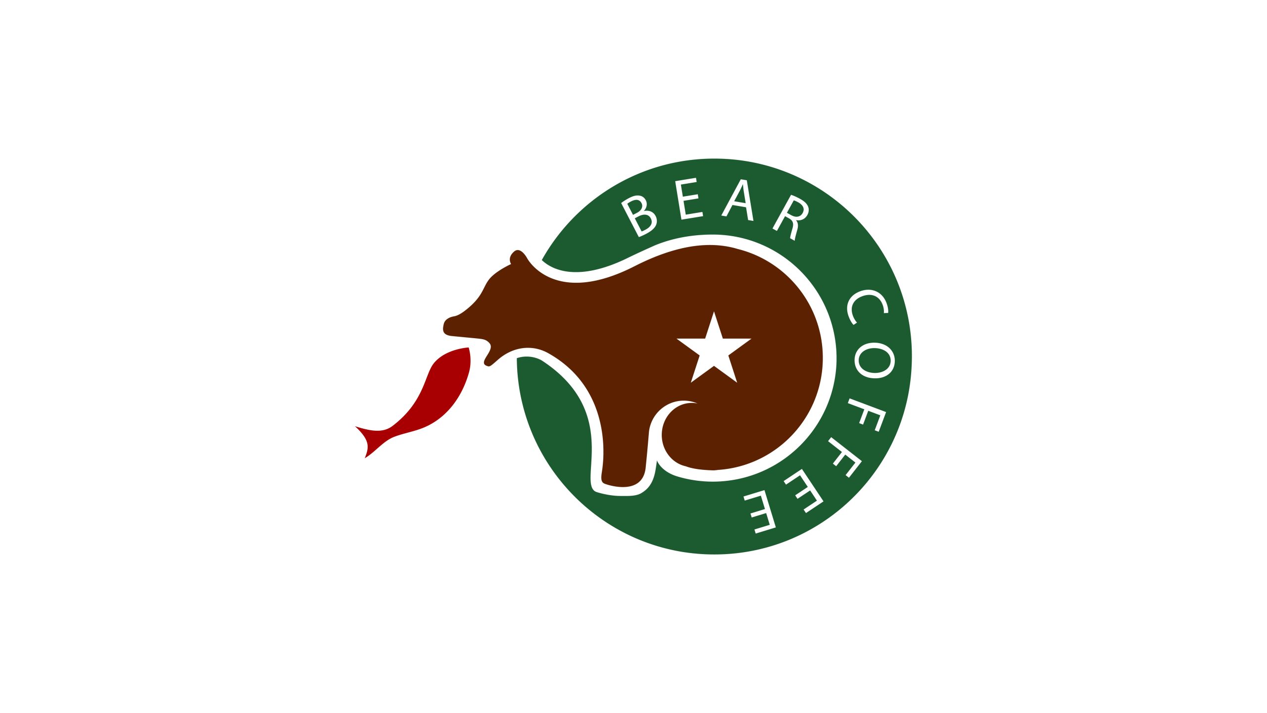
BEAR COFFEE is an independent coffee brand centered on specialty pour-over coffee and an experience of wild nature. The brand is rooted in the forest culture of the North and draws inspiration from “nature, strength and warmth,” with an emphasis on hand roasting and origin flavor.
Its brand spirit blends the mellowness of coffee with the wildness of nature, aiming to create an urban coffee culture that brings people back to nature.
The logo needed to convey both the brand's wild spirit and its professional coffee craft, creating a visual impression of nature × craftsmanship × independence.
design concept
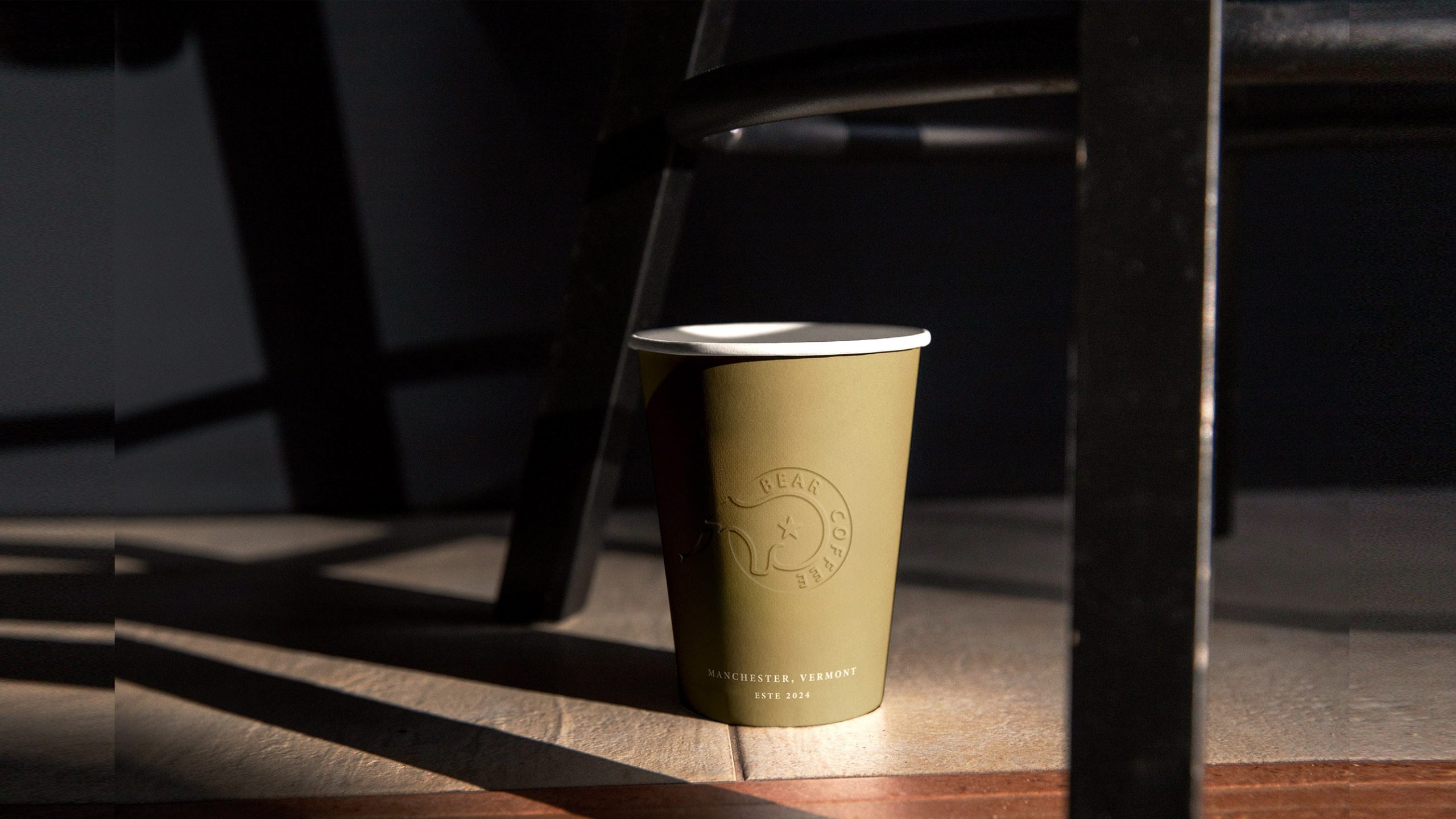
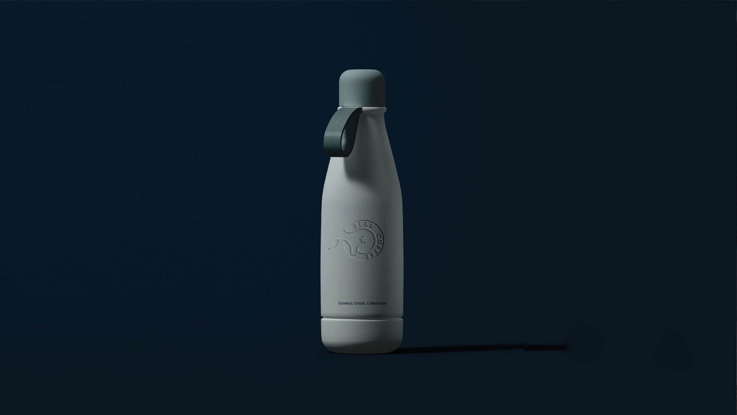
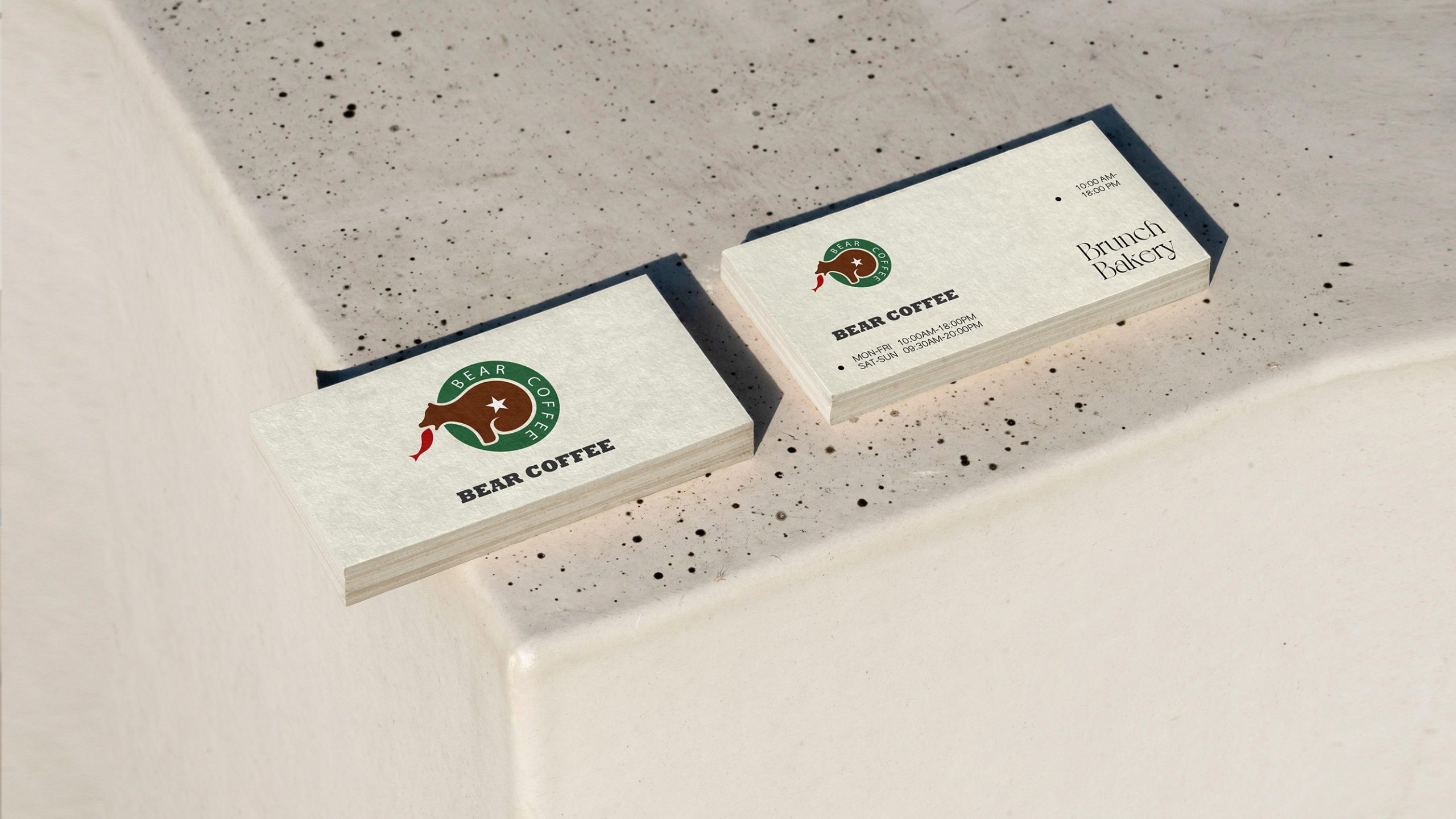
The logo centers on a bear, a symbol of strength and protection that also reflects the brand's respect for nature and its balanced attitude toward the natural world. The bear holds a coffee leaf in its mouth, signifying “nature's gift, hand-selected.” The design draws on Nordic minimalist symbol systems and American vintage coffee culture to create a mark rich in story and strong in recognition.
graphic language
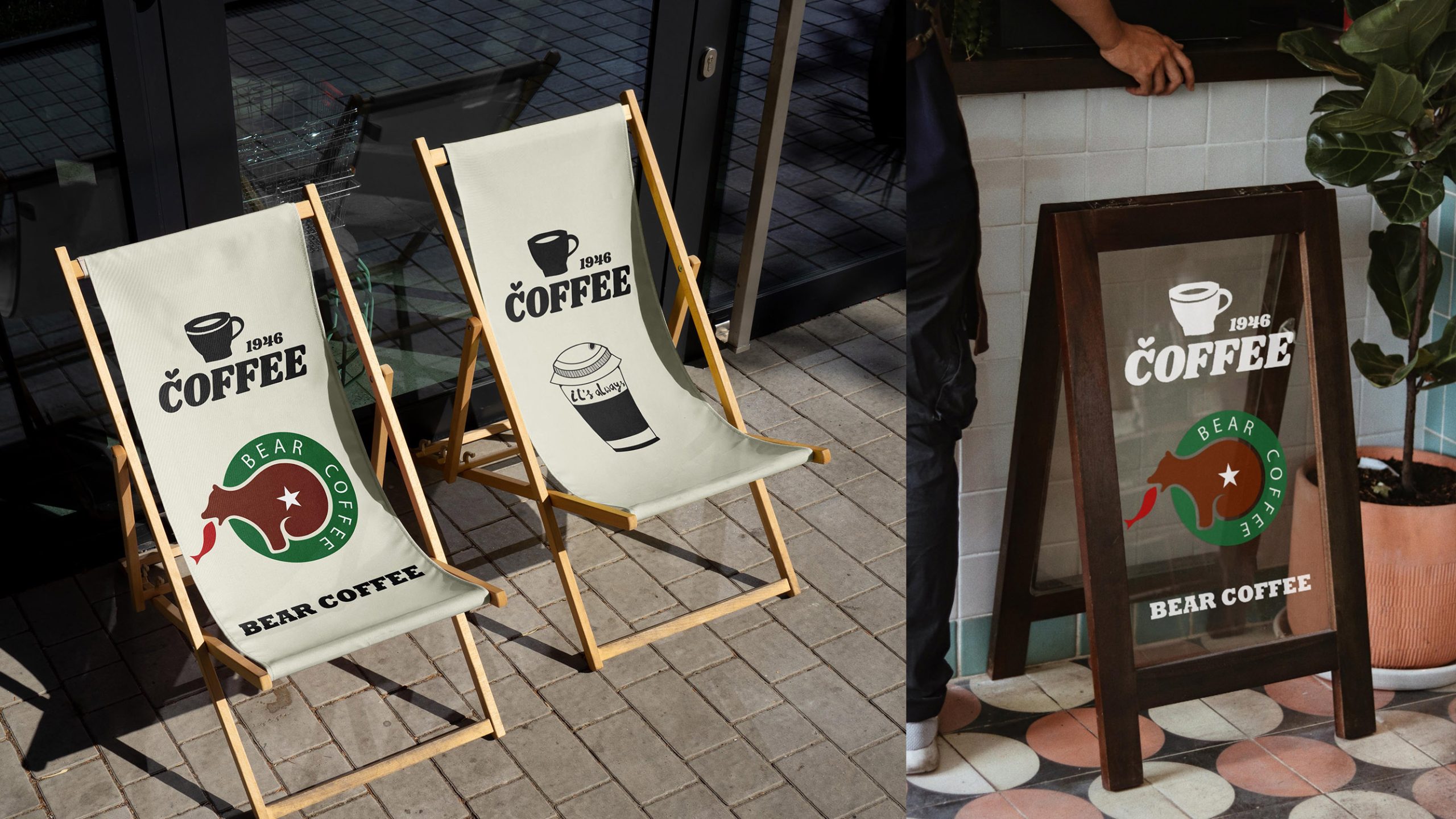
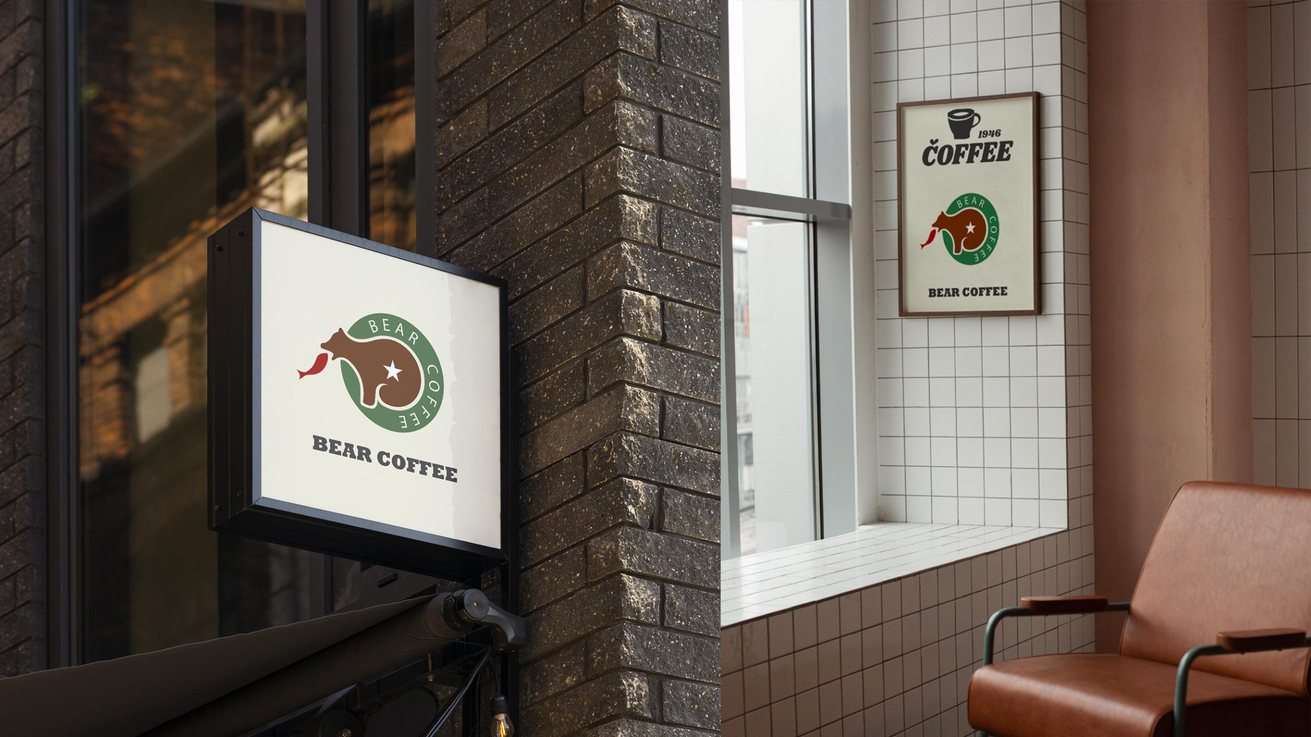
Bear silhouette: strength, warmth and protection, echoing the name “BEAR.” Star: placed at the center of the bear's body to symbolize core quality and brand conviction. Green ring: the cycle of ecology and coffee culture. Red coffee leaf: the visual focal point, evoking “the heat of pour-over and the aroma of life.” The mark is built from simple geometric forms, so it is easy to communicate and apply.
Fonts and composition
The logo uses a circular composition with BEAR COFFEE set around the ring, echoing the traditional coffee stamp. A modern sans-serif (such as Gotham / Futura) gives it a rational, contemporary feel, and even letter spacing maintains legibility and professionalism. The symbol-to-type ratio is 1 : 1.3, so the mark feels complete while remaining flexible on cups, storefronts, packaging and roasting bags.
color system
Primary deep green #365C3A: nature, forest and ecological care. Secondary coffee brown #5B2D17: roasting aroma and the spirit of craft. Accent red #A73428: passion, warmth and the energy of pour-over. Off-white #F8F5E8: a neutral background with a natural, mellow tone. Together, the colors form a coffee brand identity of nature × handcraft × warmth.
Application and extension
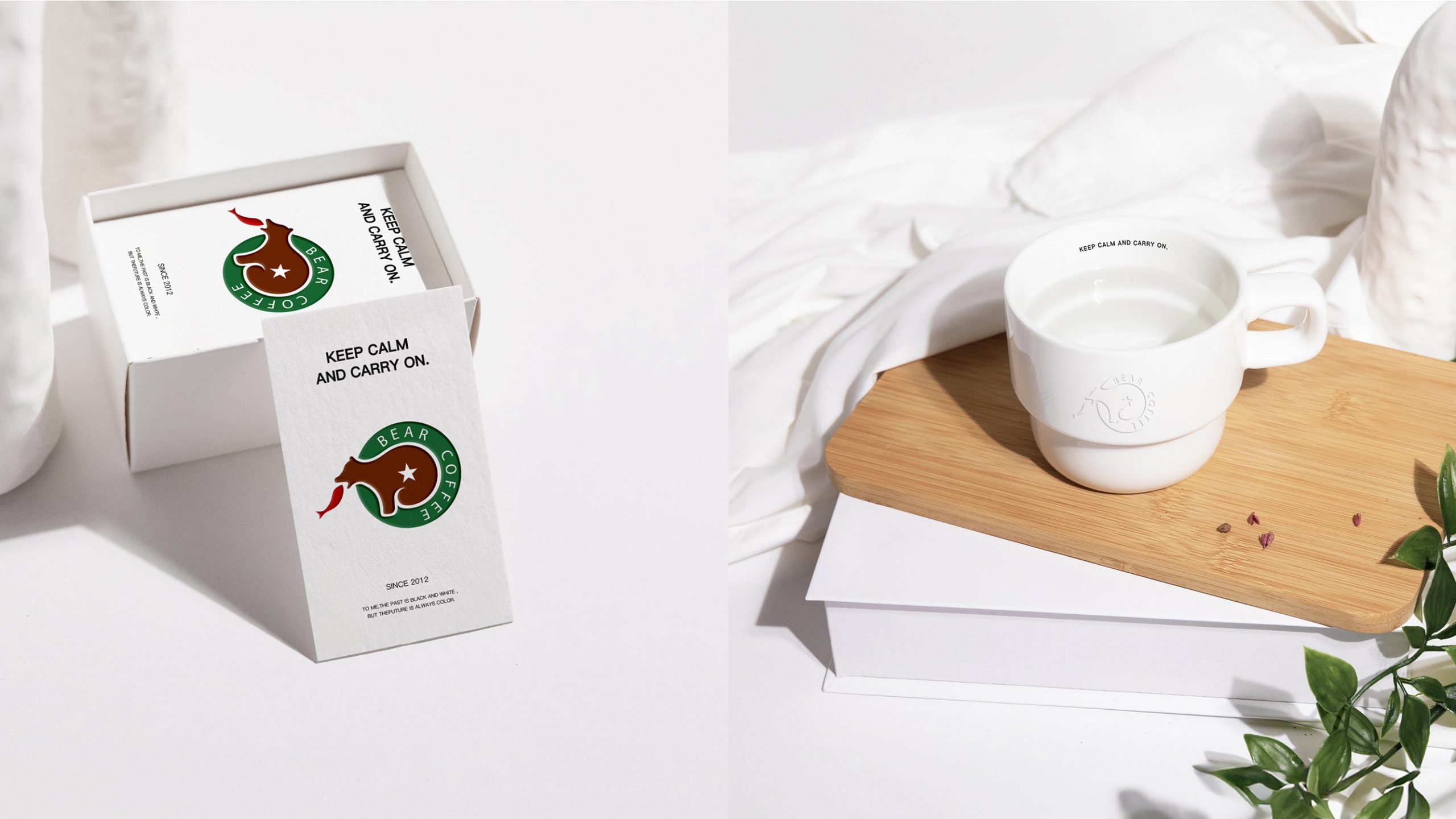
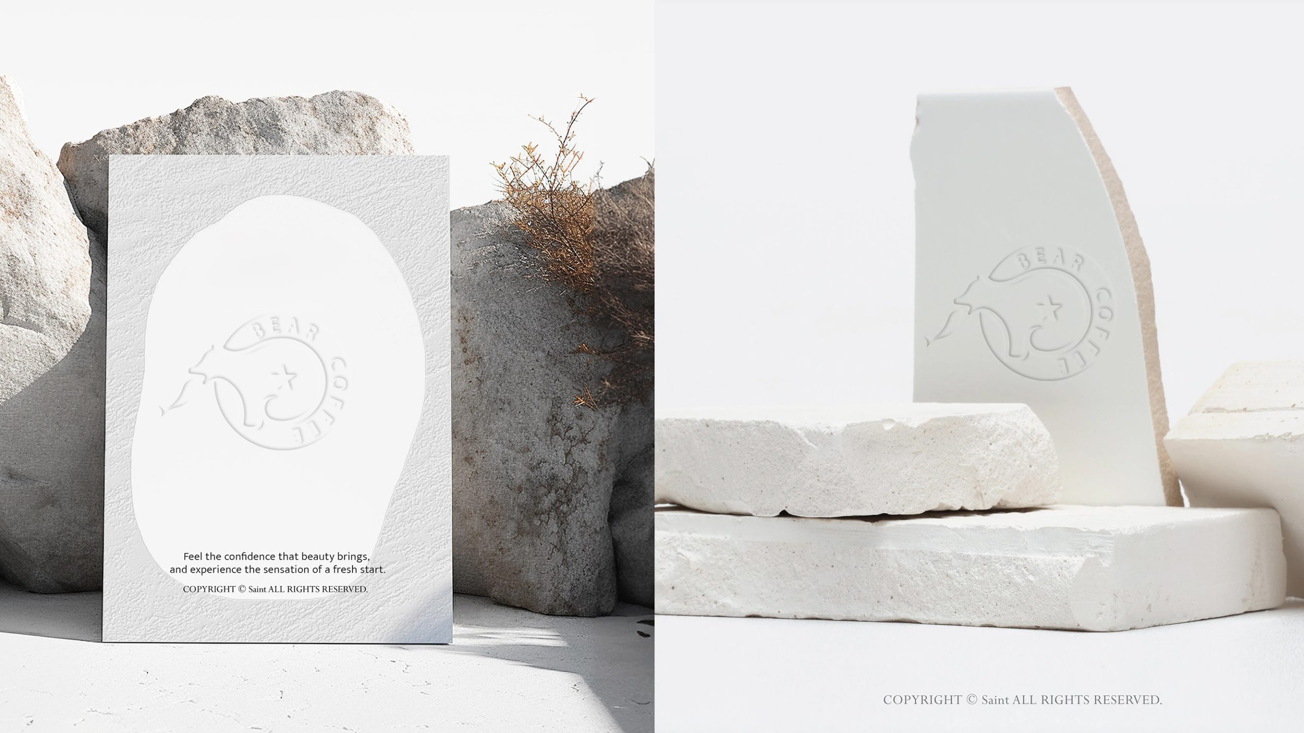
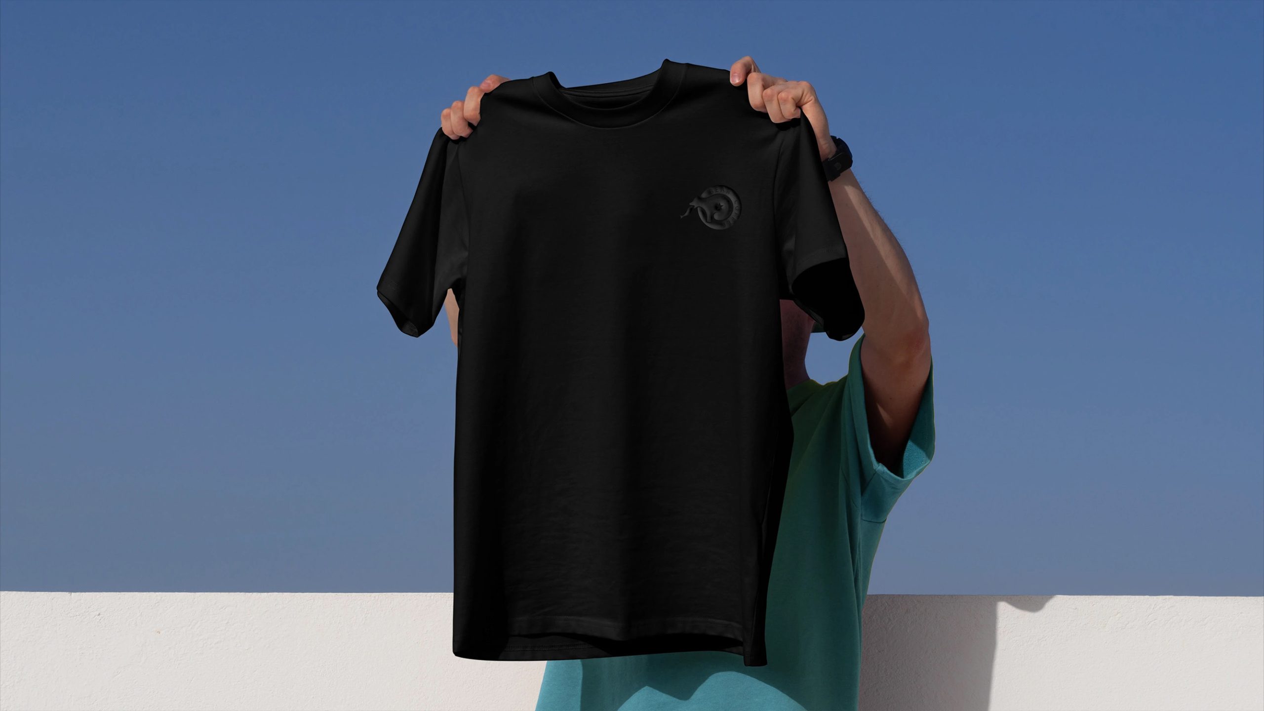
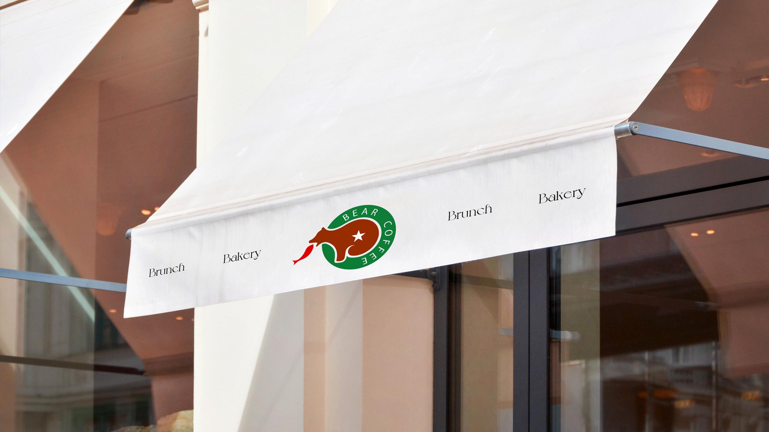
The logo appears on cups, roasting packaging, tote bags and takeaway materials; store signage, menus, murals and wayfinding; and social media avatars, the website and app icons. The circular form suits stamps, hot-foil stamping, holographic stickers, frosted glass and more. In animation, it can come to life as a bear stepping into the forest, a gently stirring leaf or the drifting aroma of coffee, creating a visual language of warmth × memory × brand story.
brand meaning
The logo brings together the brand's three core values. Nature: green symbolizes the ecological cycle and nature's giving. Craft: the bear represents strength and the rich texture of hand roasting. Warmth: the red coffee leaf represents the emotional bond between people and nature. BEAR COFFEE is more than a coffee brand. It is a guardian of slow-living culture that wakes every city morning with the warmth of nature.
Improper Usage (Protection Specification)
Do not alter the bear's proportions or orientation. Do not adjust the ratio of the primary green and brown. Do not move the star or omit the coffee leaf. Do not add shadows, gradients or outlines. Keep the ring typography proportions consistent. Minimum display width: 25mm.
design results
Since the new logo's debut, BEAR COFFEE's recognition among independent coffee brands has risen by 61%, and customers often describe it as “warm and full of story.” The brown-and-green palette gives spaces and packaging strong visual consistency and has established a specialty coffee brand defined by nature × handcraft × quality. The project is now one of Qingmei Future's benchmark cases in Visual Identity Systems for Food & Beverage and Lifestyle Brands, where it stands as a classic example of natural sensory aesthetics × brand personification.