










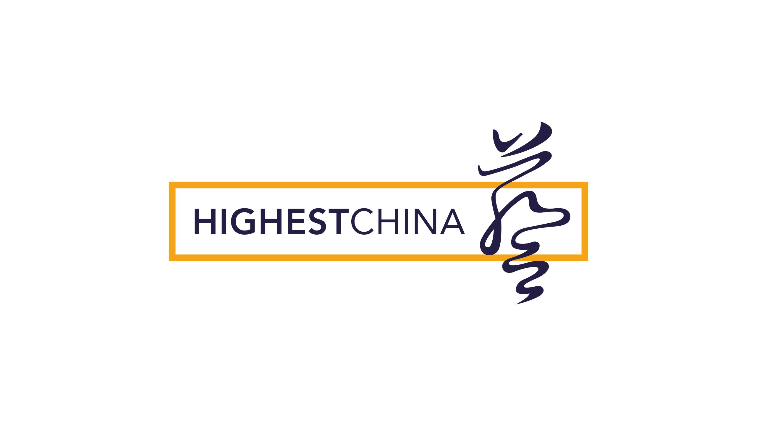
HIGHEST CHINA is an international communications group specializing in brand strategy, creative communications and cultural content integration. Its mission is to be “the creative force connecting China and the world,” and it serves clients across technology, fashion, culture and real estate.
As part of a visual identity upgrade, the brand wanted a new logo system that would express its global vision, Eastern heritage and creative ambition, and build a visual identity with both cultural character and modern communicative power.
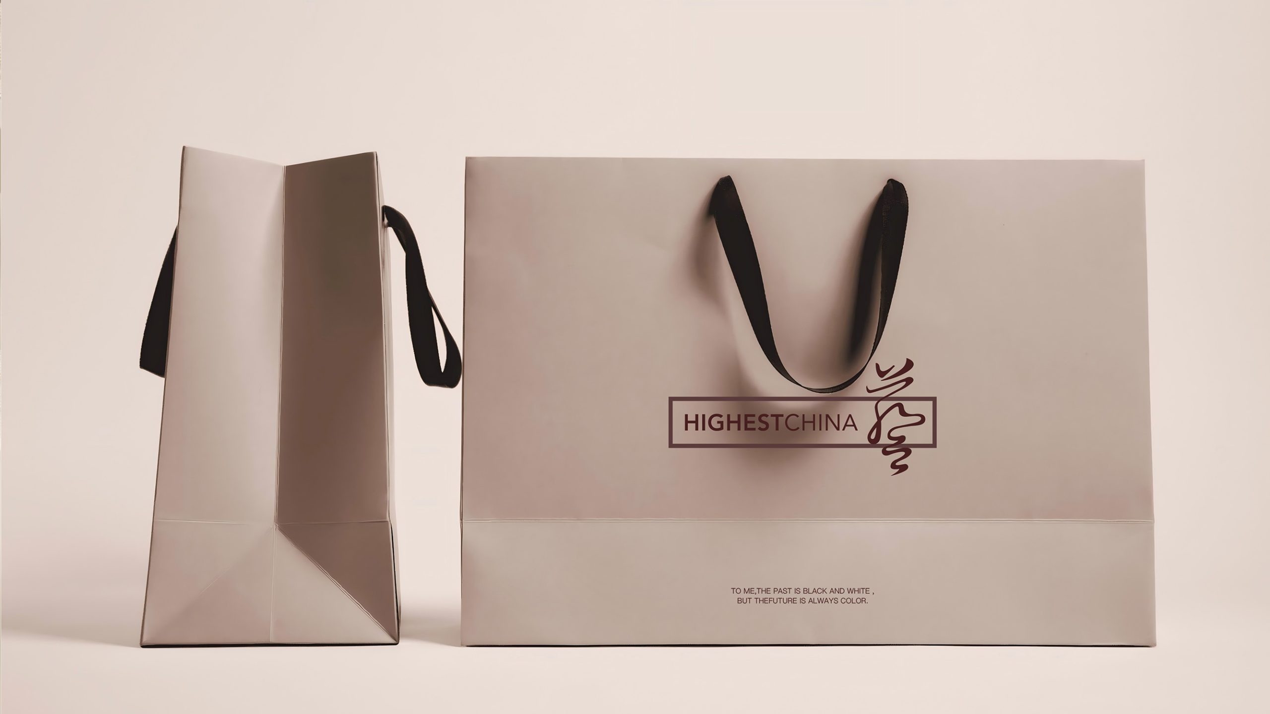
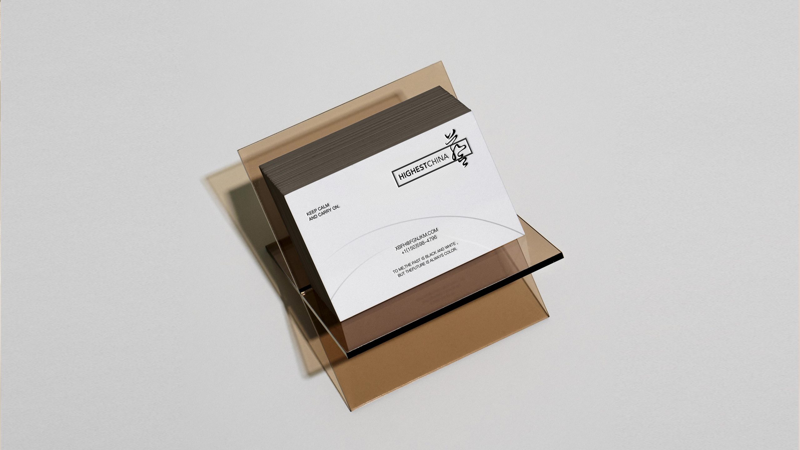
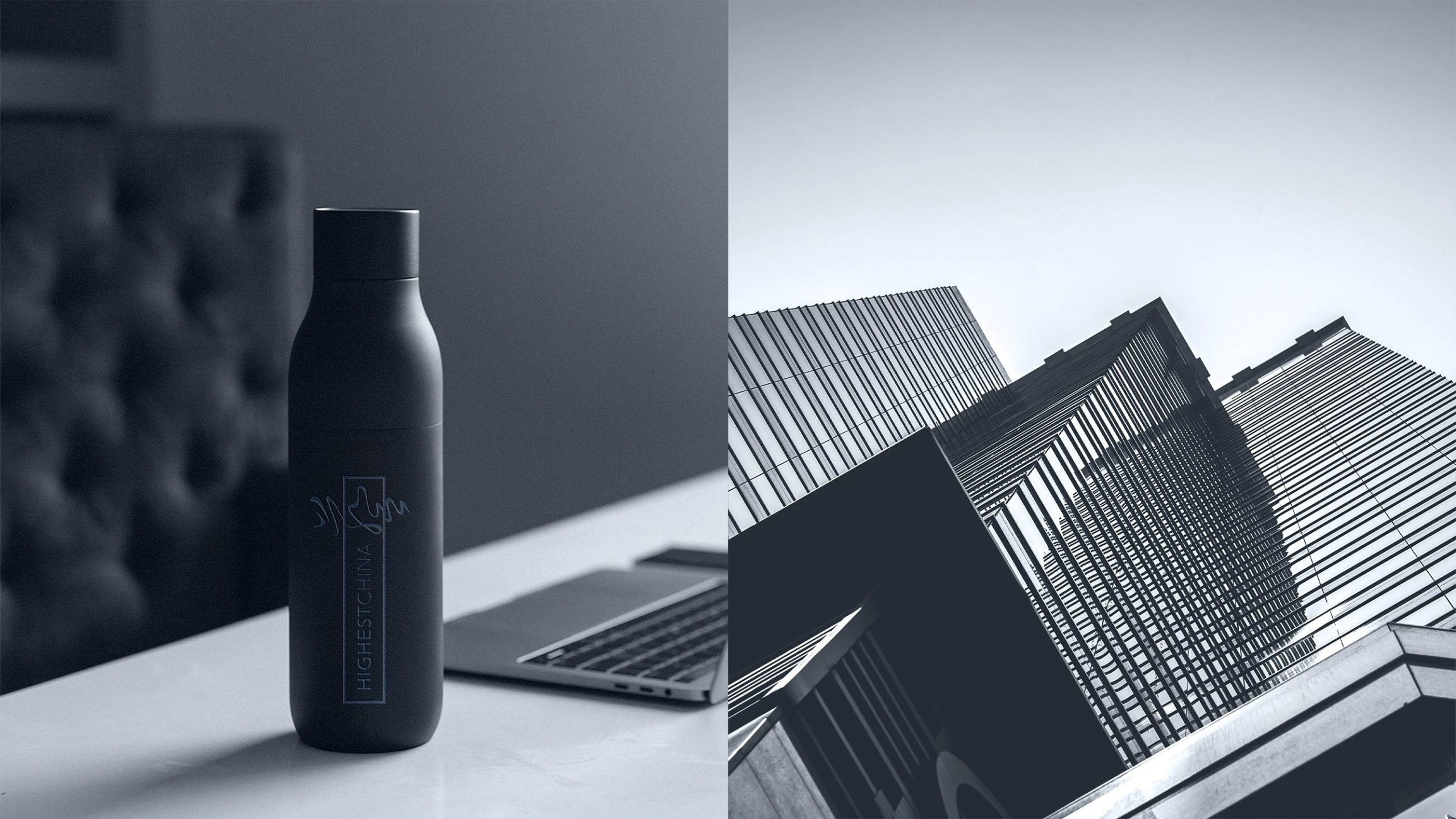
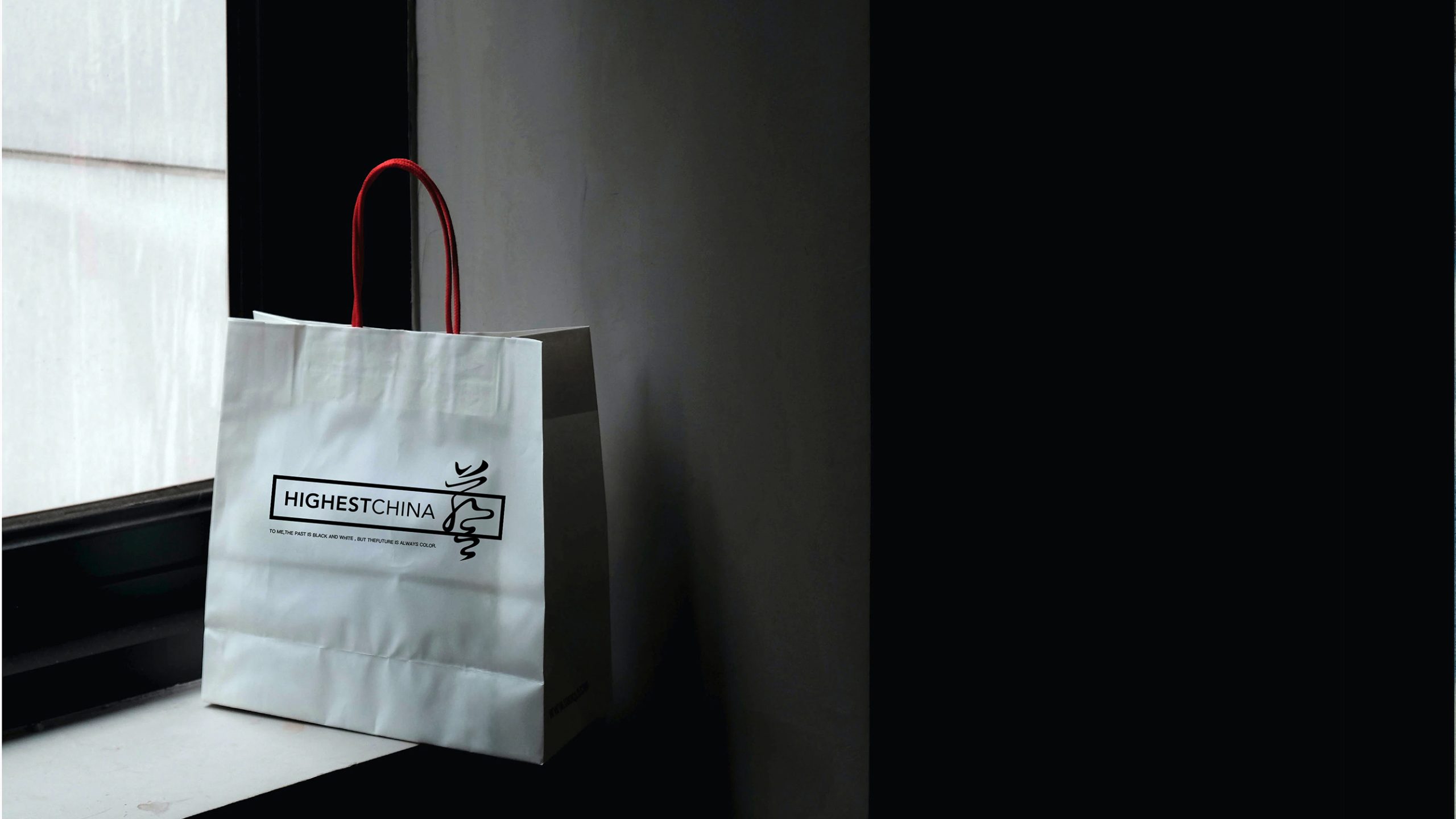
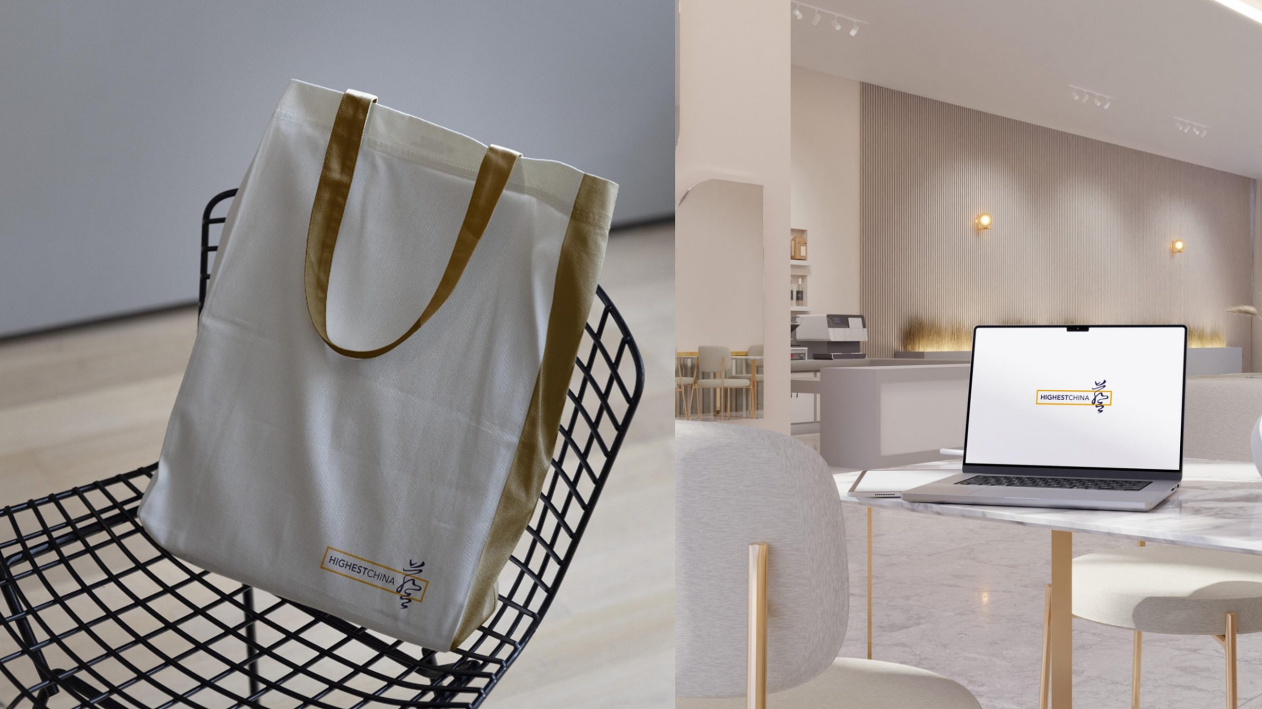
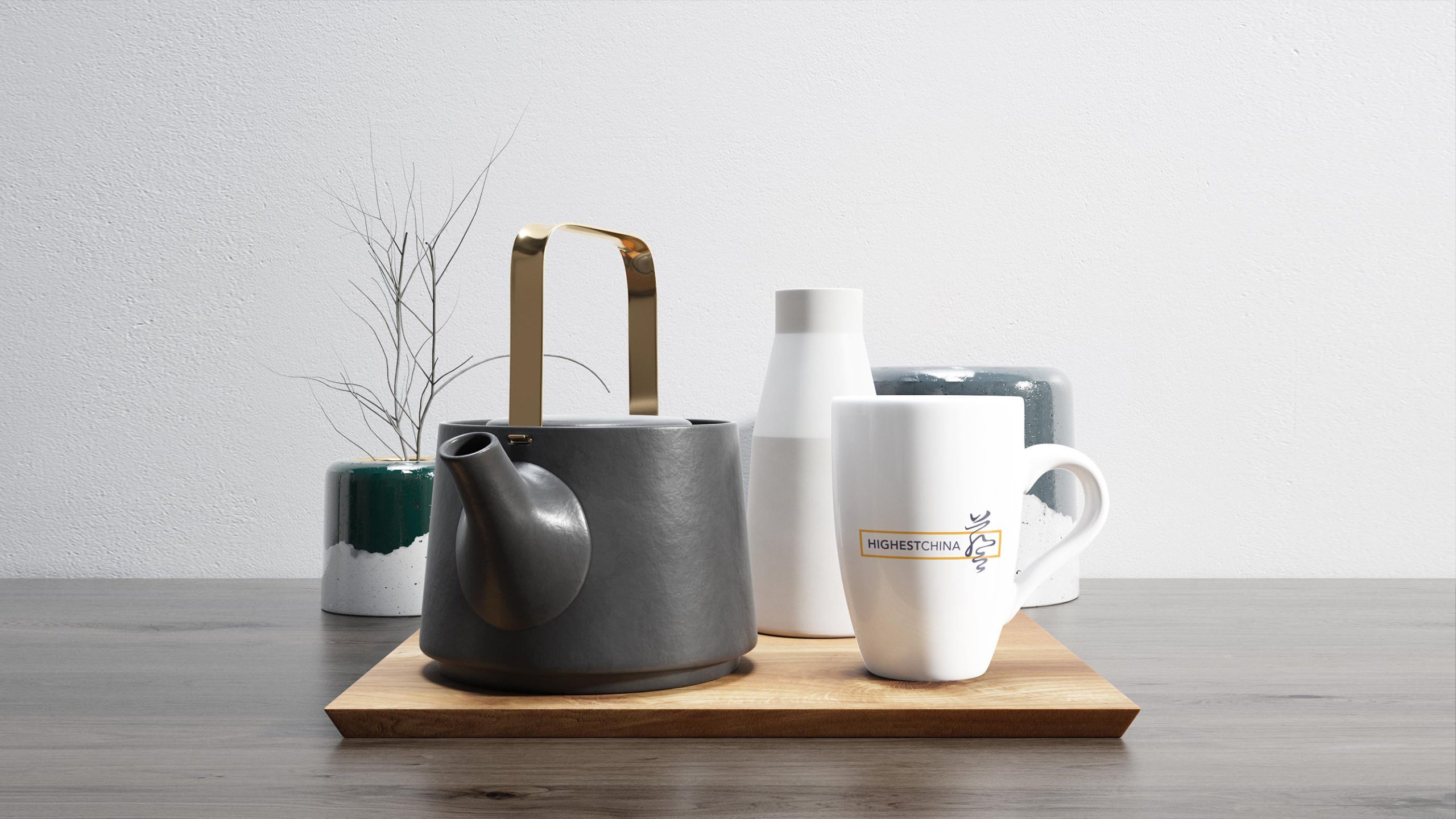
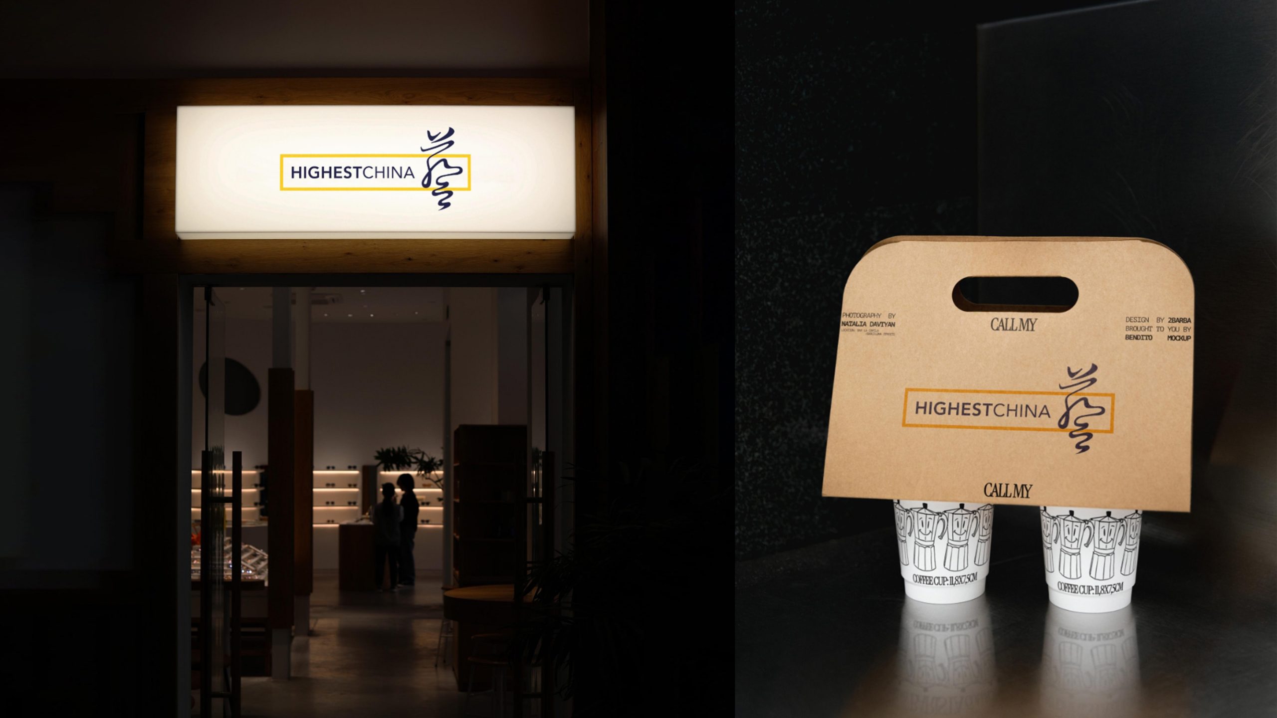
design concept
Built on the idea of East meeting West and cultures growing together, the logo pairs the modern English wordmark HIGHEST CHINA with a calligraphic symbol of the character Yi (art), creating a bilingual counterpoint. The rectangular frame represents a framework for global communication, while flowing brushstrokes break its edges, signaling Eastern insight driving innovation in global communication. The composition expresses the brand's core idea: Rooted in the East. Inspiring the World.
graphic language
Rectangular frame: international standards and logical order, representing the brand's strategic system. Calligraphic Yi: flowing strokes that capture the spirit and grace of Eastern aesthetics. Bilingual pairing: a visual logic of cultural fusion, with communication as a bridge. Stable left, dynamic right: a structural balance of reason and emotion. The result is a dual tension between rational order and expressive brushwork, forming the brand's distinctive visual language.
Fonts and composition
The HIGHEST CHINA wordmark uses a modern sans-serif for an international, professional feel. It is set in a medium weight with slightly open tracking for a sense of space. The calligraphic element is a custom brushstroke with natural variation in weight and an Eastern rhythm. The symbol-to-wordmark ratio is approximately 1 : 1.2. The calligraphy sits on the right and the English is left-aligned, creating a balanced tension where Eastern and Western cultures meet.
color system
Primary deep blue #2A2F5A: rationality, depth and international trust. Accent gold #E6B24B: honor, creativity and brand energy. Neutral white #FFFFFF: clarity, balance and space. The blue-and-gold palette forms a premium × professional × warm identity that is highly distinctive and culturally resonant within the communications industry.
Application and extension
The logo applies across: business cards, report covers, exhibition backdrops, and office systems; website homepages, video intros, digital ads, and social platforms; brand publications, award certificates, and signing ceremony backdrops. In motion, the Yi symbol can stand alone and animate as a flowing brushstroke, capturing a flash of creative inspiration. The rectangular frame can also extend into visual guide lines that unify the brand's layout system.
brand meaning
The logo expresses three core brand values. Innovation: the English structure conveys modernity and international standards. Culture: the calligraphic brushwork carries an Eastern artistic sensibility. Vision: the blue-and-gold palette signals insight and leadership. The logo is more than a visual symbol. It is a cultural stance, with Eastern aesthetics as its soul and a global outlook as its bridge, and it helps shape the global voice of Chinese creative brands.
Improper Usage (Protection Specification)
Do not alter the rectangle's proportions or the position of the calligraphic element. Do not change the blue-and-gold color pairing. Do not add shadows, outlines or gradient effects. Do not substitute non-standard typefaces for the English wordmark. Keep the spacing between calligraphy and type consistent. Minimum display width: 30mm.
design results
Following the launch, HIGHEST CHINA's brand recognition in the communications industry rose by 62%, and the media described it as “the most culturally spirited international communications identity.” The blue-and-gold palette has been widely used on stages at major events and international forums, and has become the visual emblem of the brand's “Eastern inspiration × international standards.” The project is now one of Qingmei Future's benchmark cases in Visual Identity Systems for Cultural Communications and Brand Strategy, where it serves as a classic example of a Sino-Western design grammar.