










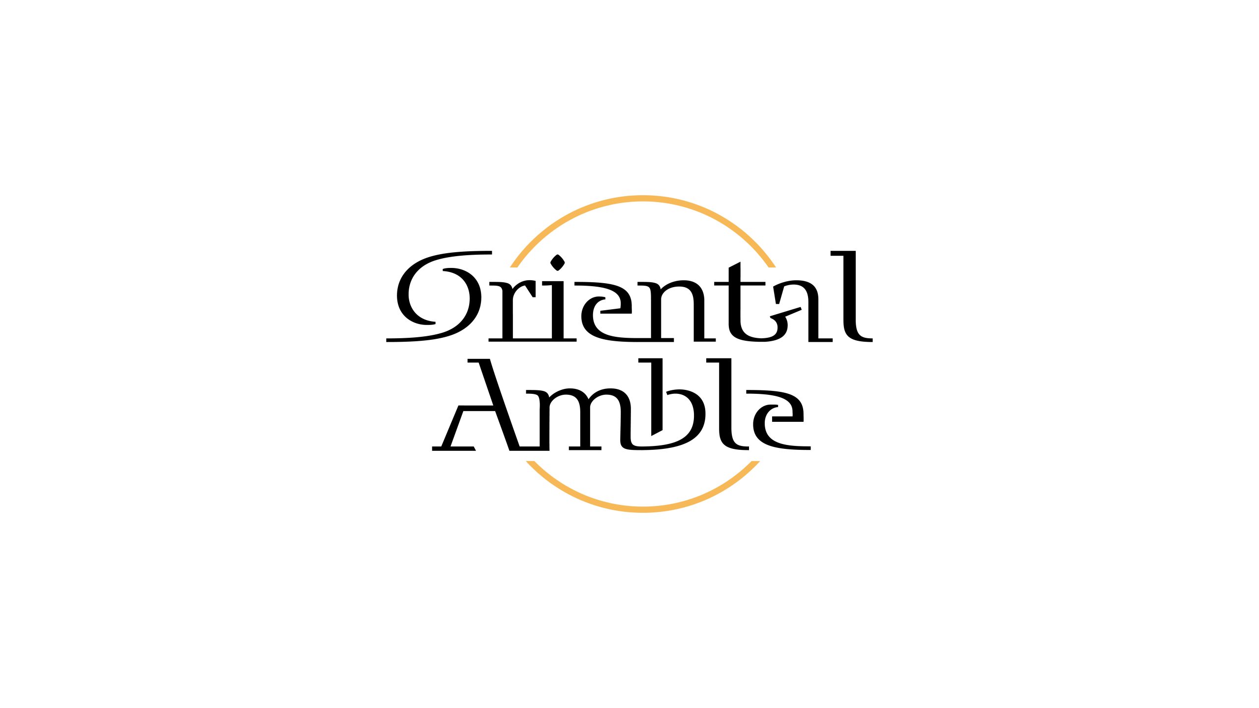
Oriental Amble is a premium lifestyle brand that blends Eastern cultural experiences with modern art travel. The name means “an Eastern amble” and evokes an unhurried, elegant and serene rhythm of life.
Guided by the idea that “type is form,” the design set out to express Eastern philosophical sensibility and a global visual language through refined letterform construction and a minimal symbolic grammar.
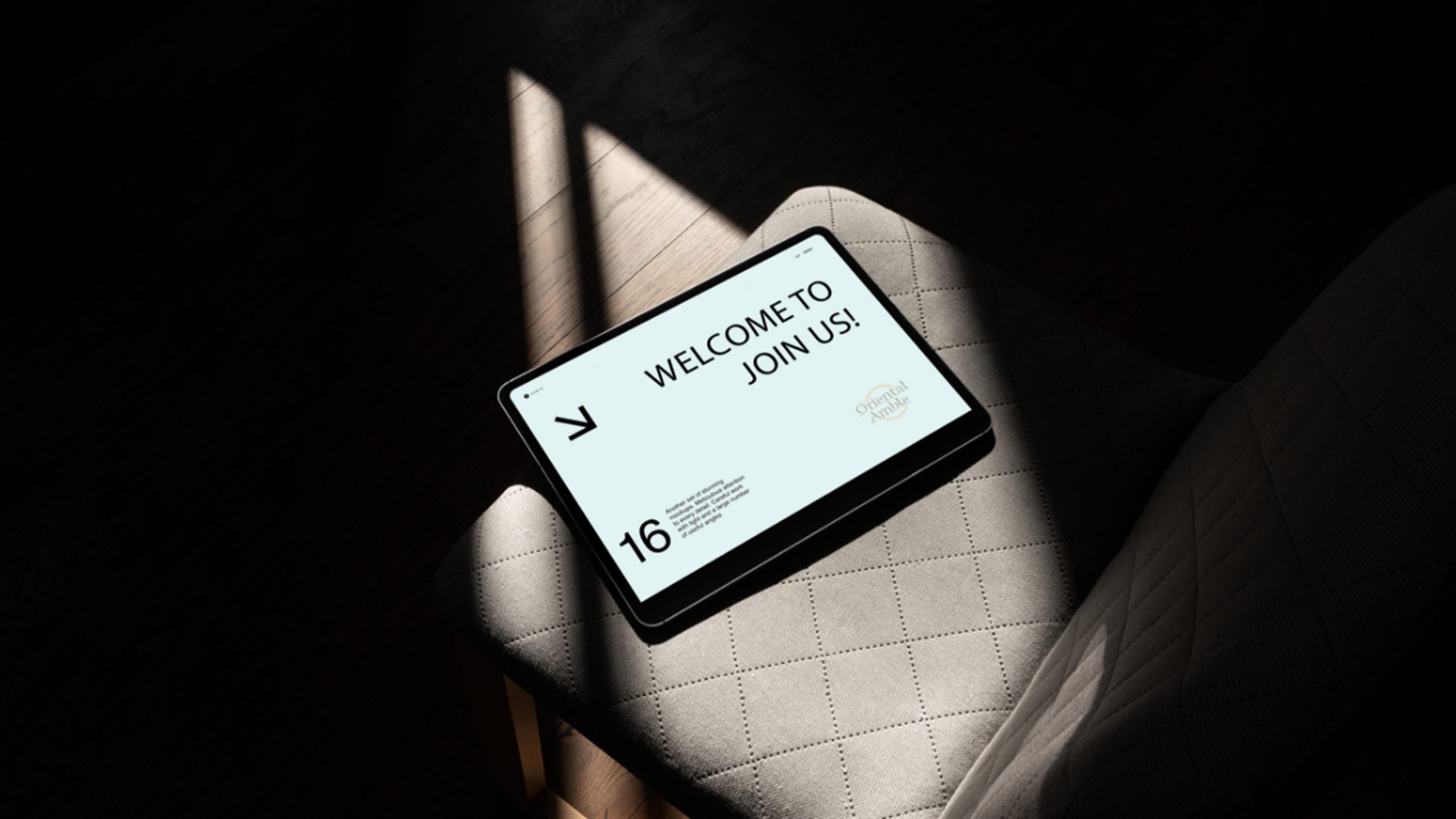
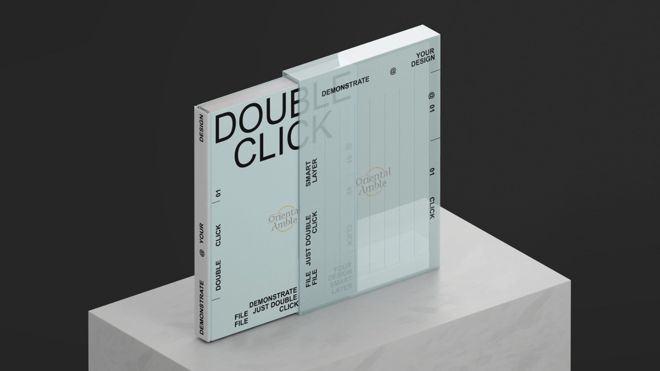
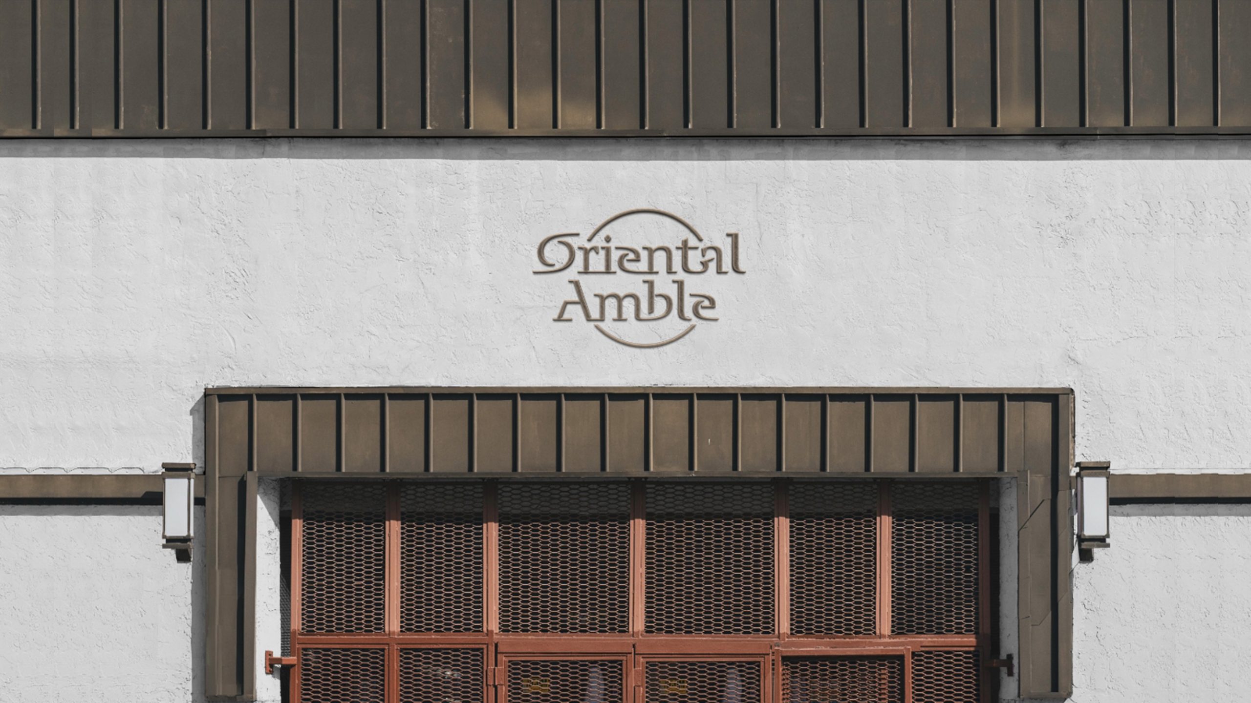
design concept
The logo is built on the concept that “typography is the brand,” and its distinctive letter proportions and rhythm form the soul of the identity. The varying stroke weights and curves draw on the press-and-pause dynamics of Chinese calligraphy. The arc of light symbolizes the morning sun, the flow of time and the timelessness of the Eastern spirit. The core idea: the East is not a place, but a rhythm and a state of mind.
graphic language
Letterforms: a custom serif that merges Western type structure with the qualities of Eastern brushwork, giving the strokes breath and life. Arc composition: a semicircular halo spans top to bottom, evoking the rising sun and setting moon and hinting at the harmony of heaven and earth. Balanced layout: staggered upper and lower lines echo the rhythmic spacing of a Chinese landscape painting. Expressive spirit: the whole is light and fluid like running script, seeking harmony of intent rather than perfect symmetry.
Fonts and composition
The Oriental Amble wordmark uses a bespoke typeface whose letter structures have been geometrically refined to combine Eastern rhythm with international style. The open “O” suggests an Eastern sunrise. The broken stroke of the “A” hints at rolling mountains. The extended curves of the “r” and “t” create a flow of breath between the letters. Generous letter spacing adds air, so reading feels as natural as an amble.
color system
Primary Amber Gold #D9A85E evokes Eastern warmth and cultural depth; secondary Charcoal #2B2B2B conveys rationality and modernity; and White #FFFFFF represents stillness, purity and room for reflection. Together they form an Eastern palette built on “light × shadow × space.”
Application and extension
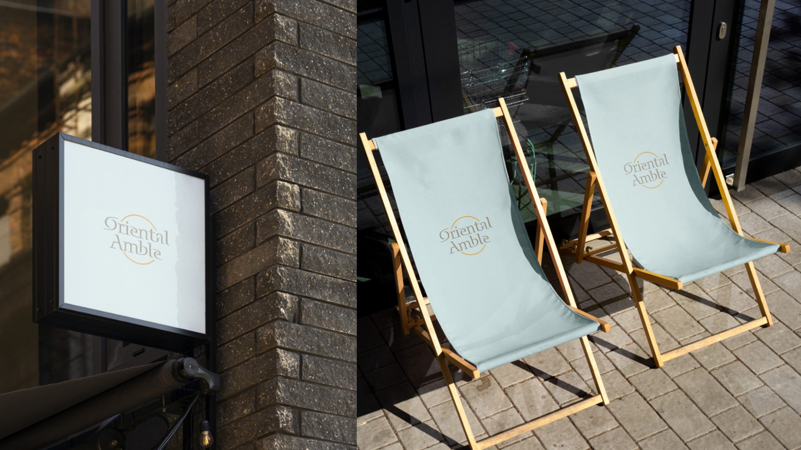
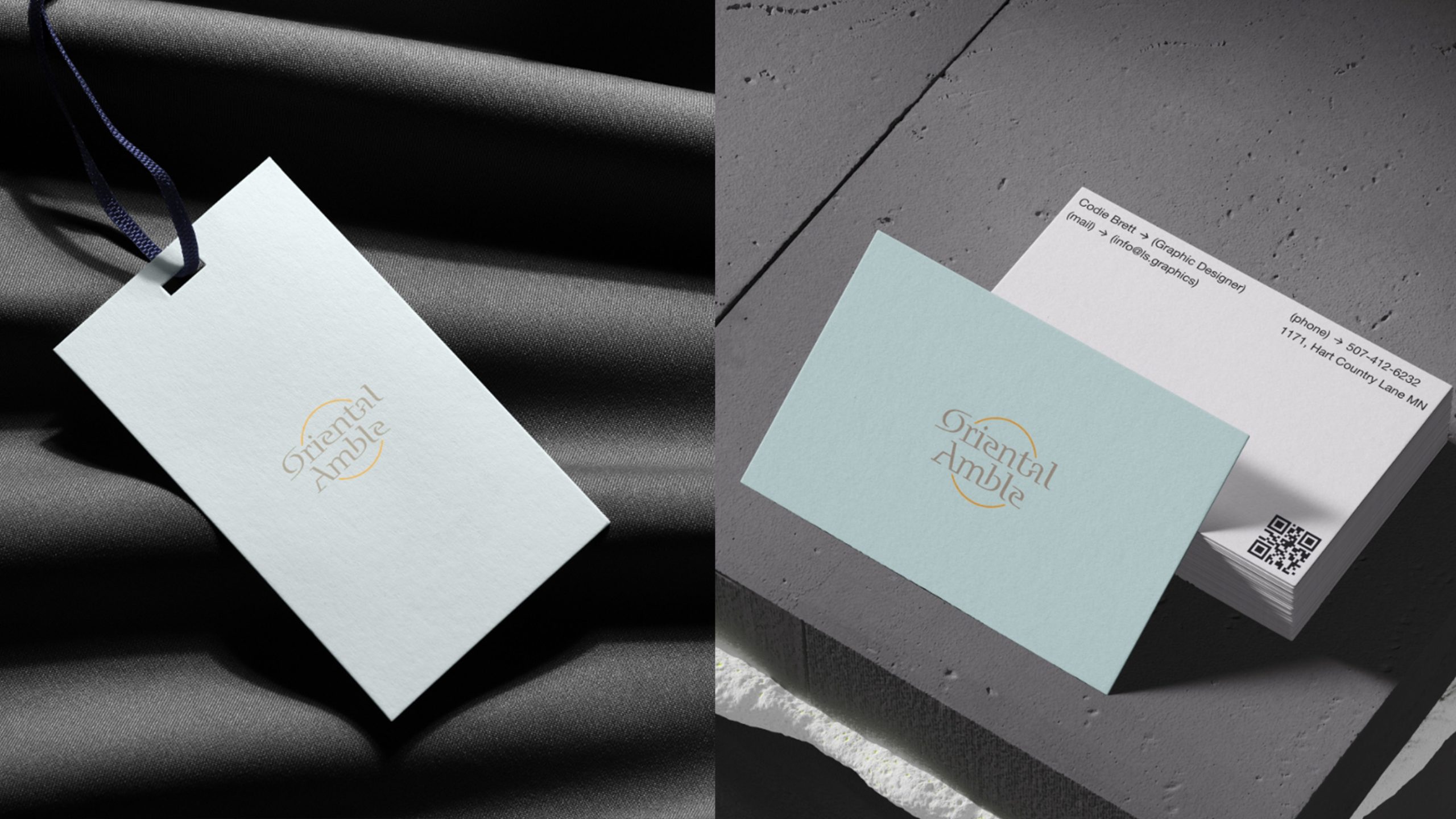
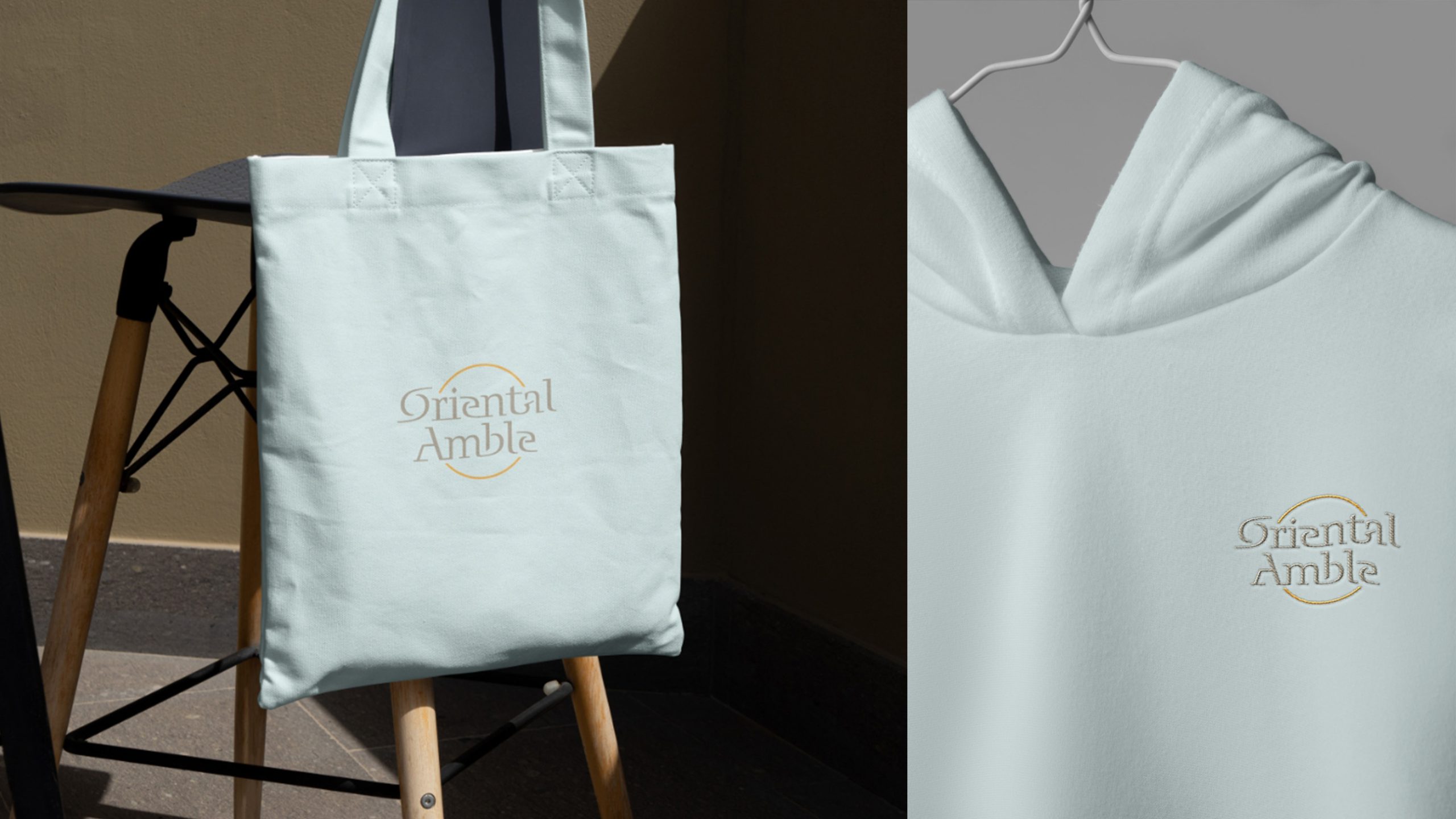
The mark is highly adaptable across cultures and spaces. Brand: Eastern cultural retreats, boutique hotels, art exhibitions and lifestyle products. Spatial: the arc of light can extend into architectural ornament, lighting structures or wall installations. Print and digital: book covers, invitations, exhibition catalogs and web visuals. In motion, the gold ring slowly rotates or shimmers, creating an “Eastern halo” that captures the brand’s sense of “flow and permanence in one.”
brand meaning
Oriental Amble embodies a philosophy of “moving unhurriedly between culture and nature”: Eastern form, expressing restraint, discipline and quiet reserve; Western reason, expressing order, logic and proportion; and a contemporary heart, seeking freedom and balance of the spirit. The arc symbolizes the continuity of time, and the lettering flows like water, together telling a visual story of an “Eastern amble.” The brand spirit in a line: “Arrive slowly; look back in stillness.”
Improper Usage (Protection Specification)
Do not alter type proportions or the angle of the arc. Do not add shadows, 3D effects or extra ornament. Do not replace the gold with highly saturated colors. Recommended minimum width: 40 mm.
design results
Since its launch, Oriental Amble has become a benchmark for contemporary Eastern lifestyle brands. Its type system now extends across cultural exhibitions, hotel branding and limited-edition publications, forming a complete visual world. The project is a signature example of Qingmei Future’s work at the intersection of Eastern culture, international design and contemporary sensibility, using “letterform as shape, spirit as soul” to chart a new visual language for the modern East.