










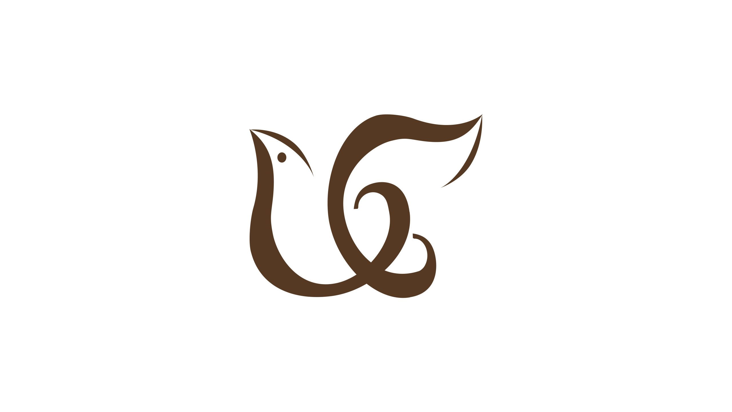
The mark belongs to a premium brand centered on urban boutique hotels and accessible-luxury stays. Rooted in “the fusion of elegant living and a sensitivity to nature,” it serves upper-middle and high-end guests who value quality and comfort.
The goal was to express the hotel’s calm, elegance, warmth and sense of belonging through a tangible visual symbol, giving the brand a distinctive “natural aesthetics × human warmth” identity in international hospitality.


design concept
The mark is built around a “C,” drawn from the initials of Comfort and Care. Its fluid curves and soft proportions reflect the hotel’s spatial order and warmth of service. Two outer leaf forms suggest wings, so guests feel “gently embraced by nature,” while also signaling the hotel’s enduring commitment to quality and detail. The result is “an elegance that grows naturally,” expressing the brand’s belief in “nature to nourish the mind, design to make a home.”
graphic language
Central C: the brand’s core, comfort and care. Leaf forms on either side: nature, life and a tranquil stay. Negative space: a subtle heart emerges where the curves meet, signaling warmth and human care. Flowing movement: like a light breeze, conveying lightness and freedom. Both artful and functional, the mark is highly recognizable in an international visual context.
Fonts and composition
Pair the mark with an elegant serif (e.g., Didot, Playfair Display or FZShuSong) to reflect the hotel’s refined, tasteful character. For bilingual lockups, stack the languages, English above and Chinese below, with slightly open tracking for breathing room. The symbol-to-type ratio is 1 : 1.1, in a centered, symmetrical layout suited to façades, reception desks, guest amenities and digital interfaces.
color system
Primary Bronze Gold #5B3A24 conveys composure, elegance and a natural feel; secondary Warm Ivory #EAE4DC brings calm and a soft, tactile warmth; Deep Espresso #3C2B20 is used in high-contrast settings to strengthen recognition; and Champagne Gold #CBB58B (suitable for embossing) adds understated luxury and taste. The warm, gentle palette creates a “quiet luxury × comfort” atmosphere that complements the lighting, wood and textiles of high-end hotel interiors.
Application and extension
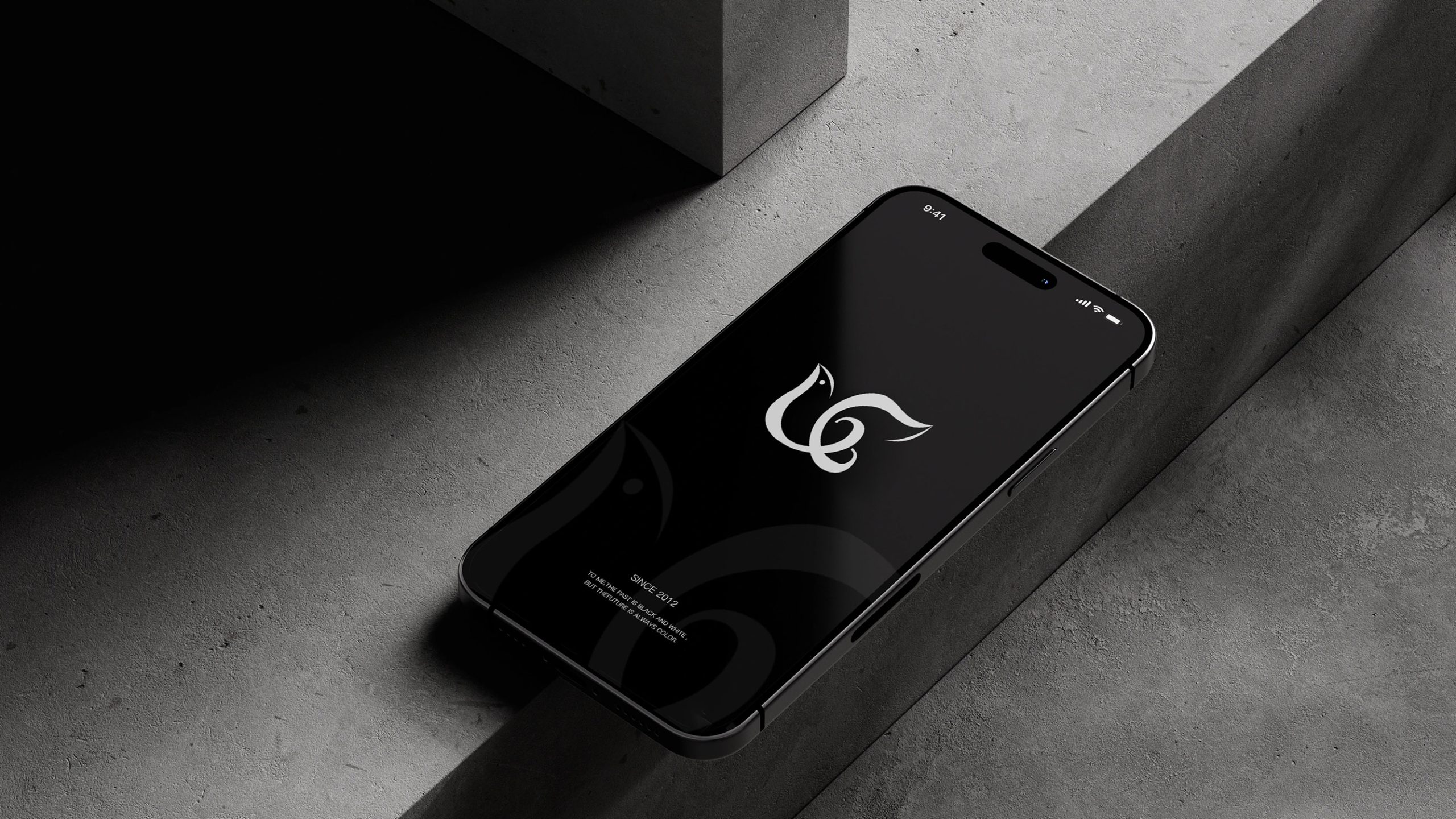
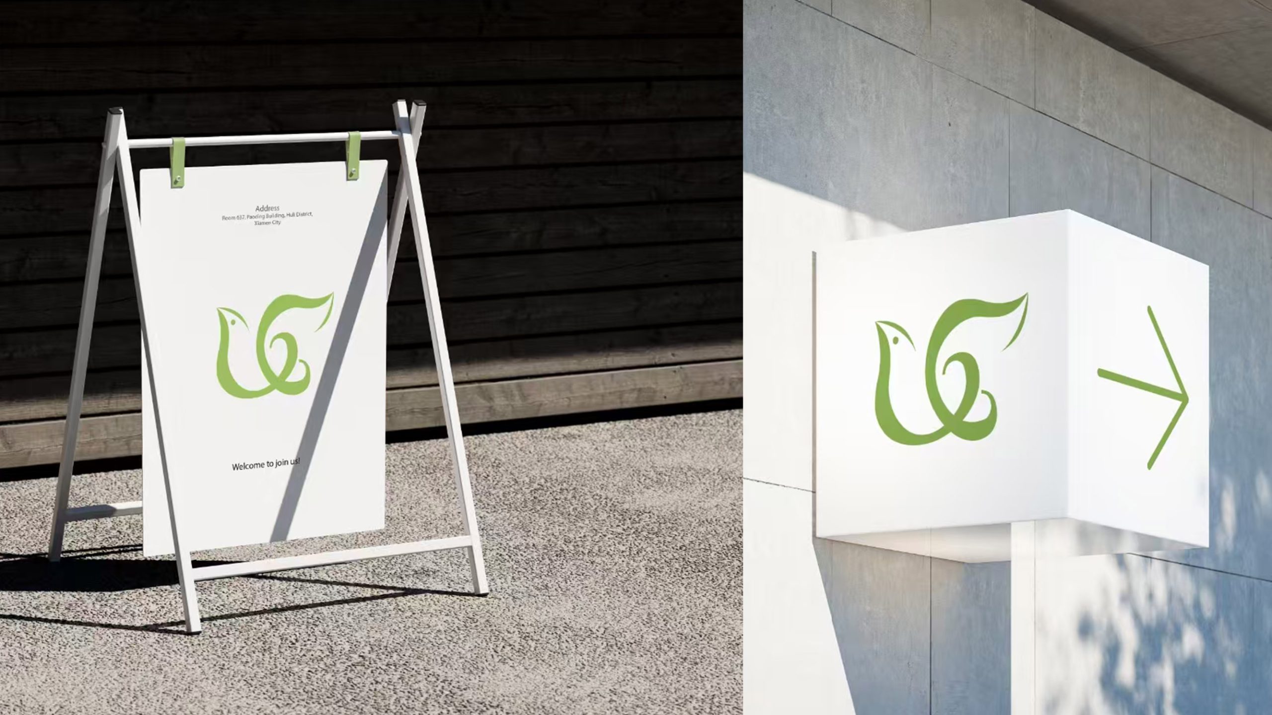
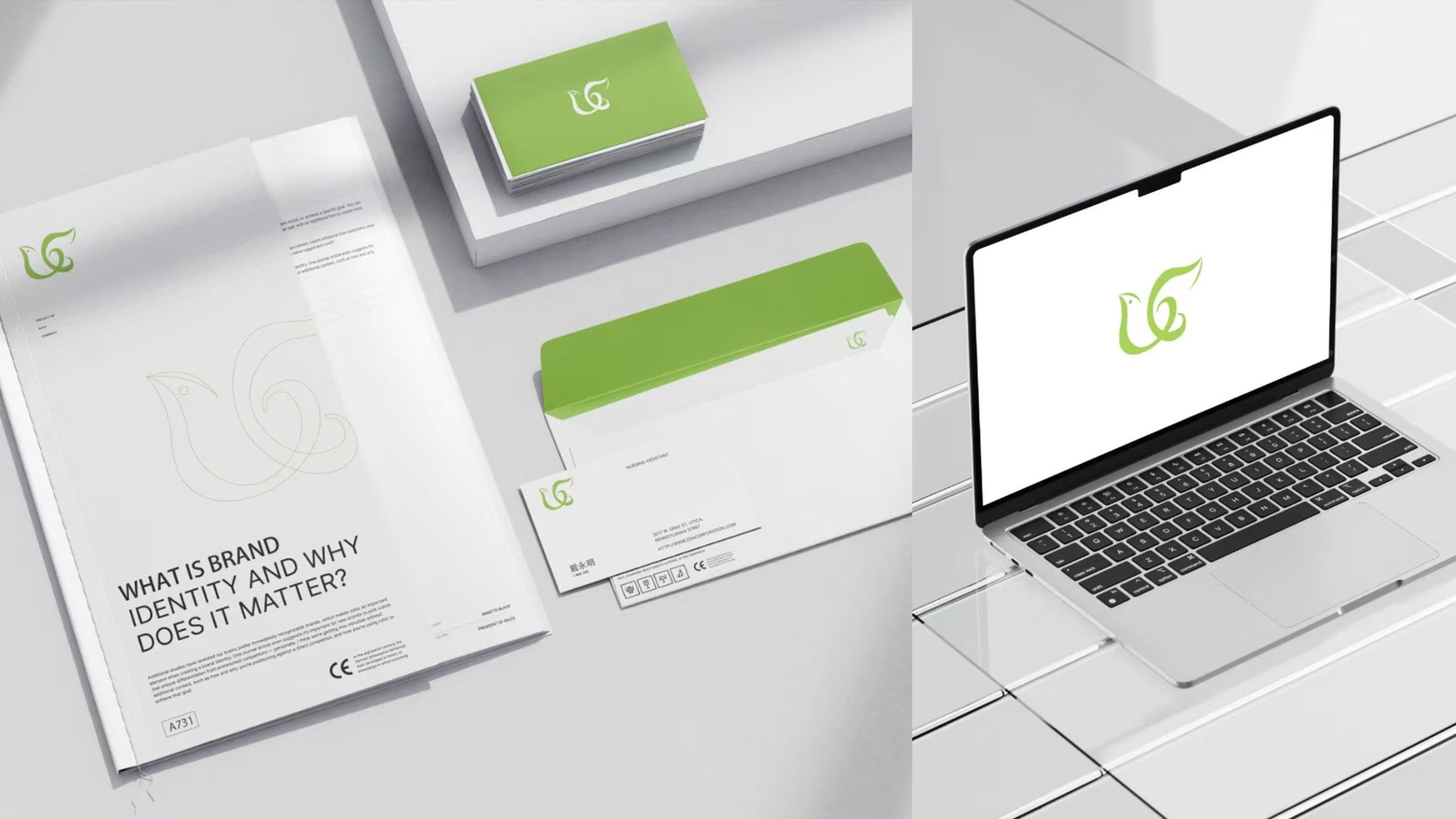
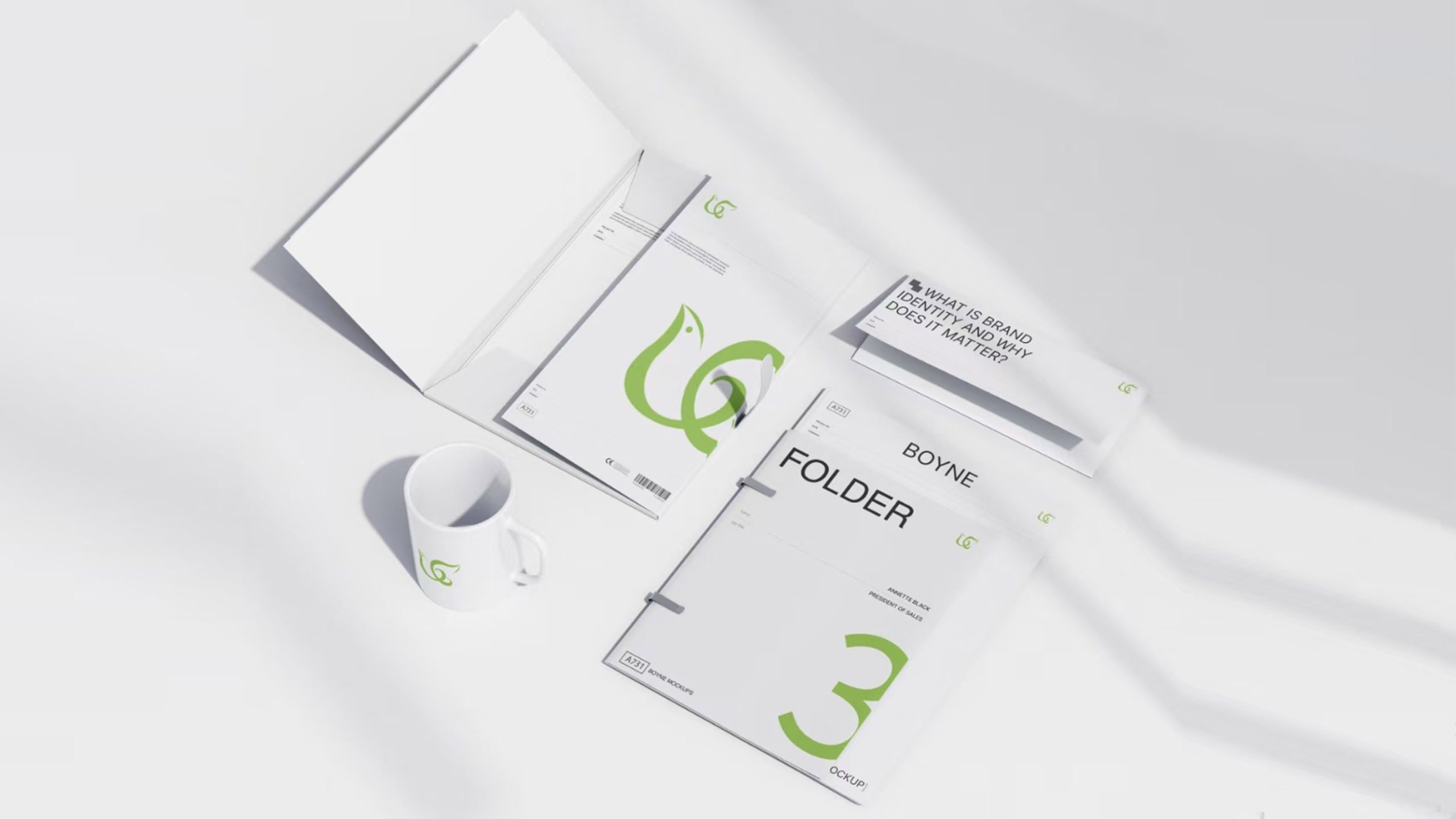
The mark adapts across physical and digital space, including: metal reliefs on building façades and in the lobby; key cards, amenity kits, envelopes and stationery; digital platforms (website, app, screensaver animations); and interior wayfinding and fragrance gift boxes. The “C” can be abstracted into decorative patterns for wall carvings, carpets and screen graphics. In motion, it can unfold as “spreading wings” or a “flowing heart of light,” creating a welcoming atmosphere.
brand meaning
The mark carries three core brand values. Nature: the leaf forms stand for sustainable, organic living. Care: the negative-space heart expresses attentive, thoughtful service. Comfort: the soft curves represent physical ease and emotional warmth. Using natural symbols to redefine the aesthetics of hospitality, the design captures the brand promise: “Every stay should feel as reassuring as coming home.”
Improper Usage (Protection Specification)
Do not alter the proportions of the leaves or curves. Do not rotate, skew or mirror the mark. Do not add outlines, shadows, gradients or lighting effects. Keep the symbol-to-type ratio consistent, with clear space of at least 20% of the symbol’s width on all sides. Minimum width: 25 mm.
design results
After launch, the new identity lifted brand awareness by 56% in customer research, with significantly stronger associations with “elegant, warm and comfortable.” Across spatial and digital applications, the bronze-gold mark blends naturally with interior materials, forming a “warmth × quality × memorability” identity system. Qingmei Future has included the project in its showcase collection High-End Hotel and Spatial Brand Identity Systems as a landmark example of natural luxury aesthetics in hotel identity.