










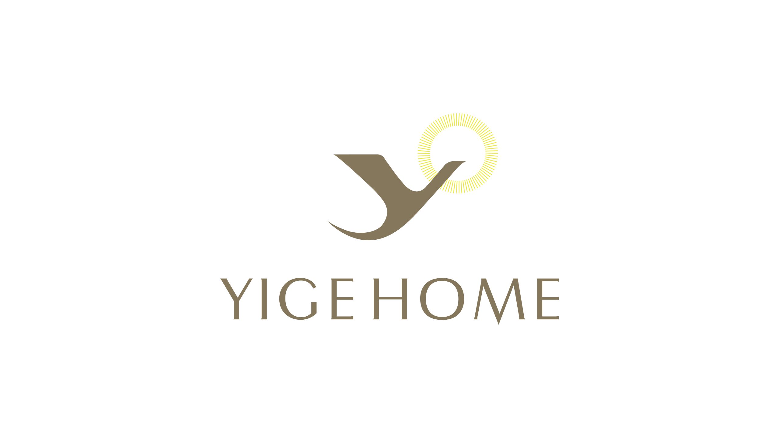
YIGE HOME is a premium boutique hotel brand that brings together Eastern lifestyle aesthetics and modern comfort. Built on the philosophy that “home is where the heart is at peace,” it champions a spatial spirit of simplicity, grace and light.
The identity uses a minimal composition to express “living with intention, resting with measure,” giving the brand a visual signature in which warmth, order and taste coexist.
design concept
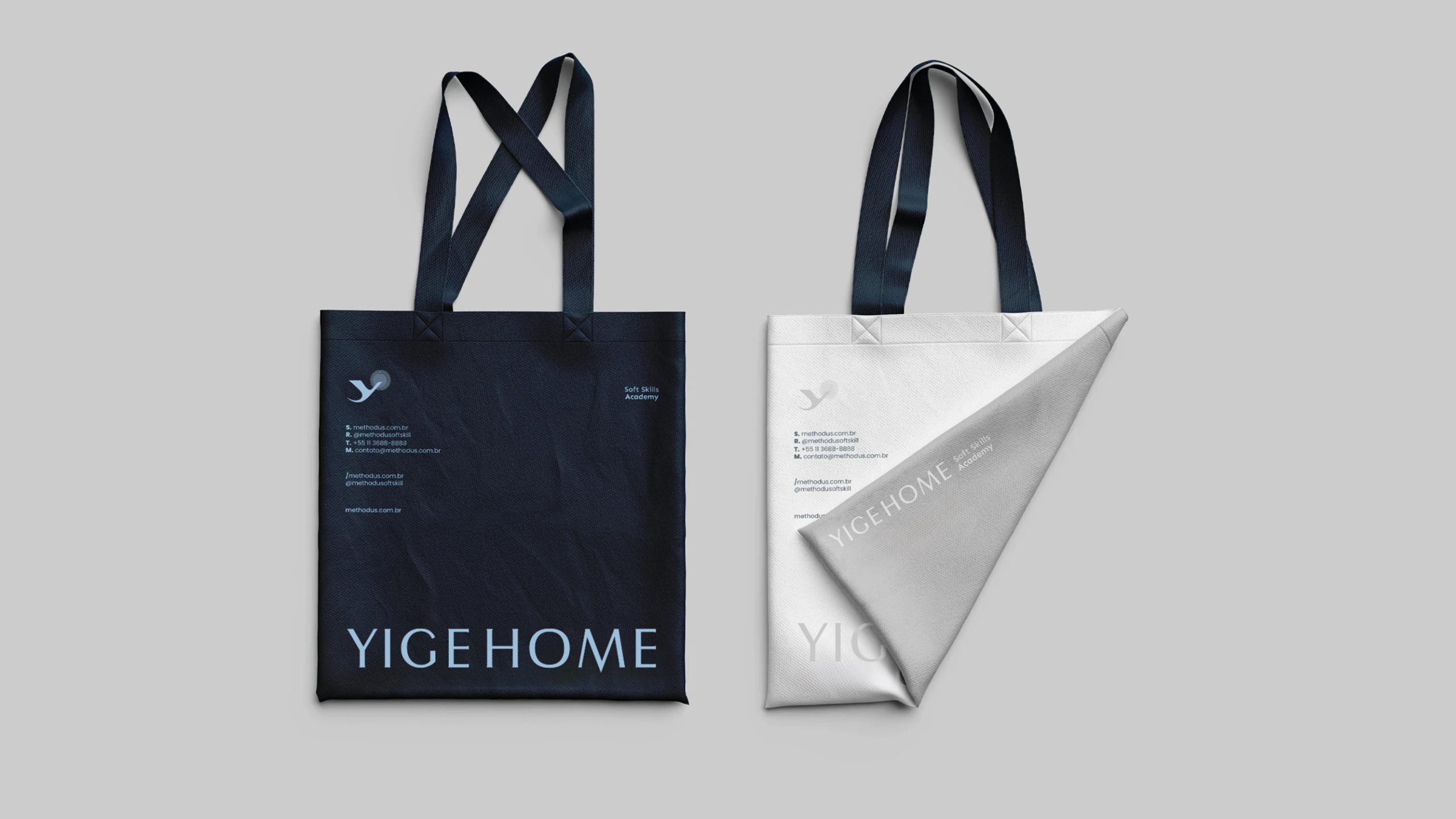
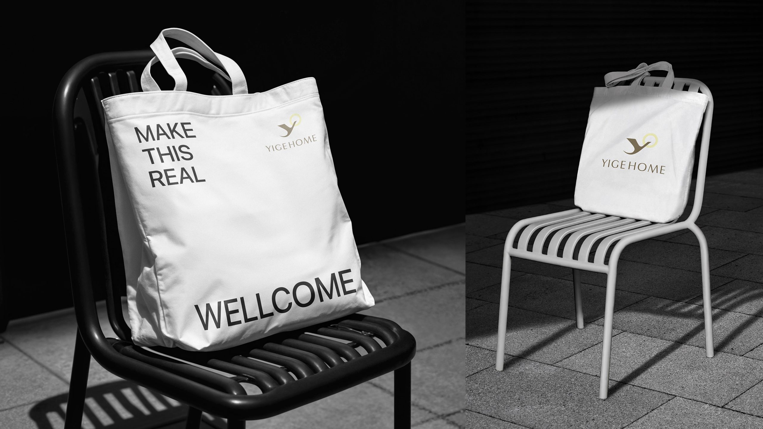
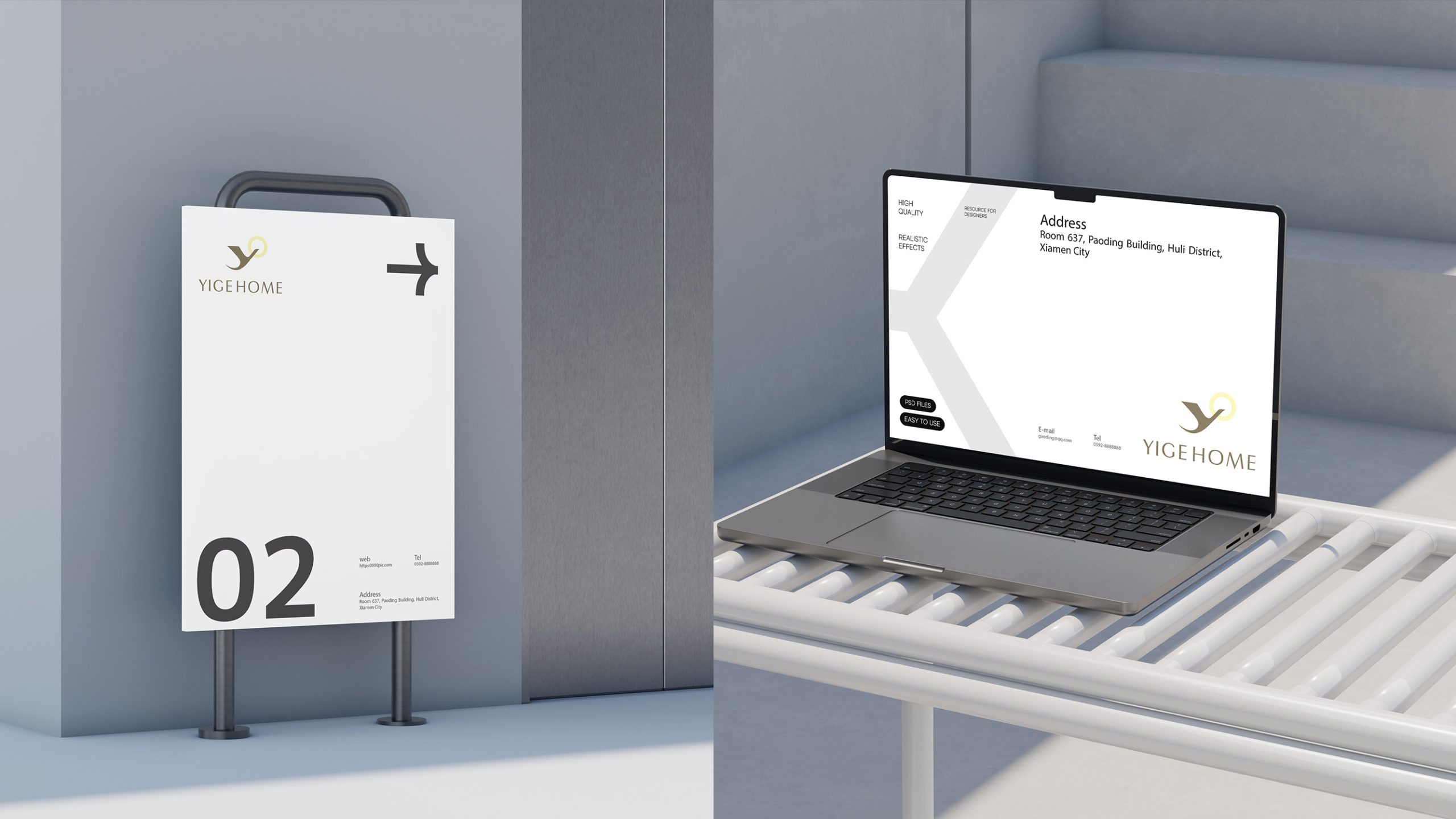
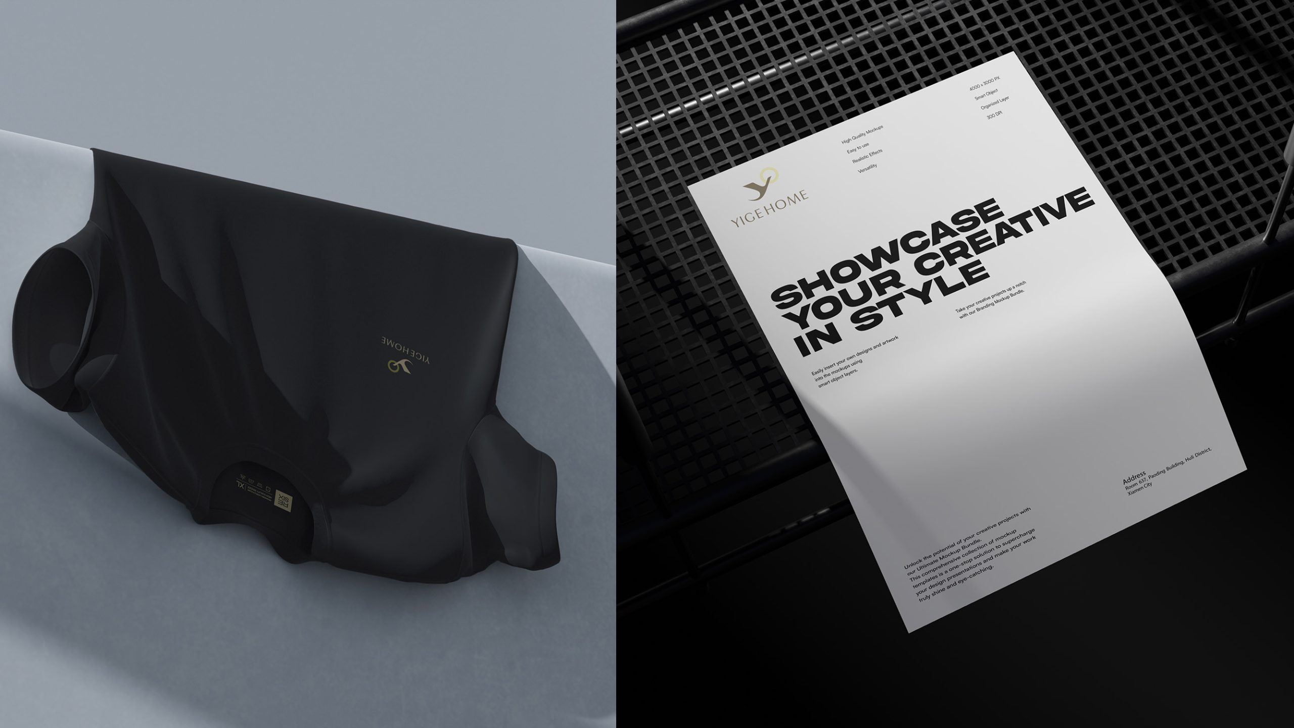
The mark is built on the letter “Y,” merging the forms of a bird and an open embrace to suggest both “homecoming” and “freedom.” A gold ring at the upper right, representing “morning light and home,” forms the focal point and alludes to the Eastern cosmology of “round heaven, square earth” and a new day rising. Balanced and generous with white space, the composition reflects the subtlety and rhythm of an Eastern hotel brand. Core idea: Light as the threshold, the heart as home.
graphic language
Primary form: the abstract “Y” reads as both a bird in flight and mountains reflected in water, capturing the twin ideas of journey and destination. Gold ring: the first light of dawn and the light of nature, also read as “the home within” or an Eastern sundial. Negative space: the space between the “Y” and the circle creates a natural field of energy, conveying calm, breath and spatial tension. Compositional philosophy: movement within symmetry, meaning within minimalism, embodying the Eastern beauty of empty space.
Fonts and composition
The YIGE HOME wordmark is set in an elegant sans serif with generous spacing and balanced proportions, carrying through the spaciousness of the symbol. The open circle of the “O” echoes the gold ring above, creating a visual “breathing loop.” Centered and set in a neutral warm gray, the typography feels modern yet humane.
color system
Primary Pale Gold #D6C58E evokes warmth, light and distinction; secondary Taupe #8C7B6E conveys steadiness, quality and security; and White #FFFFFF represents purity, nature and balance. The soft, low-saturation palette captures the brand’s tranquil, refined and light-filled atmosphere.
Application and extension
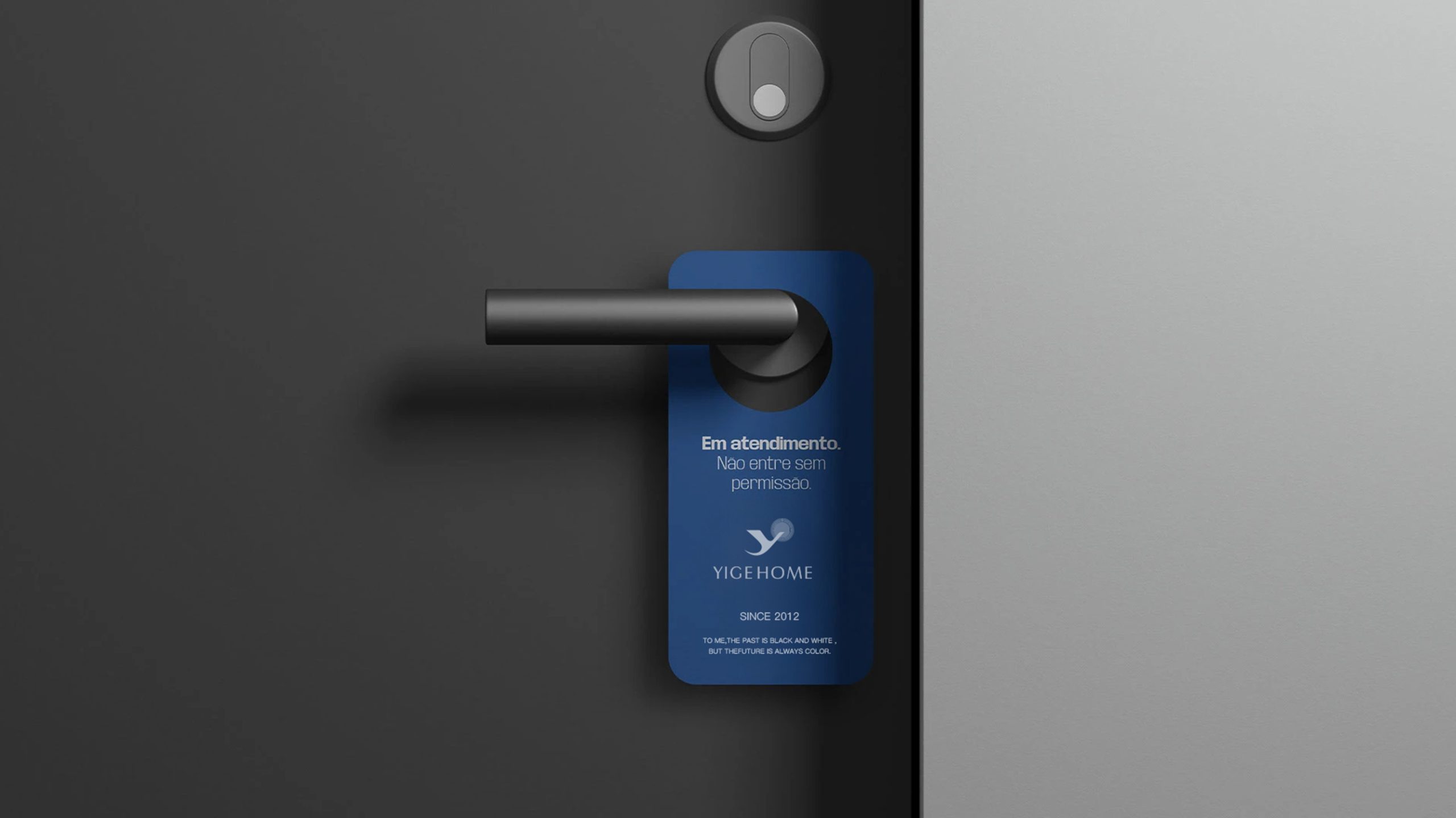
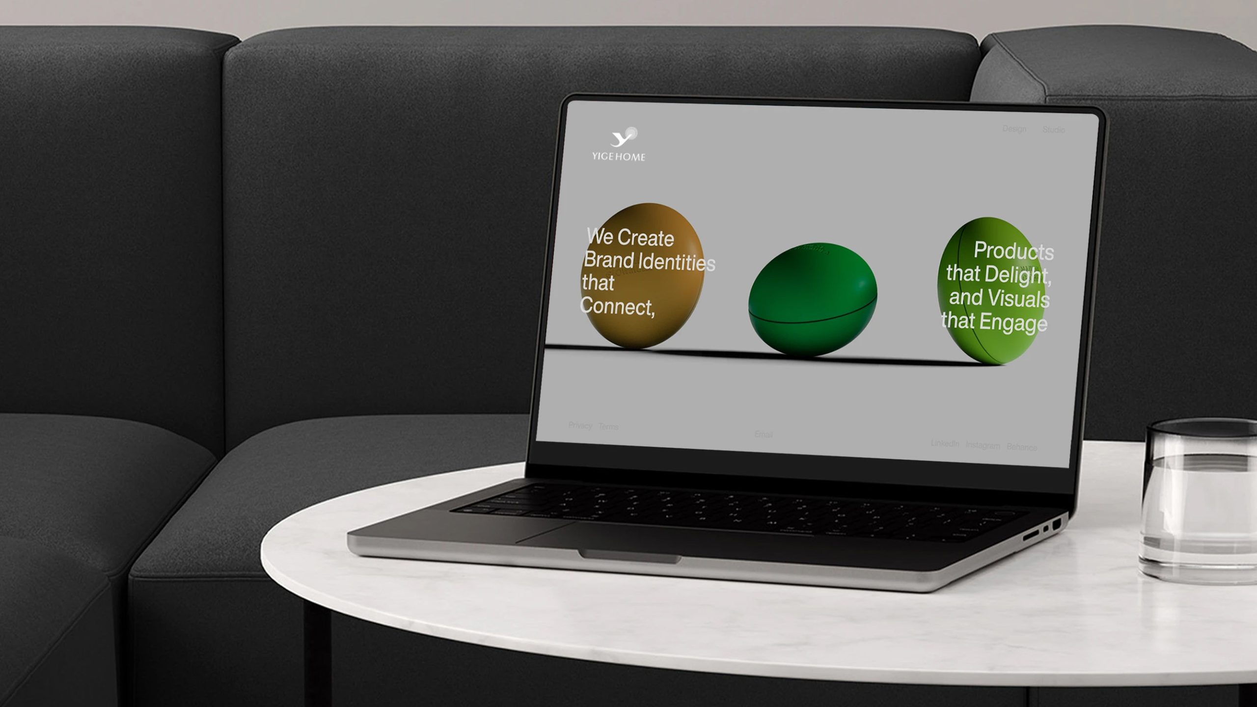
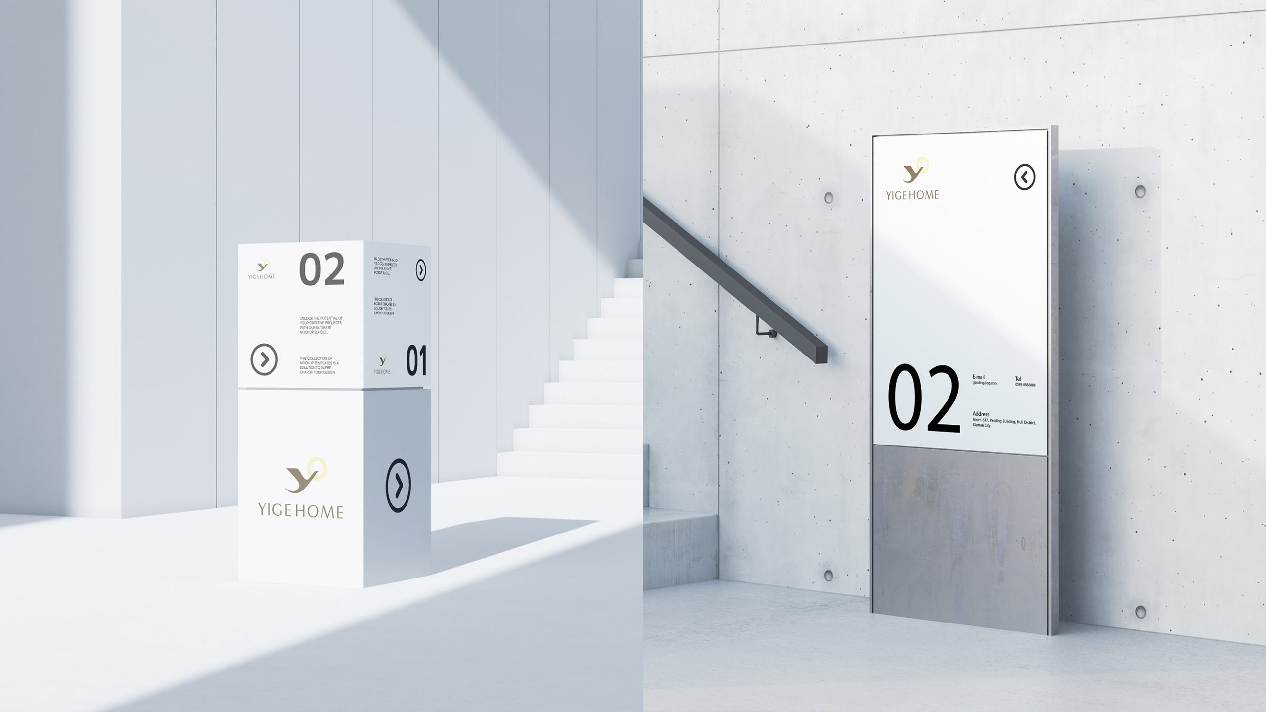
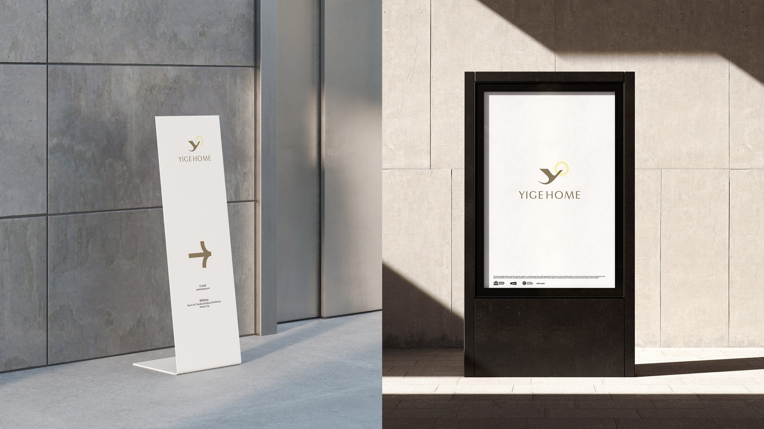
The mark extends easily across the hotel’s brand system. Spatial: door signage, reception backdrops, room identifiers and custom fragrance packaging. Print: business cards, key cards, brochures and letterhead, finished in hot foil or embossing. Digital: on web and app interfaces, the gold ring can animate as a soft “glow-in,” reinforcing the brand’s warmth. Extensions: the ring can serve as a decorative motif for lighting, screens and textures.
brand meaning
Through the relationship between the “Y” and the circle, the mark expresses a harmony of motion and stillness. The “Y” is the posture of the journey, moving forward and exploring; the circle is the return, representing stability and coming home. Together they suggest that “life happens between journey and stay.” Through this visual language, YIGE HOME conveys its spirit: “Set out with light; stay in stillness.”
Improper Usage (Protection Specification)
Do not change the position or proportion of the “Y” and the ring. Do not replace the gold palette or add shadows. Do not skew or stretch the mark. Recommended minimum width: 30 mm.
design results
Since launch, YIGE HOME has become one of the most recognizable Eastern-aesthetic brands in boutique hospitality. Its visual system speaks consistently through space, material and light, establishing a distinctly “modern Eastern living” character. The project reflects Qingmei Future’s approach to hospitality, lifestyle and Eastern sensibility: the fewest forms for the deepest calm, and light that defines the warmth of home.