











This identity was created for a specialist in cold-chain logistics and refrigerated transport systems, offering refrigerated vehicles, cooling equipment and temperature-controlled transport solutions.
The brand wanted its logo to communicate core strengths in temperature-control technology, transport safety and environmental protection, establishing a clear promise: precise cooling, reliable transport and global standards.
design concept
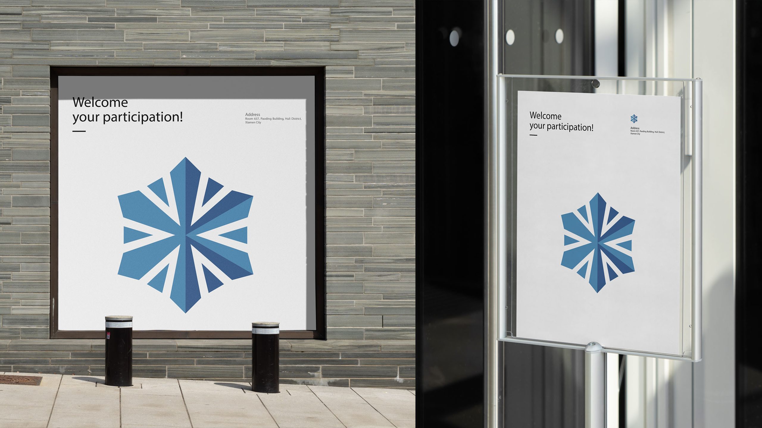
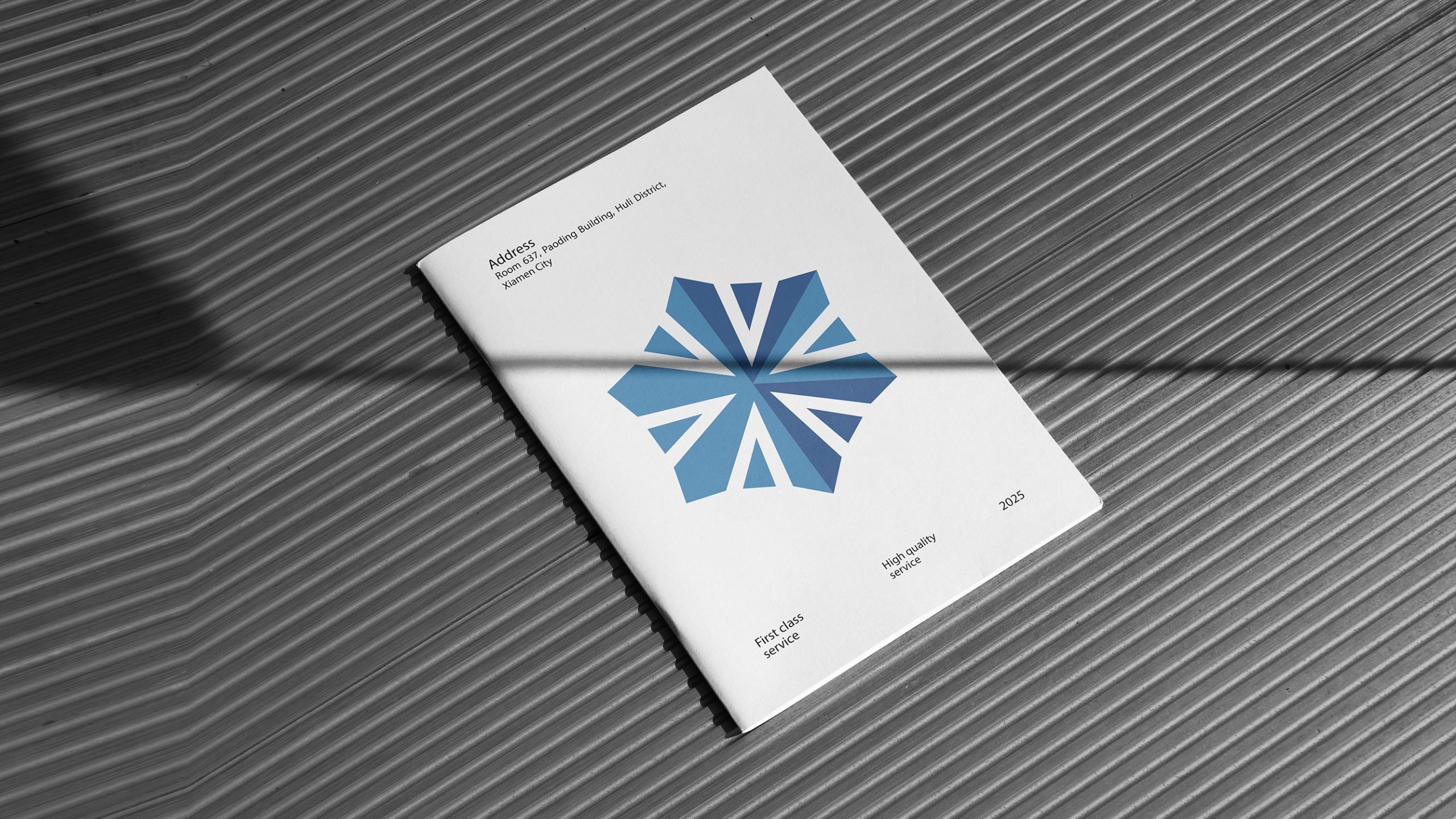
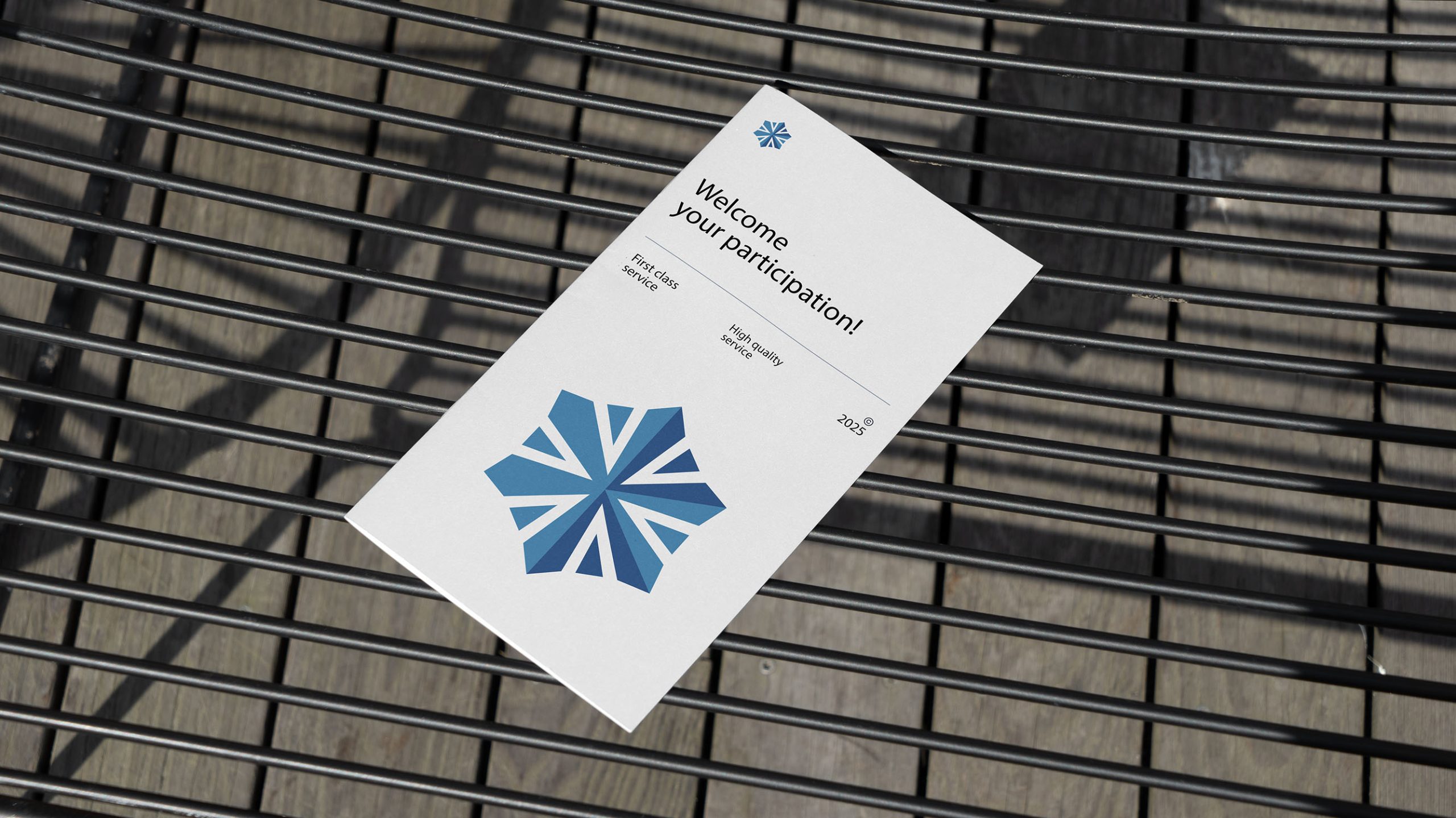
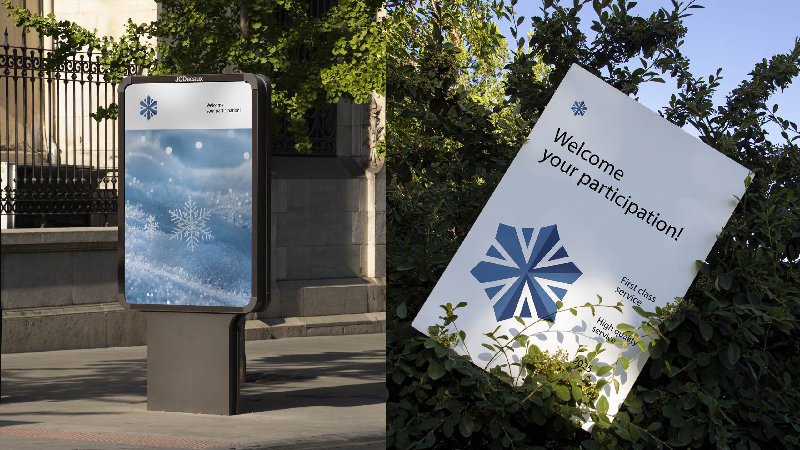
Combining a snowflake with a technological core, the logo unites cold-chain expertise with engineering precision. Inspired by the ordered beauty of natural snow crystals, the design reinterprets their form through geometric, mechanical construction to create a six-way symmetrical structure—symbolizing the precision, stability and repeatability of temperature-control systems. Six rays of cold light extend from the hexagonal center, representing reliable cold-chain service in every direction. The brand promise: “Temperature under control. Freshness within reach.”
graphic language
Snowflake structure: Identifies the refrigeration sector, symbolizing purity, stability and natural cooling energy. Six radiating geometric lines: Express the flow of cold air and the balance of forces within a system, suggesting technical precision and continuous circulation. Central node: Represents the core refrigeration unit and the company’s technological hub. Outer points: Combine the forms of fan blades and flowing air to convey the momentum of efficient operation. The overall symbol brings industrial technology together with the harmony of natural order—an expression of the art of cooling through technology.
Fonts and composition
A geometric sans serif typeface is recommended to convey the technology sector’s precision and rationality. Its stroke weight should match the snowflake lines for visual consistency. Chinese and English should appear in a horizontal lockup, with uppercase English lettering and a clean Chinese sans serif such as Source Han Sans. Maintain a symbol-to-wordmark ratio of 1:1.3 for a balanced presence on vehicle liveries and equipment nameplates.
color system
Primary cool blue #3C6FAE signifies technology, rationality and cooling energy. Supporting blue-gray #6A9CBD conveys stability and system reliability. Deep blue #1E355E communicates expertise, trust and authority in the cold chain sector. White space reinforces cleanliness and the purity associated with precise temperature control. Anchored in cool blue, the palette creates a distinctive cold chain technology identity with strong visibility across vehicle liveries and digital interfaces.
Application and extension
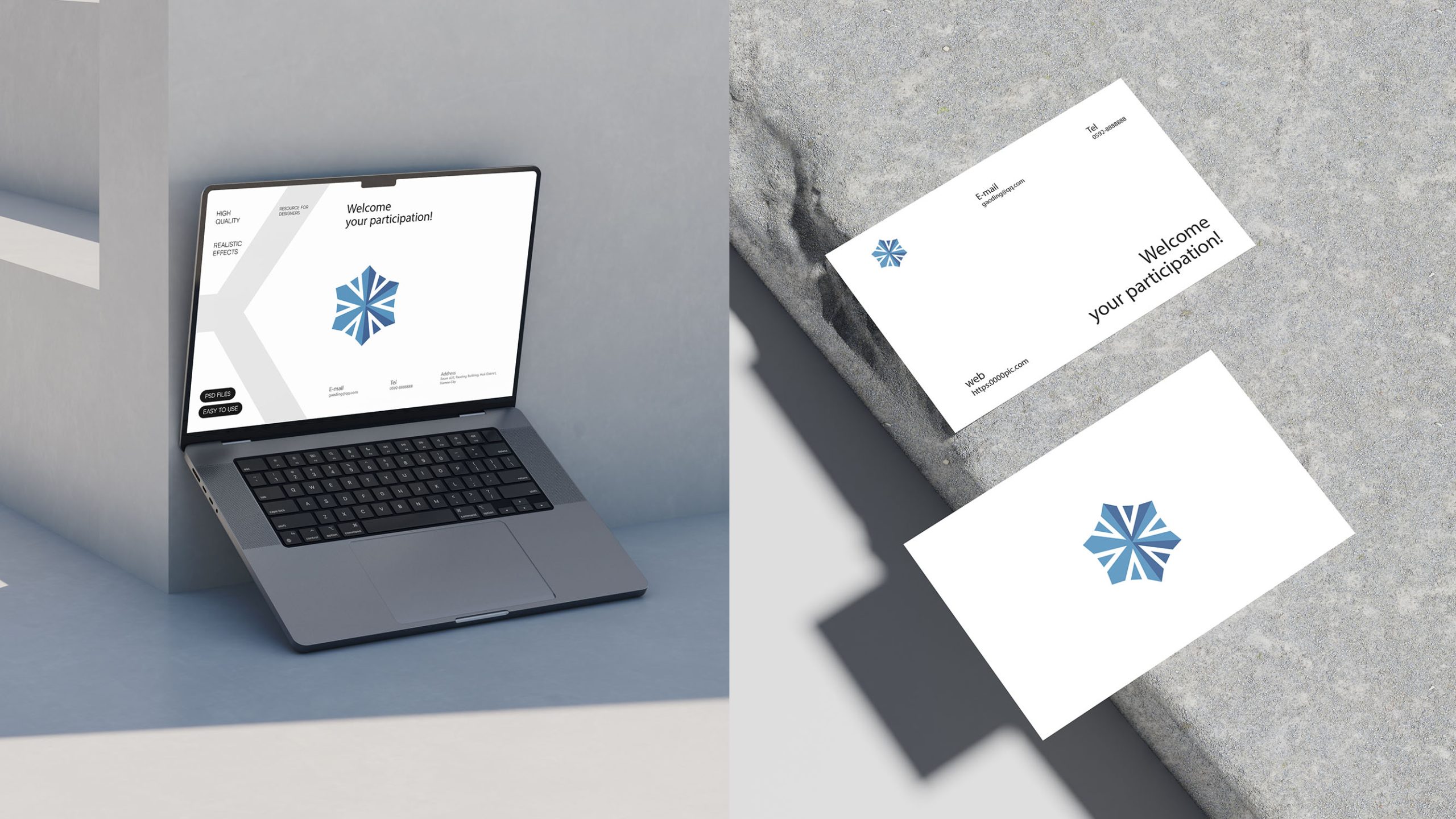
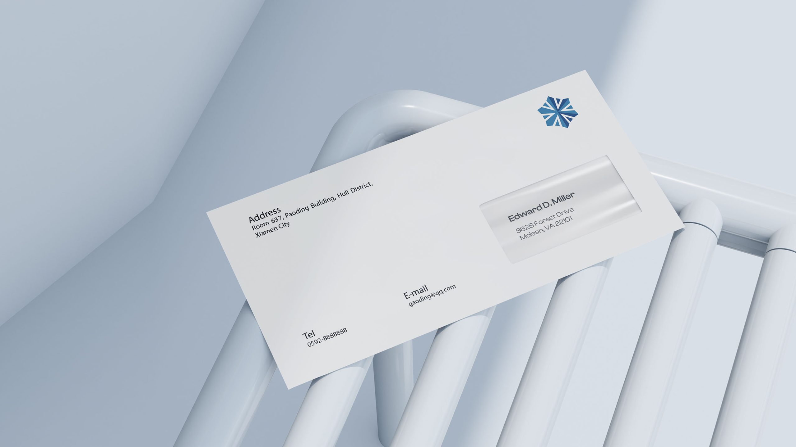
The identity extends across refrigerated vehicle liveries, refrigeration unit nameplates, warehouse wayfinding, uniforms, shipping cartons and digital control interfaces. The hexagonal motif can also serve as a standalone graphic, creating background textures, ice crystal patterns or lines that suggest cold airflow. In motion, the six radiating lines can rotate to evoke the refrigeration cycle, bringing energy and technical confidence to the visual identity.
brand meaning
Shaped like a snowflake with technology at its heart, the mark represents the company’s role as a “guardian of temperature” in the cold-chain industry. Its six-fold symmetry represents the brand’s six core values: Precision | Safety | Efficiency | Sustainability | Connectivity | Global Reach. More than an industry mark, it is the company’s visual statement of its long-held commitment to “intelligent temperature control, lasting freshness.”
Improper Usage (Protection Specification)
Do not alter the snowflake structure, angles or proportions. Do not change the core blue palette or add gradients. Do not rotate, tilt or mirror the symbol. Do not add shadows, outlines or reflective effects. Maintain a symbol-to-wordmark ratio of 1:1.3 and a minimum display width of 25 mm. Vehicle liveries must provide sufficient clear space to ensure recognition.
design results
Following the launch, brand recognition across cold chain vehicles and warehouse equipment increased by 52%. Customers described the identity as clean, technologically advanced and trustworthy. Consistent application of the blue snowflake system across the nationwide transport fleet reinforced the company’s leadership in precision refrigeration and cold chain logistics.