










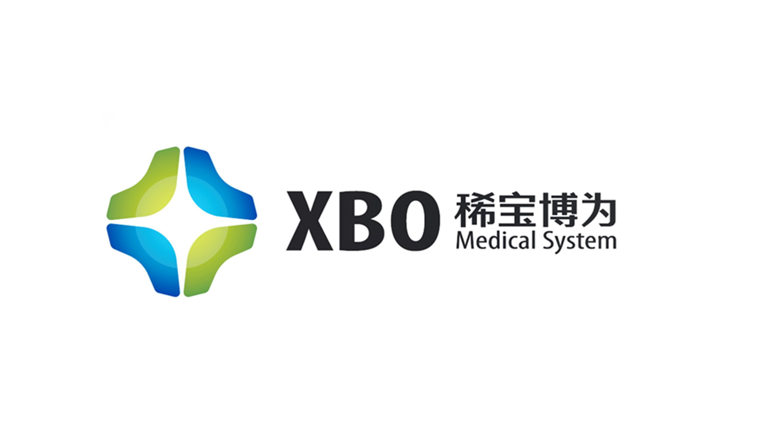
XBO Medical System is a high-tech healthcare company developing precision medical devices, clinical data systems and intelligent diagnostics. As it expanded into global markets, the brand sought a new identity system that expresses its core positioning, medical technology with human care, and communicates its innovation and professional standards in medical system solutions through an international visual language.

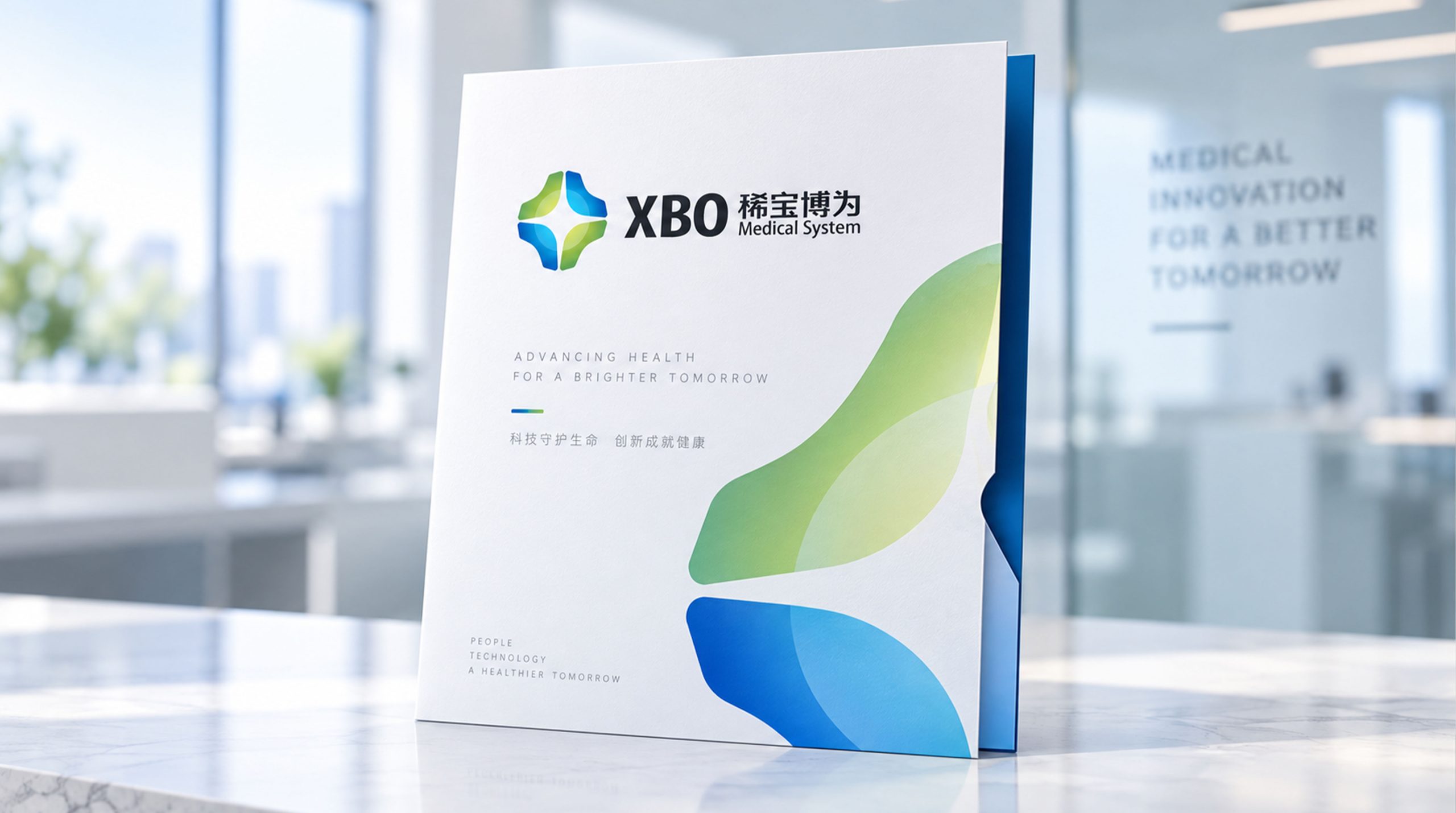
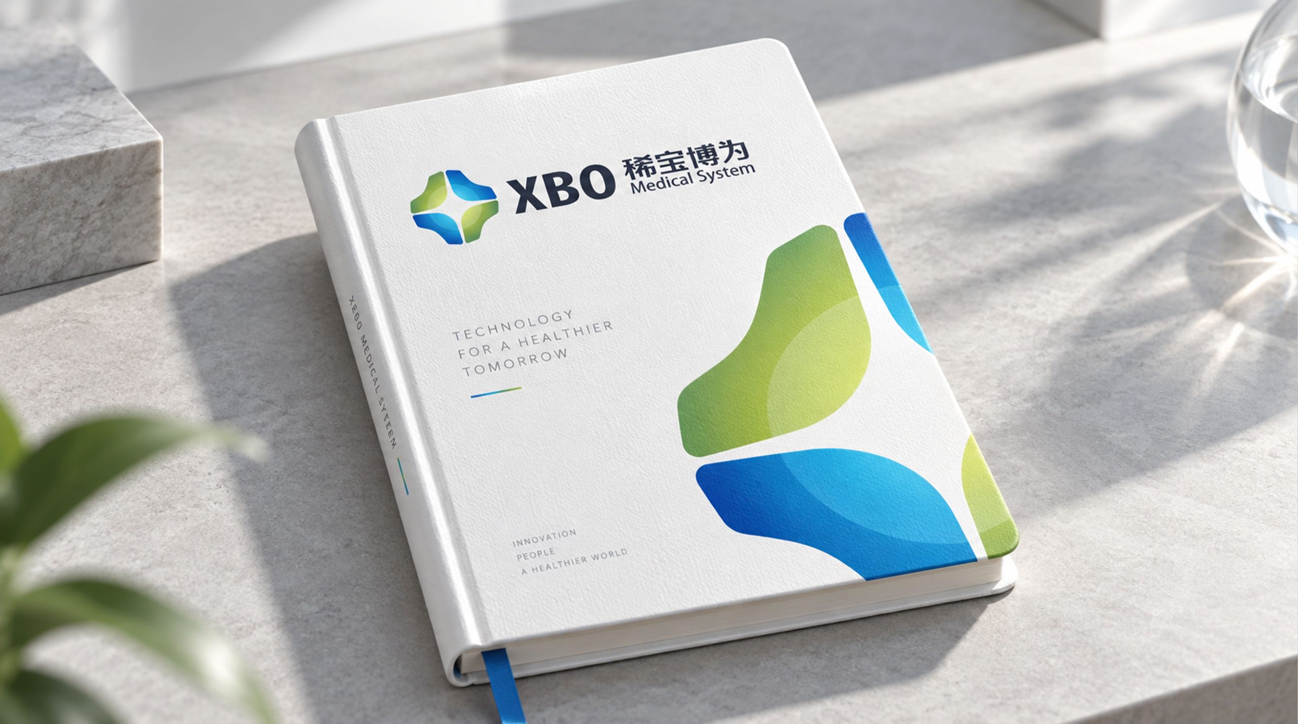
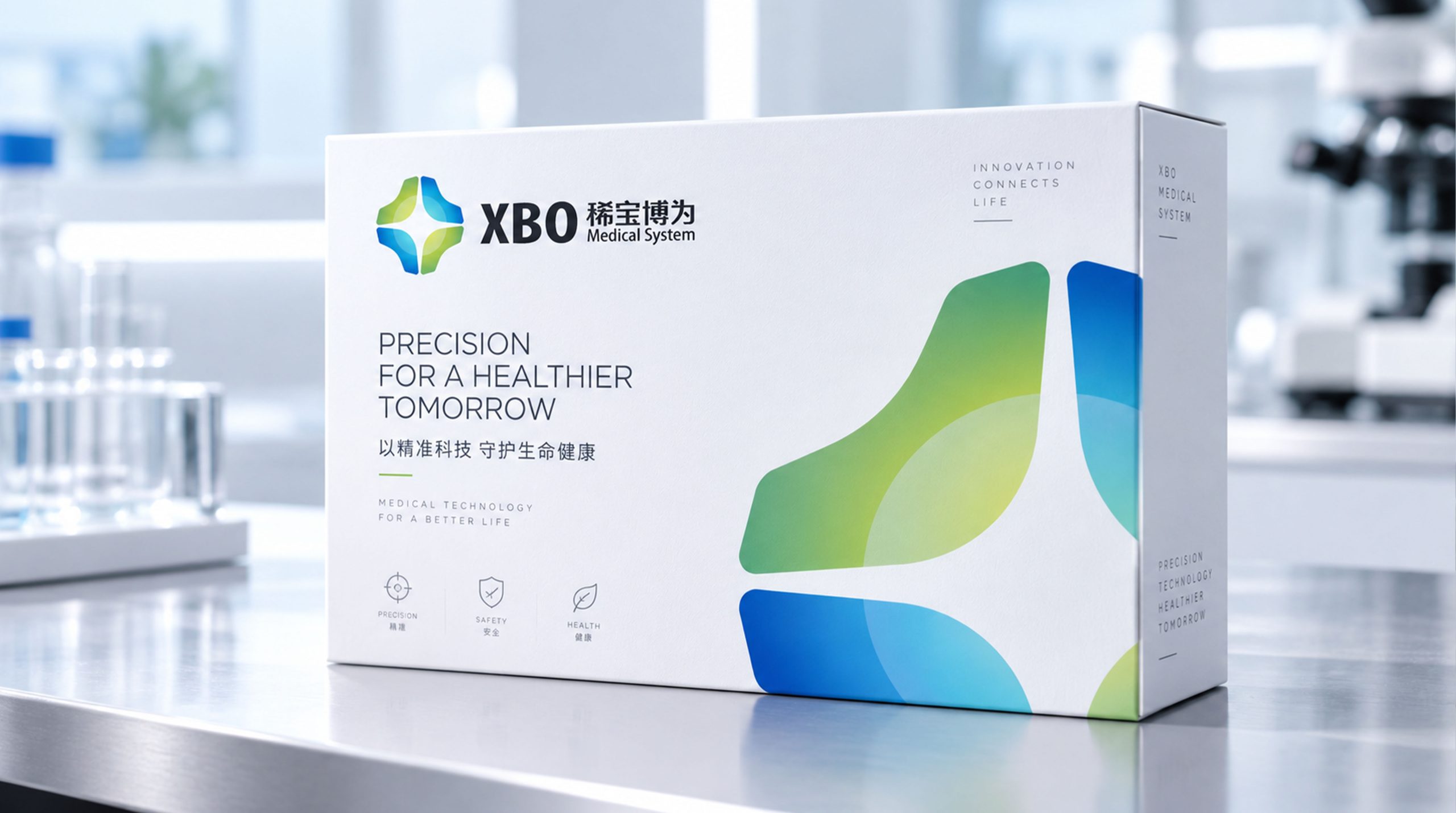

design concept
Built around the idea of “guarding life, balancing technology,” the mark fuses the medical cross with organic structure into a soft, overlapping three-dimensional form. Inspired by cell tissue under the microscope, four dynamic curves converge at the center, signifying “connecting life through technology.” The form carries the stability and rationality of healthcare while adding a sense of technological flow, reflecting the company’s commitment to building a healthier future through innovation.
graphic language
Central cross: the universal medical symbol, representing care, trust and safety. Four gradient surfaces: doctors, patients, technology and society working together as a complete healthcare ecosystem. Converging light: negative space at the center focuses light, conveying precision, hope and the power to heal. Organic curves: soft edges bring warmth and humanity, so technology never feels cold. Balanced yet fluid, the form expresses XBO’s brand promise: “illuminating life with the warmth of science.”
Fonts and composition
The primary wordmark XBO uses a geometric sans-serif with solid, strong strokes, conveying modernity and confidence. The Chinese name uses a custom sans-serif with a clear structure and compact strokes, balanced with the English. The subtitle Medical System is set in a light sans-serif, conveying professionalism and an international outlook. Symbol and text are proportioned at 1 : 1.3, and the left-symbol, right-text layout emphasizes stability and order in line with medical design standards.
color system
Primary Blue #3E8FD5: technology, rationality and trust, the core color of healthcare. Secondary Green #8AC043: life, growth and recovery. Gradient system (blue → green → cyan): dimensional depth and breathing room, signifying the union of technology and life. Neutral Gray #4A4A4A: for text and supporting copy, balancing visual hierarchy. The palette embodies the brand DNA of rational technology × living warmth, with consistency across digital platforms and print.
Application and extension
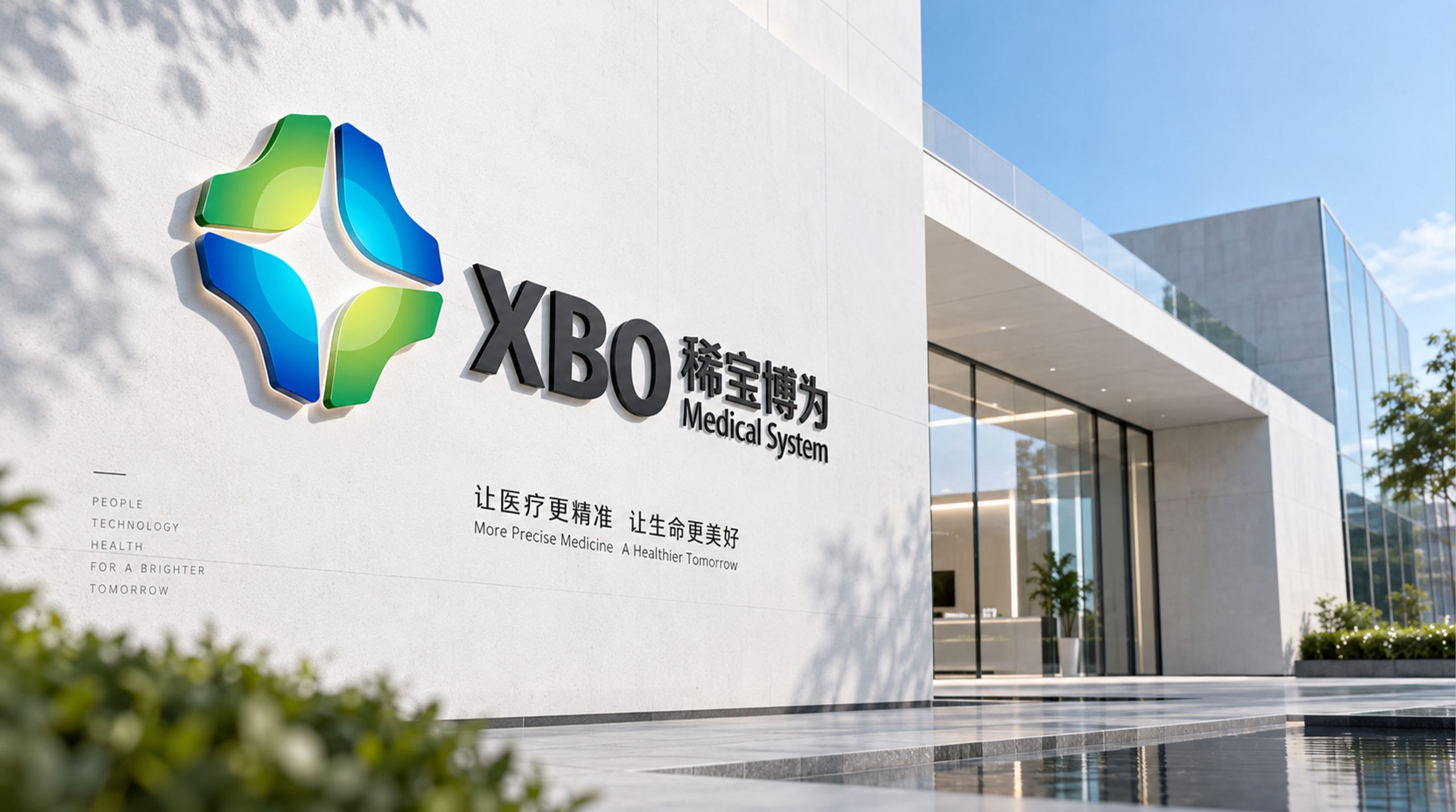
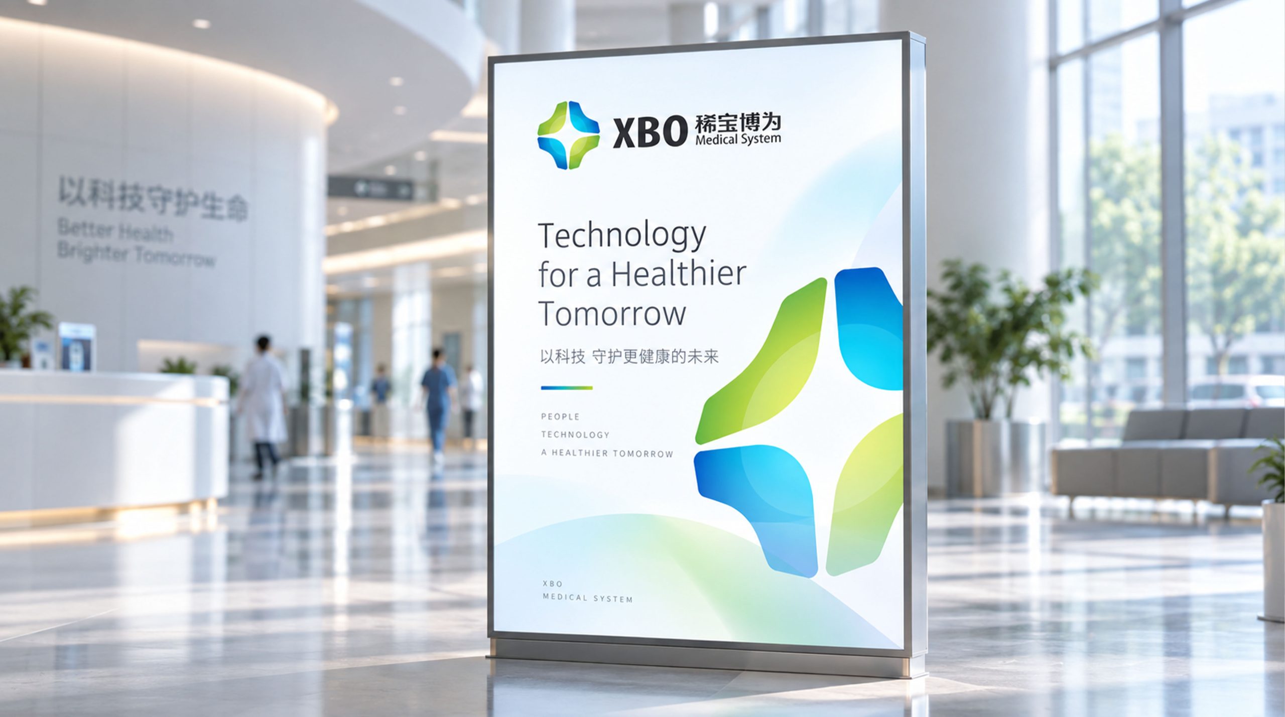
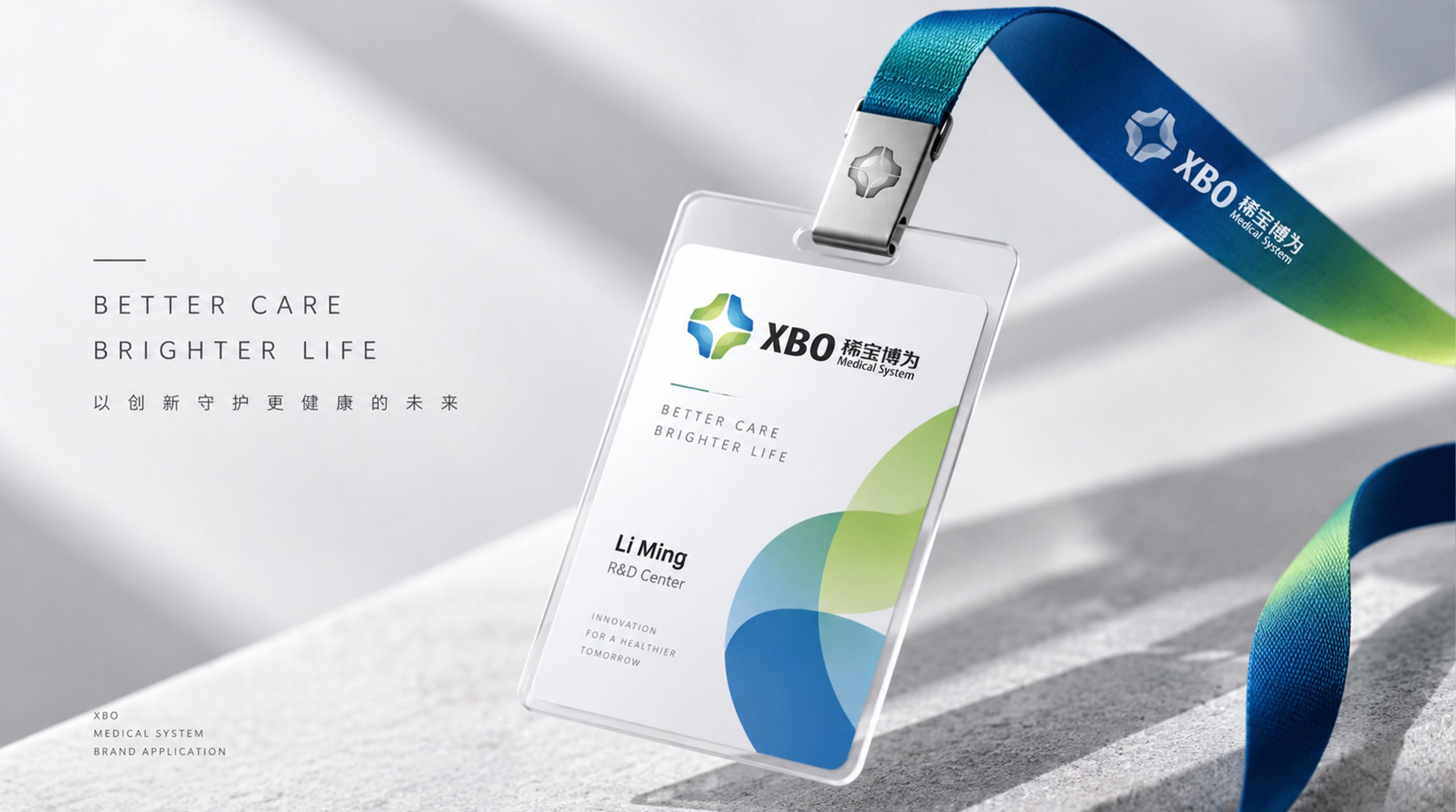
The mark applies across medical device exteriors, laboratory nameplates, web interfaces, brand showrooms, apparel, shipping packaging and mobile icons. The central cross can stand alone as a sub-brand mark, system module icon or data platform login animation. On medical equipment, the three-dimensional gradient reads as a metallic, high-tech sheen, strengthening product recognition and brand consistency. In mobile contexts, a simplified version serves as the app icon and launch animation, extending into a complete brand visual ecosystem.
brand meaning
“XBO” stands for “X Biology Orbit,” signifying the company’s mission to reshape the trajectory of life and health through innovation. The mark’s core spirit is “Precision for Life,” expressing the rationality of medical science alongside human-centered warmth. The four-way convergence forms the brand’s value system: Innovation | Expertise | Care | Integration. Together, the identity conveys XBO’s leadership and scientific credibility in global healthcare.
Improper Usage (Protection Specification)
Do not alter the direction or proportions of the blue-green gradient. Do not change the shape of the negative space at the center of the cross. Do not add shadows, outlines, reflections or other non-standard effects. Do not skew, stretch or rotate the symbol. Minimum display width: 20mm. On dark backgrounds, use the reversed or single-color version.
design results
After launch, XBO’s brand recognition rose by 47%, earning strong endorsement from international partners at medical exhibitions and in joint projects. The blue-green gradient system created a unified identity across global markets, reinforcing the brand’s core impression of technology combined with humanity. Qingmei Future has included the design among its signature medical and life sciences identities as one of the benchmark projects for visual transformation in healthcare.