










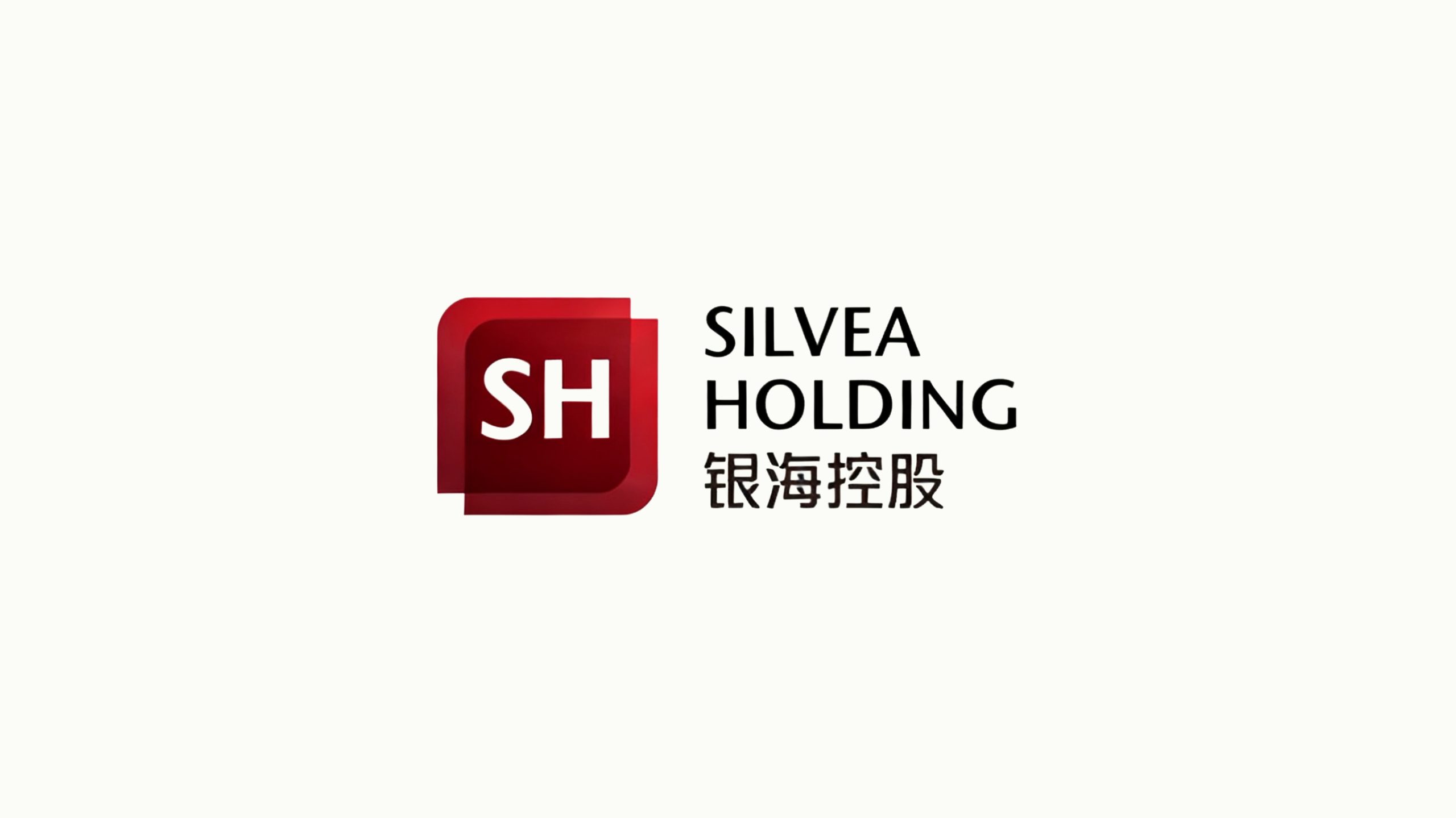
Silvea Holding is a group enterprise focused on financial investment, asset management and industrial integration. As part of its group rebrand, the company sought a new visual identity that conveys a steady, professional and international financial character, while reflecting an open, win-win strategic vision.
design concept
The logo is built on the concept of “a solid capital matrix and layers of trust.” Drawing on the group's English initials “S” and “H” within a geometric square structure, it symbolizes the company's financial foundation and structured management capabilities. Translucent overlapping rectangles on the outer layer evoke the flow of capital and collaborative growth, reflecting a corporate ethos of “steady progress, built on trust.”
graphic language
Square primary form: order, stability and financial security; Dual layering: the layered synergy of the group's diverse businesses; Center-aligned structure: reinforces systematic, disciplined internal management; Light-and-shadow gradient: creates spatial depth and a sense of capital in motion. The composition is clean and composed, conveying the authority and trustworthiness of the group brand.
Fonts and composition
The English wordmark, SILVEA HOLDING, is set in a modern sans-serif with firm strokes and tight spacing, conveying professionalism and global reach. The Chinese name, Yinhai Holding, uses a geometric gothic typeface matched to the English stroke weight. Both are right-aligned, creating a “steady left, extending right” relationship that reflects a company setting out from China toward the world.
color system
Primary Deep Red #8C1B1B: capital strength, stability and value growth; Gradient #B74032 → #631A1A: the company's step-by-step progress and accumulation; Secondary Charcoal #333333: reinforces rationality and authority; White background: transparency, discipline and trust. Together, the palette forms a distinctive “steadfast financial red” identity.
Application and extension
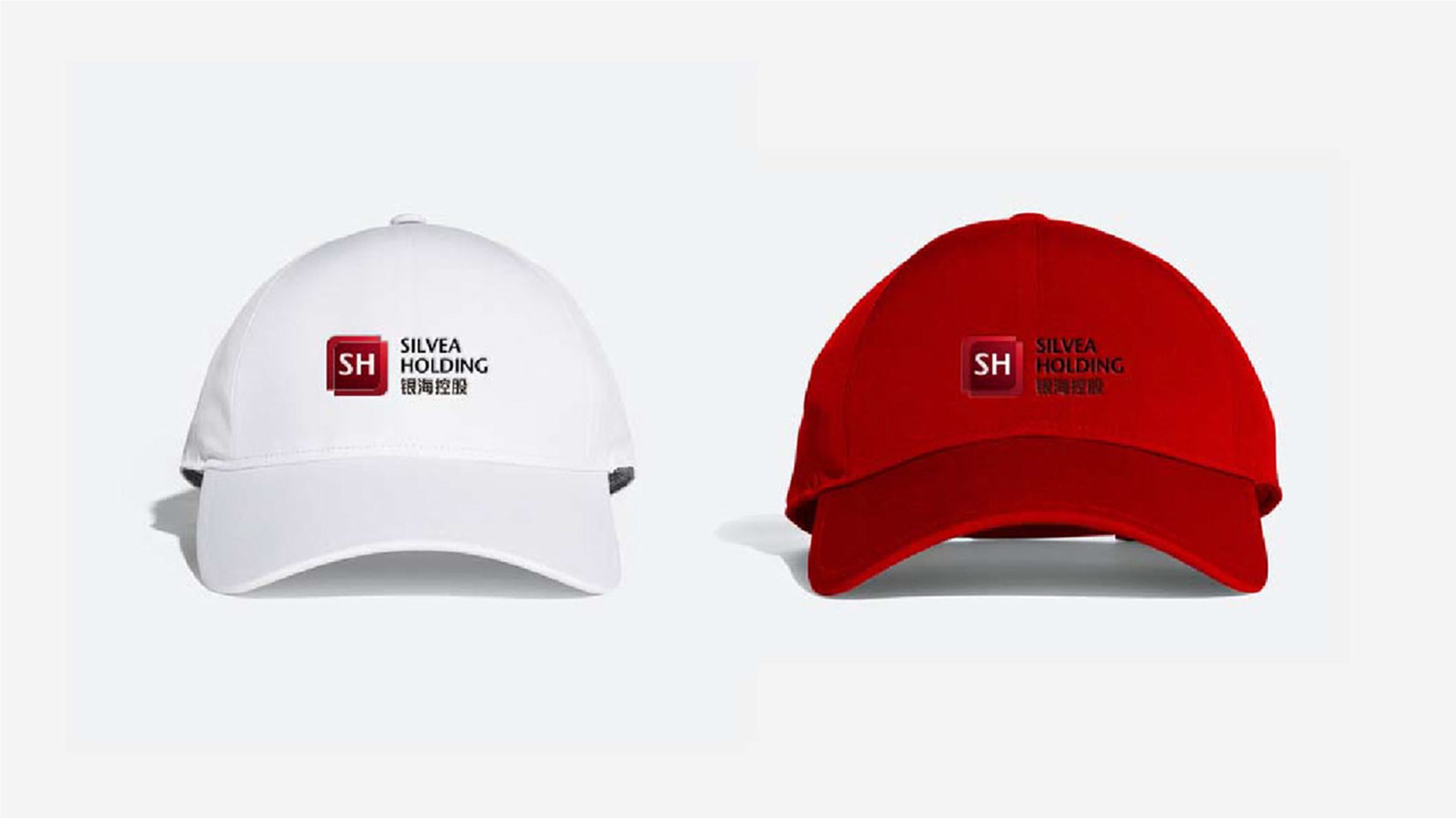
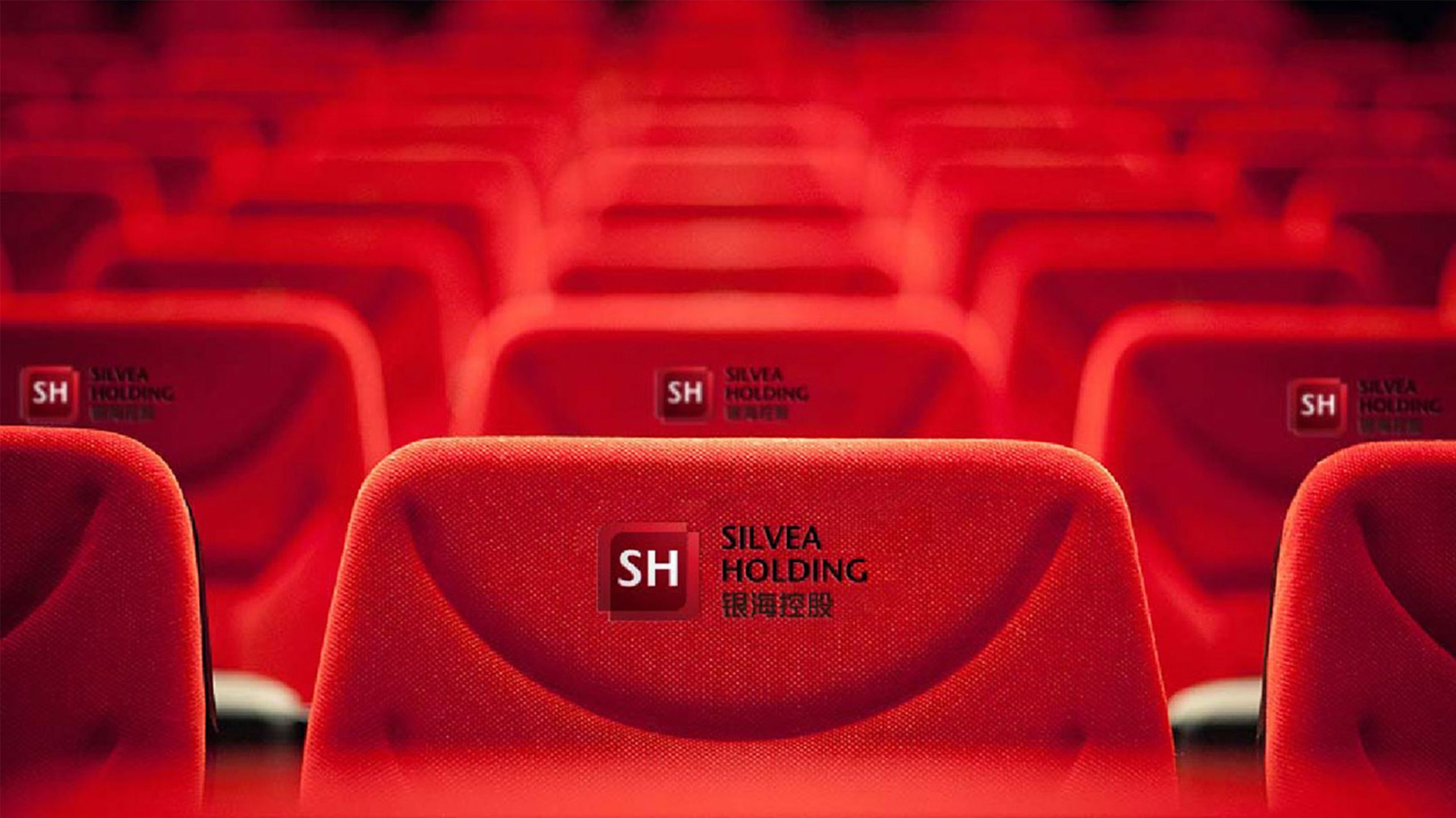
The logo remains highly recognizable across financial reports, investment documents, building signage, business cards, websites and mobile app icons. The square mark can stand alone as a brand icon, or serve as a seal, watermark or animated opener. It conveys a premium tactile quality in metal embossing, glass curtain walls and leather debossing, suiting the high-end business settings of a financial enterprise.
brand meaning
“SILVEA” derives from “Silver Sea,” evoking depth, inclusiveness and the convergence of wealth. Through the visual grammar of a “capital matrix + translucent overlays,” the logo gives tangible form to the philosophy of “prudent operation, open cooperation and shared value.” The overall identity conveys Silvea Holding's rational strength and depth of trust as an international capital platform.
Improper Usage (Protection Specification)
Do not change the primary red or the gradient direction; do not stretch, skew or rotate the square mark; do not add outlines, shadows or textures to “SH”; maintain a 1 : 1.5 Chinese-to-English ratio; minimum display width: 20 mm.
design results
Following the launch of the new logo, brand consistency across Silvea Holding and its partners increased by 41% (internal survey data). The red matrix symbol reinforced the company's image of financial stability and significantly improved recognition at international conferences and in investment documents.