











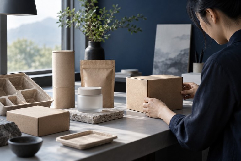

CLARITY / Clarity
Clear Information Hierarchy
We organize content around key tasks and remove unnecessary choices, helping users find their way on every page.

Visual & Product UI UX DESIGN
Making complexity
feel effortless.
Interfaces that bring together beauty, usability and conversion.
Through clear structure and thoughtful interactions, we connect brands with the people who use them.
From business goals to every interaction.

01 design concept
Start with business objectives and user journeys. Define information architecture and interaction flows to create interfaces that support brand expression, usability and conversion.
We use information hierarchy, responsive feedback and a consistent brand language to make important content easier to find and the next step easier to take.
CLARITY / Clarity
We organize content around key tasks and remove unnecessary choices, helping users find their way on every page.
CONSISTENCY / Consistency
From color and typography to components and states, we build a visual language that scales consistently across touchpoints.
CONTINUITY / Continuity
We consider the feedback and transitions around every action, using interactive prototypes to test key flows and keep the experience intuitive.
02 / What We Do
We tailor the work to each product stage and business context, connecting experience planning, visual design and development collaboration.
We map content hierarchy, user tasks and page relationships, then use wireframes and interactive prototypes to define core flows.
We translate brand language into interface color, typography, graphics and layout, establishing key screens and visual guidelines.
We define reusable components, states and usage rules to support future features and collaboration across teams.
We account for different screens and contexts, document responsive layouts, interaction feedback and error states, and work with developers through implementation.
03 / How We Work
01 / DISCOVER
Align on business goals, target users, key use cases and project scope.
02 / DEFINE
Map information architecture and user journeys, using prototypes to explore core interactions.
03 / DESIGN
Establish a visual direction and design key screens, components and states.
04 / DELIVER
Prepare responsive guidelines and design specifications, then collaborate with developers and review the implemented interface.
Vehicle cockpit UI
We design what appears on the screen, not the screen hardware.
Workshop · Architecture Workshop
3–5 working days
Walk one screen's task chain end to end; leave with an issue list and a draft of non-negotiables.
Deliverables
Not included
Final visual production & software engineering
Sprint · Design Sprint
4–8 weeks
One defined topic, such as climate controls or overseas adaptation: research, decisions and an evidence pack.
Deliverables
Not included
Long-term on-site R&D, OS kernel engineering, hardware procurement
Partnership · Embedded Partner
Quarterly, renewable
Embedded with your cockpit team, moving several topics through review gates. Suits platforms and ongoing OTA.
Deliverables
Not included
Unauthorized external naming or purely decorative styling detached from task workflows
Review gates: a step does not start until the gate is passed
04 / Related Work
Explore more interface and cross-device design projects from our work.
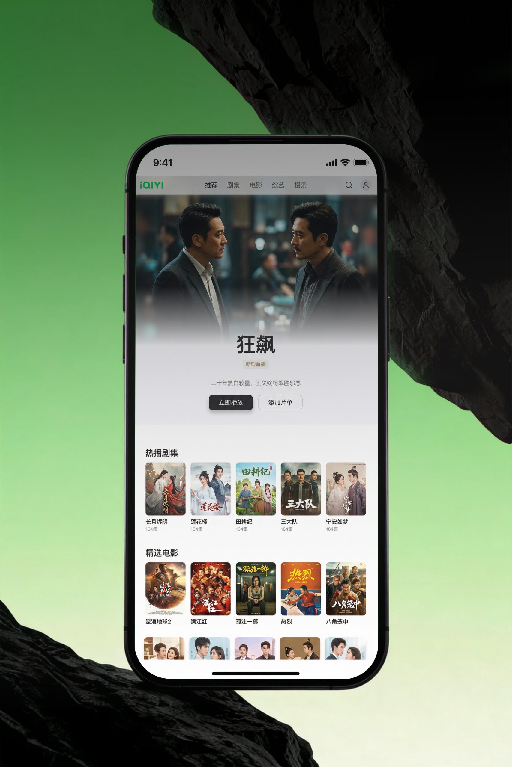
Content Platform / Cross-Device Visual Design
Putting content at the heart of the experience.
A web and cross-device visual system that uses immersive content and intelligent recommendations to shape the platform’s visual hierarchy and brand expression.
Explore Project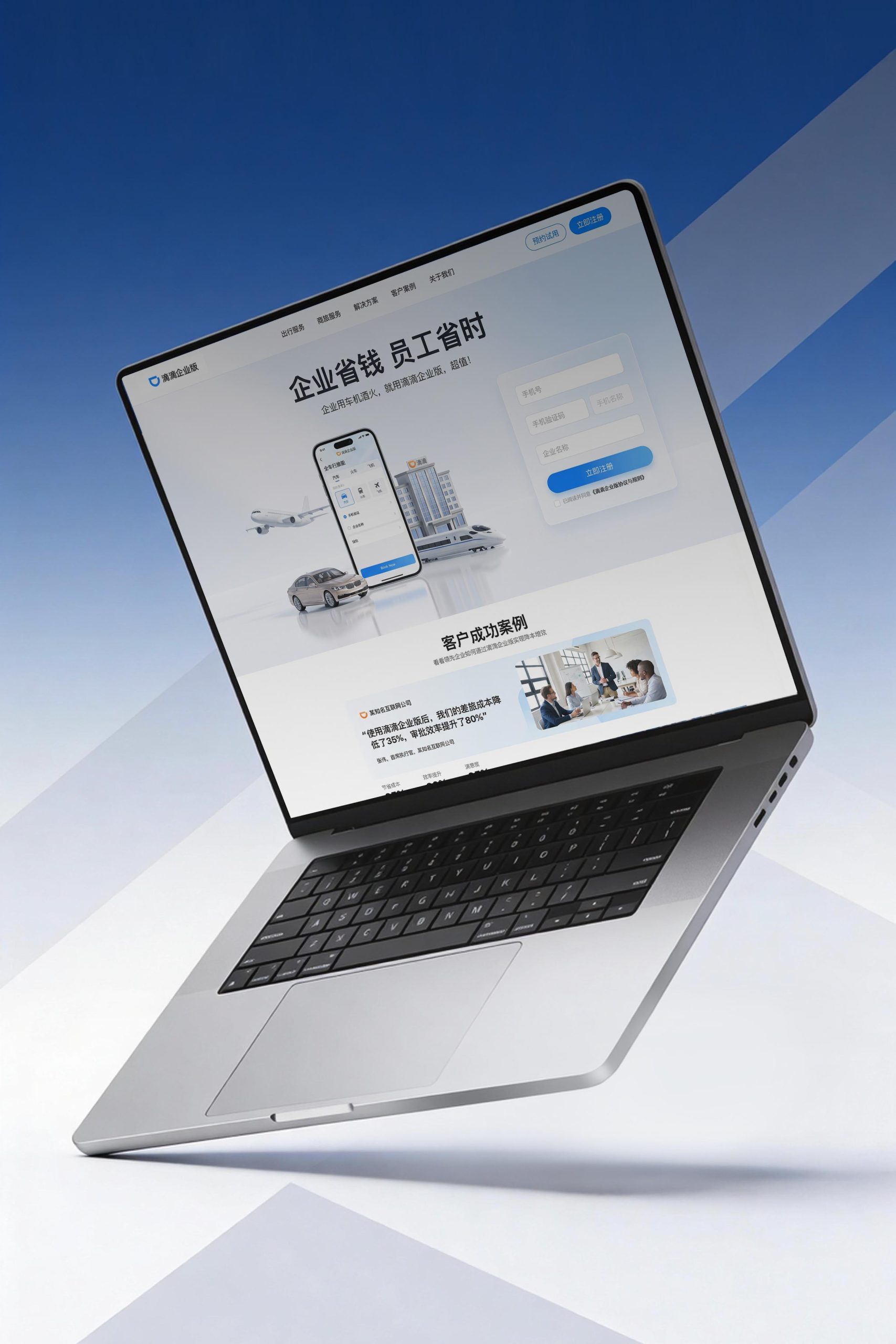
Enterprise Services / Digital Interface
Making professional services easier to navigate.
A web and cross-device visual system grounded in intelligent mobility management, expressing the professionalism of the service and the quality of the platform.
Explore ProjectSTART A CONVERSATION / Get in Touch
Tell us where your product stands, how people use it and what you need to solve. Together, we can define the design goals and how best to work together.
Discuss the project