










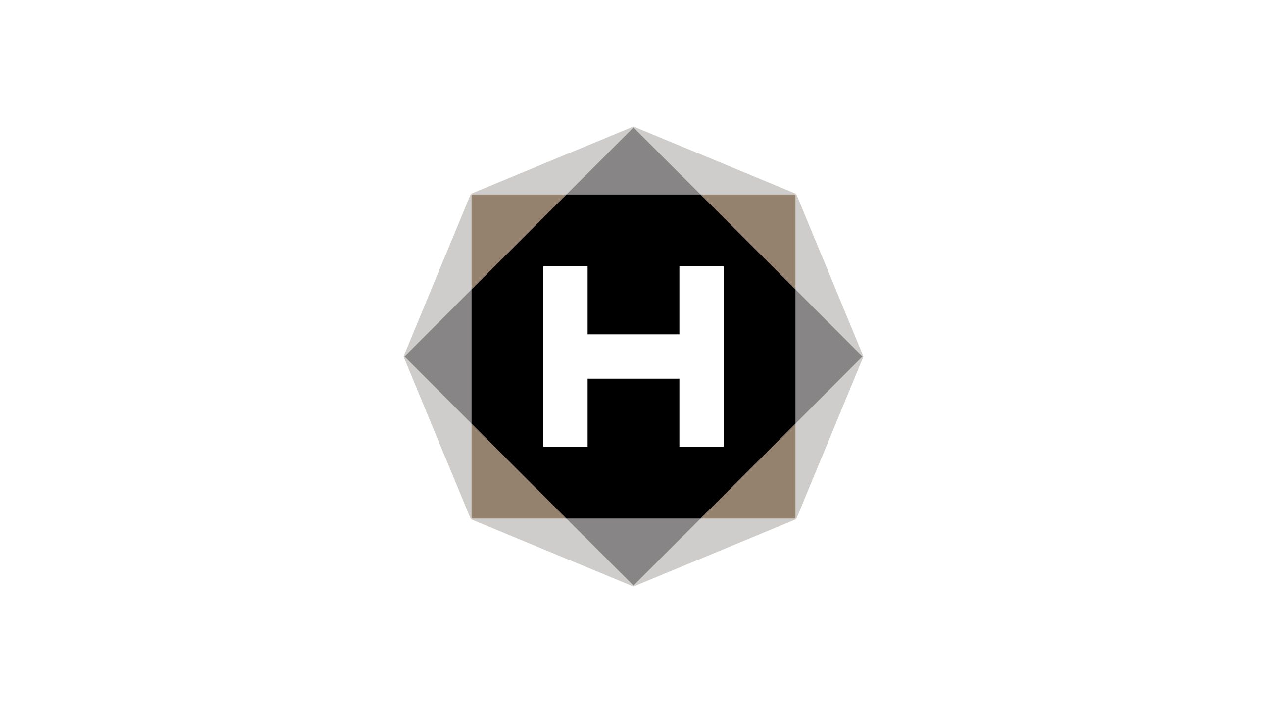
H-MEDIA is a media group spanning advertising creative, integrated communications and digital content production. The rebrand set out to create an identity that combines creative energy with organizational discipline.
The design rests on a simple conviction: advertising is not about noise, but expression shaped by structure and creativity grounded in reason. A minimal visual language captures the brand’s ethos: content at the core, strategy giving it form.

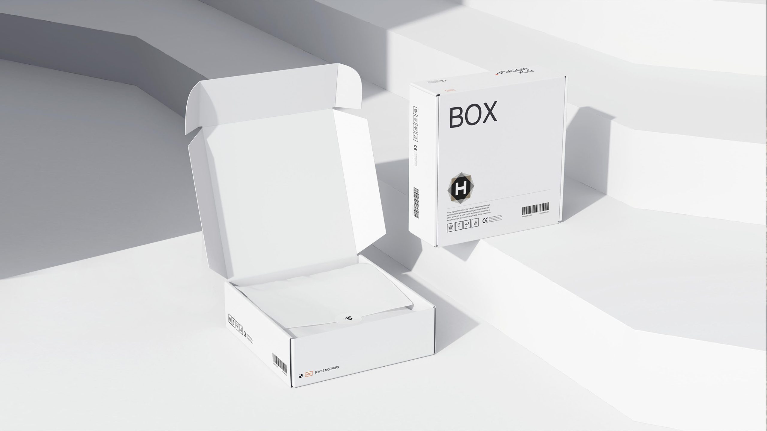
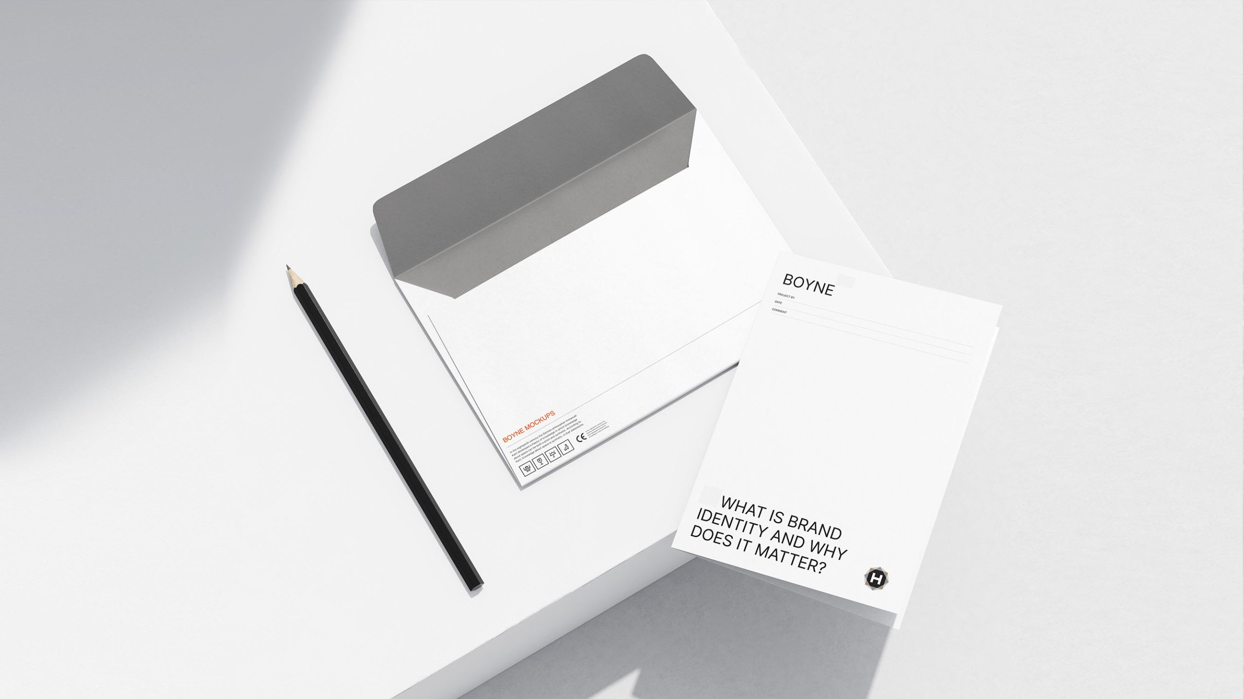
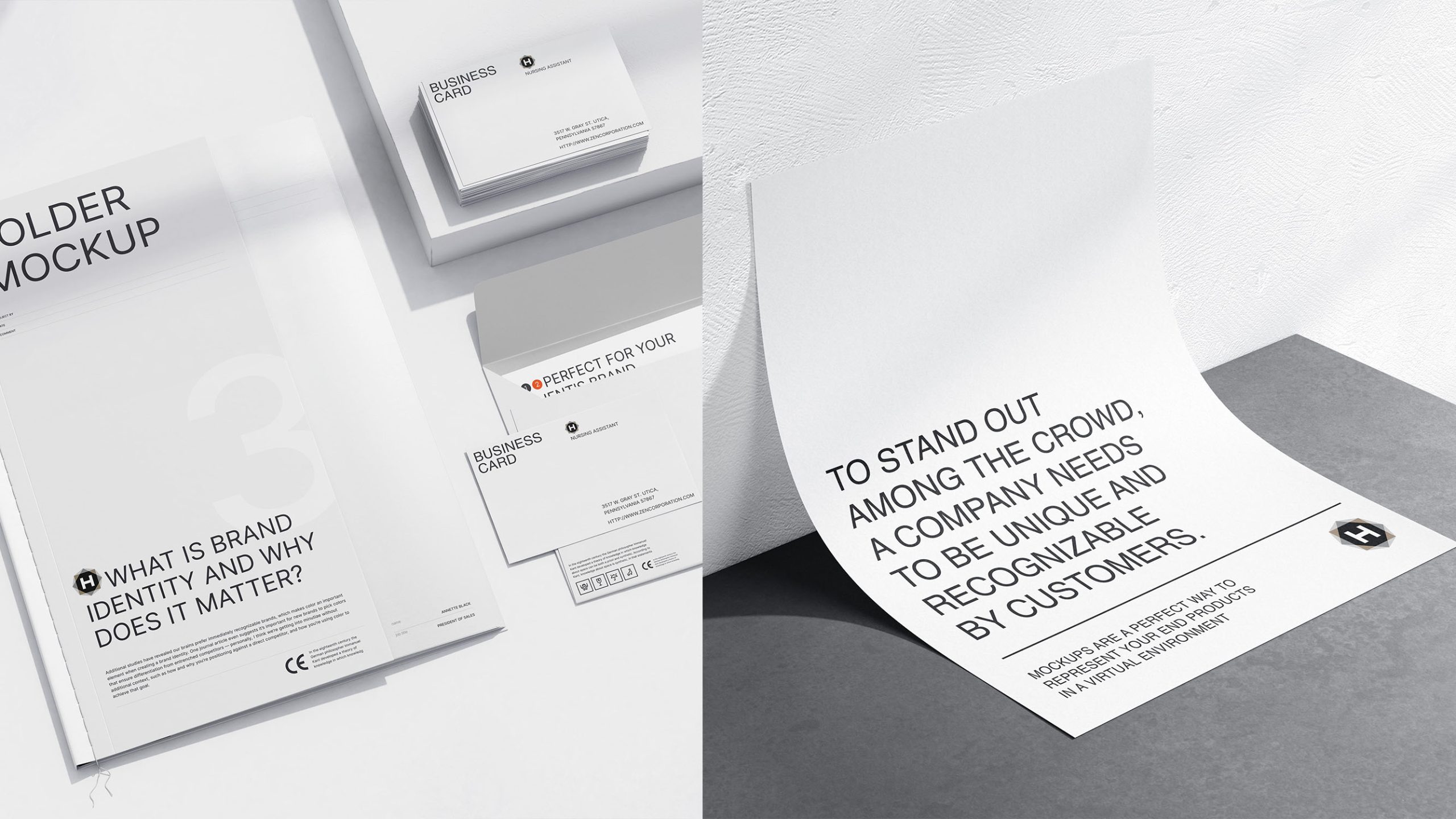
design concept
The letter H anchors the identity, standing for the brand’s initial and three connected ideas: Human—people-centered creativity; Hub—an integrated platform at the center of communications; Hyperlink—the connective spirit of the digital world. The outer hexagon represents the multidimensional media landscape, while black, white and gray create a balance of creative tension and professional credibility. The composition radiates outward from the center while retaining a clear, disciplined focus.
graphic language
Geometric core: the hexagon represents the creative ecosystem’s many connections and underlying order. Central H: embodies the brand’s core strength and focus on content, reinforcing professional confidence. Dimensional layers: overlapping gray and black create depth and perspective, reflecting the breadth of the media industry. Light and shade: graduated gray outer edges suggest the expanding reach of communications and the adaptability of media.
Fonts and composition
The H takes center stage within a precisely proportioned geometric construction. Supporting typography can use a modern sans serif such as Helvetica Neue or Proxima Nova to convey clarity and an international outlook. Across the brand system, the wordmark and emblem can be used independently or together to serve group-level communications, sub-brands and individual initiatives.
color system
Primary black #000000: depth, strength and command of content. Supporting grays #6E6E6E / #BDBDBD: layers of thought and structural logic. Highlight white #FFFFFF: creative insight and pure inspiration. The monochrome palette establishes a refined brand presence, translates easily across digital and print media, and maintains consistency across materials.
Application and extension
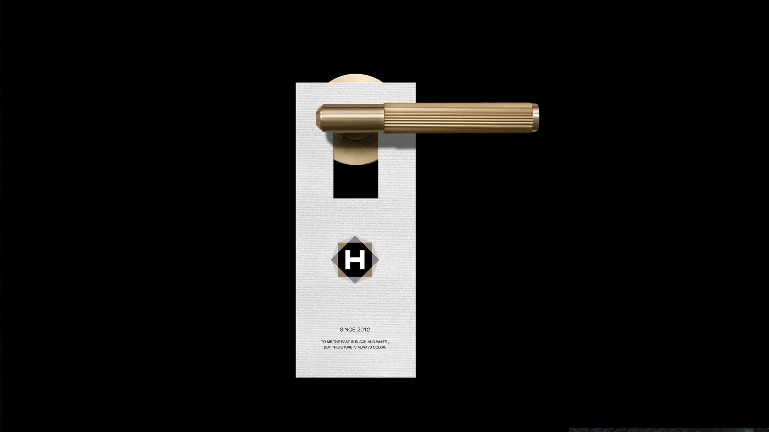
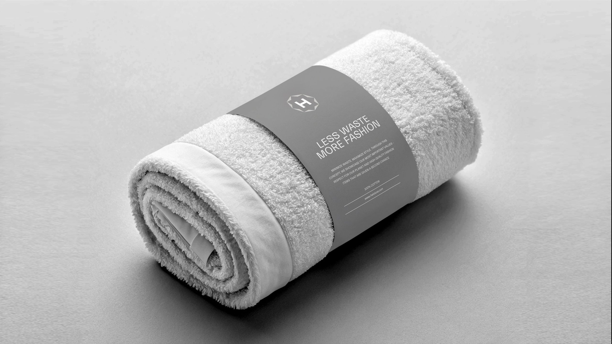
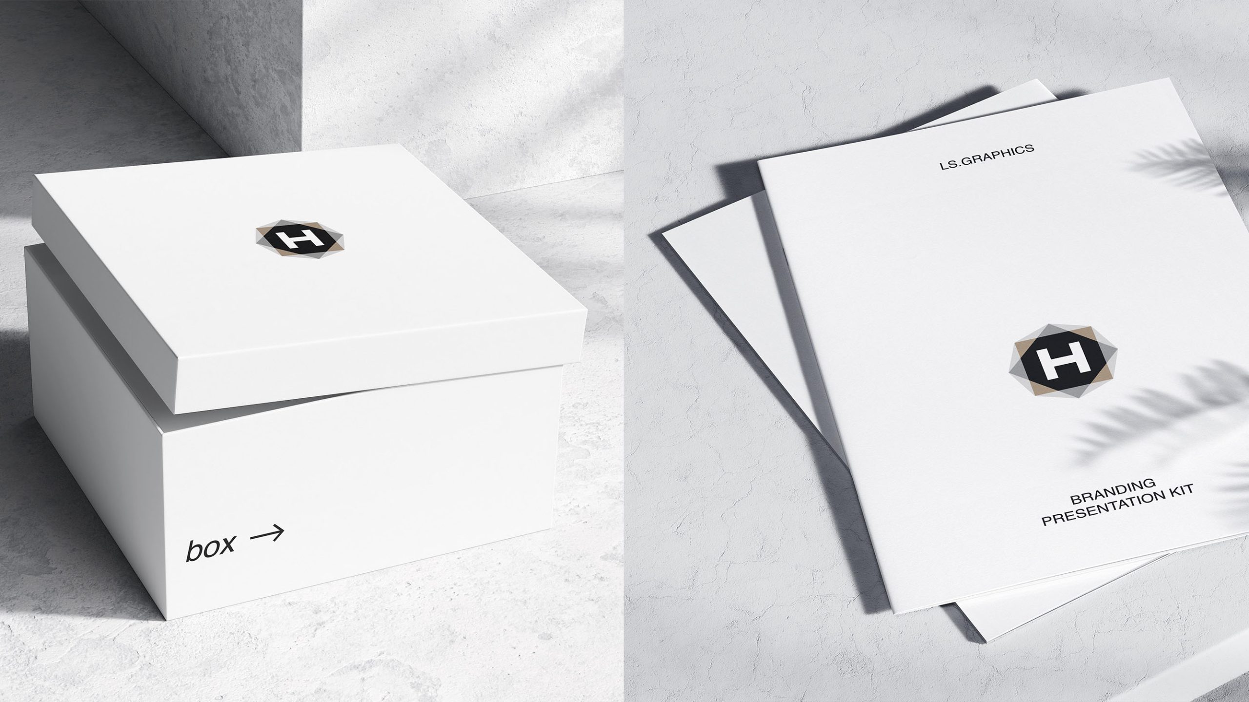
The logo is highly modular, with the flexibility to support a comprehensive identity system. Corporate communications: websites, business cards, stationery, report covers and brand guidelines. Media content: opening sequences, end animations and visual wayfinding. Physical environments: dimensional installations and dynamic lighting for offices, exhibitions and media events. Digital channels: the hexagon provides a foundational motif for social media, advertising watermarks and brand signatures.
brand meaning
More than a visual expression of H, the logo is a metaphor for how the organization works. The hexagon represents collaboration, with the H as its creative core. The transition from gray outside to black within reflects the complementary roles of insight and execution. It captures a central belief: bring order to complexity, and creativity to order. H-MEDIA’s brand spirit is distilled into one statement: “Structure Creates Freedom.”
Improper Usage (Protection Specification)
Do not alter the hexagon’s proportions or rotation. Do not change the core palette or add gradients or shadows. Do not use the H separately from its enclosing structure. Recommended minimum reproduction width: 25 mm.
design results
The new identity established H-MEDIA as a modern, intellectually driven media group through a distinctive combination of monochrome clarity and geometric order. Consistent and recognizable across digital and physical applications, it earned strong industry recognition. The project is a signature example of Qingmei Future’s work at the intersection of creative organizations, strategic consultancy and systematic branding, demonstrating design’s ability to connect thinking, structure and visual expression.