










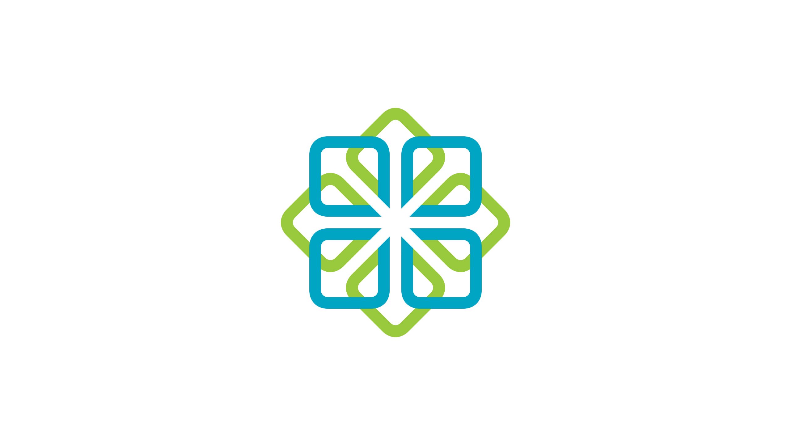
HealthLink is an integrated healthcare and health management organization spanning clinical services, public health, rehabilitation and telemedicine networks.
The rebrand aimed to create a visual system that reflects international healthcare standards while conveying warmth and trust. The logo uses simple geometry to express three core ideas: care, connection and balance in life.
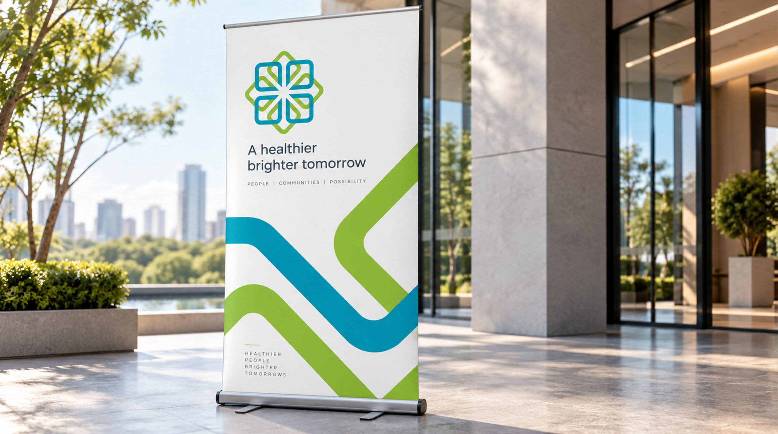
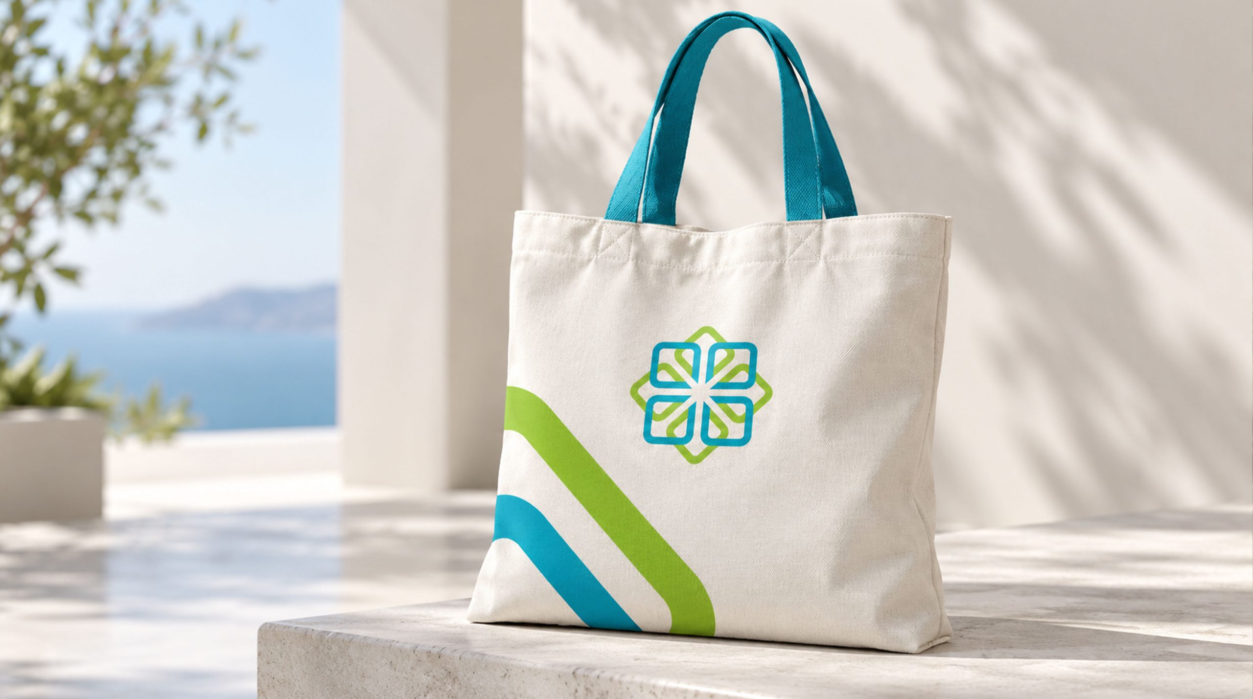
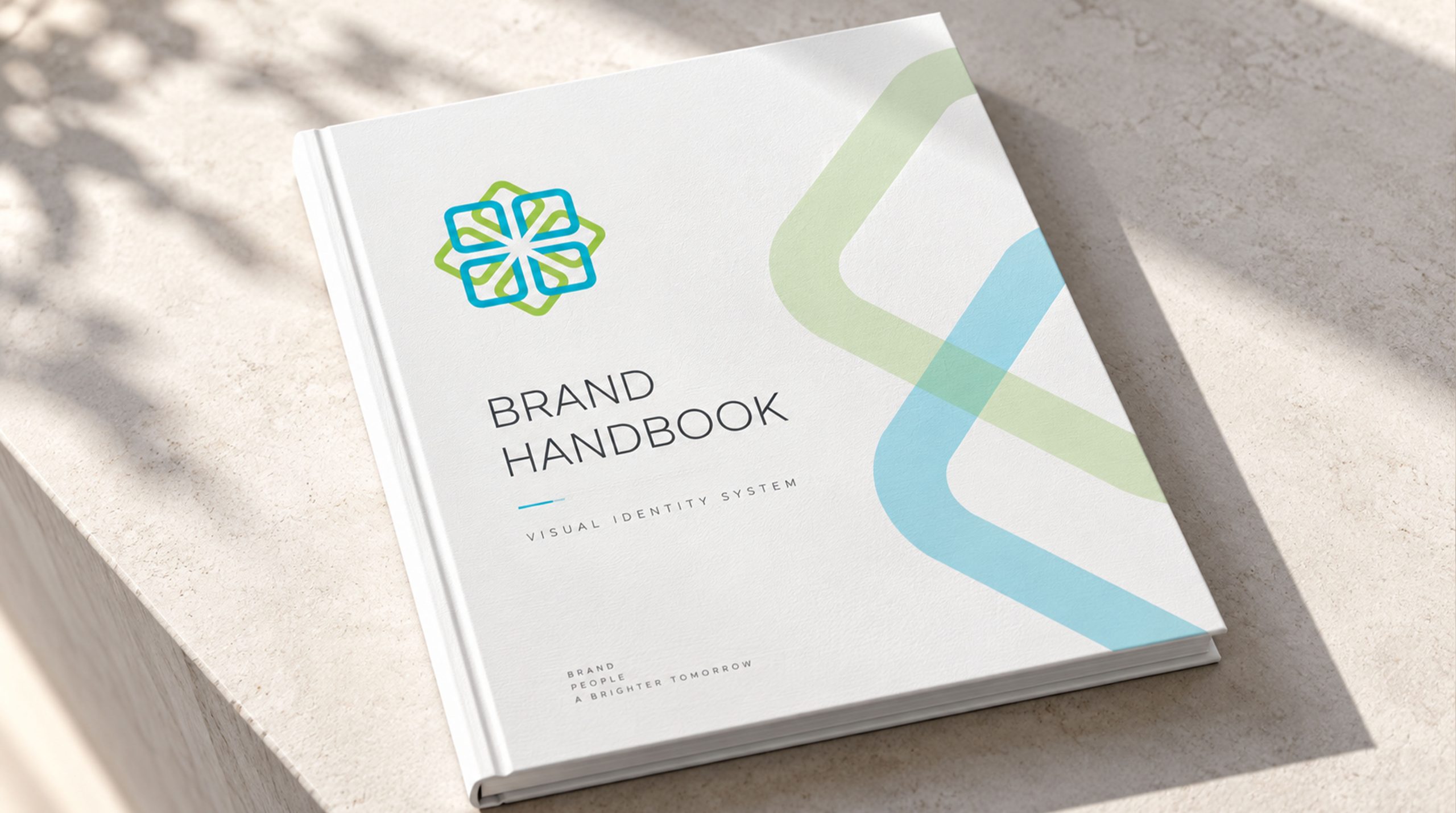
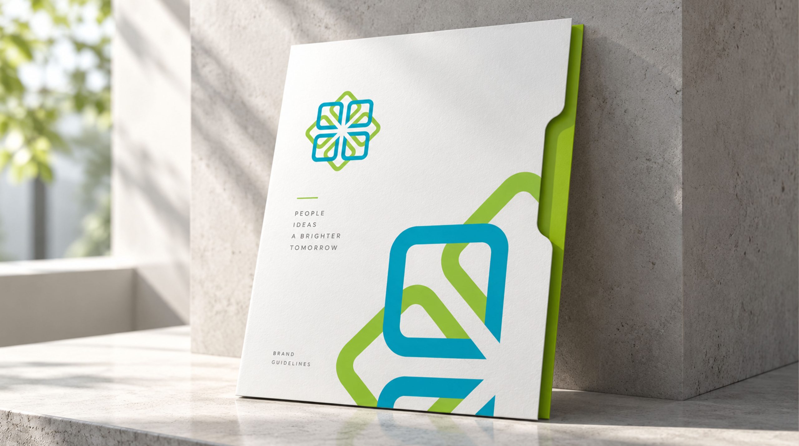
design concept
Inspired by the intersecting cross and the cycle of life, the logo weaves blue and green lines into a double-layered geometric structure. A bright central intersection symbolizes the essence of life and renewed hope. The form suggests a medical cross, unfolding petals and expanding cells, bringing together clinical precision and compassionate care. Its guiding belief: compassionate medicine, connecting lives through technology.
graphic language
Double-layered linework: the inner and outer lines express the partnership between technology and humanity, medicine and care. Central intersection: a point of light represents the conviction of healthcare professionals and the hope of life. Geometric structure: symmetry, balance and stability convey the rigor and trustworthiness of the healthcare system. Rounded corners: soft edges temper clinical precision with warmth and approachability.
Fonts and composition
The HealthLink wordmark uses a light sans serif with rounded forms and balanced proportions that echo the symbol’s softness. Bilingual lockups can place the symbol to the left of the text or use a centered, stacked arrangement to suit different applications. Typography follows the logo’s core palette, maintaining a coherent system and consistent recognition.
color system
Medical blue #4CB0C8: reason, expertise and technology. Life green #A9C55F: health, growth and balance. Intersection white #FFFFFF: purity and hope. Together, the three colors build a visual language of trust, life and light, bringing scientific rigor and human warmth into balance.
Application and extension
The logo adapts readily across media. Healthcare environments: hospital wayfinding, ward signage, staff uniforms and environmental graphics. Digital systems: clear recognition on mobile platforms, online consultations and health management apps. Public communications: a gentle yet confident presence across brochures, medical reports and community initiatives. In motion, the central intersection can emit a soft, expanding glow to express care reaching outward.
brand meaning
The structure is a metaphor for connecting and safeguarding life. Blue and green bring medicine and nature together, while the central point of light represents hope and renewal. The identity expresses three core healthcare values: science—a rigorous system of precise diagnosis and treatment; trust—the human connection between patient and practitioner; care—restoring humanity to medicine. More than a healthcare logo, it expresses a belief: every connection is a commitment to protecting life.
Improper Usage (Protection Specification)
Do not stretch, skew or change the proportions of the linework. Do not substitute the core colors or add shadow effects. Do not separate the blue and green structures. Recommended minimum reproduction width: 25 mm.
design results
The new visual system established a unified identity for HealthLink across its healthcare institutions at home and abroad. Combining geometric clarity with a warm, considered structure, the logo earned strong industry recognition and positioned the brand as a model of human-centered modern healthcare. A representative project in Qingmei Future’s healthcare branding portfolio, it demonstrates the tangible value of design in advancing human care.