











This identity was created for a contemporary college focused on educational innovation and international exchange.
Guided by a commitment to integration, intellectual discovery and innovation rooted in enduring principles, the college prepares future talent with a global outlook, interdisciplinary capabilities and a strong sense of social responsibility.
The visual identity called for a simple, dignified mark that would express the college’s academic spirit, cultural heritage and commitment to contemporary innovation.
design concept
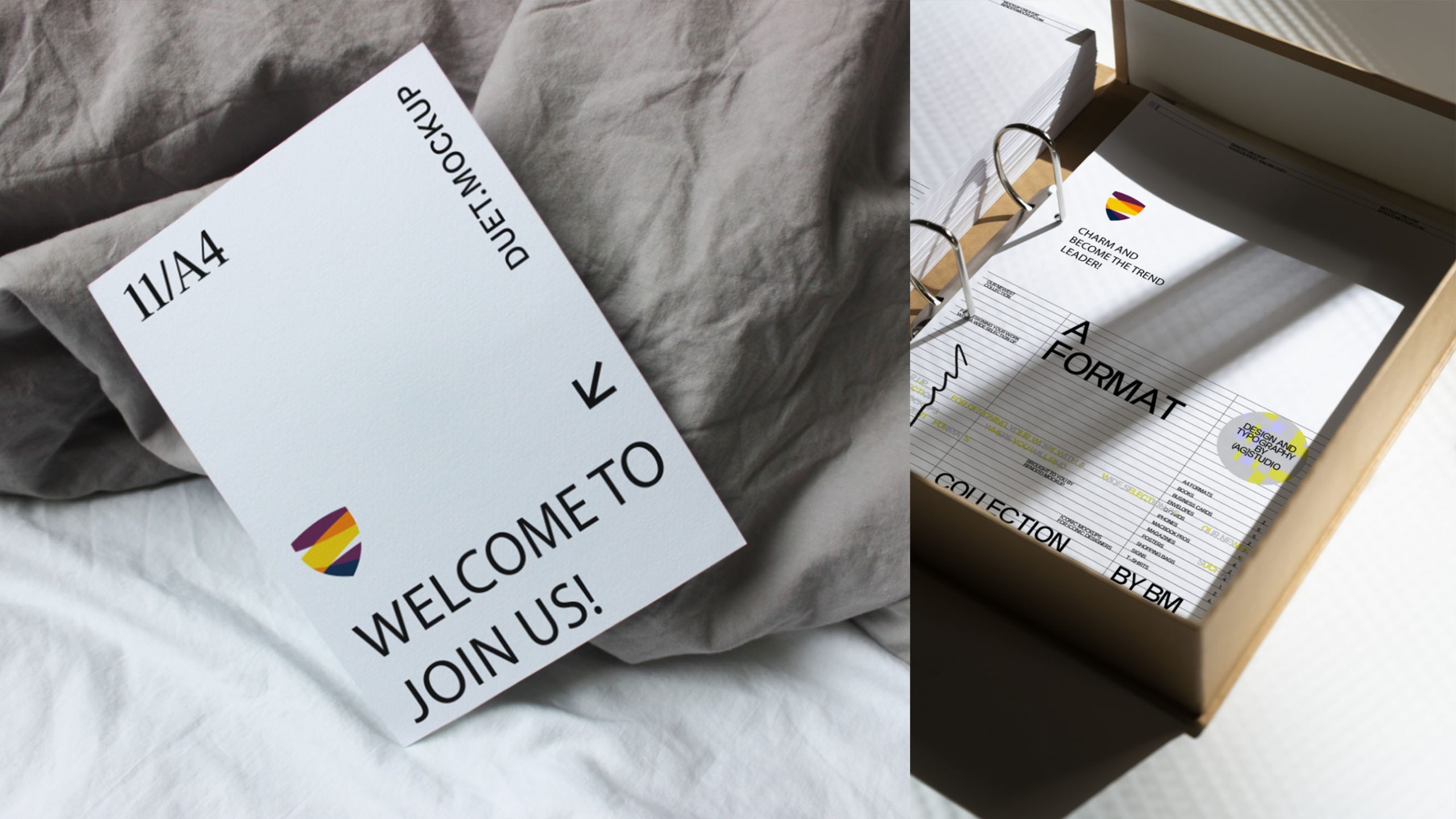
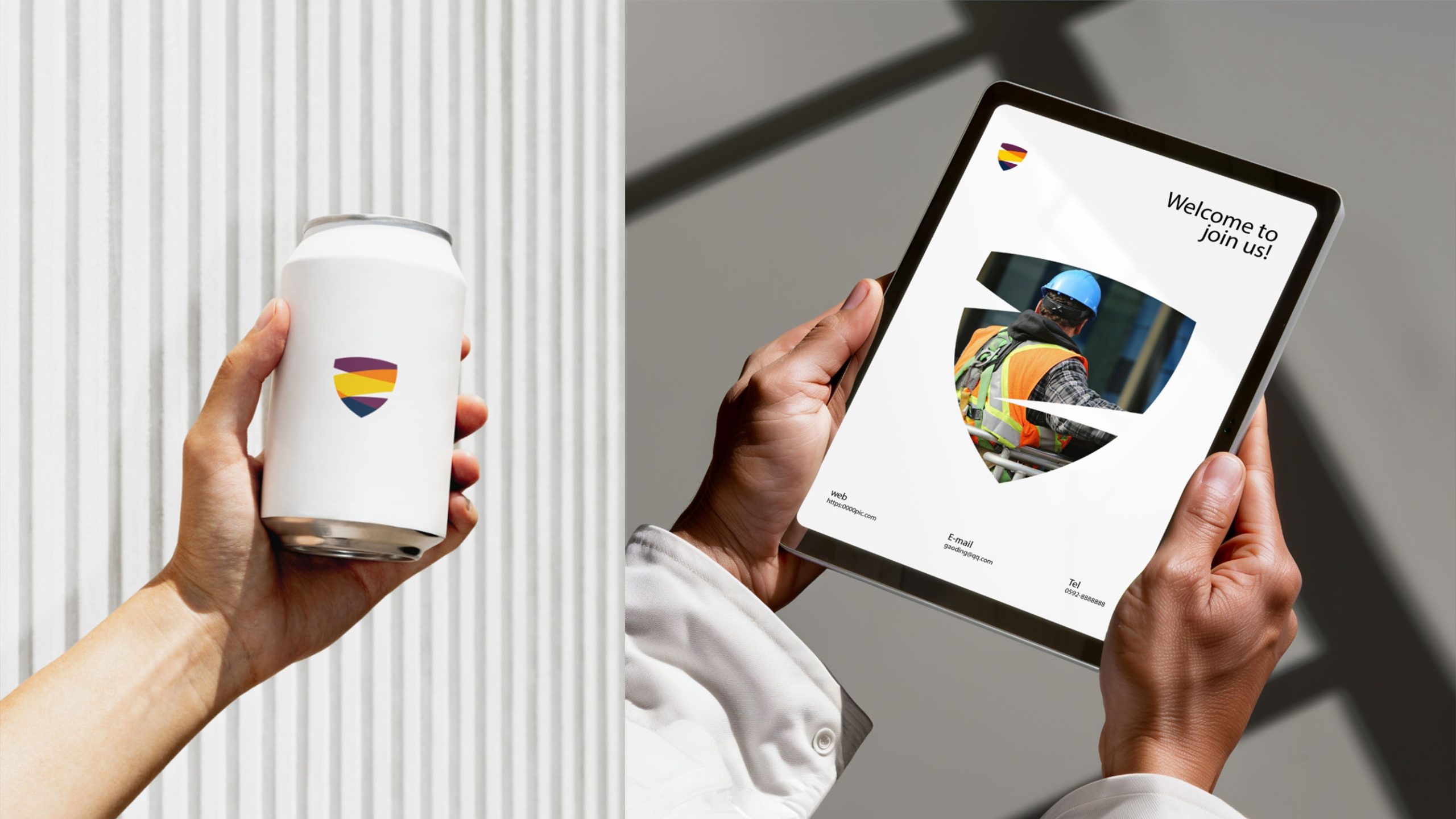
The logo centers on a shield, bringing together three visual ideas: layers of knowledge, the integration of diverse perspectives and the safeguarding of culture. The shield represents the college’s mission to protect knowledge and civilization. Inside, three flowing bands evoke the depth and inclusiveness of academic exploration. Grounded yet contemporary, the form expresses an educational spirit of integrity, openness and progress.
graphic language
Shield form: drawn from traditional academic heraldry, it symbolizes resilience, honor and responsibility. Three horizontal bands: represent accumulated knowledge, the exchange of ideas and cultural continuity. Overlapping composition: expresses interdisciplinary integration and the sharing of knowledge. Downward-pointing triangular form: grounds the composition, reflecting the college’s foundations in learning and wisdom. Modern geometry reinterprets the authority of the traditional college crest, balancing academic ceremony with international recognition.
Fonts and composition
Pair the logo with a clean sans serif such as Montserrat or Source Han Sans to express the college’s modern, rational character. Bilingual typography should remain balanced around a central axis, with uppercase English lettering reinforcing its international outlook. A symbol-to-wordmark ratio of approximately 1:1.3 ensures legibility in both horizontal and vertical formats. The shield can also stand alone on college seals, badges and uniform patches, combining dignity with contemporary clarity.
color system
Burgundy #651E46: cultural depth and academic distinction. Orange #E97B2C: intellectual discovery and a passion for learning. Gold #F5C64A: the light of knowledge and educational achievement. Navy #1D2E4D: reason, stability and a global outlook. Layered together, the four colors create an academic identity that bridges tradition and modernity, expressing the college’s aspiration to be rooted in culture and take flight through knowledge.
Application and extension
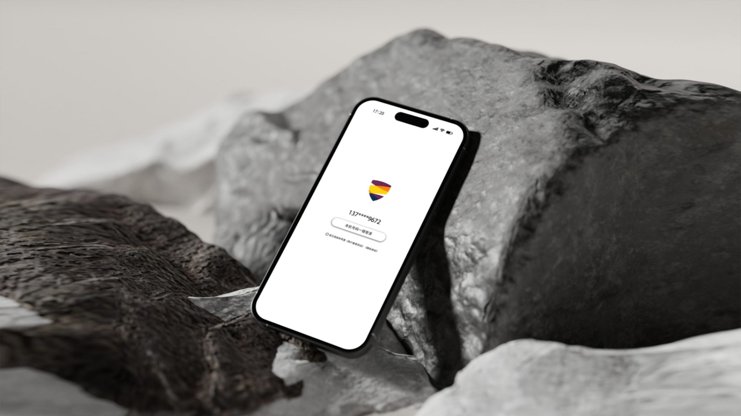
The logo works across certificates, diplomas, uniform badges, flags, conference materials, websites and digital media. The shield outline can serve independently as an institutional certification mark or embossed seal. The colored bands can extend into supporting graphics for communications, digital backgrounds and wayfinding. In digital applications, a three-color gradient animation can evoke knowledge in motion, reinforcing the college’s belief in the exchange of ideas and shared intellectual growth.
brand meaning
The shield expresses the college’s mission as a guardian of knowledge. Its three bands represent the integration of academia, culture and society, while the colors articulate three dimensions of its character: reason in blue, passion in orange and honor in gold. More than an identity, it is an expression of an educational philosophy: knowledge as a shield, innovation as a blade, inspiring the minds of tomorrow.
Improper Usage (Protection Specification)
Do not change the order or proportions of the colored bands. Do not rotate, skew or stretch the shield. Do not add shadows, outlines or gradient effects. Maintain a symbol-to-wordmark ratio of 1:1.3. Minimum reproduction width: 25 mm. Do not place the logo over busy or multicolored backgrounds.
design results
Following the launch, the college’s brand recognition across educational events and international partnerships increased by 48%. The logo has been widely adopted for international exchange programs, alumni merchandize and digital platforms. Its contemporary crest balances academic tradition with innovation, becoming an authoritative expression of the college’s commitment to carrying knowledge forward and educating through innovation. Qingmei Future has included the project in its Education and Cultural Brand Systems collection as a representative case and a reference model for college visual identity design.